Tuesday, 30 June 2009

All my ducks in a row!!!!

So it finally arrived and infortunaltly it was a while before i had time to play with it, but i finally gor a few hours to scrap and I LOVED IT!!!!!

Seriously gorgeous, i LOVE OCTOBER AFTERNOON. seriously love them. The ducks in a row line is i suppose meant for little ones, but i used it for something else ( lack of little ones in my family at the moment!!!)
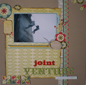
I took this photographs of my son on our day trip to France and have been waiting for the right paper to scrap them.
CAn you tell i am into butterflies at the moment!!! check out the Martha stewart punches online, seriously gorgeous!!!! used the butterfly ones on this page!!!

Then as i still had lots of pattern paper left over from the page, i made a card using the same design.


I still have several of the new October Afternoon lines to use and i will upload them here when i have done!!!!

Saturday, 27 June 2009

K & Company...

I was sent some K&Co Wild Raspberry papers this month and used them to create a fairly simple layout - easily achieved just by cutting one sheet of this beautiful patterned paper - perfect eye candy and so cheap to achieve! Click on the picture to get a larger image!


1: cut a circle using a plate as a template and glue into place.

2: using pink card stock cut a smaller circle and glue into place as shown.

3: then cut two strips, one of card stock the other of patterned paper, and glue as shown.

4: using a corner punch trim photo edges and glue into place

5: cut the flourishes out of the patterned paper and layer as desired.

6: add your title and finish with a few chosen embellishments. I've used some spotty May Arts ribbon and some yellow self adhesive pearls.

Thursday, 25 June 2009

Fathers..

We had some lovely entries for our Father's Day competition and I must apologise for not posting the results sooner, it has been very busy in the shop and with staff shortages the blog has taken a back seat. However, I thought I'd show you some of the fabulous entries we had...

Lynn sent in 2 layouts:


Jo made this card:

A layout from Louise Collins:


This was from Ginger:


Another layout from Anna:


and our winner, chosen at random by my son...
is Louise Squires

Thanks to everyone who played along - Louise send me your address and I'll post off your prize!

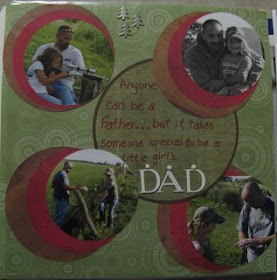
And just while we're on the subject of Father's Day, I thought I would share the layout for the crop last Saturday, which featured my father! I used Crate Paper Orbit and got to play with grunge paper too!

Saturday, 20 June 2009

Lifting a Page

I was asked to lift a page for the blog, and to write about why I chose it and how I carried out the lift.
Easy I thought.
I lift pages quite alot, but they are always already chosen for me, and often a sketch has been made up already to make it even easier to lift.

So I started searching through the blog to choose a page.
This one by Stephanie caught my eye...

I love the colours used, they are so me at the moment; and I also loved the layers- I'm very into layering myself, so that definately appealed.

I then looked through my photos to see what I could use. I found a photo of my daughter that I love, but it was a portrait shot rather than landscape as used on Stephanies page.
The first thing I did was to print out her page, so I had it to hand.
With my portrait photo ready, I then turned the print out 90 degrees to the left.
I sketched out the layout in rough at the new orientation to check it would look ok.
At this stage I realised I would also have to flip the page horizontally to make the photo work.
Then to help myself some more, I created a sketch using the drawing part of Open Office.

I left out all the little embellishment details as adding your own are to me what makes your page your own and not just an identical copy of the lifted page.

Now I had the bare bones, I could set to work.

Papermaze had sent me the lovely new Prima Flirty Secret papers to work with. I then realised that the colours are quite similar to those in Stephanies layout, and I wondered if that had helped attract me to it.

I started off with 2 sheets of Bazzill cardstock to co-ordinate with the papers.
I trimmed 1cm off two edges of the blue sheet, and stuck it to the green one to leave a 5mm border all around the edge.
(I actually removed a large area from the middle of the green sheet to reduce wastage and make my supplies go as far as possible- something I do with as many layers as I can)

Using my sketch to help me I then started cutting the papers to the various sizes and shapes. I decided to keep the basics of the layout as similar as I could to the original, and then to build my take on it on top of all the layers. The papers used are Meander and Memoirs, and another sheet of Bazzill cardstock in a very pale pink.
As before I removed the middle of the first patterned paper layer to use it as another layer higher up.

This paper Flamboyant (flocked) has the pattern flocked- it is gorgeous! So I used it as one of the top layers so it could be seen- and felt!
I added the circle from the original page too.

The photo with its dark edges seemed a little harsh, so I sanded them to soften the look.

On Stephanies original layout, she has some lovely swirls going across the middle of the page, underneath the photo. On my layout this would have translated to swirls up the left side, I felt this seemed a little unbalanced, so decided to have a swirl up the left side, and across under the photo.
To make them, I simply freehand cut some slightly curvy pieces from green cardstock.

Taking the flower idea, I then expanded it to have more flowers, spread along the curvy cardstock strips. I used a mixture of
Prima Essentials Flowers

To finish the flowers I took some clear buttons, and threaded embroidery thread through to tie knots.

The best way I think to stick down clear embellishments such as these buttons is to use small clear glue dots- the bulk box of Stix 2 Glue Dots is fab.
(photo shows before I removed the backing to stick down!)

For the title I again followed the idea of it flwing around the curve of the circle- and made it using American Crafts Fabric Thickers Patchwork Aqua; American Crafts Glitter Thickers Lax Crimson, and Making Memories Tiny Alpha Stickers Pink Ledger.

And that was pretty much that!
As you can see, some of the design I stuck to quite closely- like the layers; others I changed to fit my page- the swirls and the orientation; and others I just took the idea and expanded and changed it- like the flowers.

A lifted page can be as similar or as different as you like from the original.
Sometimes the end result will seem nothing like the one you used to lift from- but the ideas will be there.
Most of all- have fun with it!

And here is my finished page.
A Big Thankyou to Stephanie for such a fab layout that inspired me to lift it.

Wednesday, 17 June 2009

Working with papers from different manufacturers.

One of the most difficult things to do when you first start scrapping is successfully combining papers from different manufacturers or ranges. The thing to remember is that there are no rules about combining papers - you can put any colours or patterns you like together if you think it works! But there are some things you can do to ensure that your combinations will be pleasing to the eye:

Firstly, you could combine using colour. You might choose papers that have similar colours, for example the pinks and light greens used on the layout in this post, or you could go for contrasting colours. Try using a colour wheel to decide which colours would be complimentary.

Second, you could combine using pattern or design. Whether it be spots, stripes, hearts or flowers, you could look for a linking element on the papers and use that as a starting point.

Finally, you could combine via a theme - if you are making a beach themed layout, you might look for papers that have a 'sea' theme - often these will be in similar colours anyway which will make combining easier.

If you are really struggling, try starting with combining papers from the different ranges of one manufacturer - you will often find that while the papers are different, they will have similar tones or designs making combinations successful.

The key is to practice - look at what other scrappers have combined, what works and what doesn't, and make notes of effective combinations. One thing to do is look at the papers that kit companies choose to combine - this can often be a guide as to what colours will work well together, especially if you find it difficult to go to a shop and see colours in the flesh.

For this layout, I combined papers from three different manufacturers - there is a sheet of My Mind's Eye Penny Lane as a backdrop, a sheet of green designed paper by Basic Grey Urban Prairie and a sheet of floral paper by Bo Bunny Alyssa (also a strip of the brown coloured reverse). The papers work well together because of the pastel tones, complimentary colours and recurrent floral designs.


Posted by Picasa

Sunday, 14 June 2009

Glimmer mists....

are now available here in the shop. A fantastic array of gorgeous colours all ready to add a sparkle and gleam to your finished pages and art work. Each bottle has a coloured sticker on it depicting the "name" of the spray - these stickers are the actual colour of the glimmer mist when sprayed onto white cardstock. As with all mica based liquids, they will look totally different on light to coloured papers.

So, what are glimmer mists?
Glimmer mists are a water based coloured spray which contains mica. Depending on how you spray them, they can go from an all over subtle colour with a hint of glimmer to a really dense colour with heavy mica tones. They are archival safe, acid free and non toxic so ideal for scrapbook pages and all forms of craft. They can be used on paper, card, stampbord, chipboard, grungeboard, wood, canvas, lace and fabric. Try them with masks, glimmer chips and screens to create different effects - the best way to use them is to experiment and see what effects you like.
These are some of the effects you can achieve:-

Glimmer mist used was pink bubblegum....

Try mixing a couple of colours together to get a different effect:- here I've used tattered leather and pink bubblegum....


The best way to store mica based liquids is on their side - this is due to the settlement of the mica when not in use - its far easy to aggitate the mica from a larger area (ie the length of the bottle) then the base. Before using your sprays always give them a really good shake to ensure that the mica is well dispersed.

The hanging piece was created by cutting a piece of white card and laying a T!m Holtz mask onto it, I then sprayed over the mask with pink bubblegum - ensure that spray is dry before lifting any masks/stencils as the spray could disperse into the masked area - Once dry I then added another T!m mask - leaving both in place I then oversprayed with tattered leather - leaving all liquids to dry before removing masks. I then took a piece of stampbord and sprayed jazz blue onto it and added a spritz of pink bubblegum, once dried I stamped and hi-lighted with a scratch tool. A piece of card was spritzed with tattered leather and then "inspire" stamped on it - then hi-lighted with a white pen. A piece of beaded ribbon and a clasp finished it off.

The best thing to do with glimmer mists is to play and have fun and create some fun pieces...Enjoy!

Thursday, 11 June 2009

Lime Rickey...

I knew it was going to be bright and colourful, and boy is it!!! The colours on the new Lime Ricky are outstanding, seriously gorgeous!!!!!

Each piece of paper is covered in gorgeous patterns, this paper in particular is amazing


in real life!!! it looks quite dull online but in real life it is realy bright and vibrant.

I selected some of my favourite sheets from the line and made a page with them.

I made one of the words in the title stand out a bit by highlighting it. I cut out a flower from this pattern paper.


I then used one of these clocks


I used the following papers to complete this page...

Lime Ricky

Bosten Cooler
Catawba Flib
Fruit Fizz
Hoboken
Lemon Drop

THanks for looking.

Sunday, 7 June 2009

Photo combinations

Sometimes when you take photos of an event, you get one or two decent shots, but the rest are a little bit blurry and not exactly 'stars of a scrapbook page'. But you really want to include them because they tell a story that you want to remember. At other times, you take photos of an event where everyone is wearing different, clashing colours and not even the most colourful scrapbook paper will help you tie them all in together.

On these occasions, one thing to do is to convert some photos to black and white. Whilst it can work to combine all your photos to black and white, sometimes its nice to have some colour on the page. When I want to combine both black and white and colour photos on the same page, I find it helps to make one photo a definite focal point. I normally keep this one in its original colour. I then convert several smaller images to black and white, helping to add to the story without taking too much focus from the main image.


You can use all kinds of photo-editing software to convert images - you may have installed one with your printer or camera, but I find that Picasa 3 is a very simple and easy to use free software provided by Google which allows you to organise and edit your photos. Once you have uploaded your library of photos, you simply need to double-click on your chosen photo and an editing menu will appear, allowing you to change your photo into black and white easily (or into sepia if the mood takes you!). Here is a link to the software.


On this layout, most of the photos I took of this impromptu board game were of very poor quality - the main photo was the best of a bad lot thanks to poor lighting and drunken camera handling! So I kept the supporting photos small and converted them to hide the flaws.


The papers I used were My Mind's Eye Bloom and Grow "Bloom" collection - a gorgeous range with lots of orange, green and light blue tones which are my favourite colour combinations at the moment. The chipboard pieces are from the Basic Grey Offbeat collection - you get so many in a pack and they help add the finishing touch to all sorts of layouts.


Just to show how much you can do with just a few sheets of paper, I created this second layout, a simple 6 by 12, using only scraps of paper and some more of the chipboard pieces - the papers are so vibrant, they are just perfect for this holiday snap.

Friday, 5 June 2009

Twitter...

Yep, we have joined the ranks of twitterers, and you can now follow us there, with stock updates, and lots of other information! You can find us here!

Wednesday, 3 June 2009

Competition time....

We thought it was about time we had a competition as it's been a while! We love seeing the work you create and with Father's Day just around the corner, what better opportunity?! So you can either make a card for Father's Day (which is June 21st in case you were wondering!), or if you prefer to scrapbook, then a layout all about your dad! Entries must be sent to vanessa@papermaze.co.uk and the winner will be chosen at random. The closing date is June 17th and the prize is a Cosmo Cricket Early Bird crafting kit, which contains 2 sheets of each of the Early Bird papers plus a sheet of stickers! So good luck, and we look forward to seeing your creations!