Monday, 30 April 2018

The Perfect Day with Photoplay

Today we're sharing a layout from Lesley, who works in the shop with us!  She had a much-admired layout at a recent crop, so she has re-created it for us!  


The papers are from Photoplay's We Do collection, and although they are perfect for documenting weddings, as seen here, the patterns lend themselves to many other photos too.
Lesley has used the reverse of Outdoor Wedding to create the circle, then layered strips of Throw The Bouquet, Cummerbund, Invitation and Wedding Day before adding her photos.  The clusters of flowers are a mix, mainly from her own stash, but the black ones are Prima Scribbles, and matched the papers perfectly!


The chipboard piece on the left of the page is by Blue Fern Studios and has been embossed with white embossing powder, then a touch of Frantage has been added to the small heart so that it stands out.  


Thanks for stopping by, and don't forget to pop over to the Papermaze site to see what's new!


Friday, 27 April 2018

April's Crop

It's a crop day tomorrow, and this month's lovely kit has been designed for us by Anna, using the Simple Stories Bliss collection.  


As always, there will be homemade cakes & refreshments available, along with a selection of punches & dies for you to use.  We'll open the shop too for your usual discount - hope to see you there!!

Thursday, 26 April 2018

Those who don't believe in magic will never find it.


A few weeks ago I hosted a birthday party for a very dear friend of mine. And knowing that she is a huge Alice in Wonderland fan the theme of the party was always going to be that...and not at all
because I knew that Echo Park were bringing out a new line that I fell in love with! ha!

So after days of bombarding Vanessa at Papermaze with constant emails asking if it was in....IT WAS FINALLY THERE! You can find the collection here. And I raced down the next day to get it.

As I had spent weeks making her Alice in Wonderland present I really wanted to remember them. So these became the photo of my first page using this line. You can find the Alice in Wonderland line here.

And this is what my first page using this looks like.


The sticker sheet has lots of fab things to use, but the papers that are 12 by 12 also have lots of stuff you can use for fussy cutting out embellishments as well..so check those out.


I cut out the paper to look like a cake and added some white card stock to the bottom to make it look like a cake stand.


The sheet with all the butterflies on them is a must....They are perfect for cutting out and using on the page.


The title on this page was made using a sticker. I didn't want use the whole of it so I just fussy cut out the words and they worked perfectly.

TIP FOR YOU: If you want to use a sticker and you are not sure if you want to keep it there or like me you wanted cut it up...take the sticky off the back. I do this by dabbing a bit of talcum powder on there...takes that sticky right off.


I added the photo of the things I had made her for her birthday for this page....luckily she loved them! 
I also Picked up the Mary Poppins paper as well...Can't wait to get my hands into that!


Monday, 23 April 2018

Prima - Amelia Rose part 2 ......... Wast Water

Hello There,

 It's Anita back again today with another layout using the scrumptious and richly foiled Amelia Rose collection from Prima.This time I am scrapping a photo to create another page for our Silver Wedding Road Trip Album. 4 days of our road trip round the UK in September of 2017 were spent exploring Cumbria, which was utterly beautiful. The place I fell most in love with was Wast Water, truly breathtaking scenery and a day I will never forget. I will make this into a double page at some point, with the second page being much simpler, but with a lot of photos on it and journaling too.


So, I based the layout on a sheet of A Little Bit of Ink  This is such a fabulous, inky, messy, delicious paper with a generous splattering of rose gold/copper foiling across it.

 I used an old script stencil I had in my own stash and scraped some texture paste across it, just across the top of the layout and down part of the left hand side ( but then ended up covering most of it with photos and blossoms!!)


The photo of us was matted on a scrap of Lovely Scribbles 
and I cut out some tickets from the sheet of Ticket Collector I tucked these around the edge of the photo. I also placed a die cut doily under the photo, with just a small amount showing.


In my kit I had a lovely antique looking book plate, so I popped in a crystal heart cabochon and dribbled some glue before pouring over some copper/gold/silver mix micro beads and adding another crystal heart at the end of the lace strip.


Then I set about adding blossoms....lots of them, in all different colours and also adding some punched out leaves clusters ( Martha Stewart Punch) I popped some flat backed faceted dome stickers in the centres of some of the blossoms and some stems of pearls, I even added a chiffon flower that I had salvaged from a pair of my daughters sandals that were destined for the bin!! Waste not want not!!


I finished off by adding a Dusty Attic Crystal swirl ( which I cut into 2 pieces to make it go further)
and made a title using some copper foiled chipboard letters, again from my stash.


This is such a stunning collection of papers....and there are plenty more glorious new Prima collections in the shop.

Thanks for looking.....and Happy Scrapping! xx

Warmest wishes
Anita xxx

Friday, 20 April 2018

More Fun with Distress Oxide Inks

Lynn here today, back with more creations using Distress Oxide Inks. Previous blog posts on the subject can be found here (Scrapbook layout) and here (a review). This time I have tried several different techniques and then made my experiments into cards to send my friends. 
I will list all the items from the shop I used in making these cards at the end of the post.


The first method I want to share is Distress Oxide Water Painting - something I learnt from Jennifer McGuire Ink. Please see what I have done and follow the link for more information. Four of the above cards were made using this process.


Stamp images with clear Versamark ink and emboss with white embossing powder.  Then select a few colours on Distress Oxide ink and a blending tool and apply ink over the paper, blending the colours together where they meet. This works very well with the creamy texture of the Distress Oxides Inks. 


Now with a paintbrush and water, simply paint over the inside of the images, this will lift off the colour, giving a slightly different colour underneath. You can dry this with a heat tool or by dabbing with a cloth. If necessary repeat the process until you are happy with the colour change.


I trimmed the image I had made and mounted onto a card blank, the butterfly I had treated in the same way, the cut out and mounted onto the card. I added a greeting and some Nuvo drops and stickles to finish off.


A few more cards made in the same way:


On this card you can see where I flicked drops of water over the finished artwork, before making it into a card.


This card and the one above are mounted on the same card as I used to create the art work, I cut a mat slightly bigger than the piece, then I used the blending tool to and oxide ink to create a border. There was no need to ink the whole piece as I was covering most of it up, but I got a perfect colour match.


This next card took the above technique a step further.

After removing some colour from the images I added a new colour in using Worn Lipstick, I rubbed some ink onto my craft mat, spritzed it with water, then painted onto the images.


Onto a different method now, and this time I used stencils in two different ways.


For this card I used black cardstock and after taping the card and stencil in place, I simply rubbed colour over the stencil using the blending tools. Making sure I blended the colours together where they met each other.


For the next card I blended pale colours (Tattered Rose and Antique Linen), over a piece of smooth white cardstock.

Then I added a stencil and inked through with Shaded Lilac. A simple card was made by adding a fine black border and a greeting stamped in black Archival Ink.

For the last card today used the same principle I have used on several cards on my blog recently.
I add several shades of a colour to my craft mat, spritz with water and drag the watercolour paper through it, before drying. then if more colour needed I repeat the process. In this way I make several pieces of coloured card for the background of my card and for each part of the die cutting. In this case leaves and flowers. 


Here are the products I have used:

Distress Oxide Ink Pads
Versamark Ink Pad
Black Versafine Ink 
Blending tools
Watercolour paper
Cardstock - smooth white and black, Miri Card (Gold and Silver)
Embossing Powder

Stampendous Embossing Enamel
Memory Box Dies (Thank You and Happy Birthday)
Sizzix Thinlits Dies - small tattered florals
Stickles
Nuvo Crystal Drops
Sequins

Ribbon
Avery Ellie Stamps
PaperArtsy JOFY Stamps
Tim Holtz Layering Stencil
Crafter's Workshop Stencil

Here are a few alternative experiments:


 Using black embossing powder instead of white.


Embossing the cardstock, then blending Distress Oxide Inks over the patterned area.

I hope you have enjoyed this post and have some fun playing with Distress Oxide Inks and seeing how different their properties are to the traditional Distress Inks. 

Thanks for looking
Lynn x

Wednesday, 18 April 2018

Simple Stories - I Am ... Part 3

Hello, Karen here. Thank you for dropping in.

After creating two 12x12 layouts from my DT kit I had lots of scraps of patterned paper left over so I decided to make some cards.


The cut apart sheets which Simple Stories and several other manufacturers produce are perfect for cardmaking especially when layered with other papers.


I layered the cut apart cards using 3D foam on top of scraps of the other papers and added paper doilies to some of the cards.

I embellished with fussy cut butterflies from the Choosing Happiness paper, stickers from the 4x6 sticker sheets, punched borders and also lace, ribbon, small blossoms and sentiments from my stash.


I had fun creating these cards from the I Am... collection and hope you feel inspired to have a go at making some cards too. You'll find lots of lovely products at Papermaze which are perfect for cardmaking so hop on over and have a look.

Enjoy the rest of your week and I'll be back again soon with another project.

Karen x

Tuesday, 17 April 2018

American Crafts ~ Sweater Weather


Hi there, it's Anna back with you today and I have a snowy layout to show you using American Crafts Sweater Weather. For the last few years I haven't had the opportunity to scrapbook any snow days, due to the lack of it in the UK. However, the last few months have certainly made up for that! I now have so many snowy photos to use and I love this collection by American Crafts. Its great for snow, but also for winter in general, also Christmas or Christmas jumpers would work too! Take a look here.
 

I cut out a large circle using this paper, and based my layout around that. I mounted my photographs on to some bazzill cardstock and used lots of the remarks stickers around the outside of the circle.


Thanks for looking!
See you next month.
 Anna
X

Friday, 13 April 2018

Imagine That (boy) with Echo Park

Hi Tracee here with you today. Have you checked out the new Imagine That Boy collection by Echo Park, you can find it here in the shop Today I have a fun layout to share using this collection.


My picture is actually my Granddaughter falling out of an inflatable chair whilst camping, so it's not only a collection for boy pages! The colours in the collection are some of my favourites and work so well together. I even used one of the parts of the bottom edge of the paper, it made a great little tab. My page is 8 x 8, a size I have become rather hooked on making.


I couldn't resist fussy cutting out some of the dogs on the Super Dogs sheet, I let them just peek out here and there. I layered up the papers so that I could use as many as possible on the top of them I added a chipboard frame that was in my DT pack. I wanted the white part of the frame at the bottom and so mine is actually upside down, creative licence maybe!


I love a clean crisp white background and I did consider doing a crazy painty type background, in the end I opted for a stencil and some light molding paste instead, just for a little texture and interest. There is a lovely range of stencils in the shop, something for every page.
The etch a sketch sheet is fun to fussy cut too and I added some of them in, using the awesome one as part of my title. The this is what awesome looks like sticker found on the Element Sticker sheet I cut into 3 pieces and used the top and bottom part as tabs to form art of my title.

Hope you are looking forward to a happy scrappy weekend and for this page and all your scrapping needs please head over to the shop


Wednesday, 11 April 2018

Why I Love My Travler's Notebooks


Hi!! I'm Lisa and today I thought I'd do a post for you telling you why I love my Traveler's Notebooks so much.

If you haven't heard of Traveler's Notebooks, this here is one of mine. It's like a folder with notebooks within. This one has three.


There are elastics inside to keep the notebooks in but it also means that they are easy to remove.
 
You decorate the pages as if they were your 12x12 pages. Just the same but on a smaller scale.
And if you were wondering how much smaller....
 

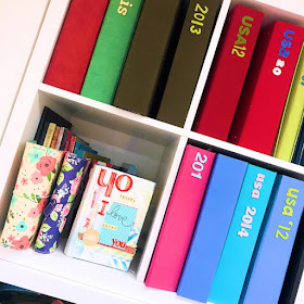
Here I have 2 Traveler's Notebooks on the bottom left of my shelf, each with 3 notebooks inside. You can easily compare the size to my traditional 12x12 albums now.
The space saving is amazing!!
But saying that, I do still love my 12x12's, but I'm finding myself reaching for my Notebooks more and more now, especially for the every day stuff.

Before I move on and show you a couple of pages that I've just made, I thought I'd point you in the direction in the store, so you can have a better look at the notebooks.     


You can view them here.

The inserts and the 'doc it journals are the notebooks that go inside. I tend to keep one notebook per project. So I have the Mickey one for my Disney trip, another for everyday stuff, another for friends...that kind of thing.

 
I've created a couple of pages for this blog post using some of the Pinkfresh Studio papers here. 
I'm a huge fan of Pinkfresh Studio. Their designs are so 'fresh' funnily enough, just light, happy and easy to use.
 
  
I do have a thing for scalloped edges. I took this 12x12 here....so yes, I still use my regular scrapbooking stash in my Traveler's Notebook....and I fussy cut one of the scalloped strips to add along the bottom.


I hand drew my 'US' and cut it out. In fact everything on this page is cut out from 12x12's. There's a lot of fussy cutting here. The papers are so much fun though, I love doing this. The leaves...the arrows....
 

....and the hearts. Look at this heart paper here. I love it so much!!
I had a little scalloped piece leftover, so I popped that in here too.


So that was a double page, then I went on to create a single page too using the same papers.


    I created my own title once again and cut out.


And I cut out more hearts and printed off my journaling to stick in. I like that clean look.

I did a video recently about creating in my Traveler's Notebook, so if you would like to hear more, the video is here.

 I hope this has been helpful and if you are new to Traveler's Notebooks, I recommend giving them a go. It's so much fun documenting on a smaller scale. It makes a great change.

Lisa x