Monday, 30 August 2021

Documenting Life - Simple Stories

 Hello, I hope your Summer is going well.


I wanted to chat about documenting daily life with you today.

Anyone keep a Project Life Album?

I started one years ago when the big craze first hit. I stuck to it for a few months, but I did find it really stressful, but I've always been one to want to document the small things in life.

So recently I started my own version.

A more relaxed style in my DIY journal.


I've kept it in my usual journal style and just add lots of photos and bits of journaling.

It feels so fun and free to me. I don't even focus on dates. Sometimes I do a weekend on one page and sometimes it could be 2 weeks worth.


I've used the Simple Stories Collection here. Simple Vintage Lemon Twist.

And if you'd like to see a process video of this page coming together, there's a YouTube video here. 


I made this page with flips that open out on both sides to give me more space for photos and journaling. The Journal Elements Paper here was so handy for the journaling sections. 


The sticker sheet here was so handy too. So fun to add to embellish.

I really hope you like this page and my own stress free take on Project Life.


Thank you so much.

love

Lisa xx

Wednesday, 25 August 2021

Swim Time - Echo Park - Under Sea Adventures

Hi everyone, Rebecca with you today sharing my second layout using Echo Park's 'Under Sea Adventures' collection. There's still plenty of this fab, fun collection left in the store and you can find it here


For this layout, I took the grey Bazzill Cardstock from the Matchmaker Pack and cut some Portholes using my silhouette machine. I cut five in total - one large one, 2 medium and 2 slightly smaller. I backed the largest porthole with my photo, which is of my son and I swimming in the sea on holiday earlier this month. Then I backed one of the medium and one of the small portholes with the 'Sudsy Sea' patterned paper, and the other medium and small ones with the 'Wonders of the Sea' paper.


I wanted to add some mixed media behind my portholes, and initially reached for the Cosmic Shimmer Pixie Sparkles in 'Beyond Blue'. These Pixie Sparkles are INCREDIBLE! They are a fine glitter powder that you activate with water and they are so shimmery and beautiful - I highly recommend them! However... it wasn't quite the right shade of blue, and I'd gone a bit mad with it so I didn't like my background at all! It went in the bin and I went back to the drawing board! I decided subtle mixed media was the way to go for this page, and decided to make myself a 'stencil'. 

I punched some 2" circles from white cardstock and taped them in a line next to each other to create a 'wave' pattern. I then used a Distress Ink pad in 'Salty Ocean' and brushed some ink lightly over the circles, creating several waves on my background. I concentrated on the area of the page where I knew my portholes would sit. I finished the background off with some white splatters.


Once I was happy with the arrangement of my portholes, I adhered them with a layer of foam behind to add dimension to the page. 


With the portholes in place, I moved on to embellishing - which was really quick and easy! I took the Element Stickers sheet and selected several stickers to use. I stuck them all to some scrap white cardstock and then cut them out. This allowed me to use them more as die cut ephemera rather than stickers, and meant that I could move them about until I was happy with the placement.


I added some stickers on top of the portholes, some behind and some inside to create some dimension and to give a realistic 'under water' appearance. I then raided my sequin stash and added sequins around the edge of the portholes to act as the bolts. I love how these portholes turned out!


I added white splatters to the entire layout using watered down white gesso. I prefer to use gesso over white acrylic paint to add my splatters as I find it sits on the surface better - and therefore dries a truer white. I find that the acrylic paint soaks into the page and becomes translucent, so doesn't appear as white. 


I then remembered that I hadn't added a title to my layout! I used the Doodlebug Sunshine Alphabet Stickers in the shade 'Blue Jeans' to add the words 'Swim Time' to the left of my design. I love these alphabet stickers - they come in so many different colours so are really handy to have in your stash.


And that's my layout complete! It's a very minimalistic layout with plenty of white space, which I think allows the elements from the collection to really sing. If you'd like to watch the layout come together, or see how I created my own stencil, there is a process video up on my YouTube channel, which you can find here.

That's all from me this month - I'll be back next month with a new collection - and I'm not going to lie... I'm a little bit excited because I'm working with the beautiful Simple Vintage Lemon Twist collection from Simple Stories!

Take care

Rebecca x

Monday, 23 August 2021

Cocoa Vanilla Studio ~ These Days #2

 Hi, it’s Anna here with you again today and I have another layout to share with you using Cocoa Vanilla Studio These Days - the collection can be found in the shop here. It really is a stunning collection, absolutely beautiful!

For this layout, I started with the b side of the pretty posies patterned paper as my background. I trimmed it down by about 1.5cm from the top and side to allow for a small boarder of bazzill flintstone

I used a cutfile by Paige Evans and backed the leaves with the b side of family ties

I mounted my photograph onto bazzill coastal and then again with the b side of neighbourhood. Distressing the edges using a paper distresser.

I then began to play with the die cut ephemera pieces, placing them around the photograph. I mounted some of them on 3D foam pads


I used some Pinkfresh Studio jewel essentials in the shade of peach fuzz to add to the flowers around the cutfile. 

To finish, I used the foam title ‘always happy’ from the foam title stickers and ‘together’ from the die cut ephemera.

Thanks so much for looking, see you next time! 

Anna x

Saturday, 21 August 2021

Echo Park Under Sea Adventures - Bubble Blowing

Hello, Karen C here again. Today I have one last layout using the Under Sea Adventures collection from Echo Park.


I had two sheet of blue paper left from this collection that I'd not used. One of the papers had a bubble design which I thought would be perfect for scrapbooking some some bubble blowing photos of my daughter but I was lacking further inspiration. I had a look at some online mood boards for inspiration and to try and decide what other colours I could team the blue papers with.


I found this yellow, blue and grey mood board which I really liked and thought it would be a perfect colour scheme for my layout. I also had some dusty attic chipboard bubbles in my design team kit which were perfect for a bubble blowing layout and in their natural state were grey. I thought printing my photos in black and white would also be appropriate and would make them pop against the blue papers. 

I started with a sheet of white Bazzill cardstock and trimmed a quarter of an inch from each edge because I knew I would want to give the finished layout a coloured border . I then used one of the Bubbles mixed media stencils from Vicki Boutin's Color Study collection and some blue ink to add a bubbly design, horizontally across the centre of the white card.


I tore a couple of strips of the Whale Hello and Sudsy Sea papers and layered these with a punched scalloped strip towards the top of the layout (overlapping the stencilling).


I double matted my two black and white photos with some white and yellow cardstock and added them to the layout.


To embellish the layout I cut some rings from yellow cardstock and dotted then around the layout, tucking some underneath the photos and some hanging off the edges of the layout. I backed three of the dusty attic chipboard bubbles with some white glitter card from my stash and added these. These really sparkle but unfortunately the photos don't so them justice. Continuing the bubbles/round theme I randomly sprinkled some yellow sequins and clear dew drops about.


The title was created by cutting the word 'Bubble' on my Silhouette from a  scrap of blue paper and the word 'Blowing' was added with Grey Puffy Alphabet Stickers from Pinkfresh Studio. To complete the layout I matted everything onto a sheet of grey cardstock.

Sadly that's my final layout using the Under Sea Adventures collection, I've enjoyed using this bright, fun collection and hope I've given you some ideas how you might also use the collection.

Enjoy the rest of the summer. I'll be back soon with another project and until then take care. 
Karen x x


Friday, 20 August 2021

Echo Park - Farmers Market - Moo-ve Over!

Hi there!

Claire back with you today sharing my second layout with the fun Echo Park Farmers Market collection.

This is another one that came together really quickly and, another one without any white cardstock!  There's just too many gorgeous papers in this collection!

For this one, I'm back at the New Forest & Hampshire County Show - and this time, I'm with a REAL cow! Isn't she gorgeous!


I started with a piece of the Blessed Floral paper, using this gorgeous woodgrain pattern from the b side.

To anchor my page, I used a piece of that beautiful black and white gingham paper from the b side of the paper called Multi Journaling Cards. I distressed the edges and rolled the bottom to create a bit of extra dimension.

Underneath, I slid a strip of the Farmer Floral paper, again rolling the edge for dimension.


I double mounted my photograph on a piece of the blue/teal paper from the Matchmaker Pack and a red piece from the Garden Seeds paper.

Around the photo, I added some fussy cut flowers from the Gather Floral paper, curling the petals for additional depth and texture.

Underneath the photo I added this cute tractor from the Element Sticker sheet which I mounted onto plain card and foam for a bit of extra height.


Along the top of the paper strip, I added two really cute stickers, also from the Elements Sticker sheet. I really love these - they were the perfect addition to the page.


Now you may have noticed that with this collection, I'm really loving creating fun titles - and this page is no exception!!  As the cow looked like she was muscling in to see what was happening, I opted for a fun bold title using the Simple Stories Color Vibe Foam Alpha stickers in Red. These are really awesome and help you create real statement titles for your projects.

I loved how the page was looking, but the top seemed bare, with all the drama happening at the bottom.  To address this, I created an embellishment cluster in the top right hand corner.  It includes a tag, a phrase and a frame from the Frames and Tags pack, with a few Nuvo Drops in Moroccan Red.


As a final touch, I added some splatters of white acrylic paint and that was it - the page was complete.

Hope you've enjoyed this one. I certainly had fun creating it.


See you next time.
Claire

xx

Wednesday, 18 August 2021

Let's Go Anywhere with Photoplay Collections

Good Morning! ScrappyAdam back with you today and I am continuing my mix and match of Photoplay - and loving it - they all match so wonderfully!


Those eagle eyed amongst you will see that I have brought in a few stickers from another collection on this layout because they worked so well and I used a few from Echo Park's Scenic Route Sticker Book!

I started with a sheet from Photoplay's America The Beautiful - Celebrate as my background as I loved the dark blue star background. 

I cut a large circle from Photoplay's 'Little Boys Have Big Adventures - You're a Star' and used this as a base for my background, following a Pagemaps sketch I then added a strip of the same paper but the B-Side, matted my photos on a paper from Birds of Feather and a cut apart card from Time to Travel

Then the fun bit - embellishments!


I used flair from Dotty About Flair and lots of bits from all the various Photoplay collections to add clusters roughly in each corner of my photos - a sticker from Echo Park did sneak in again!


That's it for this one - fairly simple but I love the result!


I will be back soon but in the meantime take care and happy scrapping!

Adam x

Tuesday, 17 August 2021

Echo Park Under Sea Adventures - Who Lives in a Pineapple......

Hello again. Karen C here with another layout using Echo Park's Under Sea Adventures collection.


For my Sponge Bob themed layout I started with a sheet of the Fish are Friends paper. The B side of this paper is probably my favourite design from the collection and it instantly made me think of the Sponge Bob cartoons my son used to watch when he was a child. I trimmed a quarter of an inch from each edge of the paper and matted this onto a sheet of yellow Bazzill cardstock.

Using the Sneaky Sharks paper I matted two photos of my son with his Lego Sponge Bob model and placed these in the centre of the layout with 3D foam underneath for a bit of dimension.

I die cut 8 tags from cardstock and papers from the collection, and tied them with green Bakers Twine. (I thought the green twine looked a little like seaweed!) The tags were tucked under the tops of the photos to create a home for the title and the twine was glued in place with wet adhesive.


The title letters were die cut from black cardstock and stuck onto the tags.


From a piece of green patterned paper, left over from last months design team kit, I die cut some seaweed and used this to embellish the bottom of the layout.


In my stash I had a Sponge Bob metal die which I have been wanting to use for sometime. This was the perfect layout for it so I cut and pieced the die cut pieces together and added the finished character to the bottom of the layout.

Finally I added a scattering of yellow sequins to the layout and the date.

I'm glad I finally got to scrapbook these photos and the Under Sea Adventures collection was perfect for it. 

Thank you for stopping by today. Until next time, Take Care and Stay Safe.

Karen x x

Monday, 16 August 2021

August Papermaze Kit

The bright and colourful kit for the month of August, is now available from Papermaze and I'm sharing my first two layouts with you today.


Before looking at how they were made, here are the details of what you will find in the August kit:
 

Patterned Papers:
American Crafts - Vicki Boutin's Color Study collection - Palette & Color Wheel
American Crafts - Paige Evans' Wonders collection - #8
Cocoa Vanilla - Sunkissed collection - Good Vibrations
Pinkfresh Studio - Happy Blooms collection - Embroidered
Simple Stories - Sunkissed collection - Sunny Days
Bazzill Basics cardstock - White & Kachina

Reverse side of papers:


Embellishments: 

12" washi tape, 2 foam glitter words, 2 CVS wood buttons, strip of puffy star stickers, 6 CVS Sunkissed floral ephemera pieces, strip multi-coloured jewels, shaped clip & Bella Blvd acrylic heart & 5 puffy star stickers

Bazzill Basics Cardstock Pack 


Grenadine, Wild Pansy, Classic Yellow & Admiral

My Commute - This layout shows my daughter walking from Royal Crescent to the Theatre in Bath - in the rain!

I started with the white Bazzill from the kit and with some inks, I dripped some of each colour from about 1/3 of the way up the page, allowing it to run down the the bottom of the page.  I also flicked some ink of each colour over the rest of the Bazzill.


While this was drying, I set about cutting out and dividing up the colour wheel on the Color Study paper. I inked the edges of these wedges, with a corresponding Distress Ink colour. Then I arranged them on the page.

A placed my photo in the centre of the layout, and then set about embellishing the page, matching my embellishments to each wedge of coloured paper. From the kit I used the coloured jewels and some of the glitter foam stars. From my own stash I found sequins, gems and pearls.

For the main title I used a Sizzix - Tim Holtz BIGZ XL Die - Society. I cut the letters twice, once from some scrap black Bazzill and a second time, from scraps of the patterned paper (the pink side). I placed the letters offsetting them to create a shadow.


With the Sizzix - Tim Holtz Thinlits die set - Alphanumeric Tiny Type Upper and more black Bazzill, I cut out the lettering for the date and place name. 


I finished off with dots of Nuvo Crystal and Glitter Drops around the page.

Awesome - This photo was taken of my daughter and her husband on their honeymoon in Bali, The beautiful scenery was ideal for this Vicki Boutin Color Study collection.

.


The 'Palette' paper was ideal and needed very little work to make a background for the layout. I flicked a little colour over the page. I used Distress Stain (Brushed Pewter and Peacock Feathers), and Distress Paint (Black Soot and Picket Fence).

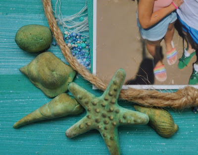
I offset my photo onto a piece of the Kachina Bazzill and placed the photo and cardstock to the bottom right of the page. Before sticking these in place, I tucked a little cheesecloth underneath, so a little shows all the way around the arrangement.

With three short lengths of jute twine, I tied reef knots to rejoin them together and created a rough circle to place around the picture.


Then with a cake decorating mould and some Lite Fimo clay, I made a selection of shells and starfish. Once these were dry I painted them with Distress Inks. To highlight the detail I rubbed in metallic gilding wax


I placed the shells around the base of the photo, and added some prills into the crevices. 

My title is a glitter foam word from the kit, I added more detail using Doodlebug Designs - All Mixed Up - Beetle Black - Tiny Alpha Rubons. 

That's all for today, I will be back with more from this kit soon
Thanks for looking
Lynn x