Wednesday, 31 August 2022

A Mini Book Inside A Mini Book

Hi, Lisa here.

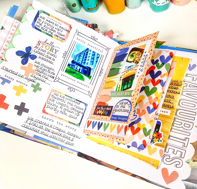
I thought this was a good idea.

To create a mini book to go inside my mini book.

I made a journal from a Little Golden Book some time ago and I've been loving documenting our Disney trips.

This time though I thought I'd make a mini book and then stick it in.


I'm using the Storyteller collection from Cocoa Vanilla Studio.

It's so perfect for telling all your stories.

I do have a video if you'd like to watch it come together, the video is here.


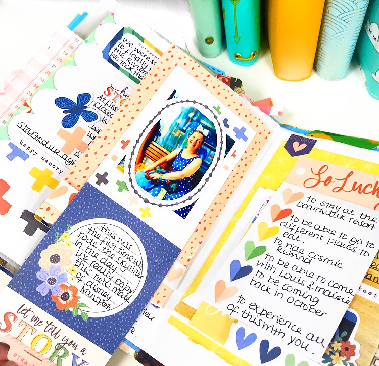
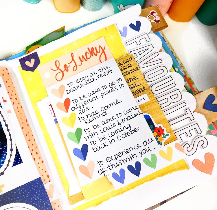
This was a great way to be able to include lots of extra photos and journaling.

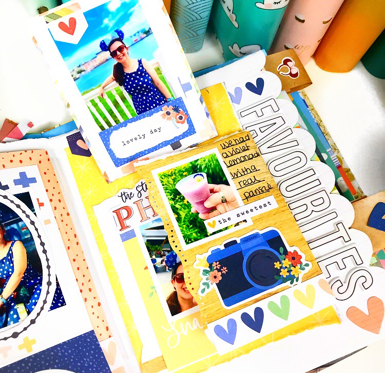
Lots of pieces to flip up and out.


I used a combination of the 12x12 papers, the stickers, the die cuts and some extra alpha stickers.

Things like adding the oval die cut frame over my photo makes such a difference.


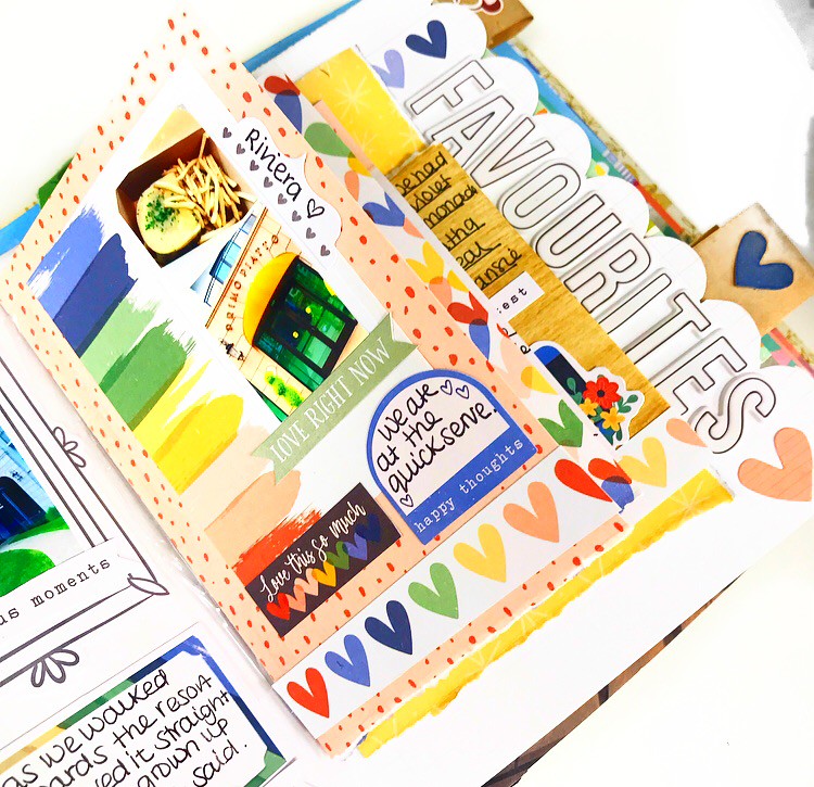
And I think these puffy stickers from Rosie's Studio could be my all time favourite alphas.
Aren't they fab?!


Making this kind of interactive page makes me so happy. I love going through all the flips at the end when it's finishes.

I love the little sticker word strips from the sticker sheet. They really add the finishing touches to a page.   


If you struggle with journaling, using these kinds of card from the 12x12 sheet really help. It's so much easier jotting down a few lines than feeling overwhelmed with a big space to journal on. 


I've had so much fun creating this in my journal.

I love how happy and bright this collection is and it goes so well with my journaling style.

I can't wait to use the leftovers for my next project now : )


Hope you like it too.

Lisa x

Monday, 29 August 2022

Just Beautiful....... Mintay Papers....Joy of Life pt 2

Hello again

It's Anita here with you today and I have my 2nd layout using Mintay's Joy of Life Collection.

I wanted to scrap this photo of my eldest daughter that I absolutely adore. It was captured on the day that should have been her wedding day, but due to covid and lockdown etc it was all postponed. We couldn't let the original date pass without doing something special for them and so we had a 'Nearly Weds Day', complete with flowers, cake, decor and getting dressed up nicely.


The page is based on a sheet of white cardstock that I trimmed 1cm from the top and also the same down one side. it was then laid onto a gutted out sheet of 04 to create a slim patterned frame around the outside edge. The large square that I gutted from the centre was full of the hot air balloon design so I cut out as many as I could from this.
These were then folded gently in half from top to bottom and layered on top of each other starting with the largest at the bottom and I made 2 stacks.
 I bent up the sides to create some dimension to each stack and then popped them to one side to use later.

Once again I used the Tim Holtz Distress Oxide Spray in Spun Sugar, I misted some patches but also spattered some drops too. I was fascinated watching the drops dry because the ink and the paint in them separated and when they had completely dried they ended up looking like small blossoms across the page ( well in my eyes they did lol)

Lots of fussy cutting came next from the sheet of 09 with a mix of flowers, birds, a cottage and a record player!
I used some of the scrappy bits to cut out some small triangles and added some twine to create a little string of bunting that I hung between the balloon stacks

The other birds and flowers were raised up on foam pads to add some more dimension to the page and the whole thing was then finished with the addition of Icicle Stickles and some AB flat backed crystals to bring a bit more sparkle.

Not sure how this last photo ended up down here..... but this is to show how the Distress Oxide Spray dried and separated...and how it looks like little blossoms ( to me anyway ;) )


I have really enjoyed creating with these Mintay papers and am really looking forward to seeing their new releases...I wonder what they will be.


Happy Crafting!

Warmest wishes

Anita xx

Friday, 26 August 2022

Photoplay - Bow Wow - Love you!

Hi everyone,

Happy Friday! Claire back with you today, sharing my second layout using the Bow Wow collection from Photoplay.

This collection is a lot of fun! So many vibrant colours and playful patterns, its perfect for a whole range of topics, but especially for capturing the antics of our furbabies as I have done here.


As always, I started with my favourite premium white cardstock and this cute dog house cutfile from Peartree Cutfiles. I cut the file in Premium Black Cardstock (another staple of my craft room!) and backed the file using the b side of the Dog-O-Mania paper which features a colourful polka dot design, and used the blue plaid pattern from the b side of the I Love My Dog paper to create the blue trim.

For extra dimension, I drew around the bone onto the coordinating red Bazzill cardstock from the Matchmaker Pack, raising it on foam pads for extra height. I also drew a squiggly border around the outside for a bit more depth.


I worked out where the file would sit, and brushed some dry Distress Oxide ink in Tumbled Glass onto my card, creating an anchor for the base of my main element.

Next, I created multiple mats for my photo. I used both sides of the Dog Treat paper, lightly distressing the edges for a ruffled, slightly 'dog chewed' feel. I cut each mat in the same size of my photo (roughly 3" square), offsetting them to create a stacked effect. 


For an extra pop of colour, I went back to the Matchmaker Pack and created a mat on my Cricut using a scalloped frame. Once the elements were all layered together, I added the cute #Rescued tab from the ephemera pack.

I really loved the look of the scalloped edge ,so set about finding scalloped designs in my Cricut library. You could create the same effect using punches or drawing round something circular like a small pot to create a similar look.

I chose three  designs and cut them in different papers from the collection; The red Bazzill cardstock from the Matchmaker Pack, the I Love My Dog paper and the Chow Time paper.


I only stuck the top of each strip down so that I could ruffle the edges for extra texture. Once in place, I added machine stitching to the top row and positioned my photo cluster on top.

To create my title, I used some Thickers from my stash and some small alpha stickers from the Simple Stories Color Vibe Sticker Book


To add a bit more drama, and to echo the black of the cutfile, I added a sticker from the Ephemera Pack which brings both sides of the layout together.

Underneath my photo cluster, I wanted to create some movement, so added these gorgeous 'WOOF' flags, again from the Ephemera Pack, stitching through each letter to create a banner and curling the edges off the page slightly.


I also added a heart from the ephemera pack and a small fussy cut dog from the Dog-O-Mania paper.


As a final touch, I fussy cut this awesome statement from the Lucky Dog paper. It's so appropriate, although in my house it's performed much more regularly throughout the day and is very typical of my furbaby!! It captures her love of life perfectly :)


I love how this turned out. Those bold colours and shapes against the crisp white cardstock really pop and look very striking in real life.


This collection has been so much fun to create with. I hope my designs have inspired you to create and enjoy some scrappy time this summer.

Until next time,

Claire xx

@scrappysoulmate

Wednesday, 24 August 2022

Anchors Away - Simple Stories - Simple Vintage Vintage Seas Collection

Hello, it's Rebecca with you today and I'm back with my final layout created with the Simple Vintage Vintage Seas collection from Simple Stories. I'm not sure I have ever enjoyed working with a collection so much before! You can find it in the shop here.


I absolutely adore all the patterns in this collection so wanted to get as many of them on the layout as possible. I selected my favourite papers and cut some strips from them, 2 inches wide. I cut them at varying lengths and arranged them along the top of the page, starting with the shortest. The first strip is 3 inches long, and then each one gets longer by one inch. I used a mix of 12x12 individual papers, and some from the 6x8 Paper . I machine stitched around the edge of each strip before adhering them to my background with adhesive foam behind them.


I selected one of the Chipboard Frames to house my photo. I chose the ship wheel frame because this layout documents a sailing trip I took my little boy on and he is stood at the wheel of the boat playing Captain! I placed it over to the right hand side of my page, on top of the longer patterned strips.


I wasn't happy with the bottom half of my page. I am a lover of 'white space' on a layout - but this was feeling more like empty space to me! I decided to add more of the patterned strips - but on a smaller scale. I reversed the patterns and lengths, which left me a nice amount of white space in the centre of my page.


I've used a Bramble Fox perspextive for my title which says 'Anchors Away' - perfect for my photo and this collection!


I had a lot of fun embellishing this page. The chipboard frame had a lighthouse on it - which didn't really work with the story I was documenting - so I cut it off and replaced it with a sail boat die cut from the Nautical Bits pack. I then built up some small clusters either side of my photo using bits from the same pack, and also the Bits & Pieces and Chipboard Stickers.


The page was feeling very heavy on the right hand side, so I decided to create some small clusters on the left of the page to balance it out. I made a small cluster at the top of the page and another at the bottom. To these clusters, I also added some small phrase stickers from the Sticker Book.


To finish the layout off, I added some white splatters using watered-down white gesso.


I hope you've enjoyed this layout and the others I've created using this collection. There is a process video available on my YouTube channel here if you'd like to watch it come together. 

Thanks for reading. I'll be back next month with an exciting new collection.

Take care,

Rebecca x

@preciouspagespapercraft


Monday, 22 August 2022

Simple Stories ~ Say Cheese at the Park #2 ☁️ 🌎

Hey all, it’s Anna back on the blog today. 
I’m sharing my second layout using Simple Stories Say Cheese at the Park, which you can find in the shop here

For this layout, I have focused on the Fantasy at the Park part of the release, which is perfectly themed to the ‘fantasyland’ lands of the Disney theme parks. 
So what better photos to scrapbook than those of ‘It’s a Small World’…


Unusually for me, I haven’t used a white background and have instead opted for a sheet of coordinating coloured cardstock to showcase my white ‘it’s a small world’ cutfile by Paige Evans. 
As soon as I saw Paige Evans’ layout using this cutfile last year, I knew it was one I just had to create with! And with this collection comes the perfect patterned paper to use to back it - Make A Wish


I backed each section of the cutfile with the shapes in the paper Make a Wish, along with a few pieces of coordinating cardstock, which you could find in the matchmaker pack.


I added my photos in square format above the cutfile and added a small title using LDRS Small Puffy Alpha Stickers.


I used my cutting machine again to cut out some small clouds, which are by Peartree Cutfiles and adhered them to the top left and right of my layout. 


I added a few elements from the combo sticker sheet, including the smiling clock face sticker in the centre of the cutfile and a few of the word and floral stickers. 


Thanks so much looking! 
I am going to continue working with this collection next month, so I’ll have more to show you then! 

See you soon!
Anna
X

Saturday, 20 August 2022

August Papermaze Kit - Part 2

Lynn here today with my second pair of layouts made using the August Papermaze Kit. Such a bright, sunny colours - papers, cardstock and embellishments.

Before looking at the layouts, here is what you will find in the kit this month:


For full details of the papers, cardstock and embellishments, please see part 1.


Happy Face - My great niece having fun with face painting on holiday this year.

This lovely paper from Vicki Boutin's Sweet Rush collection is called 'Confetti' and I just loved all these colourful circles decorated with different designs. I decided to add different embellishments to each circle, keeping with the colour schemes. For this reason, I printed three small photos and arranged them so that some of each circle was left uncovered.

From top to bottom, left to right, this is what I used:

1. Dark Blue - Pinkfresh Studios (PFS) puffy mini alpha stickers, Doodlebug Designs Shape Sprinkles - Winter Hugs and Nuvo Crystal Drops


2. Orange - yellow and orange star gems

3. Light Blue - PFS Jewels Sapphire and Ocean Breeze

4. Dark Orange - Sequins and Nuvo Crystal Drops


5. Mid Blue - PFS Jewels Sapphire and Ocean Breeze and Nuvo Crystal Drops

6. Deep Pink -
PFS puffy mini alpha stickers


7, Yellow - Nuvo Crystal Drops and Vicki Boutin Embossed Puffy Stickers from the kit

8. Lime Green - lime green heart and round gems and
Vicki Boutin Embossed Puffy Stickers

9. Orange - Nuvo Crystal Drops and
Vicki Boutin Embossed Puffy Stickers

10. Dark Pink -
Doodlebug Designs Shape Sprinkles - Winter Hugs


11. Pink - Pink pearls and Vicki Boutin Embossed Puffy Stickers

12. Dark Blue -
PFS Jewels Sapphire and mini cameras cut from the detail strip on the 'On The Agenda' paper


13. Pale Orange and 14. Yellow - The exclusive acrylic title and PSF Jewels Sunshine both from the kit


15. Pale Green - Craftwork Cards Candi and Nuvo Crystal Drops


16. Light Blue - Vicki Boutin Embossed Puffy Stickers, Nuvo Crystal Drops and Doodlebug Designs Shape Sprinkles - Winter Hugs

Finally, along the bottom of the paper, I used the strip of Doodlebug Designs Rainbow Hearts washi tape from the kit.

25th Park Run - I decided it was time to document achieving my 25th Parkrun, in July this year.

I cut the sheet of 'On the Road' paper into 2.5cm strips, making sure the stars were in the centre of each piece. I inked the edges of the paper strips with Worn Lipstick Distress Ink and cut them in different lengths. Then I wove the strips basket weave fashion onto the sheet of Quartz Bazzill cardstock from the kit.


I mounted my photo onto a piece of the same coloured Bazzill from my stash. This was placed to the right centre of the layout. I used two of the Number Bits & Pieces numbers from the kit, and placed them into position with a 't' and a 'h' cut from the reverse side of the 'On the Road' paper. 


My title and subtitle were created with Pinkfresh Studio Puffy Alpha - The Best Day and some mini puffy alpha stickers from my stash. The date is made using Arctic Bazzill and Tim Holtz - Sizzix Thinlits - Alphanumeric - Label die set.


Finally I finished off with some phrase stickers I found in my stash.


That's all for today, and completes my usual four layouts, however I still had more paper, card and embellishments to play with, and by adding some white cardstock I have made two more layouts. I will be back with these soon.

Thanks for looking
Lynn x

Friday, 19 August 2022

Mintay Papers Lavender Farm - Beatie & Polly

Hello, Karen here again with another layout using the gorgeous Lavender Farm collection from Mintay Papers. Today I've a heritage layout to share. The collections from Mintay generally have a vintage, distressed feel to them and so are perfect for heritage layouts..... but can also be used for so many other themes.

I started by trimming roughly half an inch from two sides of paper #4 and then machine stitched this, with white thread, to a sheet of paper #3 leaving a narrow border round the edge. 

I then attached my sepia photo to the lower left quarter of the layout with some 3D foam underneath to add some dimension.

I embellished the layout with die cuts from the die cut pack and some purple paper flowers from my stash. 


I tucked some white cotton lace underneath the photo too. The lace adds some texture and also adds to the vintage feel of the layout.


Finally I die cut some title lettering from a scrap of purple cardstock and placed this at the top of the layout following the arc of the window printed on the paper.


Thank you for popping in today. Lavender Farm is just one of eight beautiful collections from Mintay Papers available in the shop so hop on over to the shop and take a look.

Be back soon, Karen x x