 |
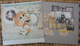
I made a page in celebration of Joyce's 90th birthday this month. I was inspired by the work of Karola Witczak when planning this page. |
I used both sides of the beautiful Stamperia (Garden - Score Watering Can) paper, first cutting a section from the top of the paper - 8"deep x 12" wide to use score side up. Then I cut another section 0.5" deep x 12" wide and a third piece 12" deep x 2" wide. The latter two are used stripe side up.
There is so many lovely images on this paper, I didn't want them to be covered by my circles, so I did some careful cutting with my craft knife. I cut out the tag, watering can, and robin to use later. I then cut around the base of the wreath and the butterfly, allowing me to lap the images over my circles.
I distressed and inked the edges of the largest and smallest pieces of paper, the third was trimmed with a Deep Edge Martha Stewart punch, then inked. All the inking was done with Distress Ink pad 'Broken China'. All three pieces were then arranged onto the base cardstock which is Fig Swirl Bazzill.
To make my circles I used two different sized doilies (5" & 4"), Then I used 6" x 6" piece of 'Stonehenge' Bazzill (taken from the next layout) and 'Yam' Bazzill to die cut two more doilies. The doilies are both Sizzix Thinlits dies. I used the centre of one of these die cuts (Yam) over the small paper doily. Then with some circle dies I cut two circles (3" & 1 1/2") from some 'Natural' cardstock left over from a previous kit. My photo was cut with another circle die 3 1/2" wide.
I used the wide cream lace from the kit and laid this across the join (3" up from the bottom) in the papers. Over this I wrapped some Baker's twine, tie it all together in the centre. Arrange all these pieces over the page, I added in the crochet flower, three wooden buttons and the four paper flowers from the kit together with a few additional flowers from my stash. I also added two key charms.
Add the journalling to the cardstock circles once you know where they will be positioned.
I made some leaf fronds punched from scraps of the patterned paper with a Martha Stewart Punch, and tucked them into each of the flower clusters. I added back in the three elements I cut from the paper at the beginning. A few of the Tim Holtz Clippings Stickers were added here and there where appropriate to the theme of my layout.
Finally my Title was created with some Glittery Chipboard American Craft Thickers White Letters.
***


Really lovely pages Lynn, great photos to use too xx
ReplyDeleteBeautiful pages Lynn. I really like how you coloured the Distress Paste with the Distress Ink. It's a nice subtle effect.
ReplyDelete