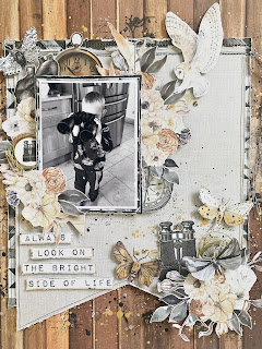
Hello, Rebecca with you today sharing an extra layout I've created using the Soulmate Collection from P13 Paper Products. I actually had this layout all planned out before this collection had even landed on my doormat, but it's ended up being the third layout I've created! I was inspired by a layout I'd seen on Pinterest that had two oversized banners and that was the basis for this layout.
I selected Paper #06 and Paper #03 and
cut two large banners from them - making one slightly larger than the
other. I then layered them on top of each other, slightly offset, and machine
stitched them together along the top with a couple of messy lines of black
stitching.
Still on my 'avoid white cardstock' drive, I decided to use the gorgeous woodgrain B side of Paper #01 for my background, but jazzed it up slightly by adding some simple mixed media. I added some stamping in Jet Black Stazon Ink and on top of that, paint splatters in gold, black and white. I did the same thing with the banners and then drew a doodled black border around them to add some interest.
I matted my photo with a couple of layers of patterned paper - I've used Paper #03 again, and also the B side of Paper #02 to bring in some darker tones behind my photo to give it some separation from the background. My photo is of my little boy last summer, looking through my parents binoculars which I thought would work really well with this collection seeing as it has a couple of elements with binoculars on!
I then set about the fun part of embellishing my layout. This is the part I find most enjoyable with the P13 collections because everything 'goes' really well. I spent some time fussy-cutting lots of elements from several of the patterned papers. The floral clusters are from Paper #02, the moths are from Paper #03 and pretty much everything else on the layout is from my favourite - Paper #07.
I built up a large cluster around my photo in the top left corner, and then created a second cluster in the bottom right corner to balance the page out. I nestled a pair of binoculars in the smaller cluster and I just love how it looks!
I wanted to incorporate some circular elements to the layout as the two rounded lenses on the binoculars in the photo were really standing out to me. I placed a sticker from Sticker Sheet #03 with a thread tangle behind it - of course using my favourite WRMK Metallic Gold Thread - to the left of my photo.
To bring a circular element to the other side of my photo, I used a compass from Cardstock Tags #1.
It was at this point that I realised I didn't have a title on my page, and I hadn't left a massive amount of space for one either! I had a look through the patterned papers and found a cut-apart element with the sentiment 'Always look on the bright side of life' on Paper #05. I cut the words out, leaving a very thin border and raised them up on foam pads before adding them to my layout.
The final touch to my layout was to add a couple of sequins and bronze coloured jewels.
If you'd like to watch how this layout came together, there is a process video up on my YouTube channel, which you can find here.
I'm sure this won't be the last you see of me using this collection - I love it so much that I couldn't resist adding a few more bits to my basket!
I'll be back next week, sharing my first layout using the new Color Study Collection from Vicki Boutin.
Until then take care,
Rebecca x


Rebecca, I just love watching your videos. I wanted to know what is on your work surface that allows you to just wipe off paint, etc. Thank you!
ReplyDelete