Hi everyone, it's Rebecca with you today sharing a colourful new layout created using 49 and Market's Vintage Artistry Sunburst collection. I've been eagerly anticipating the arrival of this collection, and typically, it arrived whilst I was on holiday, so I've had to wait until I return home to play! It's an absolutely stunning collection and I don't imagine it will hang around in the shop for long, so check it out here whilst you can!
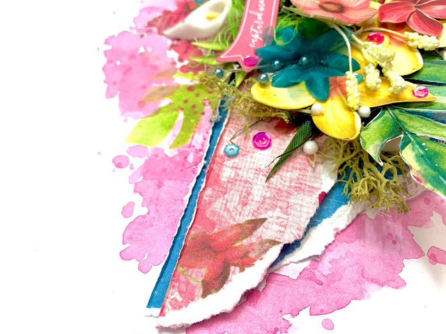
I began by cutting strips from two patterned papers (Butterfly Corsage and Azure Seaside) and then tearing the bottom edges to create some texture. I layered the papers so that the blue was just peeking out along the top, and a tiny bit at the bottom. I chose the blue paper as my little boy is wearing blue in the photo so I wanted to add some accents of the colour to the page. With my papers distressed, I added my circular photo off-centre, with some craft foam behind it to give it some elevation and to introduce some dimension. I needed the dimension to allow me to layer and tuck in allllllll the things I had in mind to use!
Before adding anymore, I wanted to get my mixed media on the page. Using a brayer, I've added some Distress Ink in the shade 'Picked Raspberry' to a sheet of Premium White Cardstock , concentrating the colour to the centre of the page. Once this was dry, I added two of the rub ons from the 6x8 Rub Ons Pack. In hindsight, I should have waited before adding these as I ended up covering most of them up with embellishments! The 49 and Market rub ons are so easy to use, and even come with a plastic tool to help transfer them.
With my mixed media dry, I adhered my patterned paper strips and photo in place. I needed to get these larger elements stuck down early so that I could work on the embellishing.
The first thing I added was some of the Tropical Foliage Laser Cut Outs. I am always amazed with how many of these die cuts are in a single pack - in this collection there are 70! I arranged the die cuts either side of my photo, only adhering them at the base so that the ends could be turned up to bring in more dimension. In among these die cuts, I've added some fabric and foam flowers. Now, I'm not normally one for using paper or fabric flowers, but I have them in my stash because every now and then, a collection comes along that really justifies them! Papermaze stock a wide range of flowers in a multitude of colours. Because the flowers are on wire, it is really easy to slot them into place. I've gone for white and blue flowers, to break up the pink (there is a LOT of pink on this page!!). I've used a mixture of Glossy Accents and Silicone Glue to adhere the flowers. I love that silicone glue holds its shape so the flowers can sit raised off the page a little - and it gives a super strong hold.
Included in this collection, is a pack of Chipboard Words written in different colours. I've selected a pink one for this layout to match my colour scheme, and also because the gardens we were in when the photo was taken was very relaxing and tranquil (well, they were until we arrived with our 6 year old!!).
In my craft room, I have a draw of 'weird and wonderful' bits - and I decided to crack it open and see what I could find to use on this layout. I found some green moss, which I tucked in and around the floral die cuts. I love the additional texture this brings to the page. I've filled in a couple of gaps with some white cheesecloth too - another fabulous texture.
You'll see I've added a couple of thread clusters in too. This is something I used to do a lot - but I find it so frustrating trying to get them to look 'right' so I have to really be in the mood for them! I wanted some thread to sit behind the circular die cut from the Ephemera Bits though, so I persevered and I think it looks OK! I also added a green cluster behind a die cut banner from the same ephemera pack.
I finished the layout off with some die cut butterflies, sequins and some little white foam balls... because why not?!
Thank you so much for reading! I hope you've enjoyed this layout. It's a little different for me, but I thoroughly enjoyed making this layout. So much so, that I decided to make a very similar one to sit alongside it in my album... and there will be a process video for that one too so watch this space!
Take care
Rebecca x
@preciouspagespapercraft


No comments:
Post a Comment