Hi everyone, Rebecca back with you today. I'm getting more and more excited as we edge closer to Halloween! Today, I'm sharing another layout created with the FaBOOlous collection from Simple Stories. You can find the full collection in the shop here.
I was really drawn to the Shrieks and Screams patterned paper and wanted to feature it on my layout so I decided to be brave and use it for my background. It's obviously a very busy paper though, so I needed to bring in some white space to work on! I cut a piece of Premium White Cardstock down to about 7 inches wide and then shortened it by tearing along the top and bottom to create some texture. I adhered this to the centre of my page.
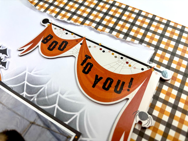
The first thing I got into place was my title - the 'Boo to You' piece from the Chipboard Stickers. I've been wanting to use this piece for ages but haven't been able to make it work on previous layouts, so I got it into place early on today!
I love this photo of my little boy from last Halloween, and due to the way his body is positioned in the photo, I decided to place it over onto the right hand side of the page so that he is 'looking' across the page towards the centre. I added a layer of dark patterned paper behind my photo to help make it pop against the crisp white background.
I love everything that is included in this collection, so I pulled out all the embellishment packs to see what I wanted to use to embellish. I started with the larger pieces as they obviously take up more space. I positioned the orange moon from the Journal Bits & Pieces in place first, along with some larger pumpkins from the Bits & Pieces.
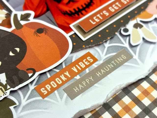
Once these were in place, I could clearly see where I had gaps and where I could tuck smaller things in to build up clusters. I've used some of the florals from the Floral Bits & Pieces pack and some phrase stickers from the Cardstock Stickers sheet. Once I had everything in position, I carefully started to adhere it all together, without sticking anything to my background. This is because I wanted to add some light mixed media to the background.
When it comes to mixed media, sometimes I find it easier to get it on the page first, and then build my layout on top of it. But other times, I build my layout and then think 'ah, maybe I'll add some stencilling' - and this was one of those times! It means everything has to come back off the page, so by trying to stick it all together, it makes it easier as I can just move it off as one piece.
I've used a stencil from my stash, along with a Distress Ink Pad in 'Black Soot' and added some spider web detailing around my photo and embellishment clusters. I love adding detail to my background in this way - it's subtle, and as there's no water or wet paint involved, it's not at all messy and doesn't require drying time - perfect when you are as impatient as me!
I finished off the layout with the addition of a cluster of bats from the Page Pieces in the top left hand corner.
I hope you've enjoyed this layout and the previous ones I've created with this collection. Thanks so much for reading.
Rebecca x
@preciouspagespapercraft


No comments:
Post a Comment