
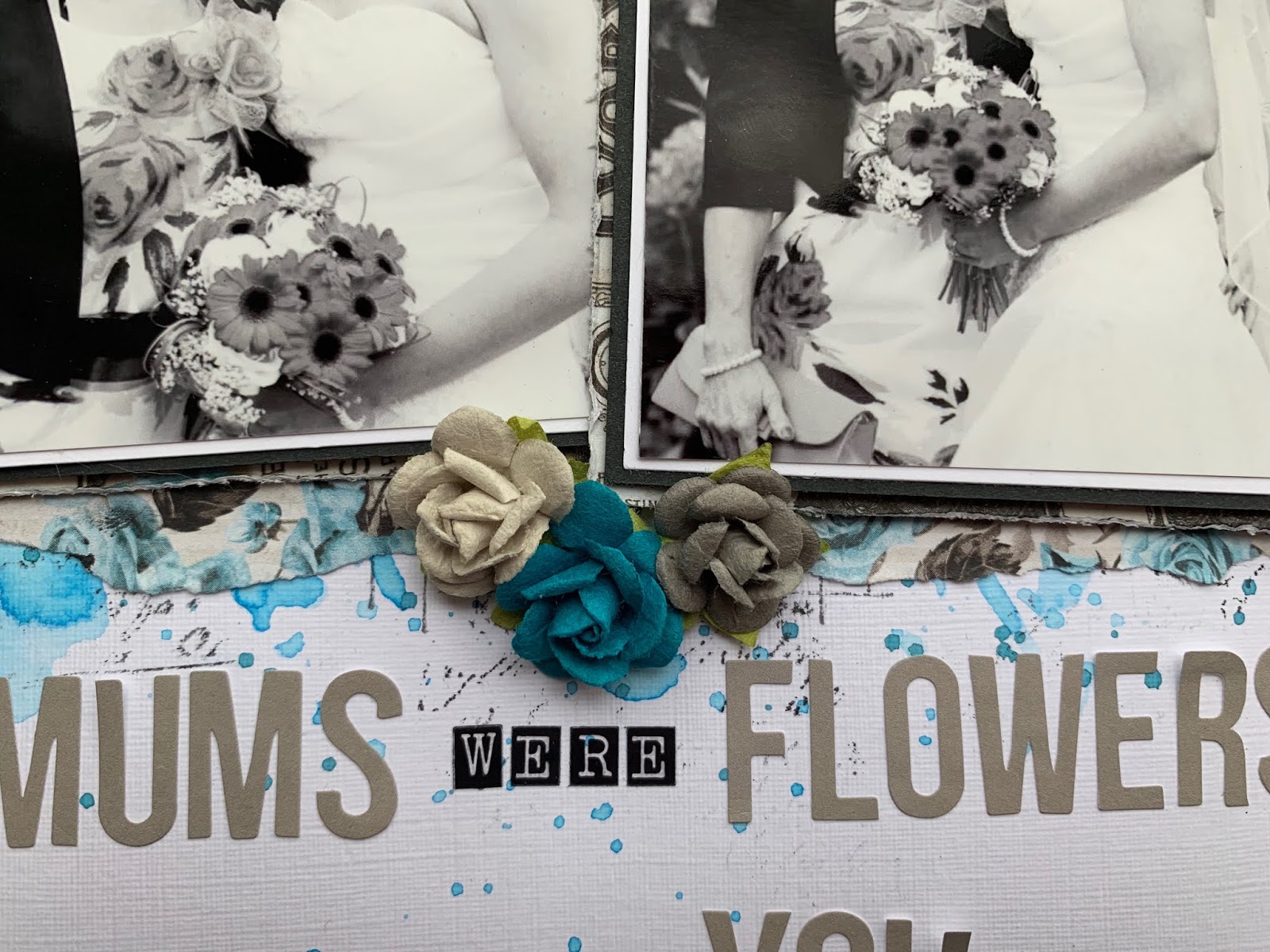
‘If Mum’s were Flowers I’d Pick You’
I was desperate to use the blue roses paper for this layout, but I didn’t want to use the whole sheet as I loved it and wanted to get several layouts out of it so I decided I would have it peeping put from underneath white card stock to provide a contrast and make the blue stand out. I tore my white cardstock at the top and bottom and distressed and rolled the edges slightly. I then taped strips of the blue roses paper underneath.

To carry on the blue theme I used the packaging technique to add some Distress ink in ‘Salty Ocean’ to the centre of my page. I also added some splatters around the edge of the ink. I then selected several stamps and added them randomly using distress ink in ‘Black soot’ so that they would be peeping out behind my photos. I also used some white texture paste and a Tim Holtz layering stencil in a couple of places for added interest.

I matted my photos first on white card, and then on black but decided this looked quite harsh against the blue background so I then backed them on paper #5 Vintage Labels which softened the appearance as the paper has blue and black tones in it. I also tore some more of the blue roses paper and added strips above and below my photos. I still wasn’t convinced there was enough on the page for me, so I added a paper doily and also some blue deco web from my stash.

I finished the page off with some paper flowers in matching colours, some nuvo drops, some wooden hearts and my title.
‘Sweet Memories’
When our little boy was about 3 months old we had a photo shoot taken at our
home and I’ve been trying to scrap some of the photos ever since but have been struggling because some of the photos aren’t very colourful. This particular photo has sat in my pile for 2 years so I challenged myself to use it and I love how the layout turned out.

Again, I wanted to use the Blue Roses paper as it’s just so pretty, but i felt it was a bit too feminine for my little boy, so I paired it with paper #3 Black/Grey Damask . I roughly tore strips of both papers to sit either side of my layout. I wanted the main focus of the page to be on the left hand side, so I only used tiny strips of the blue roses paper on the right hand side. I wanted it there to bring some blue to that side, but I wanted it subtle. I also added some Washi tape peeping out in a couple of places on both sides.

I added some Tim Holtz distress ink in ‘Salty Ocean’ to my background behind where my photo would sit. I mixed the ink with water and used the packaging technique to give it a ‘controlled messy’ look. I then added some splatters to fill some of the white space. I decided I wanted some splatters on the black paper too, but distress ink just wasn’t showing up so I used a distress oxide in ‘Broken China’ instead.
I had these 3 paper flowers I wanted to use but the turquoise one just wasn’t sitting right on the page as it was a much deeper shade of blue than anything else on the page, so I decided to colour a paper doily to match using a distress ink in ‘Peacock Feathers’. I used the doily to back my photo on and then wrapped some twine around the edge.

I finished my layout off by adding my title - made up of alphabet stickers and a wooden banner piece backed on on the same washi tape I’d used earlier, and some nuvo drops.

I hope you’ve enjoyed these layouts, thanks for reading!
Take care,
Rebecca x
3 comments:
Lovely layoute Rebecca and gorgeous paper collection. x x
Two beautiful layouts Rebecca. x
Lovely pages Rebecca, loving the pop of colour with the turquoise xx
Post a Comment