Showing posts with label JOFY. Show all posts

Friday, 1 December 2023

November Papermaze Kit - Part 2

Lynn back today, with the second pair of layouts made using the November Papermaze Kit. A lovely selection of bright colours with some black and white too.


Here are the details of what you will find in the kit.


Patterned Papers:
49 & Market - Spectrum Gardenia - Painted Foundations Color Wheel
Doodlebug Design - Hello Again - Dainty Dots
Simple Stories - The Little Things - Always Remember
Simple Stories - Simple Vintage Life In Bloom - Make Time
Simple Stories - What's Cookin' - Let's Eat
American Crafts - Shimelle Main Character Energy - After Hours
Bazzill Basics - CS White and Hillary

Reverse side of papers

Embellishments

9 frames of Tim Holtz Film strip ribbon, 3 Paige Evans die-cut leaves, heart button, 1m black twine, 1 sheet alphabet stickers, 1 strip of enamel hearts, 1 flair badge, 6 water droplets

Bazzill Basics extra pack - Blackbird, Apricot, African Violet and Petunia

Yes, You Can! Photos of the girls on the way home after their first ballet exam.

For this layout I used the CS White Bazzill from the kit and did some stencilling down the centre matching the colours of the papers. I chose Peacock Feathers, and Picked Raspberry Distress Oxide Inks through a stencil from my stash. I flicked more of these inks and some water over the area too.  


I cut two large triangles from the striped side of 'After Hours', then I cut two more slightly larger from the spotty side of  'Make Time', paper. The stripes were mounted over the dots and then applied to either side of the layout.


My photos were mounted on to white, then black cardstock scraps. and then arranged onto the layout. From scraps of the Make Time paper I cut some of the tickets and tucked these around the photos. 


My title and some arrows were taken from Vicki Boutin's The Details Thickers puffy phrase stickers pack.  More details were added with the alpha sticker pack from the kit.


Finally, I added the water droplets from the kit.


 Baby Girl - I used a photo of the very youngest member of the family.


I completed all the cutting and mounting of papers and cardstock, before working out where to do the stamping. The sizes for this will depend on the size and orientation of the photos. For this I used the Petunia Bazzill, both sides of the 'Dainty Dots' paper and the spotty side of the remains of the 'Make Time' paper. I mounted my photo onto some scrap white cardstock, and cut and arranged the mounted patterned papers across the page. Using Blackbird Bazzill as a base, and without sticking anything in place, I worked out where the stamps should go. I made light pencil marks before everything was removed from the background.


With a VersaMark ink pad and Jofy stamp set #14, I stamped the daisies onto the black, and heat embossed with white embossing powder. The paper, card and photo were then glued in place.


I punched some butterflies using a Martha Stewart 3 in 1 punch, I places a cluster of these around the flowers.


With another scrap of Make Time paper and more Petunia Bazzill, I made a half tag, punching a hole and rounding the corners. I used the heart button and the black twine from the kit to attach to the tag and mounted it to the top left of the layout.


I created some dots around the flowers and butterflies with White Gloss Nuvo Crystal Drops.


My title was created with some white foam letter stickers. With the sticker pack in the kit, I added Poppy's name and the date. Finally, I trimmed a selection of phrases from the 'Always Remember' paper, and placed them around the page.

That's all from the November kit, I'm currently preparing layouts with the December kit - I'll be back soon.
Thanks for looking.
Lynn x

Monday, 2 July 2018

June Papermaze Kit - Part 2

Hi - Lynn here, kicking off July - showing you what I made with the rest of the very beautiful June kit.


For this first layout I have chosen a photograph of my sister when she was celebrating her 30th birthday. This page was made with a lot of paper and card left over from the previous two layouts.


The base is created with the Avalanche (white), and Heidi (mauve) Bazzill left over from the Edna May layout. I also used the reverse side of the gutted piece of Kaisercraft Moody paper. Kaisercraft Marbled paper left over from the Happy Ever After Layout were used for stamping.

All the edges were inked with Seedless Preserve Distress Ink.


I worked out the placement of the photo, patterned paper etc. before doing the stamping. 
 
The Heidi Bazzill is 25cm x 25cm. The Moody paper was trimmed to 13.5cm x 18.5cm. I made a very thin mat for the photo using some left over Avalanche Bazzill. 

Stick the Heidi card to the centre of the Avalanche card, and place the Moody paper into position.

I used two sets of PaperArtsy JOFY Stamps - No.13 and No. 22 together with Jet Black Archival Ink. I stamped my images onto the Marbled paper and cut them out, then because you lose some of the detail when the images are cut out, I stamped the same images onto the page in position. Stick the cut-out images over the layout images. Use a fine black permanent parker to extend some of the stamping lines or add additional detail and any journalling. 


Add the matted photo, then for embellishment add some of the Prima tickets and a sentiment I cut from the Prima Lavender paper.
Buttons from the kit were added to the flower centres.


The next two layouts feature my great niece - Scarlett Rose, who appears to enjoy a good photo session!


The first layout was made with a sheet of pink Bazzill from the kit. I dabbed a few splodges of Distress Stain into alternate corners, using worn lipstick and weathered wood. Then once dry I added a few drips of Dylusions Ink Spray in black marble.

With scraps from the bird side of Kaisercraft Primrose paper. I cut a piece 23cm x 10.5cm and mounted this to the left of the page. I cut some strips of patterned paper from various papers, in different lengths and widths and mounted them to the top left and bottom right of the Primrose paper, together with a little of the washi tape. I arranged three photos as shown and added a sentiment I cut from the Prima Lavender paper.
 
I added the acetate title with a few dots of Diamond Glaze. 


Then I cut a few butterflies from the Primrose paper, arranged them on the stained area and made them glossy with more Diamond Glaze. 
 

Finally I trimmed the layout with a strip of lace from my stash.


For my last layout, I used the sheet of Thunder Bazzill as my base.


Using the roses side of the Lavender Prima paper, I cut a series of diamonds shapes, 3.5cm wide and 7cm tall. I inked them with Distress Ink - Worn Lipstick and arranged them on the page. Then I tied a bow in a piece of pink organza ribbon and stretched this across the width of the page.


I cut my photos and mounted them on scraps of Avalanche Bazzill. then stuck them to the page. I cut the title form Avalanche Bazzill using a Sizzix Thinlit alpha die.


To embellish I used the Prima ribbon flower, charm, sequins and gems all from the kit.


See you next time, thanks for looking.
Lynn x

Friday, 20 April 2018

More Fun with Distress Oxide Inks

Lynn here today, back with more creations using Distress Oxide Inks. Previous blog posts on the subject can be found here (Scrapbook layout) and here (a review). This time I have tried several different techniques and then made my experiments into cards to send my friends. 
I will list all the items from the shop I used in making these cards at the end of the post.


The first method I want to share is Distress Oxide Water Painting - something I learnt from Jennifer McGuire Ink. Please see what I have done and follow the link for more information. Four of the above cards were made using this process.


Stamp images with clear Versamark ink and emboss with white embossing powder.  Then select a few colours on Distress Oxide ink and a blending tool and apply ink over the paper, blending the colours together where they meet. This works very well with the creamy texture of the Distress Oxides Inks. 


Now with a paintbrush and water, simply paint over the inside of the images, this will lift off the colour, giving a slightly different colour underneath. You can dry this with a heat tool or by dabbing with a cloth. If necessary repeat the process until you are happy with the colour change.


I trimmed the image I had made and mounted onto a card blank, the butterfly I had treated in the same way, the cut out and mounted onto the card. I added a greeting and some Nuvo drops and stickles to finish off.


A few more cards made in the same way:


On this card you can see where I flicked drops of water over the finished artwork, before making it into a card.


This card and the one above are mounted on the same card as I used to create the art work, I cut a mat slightly bigger than the piece, then I used the blending tool to and oxide ink to create a border. There was no need to ink the whole piece as I was covering most of it up, but I got a perfect colour match.


This next card took the above technique a step further.

After removing some colour from the images I added a new colour in using Worn Lipstick, I rubbed some ink onto my craft mat, spritzed it with water, then painted onto the images.


Onto a different method now, and this time I used stencils in two different ways.


For this card I used black cardstock and after taping the card and stencil in place, I simply rubbed colour over the stencil using the blending tools. Making sure I blended the colours together where they met each other.


For the next card I blended pale colours (Tattered Rose and Antique Linen), over a piece of smooth white cardstock.

Then I added a stencil and inked through with Shaded Lilac. A simple card was made by adding a fine black border and a greeting stamped in black Archival Ink.

For the last card today used the same principle I have used on several cards on my blog recently.
I add several shades of a colour to my craft mat, spritz with water and drag the watercolour paper through it, before drying. then if more colour needed I repeat the process. In this way I make several pieces of coloured card for the background of my card and for each part of the die cutting. In this case leaves and flowers. 


Here are the products I have used:

Distress Oxide Ink Pads
Versamark Ink Pad
Black Versafine Ink 
Blending tools
Watercolour paper
Cardstock - smooth white and black, Miri Card (Gold and Silver)
Embossing Powder

Stampendous Embossing Enamel
Memory Box Dies (Thank You and Happy Birthday)
Sizzix Thinlits Dies - small tattered florals
Stickles
Nuvo Crystal Drops
Sequins

Ribbon
Avery Ellie Stamps
PaperArtsy JOFY Stamps
Tim Holtz Layering Stencil
Crafter's Workshop Stencil

Here are a few alternative experiments:


 Using black embossing powder instead of white.


Embossing the cardstock, then blending Distress Oxide Inks over the patterned area.

I hope you have enjoyed this post and have some fun playing with Distress Oxide Inks and seeing how different their properties are to the traditional Distress Inks. 

Thanks for looking
Lynn x

Wednesday, 4 April 2018

Creating a Scrapbook Layout with Distress Oxide Inks

Hello - Lynn here today, I'm pleased to share with you the latest set of Distress Oxide Ink pads to be released by Ranger. I have created a background for a layout using several shades. 


For details of the properties of these inks which are a mix of ink and pigment, please see the review I wrote last year, when the first set of 12 colours was released. All 36 colours can be found in the shop HERE.


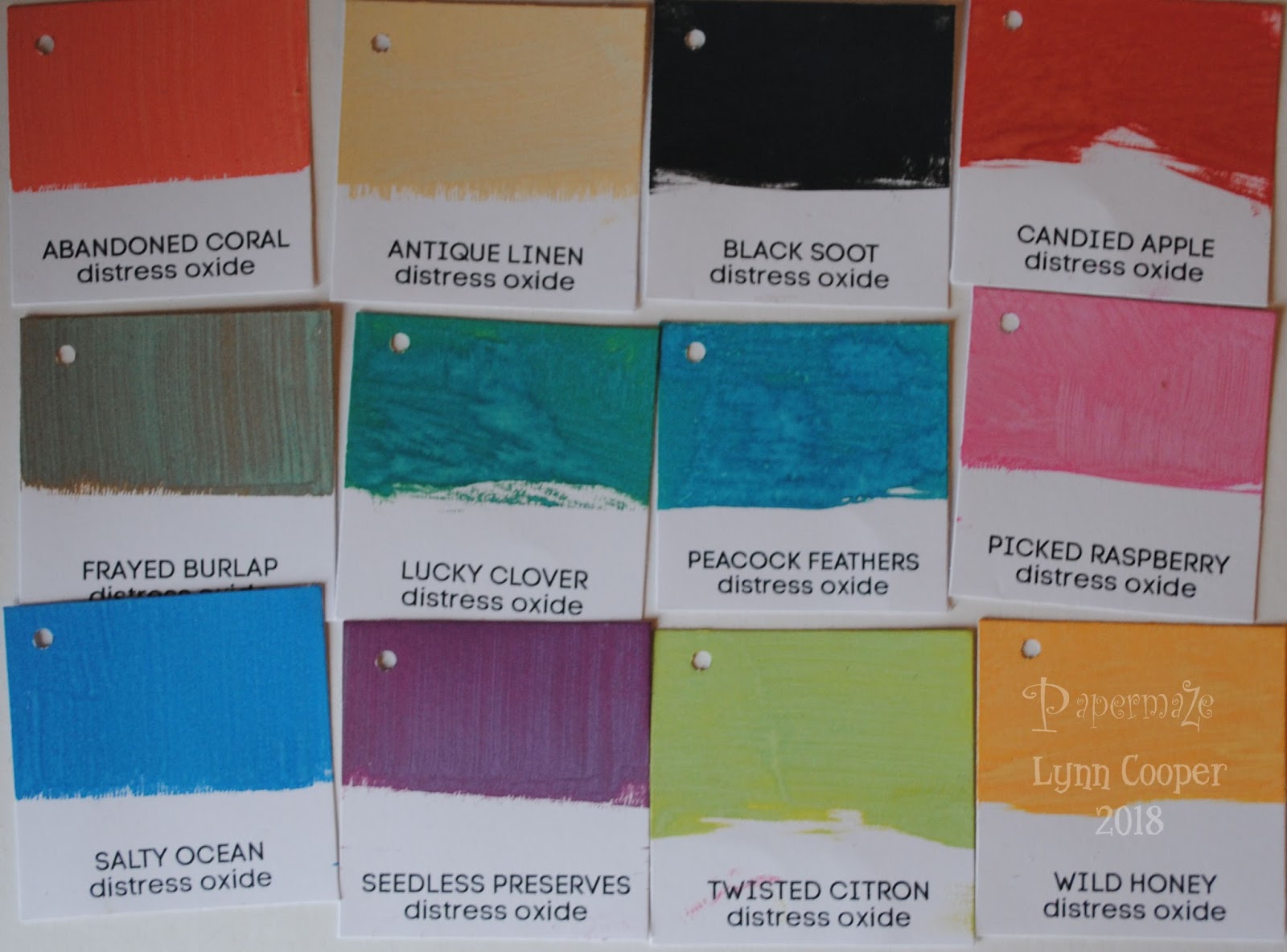
This time it's lovely to have some of the more pastel shades to add to the previous 24 colours, with the addition of TATTERED ROSE, SQUEEZED LEMONADE, SHADED LILAC and BUNDLED SAGE. In addition to the latter there are more lovely blues and greens in the form of EVERGREEN BOUGH, BLUEPRINT SKETCH, MERMAID LAGOON and FOREST MOSS. Then the bright orange that is CARVED PUMPKIN and some neutral colours AGED MAHOGONY, HICKORY SMOKE and GATHERED TWIGS. I have made some more swatches for the shop so if you visit you can see what the colours look like when used on white, kraft and black cardstock. Some of the lighter shades need a couple of coats on the black card.  The idea for the swatches came from Jennifer Mcguire's blog, she has some great storage and organisation posts, with downloadable swatches. However the swatches for the latest collection are not available yet so I set about making some myself. 


To make the background for my layout I selected colours that worked well with my photo.  Choosing 3 colours from the new range and 2 colours from previous collections.
I decided to try using Distress Micro Glaze as a smudge resistant, waterproof mask. Micro Glaze works when using a variety of inks, markers, stains, paints and more, it also works well as a sealant to protect projects. 


I used a blending tool to rub the glaze through a Layering Stencil onto the smooth white Bazzill cardstock. 

TIP: Dedicate a blending foam pad to this product, it can be stored inside the jar for future use. If a light coat of Micro Glaze is used, it will dry quickly and be very effective.


Then with the coloured Oxide Inks, and blending tools apply colour to the page blending the colours well where they overlap. This will give a seamless graduation of colour. 


My photo was cropped and added to the page, then I stamped around it with the brush and pencil stamps from the Tim Holtz, Stampers Anonymous Crazy Things Stamps. These were coloured in directly onto the layout using the Distress Oxide Inks. The beauty is that as long as the background layer of ink is dry you can layer the ink and you will get the intended colour, they will not mix with the underlying ink. 


For my title I used some PaperArtsy stamps by JOFY to stamp out the words onto the layout in Archival black ink. Then I stamped them onto white card. To add colour to the letters, I added some oxide ink to the craft mat and with a little water I painted each letter. These were cut out and stuck over the letters on the layout. 

To finish off I added a few drops of Nuvo Crystal Drops here and there.

I wrote the original review when the first 12 colours were released, and today's post is about the most recent, so not to be left out here are the 12 colours which were released later on last year. They included: PEACOCK FEATHERS, SEEDED PRESERVES, ANTIQUE LINEN, FRAYED BURLAP, BLACK SOOT, PICKED RASPBERRY, CANDED APPLE, WILD HONEY, TWISTED CITRON and LUCKY CLOVER. 


This experiment prompted me to make a layout that is very different to my normal style, it was great fun to create by playing with these great inks and so much wonderfu colour!
Back with more projects using these inks later in the month.
Thanks for looking
Lynn x