Monday 29 September 2008

Making Memories Noteworthy

I have always loved the Making Memory Noteworthy ranges so when I was sent some of the latest papers to play with, I felt totally inspired and decided to put together two layouts.


The first layout makes use of a patterned paper which is so pretty it needs very little in the way of embellishment. I backed the pretty cream and peach paper on some cream cardstock (I always do this with patterned paper to give it extra strength) and then mounted my photographs in a haphazard fashion down the side of the page, making sure that the main patterned areas of the paper were still visible. I then decided to add some interest with stamps - I used Autumn Leaves swirls, then coloured then in with gel pens for added interest. I painted the chipboard buttons with peach acrylic paint and doodled on dots with white pen. Finally, I created my title using American Crafts Thickers and Heidi Swapp ghost letters which I mounted on a piece of Making Memories spiral notebook paper. I found that drawing a doodled white line around the ghost letters helped them to stand out from the background more easily.


On my second layout, I decided to create a bolder look for a photograph of the pool from my recent holiday to Portugal. I tore up a piece of the double-sided patterned paper, inked the edges and layered them up. I doodled white vines around the edges of the photo and then mounted foam flowers in strategic positions. Doodling can really add interest to a simple page, and if you use a pencil first then you can always rub it out if you go wrong. The Making Memories tiny alpha letters added another touch of detail.


Sunday 28 September 2008

Competition time!

SO thanks to you all for popping in this week. Now onto the competition for this month. As i know how much we scrapbookers love double pagers!!! lol, that is what the competition is going to be this month!!!

This sketch was designed by the gorgeous Zarah, she has been a guest designer a few times on this blog.
So feel free to follow it completely, change it around flip it!!! it is entirely up to you. But it does have to be a double page!

And the prize???

well it is these products from Chatterbox...

You have until the 10th of October to do this and send it in! Send it to wendy@bbbweb.com, with double page in the subject line.

I am looking forward to seeing your pages.

Friday 26 September 2008

Alcohol Inks

For today's post, we thought we would speak to an expert! So please welcome Carol to the blog - she has given great instructions, all beautifully photographed for using alcohol inks!

Alcohol inks are a great media for “altering” non porous items, like tins and cd’s, and great for making fab backgrounds for use in cardmaking, atc’s, those little inchies and twinchies and also scrapping - use with your punches to create those one off extra special embellishments.

Requirements


Alcohol Inks
Felt pads
Ink applicator tool
Blending solution
Metallic Mixatives (optional)( krylon pens work too)
Glossy card stock (not photo paper)
Protective cover for work surface

PLEASE NOTE
Please ensure that ALL work surfaces are protected – although blending solution is a fantastic medium for removing ink it will NOT work on everything and could leave stains.... ALSO ensure that the room you use is WELL ventilated and one last thing NO NAKED FLAMES near the inks!!!

Right with those points out of the way, lets play:-

Place your felt pad onto the applicator – choose your inks and place 2 second squeezes of ink onto the felt. Do not mix the colours (at this stage). You can use one colour or any number, although three is usually the maximum without “mudding” your colour. With dabbing motions dab onto your glossy cardstock.

When the cardstock is covered – add a squirt of blending solution to the felt and dab

(you could add some mixative/krylon at this point – or before adding the blending solution )

Within seconds you will have a great piece of background to work with.

The main thing with alcohol inks is to play. Add more ink, less ink, put the mixative straight to the inked piece, add the mixative when adding the initial inks. The results are all fantastic, but, will be different each time. Try mixing the inks on the felt to make other colours, remember your paint mixing from school? Try it and make colours you haven’t got. My fave colour is orange, so I mix “cranberry” and “butterscotch” together with some gold for a great orange. Play and see what you can come up with.


The backgrounds can be stamped onto, but, you will have to use a “dye” ink pad, like memories or Archival, otherwise it won’t set! If you add heat, the alcohol inks bubble and burst!! (take it from one that’s tried!). Try punching out shapes and adding buttons or bling to add dimension to your scrapped pages, or using entire as a photomount. Your imagination is the limit!

Alcohol inks are great on all non porous surfaces, so try them on a piece of stampbord. Hold the stampbord at an angle (protect the bottom!) and add the ink direct to the board running it down, when dry (only a few moments depending on how much ink you’ve added) stamp and hi light.

Add the inks to a tin/cd, using the basic method above, dab the inks over the item, adding mixatives and blending solution either direct or via dabber! Great results and a fun way to wrap a present or use those spam cd’s!

Use the inks on acetate, this can be done either by the technique mentioned and then used over a photograph to give it a “dreamy” effect or again punched for unique embellishments. On the acetate card, I’ve placed inked acetate over a stamped image and cut to size, with the left over inked acetate I’ve stamped some butterfly’s, allowed to dry and then cut out, added some stickes and used as embellishements on the card...


Another fantastic method with inks on acetate is the “caught in crystal” technique. A method which uses acetate, inks and glossy accents/diamond glaze, tissue paper...... making sure the worksurface is covered pour a puddle of glossy accents/diamond glaze onto the acetate sheet, add inks, (now these can be mixed together, or added in stripes, or patches, create!) you can bleed them together using cocktail sticks then whilst still wet, add crumpled up tissue paper, be careful not to bleed the colours further and dirting them, and try not to flatten out the tissue paper then leave to dry...once dry punch out those fabby shapes and embellish away – or another method is to stamp the acetate with stazon, once dry, pour the puddle of glossy accents/diamond glaze onto the stamped image, add inks....etc....once dry the stamped image can then be used for cards, decorations etc....


At the end of the “play” your fingers will be inky! Sorry, but, there’s no getting away with that one! Try using a little of the blending solution to remove the ink. The blending solution can also help with any stray splashes of ink which might have escaped from the work area – but, please note that this doesn’t always work and the best way to not have to get ink off a white work surface before the OH gets home/ discovers it is to ensure its covered!

I’ve only mentioned and illustrated a few ideas for using inks they can be used on so much – look at Tim Holtz’s heatgun, even that has been given an alcohol ink makeover! The limit to their use is your imagination – have fun and create..............................

Thursday 25 September 2008

For my love of chipboard!!!!!

I will not even tell you how many pieces of chipboard i have, in fact it is embarrassing!!!! lol.
But it is so versatile, especially the raw type, which is why it is one of my favourite mediums to use.

The reason? you can turn it into anything you want to, any texture or colour that you need.

TIP

When you buy an alphabet set, draw round the letters and make templates before you use them. I do this for every set that i buy. Then when i use them and i have run out of the letter 'e' i can use the template to make another letter. Now granted it will not be the same, but add some ink, some faux stitching lines round all the letters and some pop dots and if you dont look to closely you will not be able to tell the difference.

I know a lot of companies bring out some matching chipboard letters to match the line of the pattern paper. But sometimes for different reasons i dont manage to get them.

This is where raw chipboard letters come in handy. I buy one of the sheets of pattern paper from the paper line, and use that to cover the letters so they match.

I have found a few you tube videos for you on this subject.


Paint is a fantastic way to colour your chipboard, especially when you mix the colours to come up with that perfect colour. This way you are not restricted to what the manufacturers have produced.

TIP

Adhere your chipboard to a piece of scrap paper when using paint as it will hold your shape or letter still and there will be less mess ( especially on your fingers!!! can you tell i hate being messy).

Inks and embossing... One of my favourite things to do is ink over raw chipboard. It is less messy then paint and quicker. When it is done, i then add some embossing ink and emboss over the top and add some glitter. Very effective and very cheap!!!

Here is a page is did using the new Basic Grey ( again, yep i am in lurveeeeeeee with this paper)

One of the things i wanted to have on this page was glitter and as i didnt have the right letters left in my letter stash, i reached for my raw chipboard alphabets.

First i picked out my letter...


Next i figured out what colour i wanted them to be. White and sparkly seemed the way to go. So i inked all the letters with white ink...


I inked them twice leaving them to dry in between. You need a good layering of the ink to cover the raw chipboard, otherwise your letters will look grey.

I then covered with some embossing ink and added some holographic embossing powder to give it that sparkle.


Wednesday 24 September 2008

Oh the dreaded double pager!!!!! - day three

How many of you actually do double pagers and enjoy them. I will be the first to say, that i dont do them, but when i do i really enjoy them. So why may you ask do i not do them more often?

I find them intimidating!!! do you?

One of the reasons is to do with one of the biggest rules behind double pagers.
The design of the pages has to flow from one page to another. One of the ways to do this is to use the same colour cardstock and pattern paper though both of the pages. This helps the page to flow together. But i never seem to have the same coloured cardstock!!! lol.

Using a line of pattern paper and speading it over both pages united the pages and keeps them together.

Next comes the photographs. Keeping the photograph of the same subject or event is another key to making the page flow. Placing the photographs is tricky as they need to balance to make the page work. This is, i think, a personal thing. What looks fine to one person may look wrong to another. My tip, go with what you want, these are your pages, do what you think looks right.

One of the things i do to keep the pages balanced it to have the photographs touching each other, like in these two double pages..... it brings the two pages together.


Also on the Happy Easter page, you can see that i mirrored how i did the edges of the pages, with the scalloped edges and the torn paper. This makes it seem like on big page, even though this is a double 8 1/2 by 11 page. Also the design principle of the visual triangle still applies to double pages... ie.. on the Happy Easter layout the visual triangle is the journaling, title and the flowers on the bottom right hand corner. Click on the pages to make them bigger.

So over the weekend i challenged myself to do a double pager.... yep, i have to tell you it took me two days to do. ( though the average page normally pages me about a day and a half).

For this double page i used the new Making Memories Fa La La La La line. This line is beyond gorgeous, take my word for it. And this one is just toooooooo beautiful!!! It looks funny in the picture, but in real life, the vellum is pure white and the snowflakes are white as well. Really Stunning.

Anyway back onto the double page. One of the comments that see regularly on message boards and in conversations, is that christmas pages are on the hardest to do. I get round that by making them all black and white. SOme people say that is cheating, but i have always done it this way. I did try once to have everyone over christmas to wear red and green, but that soooooo didnt work out!!!! Then what i do is print of the christmas pictures in colour and keep them in a special christmas album that i have.

I am sorry for the quality of the photographs this week. My camera is broken and has been sent to the shop to be fixed ( 6 weeks they say!!!!!!! not sure how i will cope with that) so therefore i am using a very old camera, which is not all that good )

Please click on the pages to make them bigger.


To start of making this double page. I sellotaped the two base pieces of card together. And approached this page as just one big page instead of two. When doing double pages, i start off in the centre of the two pages and work outwards.


I alternated the photos with titles of what each photo is about. But you can add more photos to the other squares and save the journalling for outside the edges.

My tip for doing double pages is - see it as one big page instead of two, and it really helps!!!

I will see you 2m!!!

( ps.... you sooooooo know what the competition is going to be this month now huh!!!!! :))

Tuesday 23 September 2008

Stamping... Day two

I was never a big stamper. To be honest they scared me. My reason??

well two things..
1. With the wooden blocks, you can not see where you where stamping your image. So when you where putting them onto a page or a card you had no idea what you where doing. This was alleviated some what with the growing of the acrylic stamps.
2.Secondly you are never sure that the image you stamp would come out right and you would ruin the project that you are working on.

Then someone told me about stamping on acetate / transparency's and the world of stamping opened up to me. Why had i not thought of this before!!!!

Here are some things that i have found out about stamping this way...

1.Stayzon ink works the best. I have tried other inks for this, but nothing works as well. If anyone reads this has a different ink that works well please let me know and i will edit this part of the post.

2. All makes of stamps work differently on acetate/transparency's. For example, Heidi Swapp stamps are very slippery so press very carefully. But basic Grey stamps work really well but they do stick when pulling them off, so be careful.

3. If you mess up the image you can wipe it off with a stamp cleaner, or just cut it out and throw it away.

4. It is movable. I am a scrapper that changes my mind all the time, right up until i glue everything down, so i only use things on my page that are moveable. This is one of the best things about using stamps this way. You dont like where the stamped images is, you can move it.

5. Change your mind? and you dont like it , put it in a draw and save it for later. When i pull out a favourite stamp i will often stamp it over and over again to use another time.

6. Dont like the entire image? I have a gorgeous heart stamp that i love but it has flourishes either side that i dont like. So instead of cutting up a stamp that i might like in the future, i just cut it out after it has been stamp. THis works really well with images that you may not be able tojust ink part of the image.

7.The Glaze Jelly Roll pens work really well on acetate / transparency's. You get the full colour doing it this way instead of colour onto card stock or pattern paper. Though it does take a while to dry.

8.Gluing down. The best glue to use is a wet glue that dries clear.

9. It adds another dimension to your pages, and i love dimension on pages.

10. Never rock your stamp. Rocking will give you a bad image, but i know from experience that it is hard not to rock your stamps. So what i do is, when you put your stamp onto the block, place smaller ones on the four corners ( if you have enough room) this will stop your stamp from rocking.


I have played around with stamps and transparency's for a while now and have come up with some fun ways to use it.

First idea is to make your own overlays. These are easy to make and as Papermaze sells 12 by 12 transparency's you can make them any size you want, and embellish them as much as you want. I have done a fairly small one just to show you how.

Step one - decide on how big you want it to be. For this example i have used one of the 7 gypsies small ones as an example.


Next grab a piece of scrap paper and draw in pen or pencil a square of that size. This is going to be your guideline for the rest of it.

Place your transparency over the square. Then using some scrap paper or card and place it round the square. This stops excess stamp bits getting on the rest of the transparency so you dont have unwanted images or wasting it..


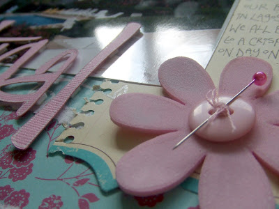
Then use a flower stamp ( the one i used you can find here) stamp onto the transparency in one of the corners. It doesnt matter which corner as when it is dry you can use either the front or the back.

You then need a stamp like i have shown in the picture below. You can find them here. I use a ruler for my instead of an acrylic block ( purely because i dont have a long one lol).


Then stamp all the way round the edge of the square.

Take off all the bits of paper and cut out.

This does take a bit of practice but i love it, and you are only restricted by the stamps in your collection.

I really like to make my own embellishments so this idea is great.

I used a stamp with written words on from this collection.

Mount it onto a block and stamp a few times onto the transparency. With this idea i dont bother about whether or not it has stamp properly as i love the effect when it is not.


Then free hand i cut out a heart shape... one of the other ideas i use this for is photo corners, which look really different like this.


I used an Autumn Leaves stamp on a page i showed on here at the weekend.

I used this stamp to put together this part of the page...


I used it on transparency, so i could build up the section. If i had just stamped it onto the page, i couldn't had had it over the flower and layered up the rest.

On this post i used some more stamps on transparencies. Then i wanted to add some colour so i used my Jelly pens to add some colour onto them...Just a little bit of colour on it made the world of difference..