Friday 30 September 2016

Kaisercraft - Barber Shoppe - Part 1

Hi Lynn here today! Sharing with you the first of two layouts I have created with the masculine Kaisercraft Barber Shoppe collection.  These very versatile papers include some great general backgrounds and some more specifically themed ones, such as planes, vintage cars, playing cards and time pieces - to name a few. Great for scrapbooking photos of the handsome gents in your life.

Sorting through some old photographs with my father, we found several of him as a young man in the 1950’s making and flying his model planes. He really enjoyed looking at these pictures and it brought back many happy memories, he was able to tell me so much about these events. This is especially important as these days he has problems with sort term memory!

Paper, Wood and Glue


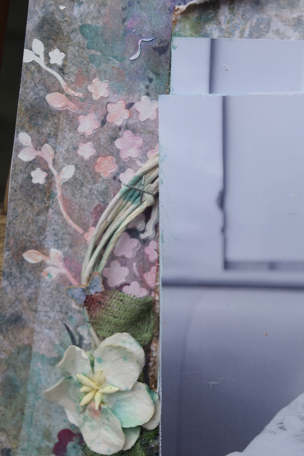
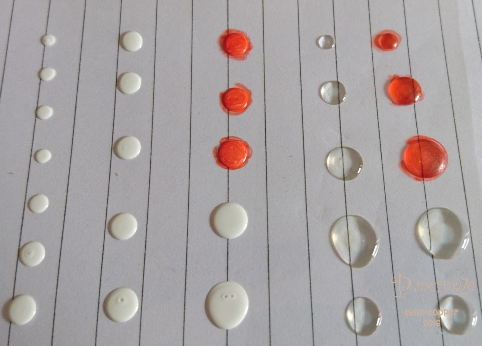
For my first layout I picked a photo of Dad making a model plane at home. I started with a sheet of grey Bazzill Basicscardstock, adding a sheet of dotty patterned paper (groomed) cut to 11.5” x 11.5”.  I cut all the separate coloured planks from the 'comb' paper and distressed them with the Tim Holtz Paper Distresser. The edges were then inked with weathered wood Distress Ink before being stuck to my base. Next I used antique white Distress Paint to add rings using two different size bottle lids. These were followed by several splats using weathered wood and walnut stain Distress Stain. The background was finished off by adding tiny copper nail heads using Liquid pearls.


From another Kaisercraft collection (
BonAppetit) I cut a ring from the burlap effect paper (Fresh). I cut letters for my title with the Cricut and black Bazzill Basics cardstock, this was dry brushed with weathered wood and antique linen Distress Paints and completed with a heavy layer of Glossy Accents.

With some scrap cardstock I cut lots of cogs using
Sizzix Tim Holtz Alterations Thinlits Die Set - Gearhead
. I covered these with a selection of embossing powders - silver, gold, black and copper. I made many more than I needed to use on future layouts, so I now have a nice little stock.

Other embellishments were from the shop or my stash and the stickers were from the Barber Shoppe sticker sheet. 

Back soon with another layout made from this great collection.

Thanks for looking
Lynn x

Monday 26 September 2016

thoughtful- Blue fern studio

Once again i used Blue Fern Studio Tranquillity collection for this layout. I knew i wanted to used the blissful patterned paper as it had this look of a large vintage postcard.
Firstly i coated my paper in clear gesso, so i could add lots of inks, mists and multi media to my page.
Then i started fiddling with the concept of using 3 black and white photos with the same image, but 2 of them were zoomed in and printed off using my cannon selphy. Once i started layering them on top of each other with silicone glue, i then knew that is was going to be the focal point of my page.
I then wanted to create a battered postcard matt. Using the calm patterned paper i stamped one of my Tim Holtz postcard stamps to the top of the paper and distressed, tore and inked the paper.
Made a paper twine circle which i tied and stapled to sit behind the matt


Back to the 12x12 paper, i added some thick white gesso through a crafters workshop cherry blossom stencil. Let that dry and went about adding my inks and mists that i had amongst my stash. I finally added a small flower, 2 leaves and a very tiny butterfly which was cut out from the waste strip at the bottom of the paper

 Close ups


Friday 23 September 2016

Masterboard part 2

Hi, Carol with you today sharing with you the second part of my masterboard piece.

Remember this post, and this?


made with acrylic paints and Seth Apter stamps by Paperartsy

So, what to do with your masterboard once created…

I have made two sets of cards and matching tags… to start I used a brown archival ink and stamped the base of the card and tag… using the Seth Apter stamps…


I also added some text stamping with black ink…


Section of the board was cut and mounted onto black cardstock…


A flower from JFY set 11 was stamped onto cream cardstock and coloured using water colour pencils and then added to the side of the project, a stamped sentiment, from the same stamp set,  was also added.


For my second set … the card was cut to size and mounted and then matted onto black cardstock.  Tando balloons were painted and then a coating of glossy accents added…. a stamped sentiment and some bling finished the set off.


There is still loads of card left….so,


I cut out different shapes and added to some project life card blanks.  Some stamping in different coloured archival ink was added to the blank first and then sections of card was added… Now I have some fun and funky cards to add to my project life sheets….


I still have loads of board left and little pieces added to small cards make great little notes for those quick messages. (obviously, the masterbord used on these noteless was another one!)


TFL xx


TFL XX


Wednesday 21 September 2016

Oh Baby! ..... with Prima Heaven Sent.

Hello There,
Anita here today with my final post for September using the adorable Prima Heaven Sent collection.
If you haven't already seen this collection then I can highly recommend it with its delicate pastel shades, vintage playful bunny, teddies and lambs and stunning soft rose gold foiling. I worked originally with it creating a gift basket and card for a new baby HERE
And now I have used it for a layout to showcase that beautiful new arrival.


I based the layout on a sheet of Welcome Baby  which I handcut wavy edges randomly around the entire edge of the page and gently inked with an old brown inkpad. I then stuck this onto a sheet of Heaven Sent and again gently inked the edges.

Around the edge of the photograph I gently ruffled some organza ribbon to make a soft frame and then placed it onto a frilly doily.


 I had a lovely chipboard butterfly by Scrap FX, which I sprinkled with large flake irridescant glitter and although it was pretty it wasn't quite right, so I sprayed over it with a pearlescant spray which also worked as a seal to stop the glitter from migrating.


I cut various bits and peices from the sheets of Sweet Lullaby and Special Delivery and used around the page and used various blossoms and bling.

I then finished the page by adding lots and lots of sprinklings of crystals to the hot air balloon and more crystals and teeny baby blossoms from the Prima Planner flowers Lola and Lucy around the wavy edge of the page.


This is a truly beautiful range of papers and has been a real delight to work with, hopefully you will decide you would like to try some too.

See you next month
Warmest wishes
Anita xx

Monday 19 September 2016

Together Again scrapbook layout

Hi Tracee with you today, I'm going to share a scrapbook page that I created with an older Jillibean Soup collection. Do ever see a collection that you missed first time round and wonder "how did that happen"?

Together Again

together again scrapbook page tracee provis papermaze

When I saw this sheet from the Sightseeing Stew collection I felt a plan forming. I used the soup label arrow stickers to point to where both my friend Debbi and I live, I used string to create trail that leads from one back to the other 

together again scrapbook page tracee provis papermaze 01

I used wood veneers and stickers also by Jillibean Soup.

together again scrapbook page tracee provis papermaze 02

I cut lots of elements from the various papers in the Sightseeing Stew collection, I punched holes in the top and threaded them onto more string to create a banner along the bottom of my photo. The globe was a cut file from the Silhouette store, I like that it adds effect without overshadowing the background paper. A few sequins for the finishing touch.
Thank you for stopping by today.

Supplies for this layout can be found over at the shop, and check out some of those older collections like me you might find a gem that you missed!


Friday 16 September 2016

This month's crop...


 It's time to crop again!  Tomorrow we'll be at our usual venue, Otley Village Hall, from 10am until 5pm, with plenty of tea, coffee, biscuits and homemade cakes, plus the usual array of punches and dies for you to make use of :) 


This month's layout mixes paper from several manufacturers.  The photo is one of the two kittens we recently acquired!  We also have the lovely Jacqui doing a demo with the PaperArtsy Iufusions!  Drop me an email if you'd like to join us tomorrow, or any other month!

Wednesday 14 September 2016

Ranger's Enamel Accents Review

Hi, Lynn here! This month I'm reviewing one of the newest products to arrive on the shelves of the Papermaze store - Enamel Accents by Ranger. Well… not ‘totally’ new - black and white enamel accents were introduced in 2010. 

So, what’s new?

10 bright colours. So now there’s a rainbow palate of 12 to choose from.


What are Enamel Accents?

Enamel accents are a dimensional medium that dries to a very shiny, opaque, domed finish. They are available from Ranger in 14ml bottles with a nozzel and cap. 


What projects could they be used for?

These fine-tip applicators are great for detailed work. They can be used on paper, card, glass, plastic, fabric, wood, metal, canvas… the list goes on, but in all cases you can create an extra dimension to your work with faux enamel accents.

So far I’ve seen them used to great effect with paper crafting, home décor, mixed media, and jewellery projects. Some have chosen to work directly on their project with the accents, others make accents on scraps of acetate to be added to a project at a later date.

These enamel accents have been used to doodle, dot, dash and decorate craft projects, achieving the look of shop sold enamel dots with a non-toxic formula. 

What colours are available?  


The Enamel Accents colours match the Ranger Dye Ink Pads (which are also available from Papermaze) and are available in:
  • Black Tie
  • Blue Ribbon
  • Caribbean Coast
  • Cheese Puff
  • Classic Cherry
  • Electric Lime
  • Glacier White
  • Grape Soda
  • Lily Pond
  • Pink Gumball
  • Wild Orchid

How do I use them?

Top tip: Before you start, grab a piece of scrap paper or paper towel to establish the flow before working directly on your project. This will eliminate any air bubbles from the nozzle which may spoil the finished shape of your enamel piece.

If the nozzle becomes blocked use a fine piece of wire with a blunt end (about the width of a pin) to remove the problem. Do not use a pin as the sharp point may make a hole and cause a leakage where you don't want it!

It is a good idea to invert the bottle while the cap is still attached and give one good shake to move the fluid to the tip of the nozzle. There is no need to repeatedly shake the bottle.

The medium is easy to apply, simply hold the bottle upside down and gently squeeze the sides until the required amount of medium has been dispensed.

Experiment. I found a little practice was needed until I was happy with the shape of the results.


If you are not working directly onto your project, use a piece of acetate. You can store the dots until you need them, and pick your favourites.

When you’re finished, wipe the nozzel with a clean cloth and replace the cap. Once the cap is definitely secure, bang the bottle on the table to move liquid from the nozzle and back into the bottle to prevent blockages.

When finished it is wise to wipe the nozzel with a clean cloth and once the cap is replaced bang the bottle on the table to remove liquid from the nozzel back into the bottle, to prevent blockages.


How long does it take to dry?

That depends on the surface size and depth your accents. It is best to leave your accents overnight for best results. 

What base materials can it be used on? Can I use different colours?


Ranger’s Enamel Accents are opaque - which means they can be used on any colour base. The colours remain true on white, black and any other colour.

What if I need a different shade of enamel dot?


I’m sure more colours will be introduced at a later date, but in the meantime, you can colour your dots.

Take the Glacier White and make the dots in the sizes you require. 
Allow to dry and then colour with your favourite alcohol markers. You can also try this with Glossy Accents instead of the Enamel Accents (see above).


How do I adhere my pre-made dots to my projects?

Peel them from the backing and simply stick in place with adhesive. Glossy Accents works well. I found that if I took the finished dots off the acetate and put them together, they don't appear to stick together. They look very attractive together in a jar, but it’s not quite so easy to see them all.


Can I use more than one colour in a single accent?


Yes, you can use colours to make designs or make eye balls on stamped images!

Tim Holtz Bird Crazy Stamp
In the image below I have used several colours, dragging a spot of green outwards with a pin to create a flower pattern. See this tutorial HERE by Ranger for more ideas. I think I need more practice!


How do Enamel Accents compare with Liquid Pearls?

Both have a place in my craft stash. The Accents (right) leave a high gloss, domed finish and the Liquid Pearls (left) a pearly, more peaked finish.


Have fun experimenting with the Enamel Accents,
and don't forget to share what you make.
Thanks for looking
Lynn x

Monday 12 September 2016

*Magical Adenture ~ Part 2*

Hello!
I have another Disney layout to show you today using the fab Echo Park Magical Adventure collection. It's been so much fun to work with and great for scrapbooking several Disney layouts.  
This time I have created a layout showing some of our character meet and greets. I got my inspiration from this sheet of patterned paper. So began by choosing a few of the squares to use. I arranged the squares and my photographs into a 3 by 5 grid. I then added some of the element stickers including the bunting with some twine. 


Thanks for stopping by!
Anna
X

Wednesday 7 September 2016

back to nature

For this months post, i was given the opportunity to work with blue fern studios, tranquillity collection.
These are stunning papers and i have used the calm patterned paper as my background, stillness as my mat and the packaging from blue fern studios, spring iris, garden daisies, splattered circles chipboard, which i have also used.
My photo has been printed on to canvas paper, which means it has lots of texture.


Firstly i have primed my background with clear gesso, if you remember this allows me to add media and inks to my page without the paper being saturated. Once dry i added some white gesso to my page, it toned down the blue of the paper, which has made a focal point for my photo to be placed on.
Using my sizzix thinlits wildflower dies, which i had cut out of scraps of card i made a stencil to put texture paste through ( you can only faintly see this but it adds and extra dimension to the layout).
i then took my chipboard pieces primed them in white gesso and painted over the top using various, mica powders, inks, and watercolours till i had the desired effect


I then matted my photo, and tore pieces of packaging, which i have tucked under the mat. Placed my chipboard on the page and used some of the wildflower dies that i cut out of the photo canvas paper and added to my page. Distressed edges of the paper in bushed corduroy distress ink. Added some crumpled cheese cloth, a tag and metal title to my page. I finally distressed the edges of my background 12x12 patterned paper but instead of inking it, kept it white to give the page a striking border.


Monday 5 September 2016

Prima Heaven Sent ..... A New Baby Gift Basket and Card

Hello There, it's Anita here today with the scrumptiously adorable new 'Heaven Sent' papers from Prima.
 They really are absolutely charming with lovely pastel shades and exquisite, but delicate foil highlights in a soft rose gold.
 I thought I would start off this month with a gift basket and card to welcome a new born.


The basket itself is made very easily from a single piece of 12 x 12 ( I used a sheet of Heaven Sent 'Joyful Arrival' ) and simply creased into 9 sections, each one being 4 x 4. I decorated the 4 mid panels with off cuts from 'Special Delivery' and also 'Sweet Lullaby'.


After distressing all of the edges with a dark brown ink pad, I punched twin holes in each of the 4 corners and when folded up, I gently threaded 2 lengths of lace through and tied up in double bows on the top of the basket.


So then all that is left to do is fill the four sections with goodies of some sort. These baskets are great for all sorts of occasions and can be themed in any way you wish. They can also be made in all sizes, as long as you start off with a perfect square. For Christmas a few years ago I made some teeny tiny ones to hang on our Christmas tree!
Here is a view of the basket from above.


Next I made the card, making a card blank from a sheet of dusty blue Bazill and layering using pieces from both sides of a sheet of 'Sweet Angel' and a baby pink Bazill. I also added some Prima leaves, Lola blossoms, a couple of sparkly heart cabouchons and some lace.


I absolutely adore the foiling on these papers, it really is the perfect finishing touch to an already beautiful design and without being over the top.


Keep your eye out on the shop site for these papers over the next day or so.....I have a feeling they won't hang about for very long!

Warmest wishes
Anita x

Friday 2 September 2016

Masterboard - part 1

Hi, Carol with you today…. as regular visitors to the blog, and the Papermaze monthly crops, will know, I just love getting all painty and there is no better way to experiment than by making master boards.

Masterboards are usually card based and an instrument to practice and try out different paints and techniques, and then to cut them up to add to your projects.

So, today, I'm sharing with you my latest masterboard…. I started off with an A4 size piece of white cardstock… I then dabbed on some acrylic paint - take a look at the dylusions in the shop, this paint is lovely and thick, a great range of colours and so very vibrant… using an old store card I swipped the paint across the cardstock…. 


I used three different colour ways and where the paint crossed over I have additional colours…. have you seen the new Paperartsy Seth Apter stamps in store…oh boy, these are gorgeous and so versatile, they can be used for your cards and scrapbooking pages, but, also great for mixed media and journalling… 


I stamped these using grey ink and also a pink ink, there are now loads of different coloured ink pads available and all add definition to your work.


doodling was then added using black and white pens...:-


This is my finished masterboard - come back later in the month and I will show you what I have created using it.

TFL xx