Friday, 30 May 2025

Easy DIY Envelope Tutorial


Good Morning!!

I'm sharing a fun envelope tutorial with you today.

I'm using this envelope as a pocket for my journaling and photos.

And I'm using this collection here from Photoplay.

This Happy Life 

And here is my YouTube channel if you'd like to watch how this page came together.


So I wanted to make an envelope to pop the extra photos inside and I thought the green paper would be so pretty with the floral inside. 

I just took an envelope that I had already and unsealed the edges.

I used a craft knife to do this.


And then once you've opened it out you can use this as a template.

I placed it over this paper here and drew around the flat envelope.

Then cut it out, folded along where the lines should be and stuck down in place using the old envelope as my guide.


 This then worked so perfect.

I stuck it down on one side with some clear tape so I used it as a flip.

The photos can now go inside and I cut a piece of card to go inside for the journaling.


And on the reverse I've added a little journaling and more photos.


 And then I created on the page next door too.

I covered up most of the page, just leaving the illustrations on view.

This is the green scalloped paper that I used here, I love this design. 

I really love how this came together.

I hope you like the envelope idea.

Please give it a go : )


Lisa x 

Wednesday, 28 May 2025

Echo Park ~Born to Travel 🧭 #2

Hi! 
It’s Anna back with you today and I’m sharing my second layout using one of Echo Park’s latest collections Born to Travel, which you can find in the shop here.


For this layout I have used a globe cutfile, which is by Peartree Cutfiles. 
I began with a sheet of 12x12 Bazzill white. I then trimmed ‘Flying Airplanes’ down by roughly an inch on each side. I adhered it just slightly off centre on my cardstock. 


I added a couple of stitches to each side of the patterned paper to add some extra detail. 


I cut the cutfile out on the b side of ‘Born to Travel Elements’ and I backed it using the b side of ‘Tourist Licence Plates’ for the land sections and with coordinating bazzill cardstock from the matchmaker pack for the sea section. 
I mounted my photo on to the b side of  ‘Soaring Hot Air Balloons’ and then layered some element stickers around my photo.


I created a hidden journaling element as there was a lot to say about this day out…
So I used a cut apart Travel Jounaling Card and added a tab to the top. I added the wording ‘pull’ for the reader to spot the hidden element. 


Thanks so much for looking! 
See you next month when I’ll be working with a brand new collection - see you then! 

Anna

@acraftylifewithanna

Monday, 26 May 2025

Courageous - 49 and Market - Rust & Revs 2.0 Collection

Hi everyone!

It’s Rebecca here, and today I’m excited to share my latest layout, created using the fabulous Rust & Revs 2.0 Collection from 49 and Market. If you loved the original Rust & Revs collection, you’re going to adore this new release by Dennis Bruton! The two collections are distinct enough to stand on their own, but they also coordinate beautifully—perfect for mixing and matching! You can find Rust & Revs 2.0 here.


To start, I cut strips from various patterned papers in the 12x12 Collection Pack and layered them to add depth and interest. I also incorporated a chipboard frame from the Chipboard Words and Phrases, which I cut in half so each piece could peek out from either side, introducing a fun pop of texture.


I mounted my photo using a coordinating solid cardstock from the 12x12 Solids Pack —choosing yellow to echo the yellow seat in the photo. To give it extra dimension, I raised the photo on a layer of adhesive foam.

Next, I tucked in a couple of pieces from the Die-Cut Elements —a tag above the photo and a tab to the left—for added detail and balance.

One of my favourite 49 and Market products is the Laser Cut Out Elements —I’m always amazed by how much they pack into a single set! For this layout, I chose a chain link design and positioned a small section above and below the photo, along with a yellow quad bike for a fun focal point. To bring in a touch of green, I added Laser Cut grass on either side, tying it all together with the green in my photo.


For the title, I chose the chipboard word "courageous." It felt fitting—my son is often anxious about new things, but he’s always shown such bravery when it comes to driving his grandad’s tractor. This year was extra special, as he finally grew tall enough to reach the pedals on his own, no help from mum needed!


Once all my layers and embellishments were in place, I turned my attention to the background. While I usually love leaving white space on my layouts, this one felt a little too bare. So, I added a touch of mixed media to bring everything together.

I began by applying a few Rub-On Transfers —I always add these before any ink work so the designs remain crisp and visible. Then, using a mini brayer, I applied some black Distress Oxide Ink for a distressed look and finished with black acrylic paint splatters for added texture and movement.


As a final touch, I added a couple of Epoxy Coated Stickers to finish off the page just right.

Thanks so much for stopping by—I hope you’ve enjoyed seeing what I’ve created with this amazing collection. I already know it won’t be the last time I reach for Rust & Revs 2.0!

Take care,
Rebecca x

@preciouspagespapercraft

Friday, 23 May 2025

May Crop

 Our May crop is tomorrow, Saturday 24th - and this month's kit uses a variety of papers with pastel colours.


As usual, we're at Otley Village Hall in Suffolk from 10am until 4pm.  There'll be delicious home made cakes, and dies & punches for you to use, and there'll be a discount in the shop!  

Monday, 19 May 2025

May Papermaze Kit - Part 1

Lynn here, with the new Papermaze Kit for May. The kit is full of bold and bright coloured papers and Bazzill Cardstock. Great for fun filled summer, kids and holiday layouts. My first two layouts record my children's activities, when they were much younger.


In the kit you will find the following items:


Patterned Papers:
Echo Park - Born to Travel - See the Sights Plaid & Postcard
Echo Park - Little Things Mean a Lot - Bright Butterflies
Graphic 45 - Spring is in the Air - Choose Happy
Photo Play - Lucky Cat - Cherry Blossoms
Simple Stories - For the Record - Just the Details


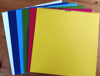
The photo above shows both sides of each paper.

Embellishments:
2 Woodware junk Label Stamps, purple & pink Studio Light pearls, 10 Dress It Up red hearts, 2 doilies, P13 frames, Rosie's Studio Bayfair dragonfly, 12 Rosie's Studio Bayfair Sentiments Ephemera & 12" Doodlebug washi tape Airmail.


Bazzill Basics Cardstock - Bazzill White, Admiral (included in kit), Wildberry Pie, Mexican Poppy, Grenadine & Hillary (Extra Pack).


Emily as Jessie - Emily loved Toy Story and her favourite character was Jessie, so when the school had a Disney themed Christmas fair, She wanted to dress up as Jessie. So, with the hat from the Disney Store, I made her the rest of the costume.


I started this layout by trimming a sheet of Smooth White Bazzill cardstock to measure 11" x 11". Then I used a large sunburst cutfile to stencil Squeezed Lemonade and Mustard Seed Distress Inks to create a background. Then I flicked Mustard Seed, Candied Apple and Blueprint Sketch. Once dry I applied it centrally over a sheet of
Bright Butterflies paper, which I had gutted to make a 1" frame.


I cut a 10.5" x 1.5" piece of  Choose Happy paper and placed this across the horizontally bottom of the cardstock. I stuck a length of filmstrip washi tape along the top of this paper. With some heavy jute twine, I created a double rope loop to place to the left side of the layout. I finished this off with a knot to the bottom left and glued the tails down in smaller loops.


I placed a couple of 3D stickers (cowboy boots and horseshoe from my stash), near to the knot.


I trimmed three images of Emily from the photos and arranged them inside the lasso. Using the Cricut, I cut lettering for the title, with the Admiral Bazzill and the remains of the Bright Butterflies paper. The title was placed above the photos.


I cut some stars from Grenadine, Mexican Poppy Bazzill. These were placed around the lasso, raised up on 3D foam pads.


With two pieces from the selection of Rosie's Studio Bayfair Sentiments Ephemera in the kit, I added a journalling tag, with the addition of some Baker's twine, and a label for the date. The date was spelt out with Doodlebug Designs Alphabet Soup in Blue Jeans. Finally, I scattered some puffy star stickers over the page.


Crazy Coupe - My children were given a Little Tikes - Cozy Coupe for their 3rd birthday. Andrew especially loved his first car! This layout was inspired by a page made by Niki Rowland for Simple Stories.


With the Bazzill White cardstock from the kit as the background for this layout, I started by creating the starburst rays, by cutting pieces from several papers in the kit. I used both sides of
Cherry Blossoms, Just the Details, Bright Butterflies and See the Sights Plaid. I also used the blue side of Choose Happy. These were held in place with a line of navy-blue machine stitching. the sun was made with a circle of Mexican Poppy Bazzill, and a scrap of white cardstock.


I placed the photos to the left of the layout, then I created two rosettes made with the Tim Holtz, Sizzix Rosettes die set, and more of the papers and Bazzill from the kit.


I used more of the Bazzill from the kit and the Cricut to cut a title, large numbers and stars. These were scattered over the layout, some being layered up with 3D foam pads. 


I fussy cut some phrases from the Just the Details paper and added these randomly onto the page.


My journalling was written along the side of the rays onto the cardstock.


That's all for today, I will be back with two more layouts from the May kit soon.
Thanks for looking.
Lynn x

Friday, 16 May 2025

Photoplay This Happy Life - Summer Vibes

Hello! Karen here, and I've got a new scrapbook layout to share featuring Photoplay's This Happy Life collection. It's such a bright and cheerful collection – absolutely perfect for showing off those sunny summer snapshots!

For this layout, I began by cutting Paige Evans' gorgeous 'Heartburst' cut file from smooth white cardstock. 

Next, I backed that cut file (leaving the heart unbacked) with a colourful mix of patterned papers from the collection. To make it really pop, I positioned it in the centre of a slightly trimmed down piece of black 12x12 cardstock. A layer of 3D foam underneath the backed cut file gives it dimension and a bit of shadow. Finally, I mounted the whole thing onto a white cardstock base.

Within the heart, I created a collage of punched paper hearts. I used two different sizes of heart punches. As I arranged them, I made sure to spread out the various colours and sizes for a balanced look. For a little extra sparkle, I also scattered a few iridescent sequins among the punched hearts.

My photo was double matted to help it stand out, and I positioned it near the bottom of the layout, letting it slightly overlap the central heart design. To add a sub-title, I grabbed one of the cut-aparts from the "It Happened" paper and tucked it under the corner of the photo. I also added some punched paper hearts to the top of the card, and digging through my stash, I found a word strip leftover from the design team kit I used last month – perfect for adding a little extra sentiment.

To finish off, I die-cut the words "Summer Vibes" from more black cardstock and placed them in the top left corner of the layout. It felt like the perfect title for this happy, summer photo of my daughter.

I really hope you enjoy seeing his layout and I hope you get some time to scrapbook your own happy summer memories too.

Until next time, take care.

Karen x x

Monday, 12 May 2025

Echo Park ~ Born to Travel ✈️ #1

Hi everyone, it’s Anna back with you today and this month I’m working with Echo Park - Born to Travel. 

You can find the whole collection in the shop here


For this layout I began by using ‘Postcard’ as my base. I then trimmed roughly 1/4 of the ‘b’ side of ‘Ready to go Luggage’ down as well as trimming it around the edge to fit inside the boarder of ‘postcard’. 

I placed the boarder sticker from the element stickers down the edge of ‘Ready to go Luggage’ 


I mounted my photo on to the b side of ‘Soaring Hot Air Balloons’ and cut out two journal cards from ‘Travel Journaling Cards’. One of which was to act as my title and the other being my journaling space. 
I adhered these three pieces vertically along the edge of my patterned paper. 


I cut out some strips from ‘Tourist licence Plates’ and adhered a strip under my photograph, with a couple of extras used elsewhere on the layout. 


I then pulled out the element sticker sheet again and added a few to my layout, including the aeroplane and some florals. 


After adding my journaling, that was my layout complete! 


Thanks so much for looking!
 See you again later in the month for a second layout using this collection. 

Anna 

@acraftylifewithanna

Friday, 9 May 2025

Determined - 49 and Market - Rust & Revs 2.0 Collection

Hi everyone!

It’s Rebecca here, and I’m excited to share my first layout of the month with you. This time, I’m creating with the Rust & Revs 2.0 collection by 49 and Market—a stunning release designed by Dennis Bruton. Whether used on its own or paired with the original Rust & Revs collection, it offers incredible versatility and creative potential. You can find the collection in the shop here.


I instantly fell in love with several of the patterned papers in this collection and knew I wanted to showcase a few of my favourites. I chose three designs and used metal nesting dies to cut various-sized circles. These were then layered onto a sheet of Premium White Cardstock, creating a central focal point. To finish the layered look, I added a circular photo right on top.


Below the photo, I positioned my title, which I chose from the Chipboard Words and Phrases set. Since the title has a bold, blocky shape, I trimmed the bottom of my photo and circles in a straight line to mirror its structure and give the design a more cohesive feel.


With plenty of space on either side of the photo, I dived into the embellishments. I selected several Laser Cut Elements from the collection to build two main clusters. To add depth, I used foam pads under some elements. I also tucked in a tag from the Die Cut Elements and even repurposed a film strip from the laser-cut packaging—such a great way to squeeze a few extra goodies out of your supplies!


Once my clusters were complete—but before adhering everything to the background—I added some mixed media to bring the layout to life. Using Distress Oxide Inks in Twisted Citron and Black Soot, I rolled colour onto the cardstock with a mini brayer, making sure it peeked out from behind my main design.


To finish, I added Rub-On Transfers and bold black paint splatters for extra texture and drama.

Thanks so much for stopping by! I’m absolutely loving working with this collection and can’t wait to be back at the end of the month with another layout to share.

Take care, 
Rebecca xx

@preciouspagespapercraft