Showing posts with label boy layout. Show all posts

Wednesday, 27 August 2025

Simple Stories Book Fair- School Days Scrapbook Layout-Rebecca Bee

Hello everyone! Rebecca Bee here today aka Scrap Paper Uk and today I have a layout using Simple Stories Book Fair.

 With the new school year looming next week, this collection is absolutely perfect for documenting back to school photographs.  


I have documented two of 2024's back to school photographs in this layout. The vivid colours in the Way to Go paper were perfect for my photos and for cutting apart & rearranging as colourful striped panels on a piece of Bazzil Blue Oasis cardstock. I have punched the edge of one of the panels using a notebook edge punch to add a scholastic feel to the page.


A little foam adhesive adds some simple dimension, and some white acrylic splatters add a little contrast and texture to the deep background cardstock. For my next layout using the collection and as a self confessed book worm, I am excited to use the book imagery in this collection to track some of the great books I have read so far this year...until next time! 

I've added a perspex piece from my stash to form a title, and some twine threaded through one of the cut apart tags in the Tag Elements paper to add a layer in the clusterb to the right hand side of the page.
I hope you join me to see what I make next with this lovely colourful collection! Rebecca XOXO

Monday, 26 May 2025

Courageous - 49 and Market - Rust & Revs 2.0 Collection

Hi everyone!

It’s Rebecca here, and today I’m excited to share my latest layout, created using the fabulous Rust & Revs 2.0 Collection from 49 and Market. If you loved the original Rust & Revs collection, you’re going to adore this new release by Dennis Bruton! The two collections are distinct enough to stand on their own, but they also coordinate beautifully—perfect for mixing and matching! You can find Rust & Revs 2.0 here.


To start, I cut strips from various patterned papers in the 12x12 Collection Pack and layered them to add depth and interest. I also incorporated a chipboard frame from the Chipboard Words and Phrases, which I cut in half so each piece could peek out from either side, introducing a fun pop of texture.


I mounted my photo using a coordinating solid cardstock from the 12x12 Solids Pack —choosing yellow to echo the yellow seat in the photo. To give it extra dimension, I raised the photo on a layer of adhesive foam.

Next, I tucked in a couple of pieces from the Die-Cut Elements —a tag above the photo and a tab to the left—for added detail and balance.

One of my favourite 49 and Market products is the Laser Cut Out Elements —I’m always amazed by how much they pack into a single set! For this layout, I chose a chain link design and positioned a small section above and below the photo, along with a yellow quad bike for a fun focal point. To bring in a touch of green, I added Laser Cut grass on either side, tying it all together with the green in my photo.


For the title, I chose the chipboard word "courageous." It felt fitting—my son is often anxious about new things, but he’s always shown such bravery when it comes to driving his grandad’s tractor. This year was extra special, as he finally grew tall enough to reach the pedals on his own, no help from mum needed!


Once all my layers and embellishments were in place, I turned my attention to the background. While I usually love leaving white space on my layouts, this one felt a little too bare. So, I added a touch of mixed media to bring everything together.

I began by applying a few Rub-On Transfers —I always add these before any ink work so the designs remain crisp and visible. Then, using a mini brayer, I applied some black Distress Oxide Ink for a distressed look and finished with black acrylic paint splatters for added texture and movement.


As a final touch, I added a couple of Epoxy Coated Stickers to finish off the page just right.

Thanks so much for stopping by—I hope you’ve enjoyed seeing what I’ve created with this amazing collection. I already know it won’t be the last time I reach for Rust & Revs 2.0!

Take care,
Rebecca x

@preciouspagespapercraft

Monday, 25 March 2024

Outdoors Adventure - Cocoa Vanilla Studio - Great Escape Collection

Hi everyone! 

It's Rebecca with you and today I am sharing my second layout created with the fun Great Escape collection from Cocoa Vanilla Studio. You can find the collection in the shop here.


When I first saw this collection, my eye was immediately drawn to the Happy Camper paper with all the different coloured flags and an idea started forming in my head. This layout is me getting that idea out of my head and onto paper! To start, I used my Crop-A-Dile to punch holes and set metal eyelets at 6 points on a sheet of Premium White Cardstock. Through these eyelets, I threaded some white embroidery floss going vertically down the page in 3 lines.

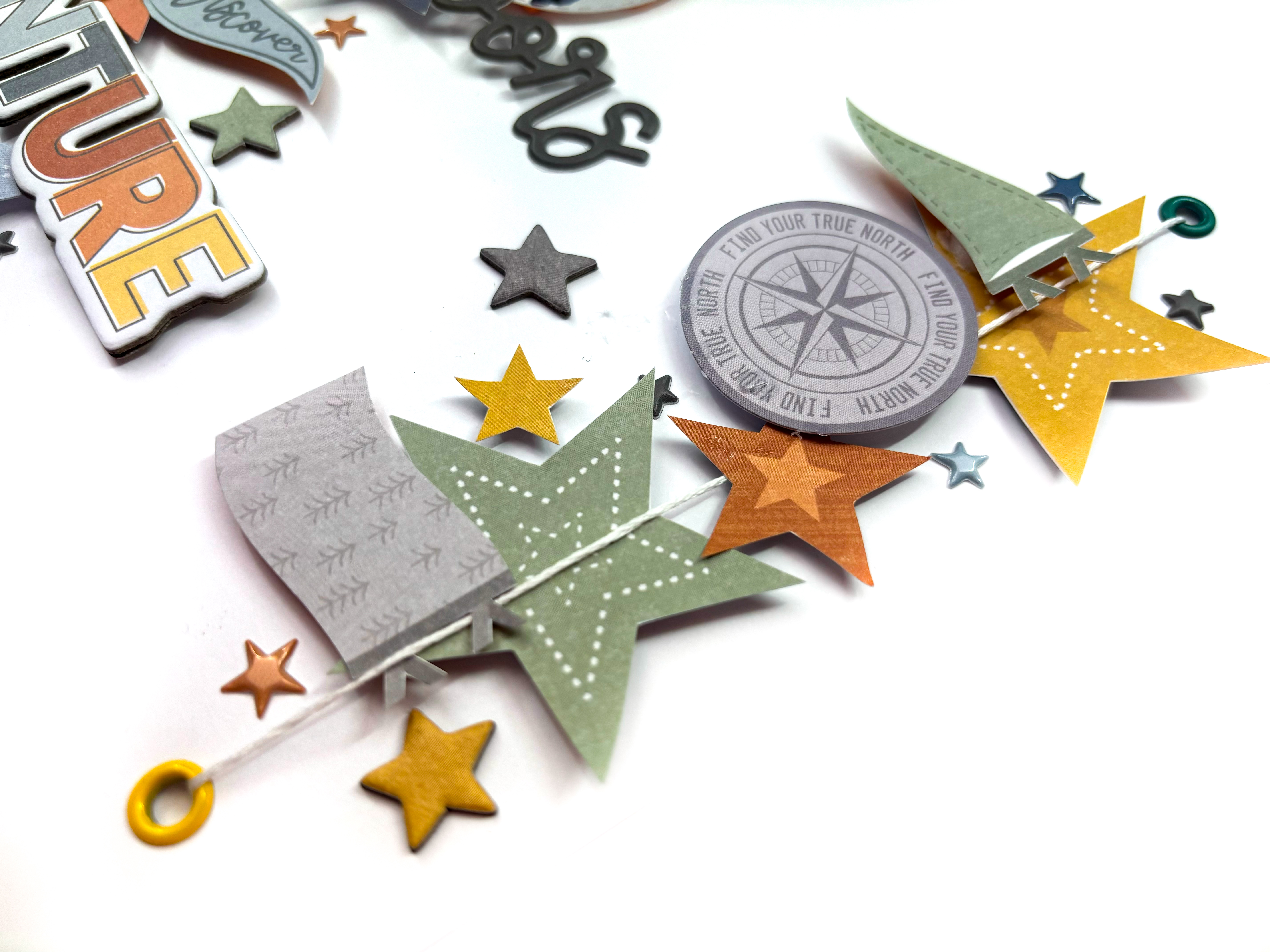
Using my Cutter-Bee scissors, I fussy cut several flags from the Happy Camper paper, and some stars from the Star Gazing paper and positioned them along the line of the embroidery floss. 


To the centre line, I placed a small, circular photo and underneath it, the word 'Outdoors' from the Puffy Title stickers.


I built up the clusters, following the lines of the embroidery floss using pieces from the Die-Cut Ephemera and Chipboard Stickers, making sure to have one circular piece in each line.


To the longer central line, I added the word 'Adventure' from the Chipboard Stickers. I love how this title is mutlicoloured and echos all the colours on the layout.


To finish the layout, I added several of the star Puffy Stickers, keeping them tight to the cluster lines.


I hope you've enjoyed this layout and it inspires you to use the Great Escape collection. 

Until next time, take care!

Rebecca x

@preciouspagespapercraft


Friday, 8 March 2024

Adventure - Cocoa Vanilla Studio - Great Escape

Hi everyone!

It's Rebecca with you today sharing my first layout for March. It feels like forever since I created a proper 'boyish' layout, so this month I've chosen to work with the new Great Escape collection from Cocoa Vanilla Studio. You can always count on CVS to release a cracking 'boy' collection! You can find it in the shop here.


As soon as I saw the grey woodgrain paper (the B side of 'Starry Night'), I was in love! It's a really lovely paper, and it's not too busy so it's perfect for a background! I cut small sections out of two of the edges and after distressing them, backed them with patterned papers from the collection.

Next, I die cut 2 large stars from the same 2 patterned papers (Happy Camper and Journey) and placed them central on the page. On top of these, I added my circular photo. I knew I wanted this layout to be quite minimalistic, so I kept everything clustered tightly in the centre of the page. 

Underneath the photo, I added 2 strips of patterned papers with fishtails cut into each end. I offset these slightly so that they weren't too 'blocky' and on top of these I added one of the Puffy Title Stickers.


Either side of my photo I added elements from the Die-Cut Ephemera. My photo is of my little boy playing in the village park on holiday, and so I've used the 'Fun Times' signpost, a compass and the words 'wild' and 'roam'. 


Underneath my title, I placed one of the Chipboard Stickers. I love this piece because the shape matches the banners I've created under my photo.

Wanting to extend the design down slightly, I've staggered some phrase stickers.


To finish off the layout, I've arranged lots of the star Puffy Stickers around the central cluster, trying to get an even spread of colours, and doodled a black border around the edge of the background.


Thanks for reading! I hope my layout inspires you to create with this fabulous collection.

Take care,

Rebecca x

@preciouspagespapercraft


Monday, 14 August 2023

You Are My Happy - Simple Stories - Simple Vintage Essentials Collection

Hello, it’s Rebecca back with you today, sharing my second layout created with the amazing Vintage Essentials collection from Simple Stories. I’m loving pairing this collection with some grungy mixed media so I pulled a few supplies out for this layout.


I began by cutting a couple of strips of patterned papers, one shorter than the other, and tearing along the bottom of them to introduce some texture. I machine stitched the smaller strip in place on top of the larger, and then added some zig zag stitching for effect.


After matting my photo with a darker patterned paper, I adhered it to the strips with a layer of craft foam behind it. I always like to add foam behind my photo(s) to make sure they sit raised from the page, therefore remaining the focal point.

Once I had these larger elements stuck together, I was able to mark out the area where I wanted my mixed media to sit. I began by adding some grey ink to a sheet of Bazzill Marshmallow Cardstock using a Brayer. I love the effect brayers give – they also offer lots of control so perfect if you’re a bit nervous of mess! Once this was dry, I added some script stamping using black Staz On ink. On top of this, I pressed some Nuvo Glimmer Paste through a Tim Holtz stencil. I added a dot of black acrylic paint to the paste to darken it, being careful not to lose the glitter effect. I finished the mixed media off with some black splatters.


Behind my photo, I added some white sequin waste and black netted material to bring some more texture to the layout. I love building layers using different materials.


For my title, I’ve used my all-time favourite Simple Stories product – the Foam Stickers. I am always in awe of the amazing fonts Simple Stories come up with for these stickers, and the phrases are also perfect for lots of different titles.


I finished the layout off with a few ephemera pieces from the Botanical Bits pack. This pack is fabulous - it includes 38 die cuts including florals, butterflies and dragonflies!


I hope you’ve enjoyed the layouts I’ve created with this collection. It has fast become my new favourite Simple Stories collection (and yes, I know I say this every time they release a new collection!).

I’ll be back later in the month with a new layout using the gorgeous Vintage Artistry Sunburst collection from 49 and Market.

Take care

Rebecca x

@preciouspagespapercraft

Friday, 25 February 2022

Pebbles ~ Kid at Heart ❤️ #2

 Hi all! 

We’re nearly at the end of February already!? This means it’s time for my second blog post with the Pebbles Kid at Heart collection. I have loved using this collection, it’s so bright, cheerful and great for any theme of layout!

Take a look at the whole range in the shop here

Here is my second layout…


So, to create this page I started by using a sheet of blue bazzill cardstock from the matchmaker pack. I then used my cameo to cut out a ‘my boy’ title cutfile by Paige Evans.

I backed the cutfile using patterned papers from the collection - ‘party time’, ‘chasing rainbows‘playful’and ‘scatter happiness

I then printed my photograph and double mounted it, using Bazzill whirlpool cardstock and ‘party time

I then had a look at my packet of phrase ephemera and chose a few pieces that worked with my layout. I adhered these pieces either side of my photo. The ephemera in this collection are gorgeous, some pieces have a lovely shimmer to them too, there’s also lots in a pack and they are great quality too!

 I fussy cut a few of the florals from the ‘scatter happiness’ paper and punched out some stars from my scraps of patterned paper and cardstock. To finish I added two strips of scalloped boarder from the ‘playful’ paper.

Thanks so much for looking, I’ll see you in March with some more layouts!

x Anna x

Saturday, 26 June 2021

Design Your Own Destiny - P13 Paper Products - Free Spirit

Hello, it's Rebecca here with you today sharing my latest layout using P13 Paper Products 'Free Spirit' Collection, which you can find in the store here.

When I sat down to create this layout, I had no plan in mind - I had just intended to have a flick through the collection and see which papers took my fancy, and suddenly I had a completed layout on my desk!


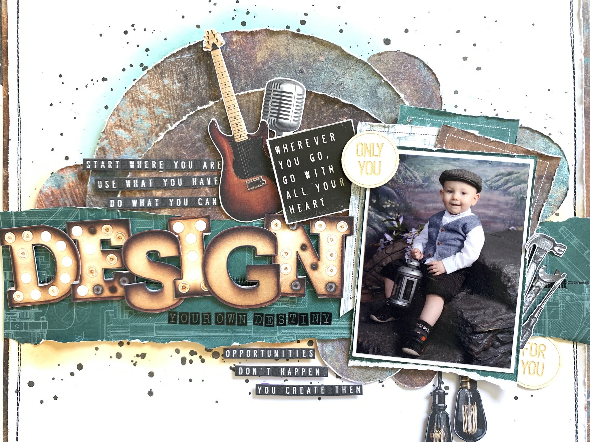
I started by cutting a large circle from Paper #3 and then cut the circle in half. I moved the two pieces around on the page a bit, trying to decide how I wanted to place them and then decided to add a torn strip of Paper #6 horizontally across the page, with the two semi-circles layered behind it. 

With my sewing machine, I stitched two lines of black thread around the edge of my page, (after trimming it down by about 1cm on two sides) not worrying about it being too neat. I also stitched across the centre of the green strip - which turned out to be pretty pointless as I covered it all up!! I then framed my background cardstock using Paper #3 to co-ordinate with the semi-circles.

I added some colour underneath the torn strip of Paper #6 using a Distress Ink in 'Rusty Hinge'. I only wanted a light amount of colour so I used a blending brush to apply the ink dry, rather than using the packaging technique. I did the same thing above the semi-circles using a Distress Ink in 'Evergreen Bough'. I finished off my background by adding some black paint splatters.


Using my circle punches, I created some smaller circles from Paper #3 and arranged them on the page tucked behind the torn strip and semi-circles. 

I matted my photo first with white cardstock, and again on Paper #6 to co-ordinate with the torn strip across the centre of the page. I then layered some of the Banner Die Cuts behind my photo, all offset to add a bit more colour and interest. Obviously this is me - so I distressed all the edges too!


Similar to my previous layout, I decided to use the letters from Paper #4 for my title and was able to spell the word 'Design'. I added this across the green strip, raised up on foam pads, and finished my title off with some alphabet stickers by American Crafts to make my title read 'Design Your Own Destiny'. 


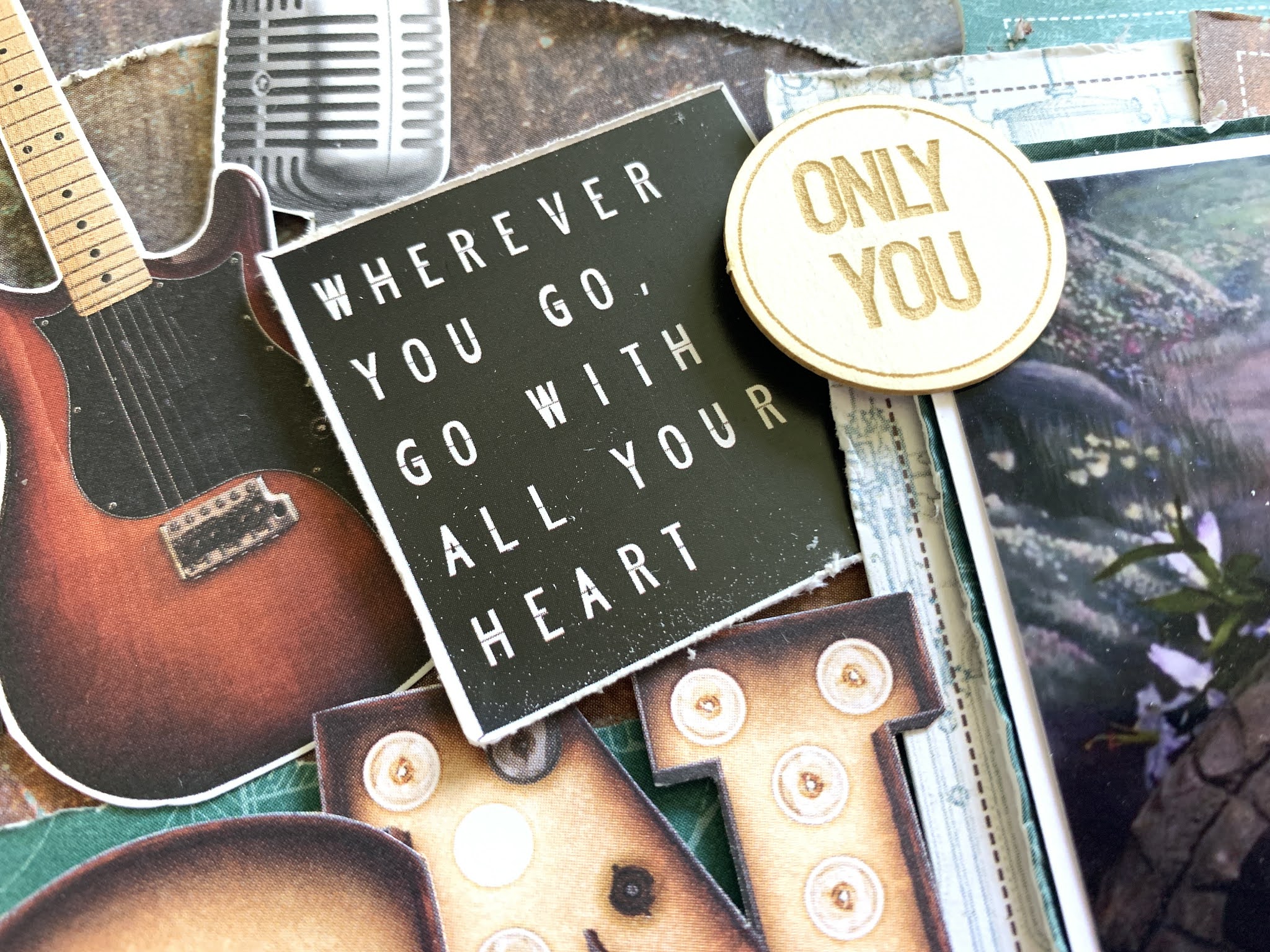
Now I could move on to embellishing. I added a sticker from Sticker Sheet #2 which says 'Wherever you go, go with all your heart' as I thought the sentiment worked really well  with my title. I added this sticker to the left of my photo, along with a couple of elements I'd fussy-cut from Paper #7


I added a few tools to the right of my photo, and some light bulbs hanging from underneath my photo - also fussy-cut from Paper #7.


This collection has some really lovely chipboard pieces in it and I have Chipboard Embellishments #6 which has 12 circular pieces. I selected two of them and placed them diagonally around my photo.


I finished my layout with a couple of sentiments cut from Paper #1. I cut them into tiny strips and placed one above my title and one below.


Thanks for reading! I'f you'd like to watch how this layout came together there is a process video up on my YouTube channel here.


I'll be back next month with a brand new collection, so until then...

Take care

Rebecca x

Friday, 11 June 2021

Adore - P13 Paper Products - Free Spirit

Hello, Rebecca here with you today. I'm working with P13 Paper Products again this month, and this time around I've been playing with the 'Free Spirit' collection, which you can find in the store here.

I only discovered P13 earlier this year, but I have absolutely loved working with their collections. Free Spirit is more of a masculine collection so it's great for scrapping the boys and men in your life. I have a set of photos of my son, taken by a professional photographer when he was about 18 months old and I've never been able to find the right collection to scrap them - but the colours in Free Spirit are perfect so I'm going to be using this collection to finally get them scrapped!


As with the other P13 collections I've worked with, Paper #7 is full of individual elements that are perfect for fussy-cutting. I was immediately drawn to the large light bulbs on this paper so was desperate to get those on this layout! I also loved the letters on Paper #4 as they have waht look like little LED lights on them. I set about cutting some of the letters out until I could make a word and I quickly came up with 'adore' which I thought was perfect for a title.


I began by arranging my photo, title letters and light bulbs onto a sheet of Premium White Cardstock and marking the area lightly with a pencil as I wanted to add some mixed media to my background. I've really fallen in love with stamping lately, so I pulled out a selection of small rubber stamps from my stash and my Jet Black Stazon Ink Pad and added lots of stamping to my background. Once I was happy with my stamping I also added black ink splatters - squeezing the paintbrush bristles to make some larger paint drops too. I used watered-down acrylic paint for this.


Happy with my background, I brought everything back onto the page to see how it looked and felt like I needed something to ground or frame the layout, so I tore some strips from Paper #5 (both sides) and added them to the top and bottom of the page. 


Ready to move on to embellishing the layout, I fussy-cut some film strip from Paper #7 and tucked it behind my photo, but wanted more! Luckily I have a filmstrip stamp, so I stamped myself some images and cut them out to add to the layout. I brought in a circular tag from Decorative Tags #1 that matched my title, and also a banner from Decorative Tags #2 which says 'Dream Big', along with a couple of other banner-type pieces from Paper #7.


I felt like the layout needed a subtle pop of colour so I matted my photo on both white and black cardstock, and then added a layer of the B side of Paper #4 to match the green-ish tones in the background of my photo. I then added some more splatters to my background in a coordinating green colour before sticking everything down.

As is normal for me - I love to have a lot of texture and dimension so I raised all of the light bulbs and my photo up on foam to give them some height. At this point I also fussy-cut an extra light bulb from Paper #5 and added it in.

Wanting more of the green colour on the page, I selected some stickers from Sticker Sheet #1 and Sticker Sheet #2, added some foam behind them and positioned them along the edges of my torn paper strips.

On to the finishing touches - I added some more large black paint splatters and then selected a phrase from Paper #1 which reads 'You have the World at your feet', cut each word out individually and then stuck it onto one of the banner-type pieces I'd fussy-cut from Paper #7. 

The layout was then completed with the addition of some black embroidery thread through the tag and also to one of the light bulbs as there was one that didn't have a 'cable' for it to dangle from.


Thank you very much for reading. If you'd like to watch how this layout came together, there is a video up on my YouTube channel which you can find here.

I'll be back later in the month with another layout using this collection, so see you then!

Take care

Rebecca x 


Thursday, 6 May 2021

Always Look On The Bright Side of Life - P13 Paper Products - Soulmate

Hello, Rebecca with you today sharing an extra layout I've created using the Soulmate Collection from P13 Paper Products. I actually had this layout all planned out before this collection had even landed on my doormat, but it's ended up being the third layout I've created! I was inspired by a layout I'd seen on Pinterest that had two oversized banners and that was the basis for this layout.


I selected Paper #06 and Paper #03 and cut two large banners from them - making one slightly larger than the other. I then layered them on top of each other, slightly offset, and machine stitched them together along the top with a couple of messy lines of black stitching.

Still on my 'avoid white cardstock' drive, I decided to use the gorgeous woodgrain B side of Paper #01 for my background, but jazzed it up slightly by adding some simple mixed media. I added some stamping in Jet Black Stazon Ink and on top of that, paint splatters in gold, black and white. I did the same thing with the banners and then drew a doodled black border around them to add some interest.

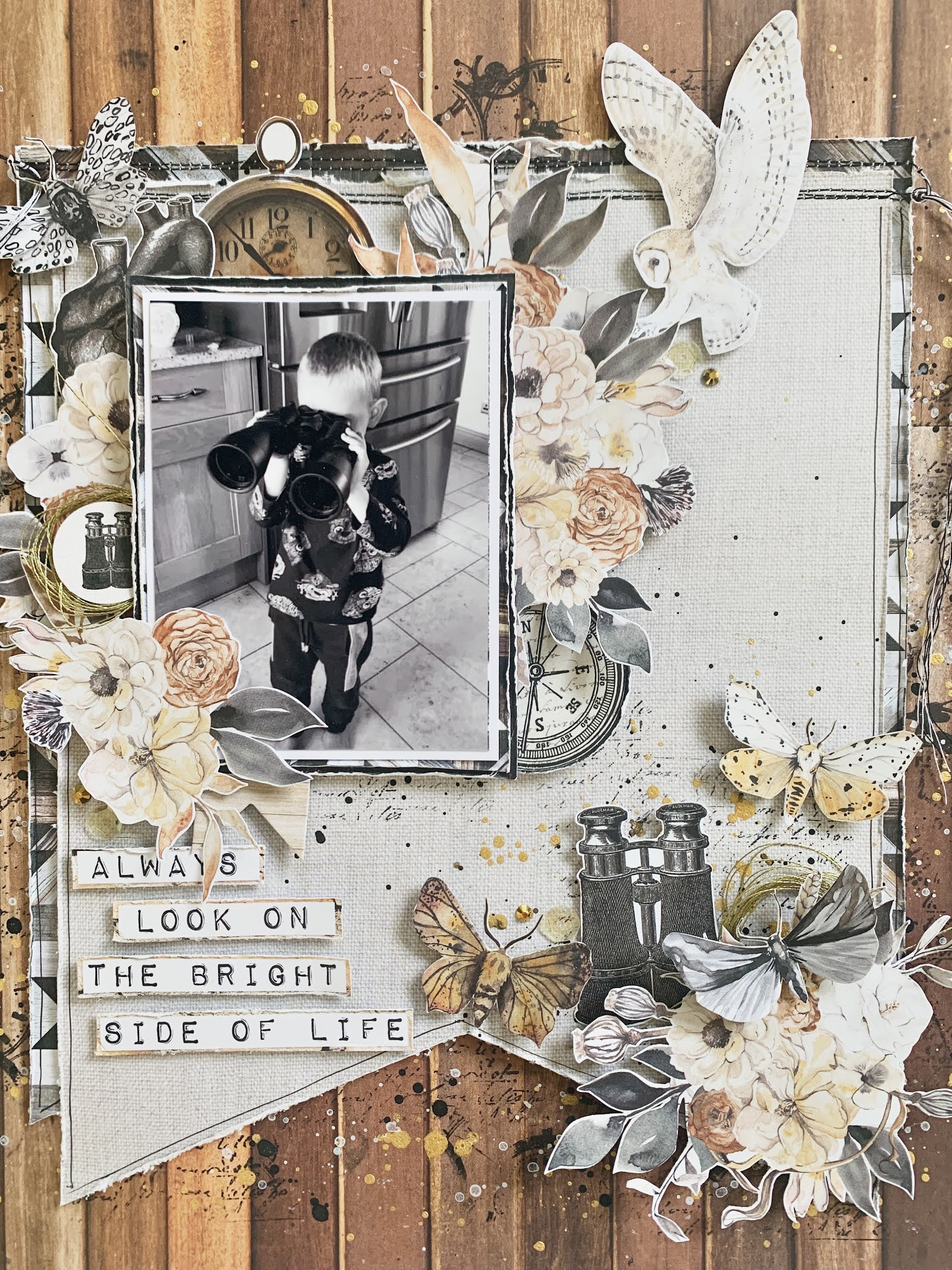
I matted my photo with a couple of layers of patterned paper - I've used Paper #03 again, and also the B side of Paper #02 to bring in some darker tones behind my photo to give it some separation from the background. My photo is of my little boy last summer, looking through my parents binoculars which I thought would work really well with this collection seeing as it has a couple of elements with binoculars on!

I then set about the fun part of embellishing my layout. This is the part I find most enjoyable with the P13 collections because everything 'goes' really well. I spent some time fussy-cutting lots of elements from several of the patterned papers. The floral clusters are from Paper #02, the moths are from Paper #03 and pretty much everything else on the layout is from my favourite - Paper #07.

I built up a large cluster around my photo in the top left corner, and then created a second cluster in the bottom right corner to balance the page out. I nestled a pair of binoculars in the smaller cluster and I just love how it looks!

I wanted to incorporate some circular elements to the layout as the two rounded lenses on the binoculars in the photo were really standing out to me. I placed a sticker from Sticker Sheet #03 with a thread tangle behind it - of course using my favourite WRMK Metallic Gold Thread - to the left of my photo.

To bring a circular element to the other side of my photo, I used a compass from Cardstock Tags #1.

It was at this point that I realised I didn't have a title on my page, and I hadn't left a massive amount of space for one either! I had a look through the patterned papers and found a cut-apart element with the sentiment 'Always look on the bright side of life' on Paper #05. I cut the words out, leaving a very thin border and raised them up on foam pads before adding them to my layout.

The final touch to my layout was to add a couple of sequins and bronze coloured jewels.

If  you'd like to watch how this layout came together, there is a process video up on my YouTube channel, which you can find here.

I'm sure this won't be the last you see of me using this collection - I love it so much that I couldn't resist adding a few more bits to my basket!

I'll be back next week, sharing my first layout using the new Color Study Collection from Vicki Boutin.

Until then take care,

Rebecca x