Showing posts with label Die Cut Ephemera. Show all posts

Monday, 27 April 2026

Wonder - 49 and Market - The Looking Glass Collection

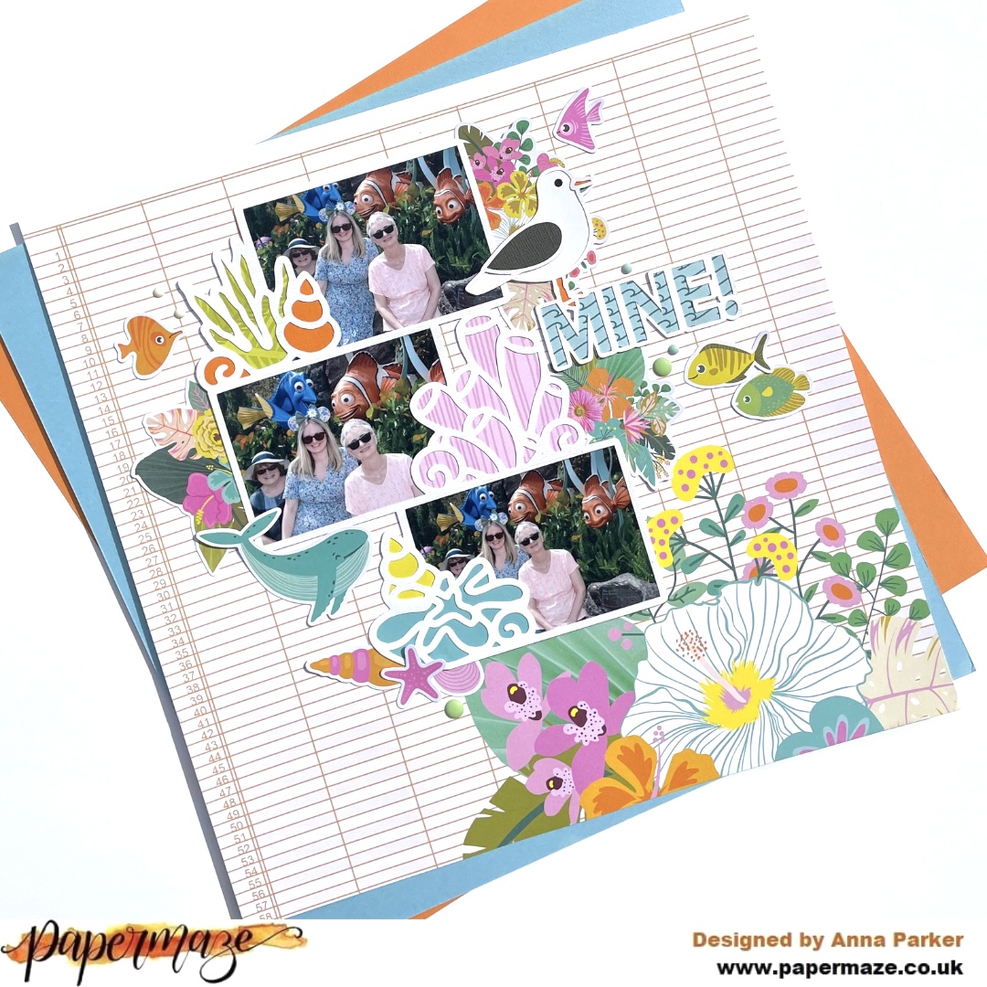
Hi everyone, Rebecca here, sharing my second layout of the month. I’ve absolutely loved designing with 49 and Market’s 'The Looking Glass' collection—it’s incredibly versatile and a joy to work with. You can find the full collection in the shop here

The photos featured on this layout were taken at the same time and location as those on my first layout this month, so I’ve kept a similar colour palette. This allows both pages to sit beautifully side by side in an album.


To begin, I selected two of the larger looking glass die cuts from the Wildflower Laser Cuts. I wanted to use the circular elements to frame my photos, so I arranged them centrally on the page, with the handles extending outward toward the corners. Around the handles, I added some of the charming woodland elements from the Laser Cut Elements, including a small cottage, rocks with toadstools, and a tree stump.

I then built up these clusters using the Wildflower Laser Cuts, incorporating both larger floral pieces and smaller accents to add depth and dimension with ease.


In the centre of the page, I added my title—“Wonder”—from the Chipboard Set. I love the impact of a simple one-word title, though these chipboard elements can easily be combined to create longer phrases. I also included an additional chipboard phrase in the lower cluster to help extend the design and create a better sense of flow across the page.


To add more interest to the background, I chose a subtle patterned paper and tore two sections from it. I positioned these in the areas on either side of the looking glass elements that were left unembellished. This not only introduced extra colour and texture but also helped fill some of the empty space.

With all the elements adhered in place, I moved on to adding mixed media. For continuity, I used the same shade of Distress Oxide Ink Pad —'Iced Spruce'—as in my previous layout. It perfectly matches my son’s jacket, making it an ideal choice. I always enjoy pulling colours from my photos into my designs to create a cohesive look.

I diluted the ink slightly and first applied it to a sheet of Premium White Cardstock using a brayer. To soften the effect and avoid any harsh blocks of colour, I also used the packaging technique in selected areas.


Thank you so much for reading. I hope you’ve enjoyed seeing the layouts I’ve created with this beautiful collection and that they’ve inspired you to get creative with it yourself.

Take care, 


Rebecca xx

@preciouspagespapercraft


Monday, 21 July 2025

Keep Your Light Shining - Mintay Papers - Lighthouse Collection

Hi everyone, it’s Rebecca here with my final layout of the month.

Can you believe how fast July has flown by? This month, I’ve been working with the beautiful Lighthouse collection by Mintay Papers, and I’ve absolutely loved it. The deep, moody colours in this collection are so inspiring—it’s been a real joy to create with. You can find the full collection in the shop here.


For this layout, I decided to be a little brave and chose Paper 05 for my background. It’s much darker than what I usually go for, but I was really drawn to its rich shades and intricate details. I just had to give it a go!

I started by layering several papers from the 6x8 Add-On Paper Pad, carefully selecting lighter tones to contrast with the dark background. I distressed all the edges to add texture and visual interest—the white torn edges reminded me of ocean foam, which felt perfect for this coastal theme.

To enhance the beachy vibe, I incorporated some hessian, netting, and cheesecloth into my layers. These textures brought the layout to life. I used a couple of staples to secure everything, making sure to place them in the centre of the pieces so they wouldn’t be visible once the layout was complete.


No beach layout is complete without a lighthouse, right? I fussy-cut one from the 6x8 Add-On Paper Pad and nestled it into my paper layers. For the photo, I mounted it on a lighter patterned paper to help it stand out against the dark background.

Around the photo, I added embellishments using pieces from the Paper Die Cuts and Paper Elements packs. There are so many goodies in these sets! You can even stretch the collection further by fussy-cutting images from Paper 09 to create your own unique embellishments.


For the title, I chose a phrase from the Paper Stickers Words sheet and popped it up on foam pads for dimension. I placed the title in two staggered lines just beneath the photo to create a balanced look.


To finish the layout, I added lots of metallic gold and white splatters across the page. I love how the splatters help break up the dark background and bring light and energy to the design.


Thanks so much for stopping by! I’ve had such a great time creating with this stunning collection, and I hope you’ve enjoyed following along. It’s available in the store now, and I can’t wait to see what you all make with it!

Take care,
Rebecca xx 

@preciouspagespapercraft


Monday, 7 July 2025

Lighthouse by the Sea - Mintay Papers - Lighthouse Collection

Hi everyone,

It’s Rebecca here on the blog today, and I’m so excited to share my first layout using the brand-new Lighthouse collection by Mintay Papers. As a lifelong lover of lighthouses, I was absolutely thrilled to get my hands on this stunning collection! You can find the collection in the store, here.


To begin, I chose the beautiful dark blue woodgrain paper and cut a section roughly 7 inches wide. I tore along the top and bottom edges, then added extra texture by distressing them with my fingernails. On either side of this main panel, I added slightly shorter strips of a striped woodgrain paper from the 6x8 Paper Pad to bring in a bit of contrast and visual interest.


I matted my photo on a lighter paper from the 6x8 paper pad, then layered it on top of the background. I love how the contrast between the dark and light papers really helps the photo stand out!


Behind the photo, I tucked in one of the large tags from the Paper Elements pack, and added two smaller tag-shaped die cuts above the photo, also from the same pack.

To the right of the photo, I added a large fussy-cut lighthouse. It fits the layout perfectly — especially since the photo was taken with the Needles Lighthouse in the background! 


I built a small cluster of coordinating Paper Die Cuts on that same side to add balance and depth.


For the title, I used stickers from the Paper Sticker Words, sticking them onto white cardstock first and then fussy cutting around them. This gives them a bit more sturdiness and helps them pop on the page.


I was so tempted to add some white paint splatters to tie the layout together — but I couldn’t quite decide! I might still add them before this page finds its home in my album.

I hope you’ve enjoyed a look at my first layout using this gorgeous collection. 


Thanks so much for stopping by — I’ll be back later in the month with more inspiration!


Take care,


Rebecca xx

@preciouspagespapercraft. 

Monday, 26 May 2025

Courageous - 49 and Market - Rust & Revs 2.0 Collection

Hi everyone!

It’s Rebecca here, and today I’m excited to share my latest layout, created using the fabulous Rust & Revs 2.0 Collection from 49 and Market. If you loved the original Rust & Revs collection, you’re going to adore this new release by Dennis Bruton! The two collections are distinct enough to stand on their own, but they also coordinate beautifully—perfect for mixing and matching! You can find Rust & Revs 2.0 here.


To start, I cut strips from various patterned papers in the 12x12 Collection Pack and layered them to add depth and interest. I also incorporated a chipboard frame from the Chipboard Words and Phrases, which I cut in half so each piece could peek out from either side, introducing a fun pop of texture.


I mounted my photo using a coordinating solid cardstock from the 12x12 Solids Pack —choosing yellow to echo the yellow seat in the photo. To give it extra dimension, I raised the photo on a layer of adhesive foam.

Next, I tucked in a couple of pieces from the Die-Cut Elements —a tag above the photo and a tab to the left—for added detail and balance.

One of my favourite 49 and Market products is the Laser Cut Out Elements —I’m always amazed by how much they pack into a single set! For this layout, I chose a chain link design and positioned a small section above and below the photo, along with a yellow quad bike for a fun focal point. To bring in a touch of green, I added Laser Cut grass on either side, tying it all together with the green in my photo.


For the title, I chose the chipboard word "courageous." It felt fitting—my son is often anxious about new things, but he’s always shown such bravery when it comes to driving his grandad’s tractor. This year was extra special, as he finally grew tall enough to reach the pedals on his own, no help from mum needed!


Once all my layers and embellishments were in place, I turned my attention to the background. While I usually love leaving white space on my layouts, this one felt a little too bare. So, I added a touch of mixed media to bring everything together.

I began by applying a few Rub-On Transfers —I always add these before any ink work so the designs remain crisp and visible. Then, using a mini brayer, I applied some black Distress Oxide Ink for a distressed look and finished with black acrylic paint splatters for added texture and movement.


As a final touch, I added a couple of Epoxy Coated Stickers to finish off the page just right.

Thanks so much for stopping by—I hope you’ve enjoyed seeing what I’ve created with this amazing collection. I already know it won’t be the last time I reach for Rust & Revs 2.0!

Take care,
Rebecca x

@preciouspagespapercraft

Wednesday, 15 January 2025

Winter Wishes - Simple Stories - Simple Vintage Fresh Snow Collection

Hi everyone,

It’s Rebecca here, and I’m excited to share my first layout of 2025 with you today! This month, I’m working with the beautiful Simple Vintage Fresh Snow collection from Simple Stories. From the rich colours to the delicate patterns, I’m absolutely in love with everything about it. You can find the full collection in the shop here.

I’m a huge fan of woodgrain papers, and this collection includes a stunning grey woodgrain design with soft foliage accents in the corners. Naturally, it was the first paper I reached for. I cut a 6-inch wide strip, making sure to include some of the foliage at both the top and bottom. I wanted the paper to be centred on the layout but didn’t want it to extend from top to bottom. Trimming either end would have meant losing the beautiful foliage, so I decided to cut out a section from the middle and then reassemble the two pieces with tape on the back. I knew I could hide the seam with careful embellishment placement. With this done, I distressed all the edges to introduce some texture.


To complement the dark navy in my photo, I chose a darker patterned paper and tore a section to add some contrast to the lighter woodgrain. The mix of darker and lighter tones really made the page pop.

Next, I placed my 3x4-inch photo in the centre of the layout, but something about the sharp edges didn’t feel quite right. I wondered if a circular photo would balance the design better. Noticing a lot of brown tones in the embellishments, I decided to create a frame for the photo using a brown patterned paper.

Using a set of metal nesting dies, I die-cut three circles from a strip of patterned paper, making sure they were perfectly aligned. Rather than using the circles themselves, I opted to keep the negative space, which would typically be discarded. This leftover piece became the perfect frame for my photo. I adhered the photo behind the middle circle and trimmed the edge circles to leave them open. Then, I angled this strip across the layout for added interest.


With my papers and photo in place, it was time to embellish. I selected a few of my favourite pieces, including florals from the Floral Bits and Pieces and a sweet birdhouse from the Cardstock Stickers. I raised everything on foam pads to add dimension and arranged them in two clusters around the photo.


To finish, I added some Rub-Ons peeking out from behind the floral clusters. The Simple Stories rub-ons are so easy to apply and give a lovely texture to the page. I completed the layout with a couple of small hearts from the cardstock stickers.


Thanks so much for reading! I hope this layout inspires you. The Simple Vintage Fresh Snow collection is truly gorgeous, and I can’t wait to see the beautiful creations you make with it.

Take care,
Rebecca x 
@preciouspagespapercraft

Thursday, 26 September 2024

Thankful - 49 and Market - Vintage Orchard Collection

Hi everyone, it's Rebecca with you today sharing my second layout of the month. I'm still loving working with the Vintage Orchard collection from 49 and Market - more so now the weather has turned that little bit more autumnal! Anybody else scrap with the seasons? It may be a bit weird but I'm not one for scrapping summer in autumn, and spring in winter etc... I find my inspiration and creativity flow better working with the current season. You can find the full collection in the shop here.


For today's layout I really wanted to use the black woodgrain patterned paper from the collection, but felt like it was a bit too much as a background and felt like I needed some empty space on the page to balance it out. To achieve a more balanced feel, I cut the woodgrain paper into smaller strips, distressed the edges and arranged them in the centre of a sheet of Premium White Cardstock. To add a bit more detail to these strips, I applied torn sections from the Washi Tape Sheets and I love the look that this has achieved.


Not wanting to cover up all the washi, I decided to just scrap with one photo today. I've used one of the Stacked Frames to house my photo, with a journalling card from the Ephemera Bits to bring in more of the copper shade that features in my photo. I positioned my photo over on the right hand side of the page, and using some of the die-cuts from the Laser Cut Elements and Laser Cut Wildflowers, I built up a small cluster in the corner.


For the title, I've used a die-cut from the Ephemera Bits. I've gone for a bright green title to bring a pop of colour to the page. 


To help balance the layout, I've created a smaller cluster using die cuts to the top left corner of the layout. On top of both clusters, I've added a chipboard phrase from the Chipboard Set.


To add some details to my background, I've applied some Rub-On transfers from both the Botanicals Rub-Ons and the Essentials Rub Ons. I absolutely adore 49 and Market rub ons - the packs are so generous and they are so easy to apply. I love how they give my background a mixed-media effect with very little effort from me!

To finish the layout, I slotted in a couple of notebook edge die cuts from the Laser Cut Elements and some of the Wishing Bubbles and Baubles stickers. 


Thanks so much for reading. I hope you like the layout and it offers you some inspiration. This stunning collection is available in the shop now so grab it before it sells out!

Take care

Rebecca x 

@preciouspagespapercraft


Wednesday, 5 June 2024

Coastal Memories - Mintay Papers - Coastal Memories Collection

Hi everyone, it’s Rebecca with you today sharing my first layout for June. I really can’t believe it’s June already! I’ve just had the May half term at school, so now we are back for the last stretch before the summer holidays and so my mind is thinking ahead to our upcoming holiday and beach days etc. It got me in the mood for scrapping some beachy photos and so this month, I’m working with the Coastal Memories collection by Mintay Papers, which you can find in the shop here.

I love the neutral tones in this collection with hints of cool blue. I’m a bit of a sucker for anything coastal/nautical related so I immediately noticed all the ships wheels and starfish etc in this collection. 


I began by fussy cutting a large cluster from the top of Paper #2. I loved the composition of this cluster and how it had florals dangling down. It lent itself well to a circular photo at the top. 


I decided to position this fussy-cut cluster in the centre of a sheet of Premium White Cardstock. I adhered my photo to the cluster, and then introduced some of the Paper Die Cuts either side of my photo. I raised the die cuts up on foam pads to introduce some dimension and to make the whole cluster look more three-dimensional. 


For my title, I’ve used two of the stickers from the Paper Word Stickers. I stuck these to some white cardstock and then cut around them. This helps make them a bit more sturdy, and meant I could easily raise them up with foam. My title sits nicely under my photo. 


Once I had the elements stuck together as one piece, I was able to lift it off the page easily to enable me to add some mixed media to the background. 


The ‘Iced Spruce’ shade of Distress Oxide  matches this collection so beautifully. Mixing some of the oxide ink with water, I applied it to my background with a brayer just to the centre of the page where my cluster would sit. I then went over some areas, applying the ink directly to the cardstock with a blending brush. This gave a bit of variation in the shading, and allowed me to have more of a curved shadow of ink behind the top of my photo. Next, I added some splatters of ink in the same shade, and finished off the background with some stencilling. I’ve used a Tim Holtz stencil and applied the ink using my blending brush. I chose this stencil as it’s quite a rustic pattern, and reminds me a little of an old fishing net. 


To a couple of places, I added some roughly cut cheesecloth to add a bit of texture to the page. I always love using cheesecloth or hessian on coastal pages. I’ve also added tiny bits of faux-seaweed. I’ve not gone over the top with the seaweed because I wanted it to complement the page, and not be too distracting. I’ve also positioned a few of the Paper Word Stickers running diagonally in line with my title, and extended this line with a couple of die cut seagulls. 


I then finished the layout off with the addition of a couple of jewels to remember water droplets, and some Sequins to add a little sparkle. 


Thank you so much for reading. I hope you’ve enjoyed this layout and much as I enjoyed making it. Don’t forget to check out this stunning collection in the shop!


Take care,


Rebecca x

@preciouspagespapercraft

Monday, 20 May 2024

Simple Stories ~ Just Beachy #2 🐠

Hi all, it’s Anna back with you today. I’m sharing my second layout using Simple Stories - Just Beachy. 
You can find it in the shop here


To create this layout I used ‘Follow the Sun’ as my base. 
I then found a couple of cutfiles that I wanted to use alongside my Finding Nemo themed photos. 


I added three photos to the frames of the cutfile and then backed the seaweed, coral and shell elements with patterned paper from the collection


This MINE cutfile was perfect for a finding Nemo theme, I backed it using ‘High Tides’ and some scraps of appropriately coloured cardstock for the seagull!


I picked out the sea elements from the Bits and Pieces pack and used them to add clusters around the cutfile. 


I added a few enamel dots, I placed some of these near the fish to resemble bubbles! 


I used the floral bits and pieces to tuck around the cutfile, further extending the large florals on the paper. 


Thanks so much for looking! 
See you next month. 

Anna
X

@acraftylifewithanna

Friday, 3 May 2024

Simple Stories ~ Just Beachy #1 ☀️

Hi, it’s Anna back with you today! This month I’m working with the fabulous, bright and summery ‘Just Beachy’ collection by Simple Stories. 
You can find all of the lovely pieces in the collection here


For this layout I’ve used a grid cutfile by Paige Evans. I love to create grid layouts and a grid style cutfile is right up my street too!
The cutfile did have an additional two images on it, but I trimmed those off so that I could get in a couple more pictures! I have so many photos from our Florida holiday, I need to get in as many as I can on my layouts! 


I started by printing out the pictures I wanted to use in squares and mounting them to the empty square sections of the cutfile. I then backed the images in the cutfile using patterned paper from the collection as well as coordinating cardstock. 


Once my cutfile was complete I adhered it onto bazzill cardstock, which was also in the cardstock matchmaker pack. I am normally a white background kind of girl, but I fancied trying something bolder! 


I then added a few pieces from the Bits and Pieces pack dotted on the grid around the photos.


I added a journaling circle from the Pretty Little Studio Good Vibrations Die Cuts, which fitted in the middle of the sun perfectly. I will add my journaling to this space. 


Thanks so much for looking!
 See you later in the month with another layout using this collection.
 
 Anna 
X

@acraftylifewithanna