Showing posts with label rub ons. Show all posts

Monday, 9 February 2026

A Moment in Time - 49 and Market - Nostalgic Memories Collection

Hi everyone, it’s Rebecca here, and today I’m kicking off February with a brand-new collection from 49 and Market – Nostalgic Memories. This is such a beautiful collection, and I can easily see it working across any season. I’ve used it to document a photo taken last autumn, as I loved how perfectly the colours echoed the leaves scattered on the ground. You can find the full collection in the shop here.


I began by selecting a patterned paper for my background. I’m always drawn to designs with subtle detail—something that adds interest without overpowering the layout. Once I’d chosen my background, I picked out a couple of contrasting papers and cut small hexagons from them using my metal dies. I paired a busy floral pattern with a solid paper featuring very soft detailing, then arranged the hexagons in a tight, central design across two rows.

On top of the hexagons, I positioned my photo. Normally, when I use a repeated shape on a layout, I like to mirror that shape with my photo. However, it just didn’t feel right this time, so I opted for a smaller square photo instead. I printed the photo twice and layered them with white borders to help them stand out against the deeper tones of the collection.


To the right of the photo, I added my title from the Chipboard Words pack, raising it on foam pads to create some dimension. I love how both the title and the photos feature white borders—this small detail brings a lovely sense of consistency to the page.


Around the photos and title, I embellished with some of the elegant florals from the Laser Cut Florals. The colours work beautifully with the leaves in my photo and almost feel like they’re flowing straight out onto the page.


To add even more detail to the background, I applied some of the Blendable Rub-On Transfers. These are such an easy way to add delicate detail with minimal effort, and they really elevate the finished layout.

To tie everything together, I finished the page with Distress Oxide Ink in 'Victorian Velvet', applied with a blending brush around the edges of the page and lightly over the rub-ons for a soft, blended effect. I then completed the layout with a few ink splatters in the same shade.


Thank you so much for reading. Don’t forget to check out this gorgeous collection in the shop.

Take care,  
Rebecca xx

@preciouspagespapercraft


Wednesday, 12 November 2025

Memories - 49 and Market - Echoes of Time Collection

Hi everyone!

It’s Rebecca on the blog with you today, sharing my first layout for November. This month, I’m working with the beautifully elegant 'Echoes of Time' collection from 49 and Market. I absolutely love the soft purple and grey tones in this collection — they have such an earthy feel, while the elements give off a whimsical “Alice in Wonderland” vibe. It’s such a versatile range and perfect for documenting all kinds of memories and photos. You can find the full collection in the shop here.


To begin, I cut strips from two patterned papers and one of the more solid cardstocks, layering them in the centre of a sheet of Premium White Cardstock. I tore the top and bottom edges of each strip to add texture and visual interest before positioning my photos on top. I printed my photo twice, with a white border, and layered them slightly offset — one of my favourite techniques at the moment because it adds such lovely depth and movement to the page.


Beneath my photo, I added my chipboard title “Memories” from the Chipboard Bits pack. Behind this, I layered in some Wildflower Laser Cuts elements and then mirrored this cluster in the top-right corner to help balance the composition. I also tucked in a few smaller icons from the Laser Cut Elements for extra detail.


Once all these elements were layered together, I could move everything on and off the page in one piece while working on the mixed media background.

I began by adding some of the new Irresistible Rub-Ons — such a fun addition to the collection! They apply white and resist ink, which really makes them pop. I chose one of the new 49 and Market x Ranger Ink Pads in the shade Lavender Kisses. After watering the ink down slightly, I ran a small brayer through it and rolled it vertically over my background. This created a soft, blotchy effect that faded towards the edges. Once the ink was in place, the rub-ons really stood out beautifully. I finished the background with some subtle stamping using 49 and Market rubber stamps and a coordinating ink in the shade 'Fossil'.


When everything was dry, I adhered my layered photos and embellishments onto the background, adding a little foam behind for extra dimension.

Thank you so much for stopping by today! I hope my layout inspires you to get creative with this timeless collection.

Take care,


Rebecca xx
@preciouspagespapercraft

Friday, 22 August 2025

Wonderful Adventure - 49 and Market - Botanical Buzz Collection

Hi everyone,

It’s Rebecca here, back on the blog! Today I’m sharing my final layout using the beautiful Botanical Buzz collection from 49 and Market. This collection has been such a joy to work with—every single element is just gorgeous! You can find it in the shop here.

To start, I cut several small hexagons from different patterned papers in the 6x8 Paper Pad. I love having this smaller pad on hand—it means I don’t have to cut into the larger 12x12 sheets just for a small shape. After playing around with the layout a bit, I arranged the hexagons on a sheet of Premium White Cardstock. Some I adhered flat, while others I raised on foam pads to add a touch of my signature dimension.

On the left side of the design, I placed my photo inside one of the hexagonal frames from the Die Cut Elements. I also popped the photo up on foam for extra depth and to balance the overall layout.


Next, I added my title to the right of the photo, bridging the gap between the photo and the hexagons. The Chipboard Words in this collection are absolutely stunning and make it so easy to choose the perfect title for your page.


To draw more attention to my photo, I created three small floral clusters using the Laser Cut Elements, placing them in a triangle around the photo. It’s a classic design technique that helps guide the viewer’s eye—one I remember learning when I first started scrapbooking. That said, I don’t always stick to 'rules'. I like to do what feels right creatively!

To finish off the page, I added a few details to the white background. I used Rub-On Transfers around the edges of the layout and even applied a few directly onto the patterned paper hexagons. Then, for a final flourish, I added some metallic gold paint splatters.

Thanks so much for stopping by. I hope you’ve enjoyed the layouts I’ve created with the Botanical Buzz collection and that they’ve inspired you to get crafty with this stunning range.

Take care,

Rebecca xx

@preciouspagespapercraft 

Friday, 8 August 2025

Let’s Explore Together - 49 and Market - Botanical Buzz Collection

 Hi everyone!

It’s Rebecca here, and I’m so excited to be sharing my first layout for August. This month, I’m working with the absolutely stunning Botanical Buzz collection by 49 and Market. Designed by the incredibly talented Dennis Bruton, this collection truly left me in awe. You can find the full range in the shop here.


To get started, I chose a couple of large hexagon frames from the Die Cut Elements pack. This pack includes three sets of nesting hexagons, each in a different colourway. I wanted two frames of the same size, so I trimmed a larger one down and pieced it back together—problem solved! I set the hexagons aside and flipped through the 6x8 Paper Pad to select a couple of papers for layering.

I cut a fishtail-ended strip, distressed the edges, and placed it in the centre of a sheet of Premium White Cardstock, along with the two hexagon frames. I then added my photo, which I matted with a couple of contrasting papers to make it pop. As always, I backed the photo with foam to give it some dimension and ensure it stands out.


For the title, I used one of the Chipboard Words, positioning it in the bottom corner of my photo. I layered some Laser Cut florals and leaves behind the title—and to balance the design, I added similar florals to the opposite side of the photo.


To add depth and texture, I tucked a Laser Cut wooden fence behind the paper layers and hexagons. While it looks like the fence runs all the way across the page, I actually cut it into two smaller pieces and placed them on either side of the photo—saving the centre piece for another project!

Above the photo, I layered in a tag, a ticket stub, and the cutest little lamppost. While it doesn’t relate to the photo or memory, it was too adorable not to use! All of these pieces came from the Die Cut Elements  pack.


Although I loved the colours on the layout, the bright white background felt a bit stark—so I turned to mixed media to soften things. I started by applying Distress Oxide in the shade ‘Speckled Egg’ using the tried-and-true ‘packaging technique.’ I then used the same ink to add splatters with a paintbrush. For a touch of shimmer, I added some metallic gold splatters as well.

To add even more texture, I brought in some stamping. Since black ink would have been too harsh against the soft tones, I chose Stazon Ink in the shade Stone Grey. Using a mix of 49 and Market and Sizzix stamps, I stamped several images around the edges of my design.

Finally, I finished off the background with some of the gorgeous Rub-On Transfers—opting for several yellow and green hexagons to tie the whole page together.

Thanks so much for stopping by and reading! Botanical Buzz has quickly become one of my all-time favourite 49 and Market collections, and I can’t wait to see what you all create with it.

Take care,
Rebecca xx

@preciouspagespapercraft

Friday, 9 May 2025

Determined - 49 and Market - Rust & Revs 2.0 Collection

Hi everyone!

It’s Rebecca here, and I’m excited to share my first layout of the month with you. This time, I’m creating with the Rust & Revs 2.0 collection by 49 and Market—a stunning release designed by Dennis Bruton. Whether used on its own or paired with the original Rust & Revs collection, it offers incredible versatility and creative potential. You can find the collection in the shop here.


I instantly fell in love with several of the patterned papers in this collection and knew I wanted to showcase a few of my favourites. I chose three designs and used metal nesting dies to cut various-sized circles. These were then layered onto a sheet of Premium White Cardstock, creating a central focal point. To finish the layered look, I added a circular photo right on top.


Below the photo, I positioned my title, which I chose from the Chipboard Words and Phrases set. Since the title has a bold, blocky shape, I trimmed the bottom of my photo and circles in a straight line to mirror its structure and give the design a more cohesive feel.


With plenty of space on either side of the photo, I dived into the embellishments. I selected several Laser Cut Elements from the collection to build two main clusters. To add depth, I used foam pads under some elements. I also tucked in a tag from the Die Cut Elements and even repurposed a film strip from the laser-cut packaging—such a great way to squeeze a few extra goodies out of your supplies!


Once my clusters were complete—but before adhering everything to the background—I added some mixed media to bring the layout to life. Using Distress Oxide Inks in Twisted Citron and Black Soot, I rolled colour onto the cardstock with a mini brayer, making sure it peeked out from behind my main design.


To finish, I added Rub-On Transfers and bold black paint splatters for extra texture and drama.

Thanks so much for stopping by! I’m absolutely loving working with this collection and can’t wait to be back at the end of the month with another layout to share.

Take care, 
Rebecca xx

@preciouspagespapercraft


Monday, 24 February 2025

Wonderland - Stamperia - Create Happiness Dewdrops Collection

Hello Friends!

It’s Rebecca here on the blog today, and I’m excited to share my second layout of the month, created using the beautiful Create Happiness Dewdrops collection by Stamperia. I’m so glad I stepped outside my comfort zone and experimented with this collection—it’s been such a joy to work with! You can find the full collection in the shop here.


I’m absolutely smitten with the patterned papers in this collection. Many of them feature exquisite details along the edges, making them perfect for backgrounds. For this layout, I chose the Flower Corner paper, which has stunning florals and text running down the sides. It left a perfect open space in the center, giving me just the right area to build a central design.

I began by tearing a strip of the same paper—this time, using the beautiful woodgrain design on the reverse. I positioned this strip vertically down the centre and placed my photo (framed with one of the die cuts from the Adhesive Paper Ephemera) right on top.


To add some extra flair, I used a metal die to cut out a viewfinder shape from the Wood paper. After cutting it in half, I positioned the two halves on either side of the woodgrain strip. From there, I began building clusters around these elements, using florals from both the Adhesive Paper Ephemera and the Die Cuts. I also added a third cluster beneath my photo with a filmstrip die cut, a coffee cup die cut, and a floral piece. For the title, I selected one of the chipboard words and placed it on top of the cluster. I absolutely love how the little coffee cup is nestled in—perfectly fitting, since the photo was taken in a Starbucks coffee shop!


To finish the page, I couldn’t resist adding a few of the Pinecones and Flowers Rub Ons. I placed tiny bubbles on the background and created my own epoxy flair by applying a rub-on to some patterned paper, then punching it out with a 1-inch circle punch. I topped it off with a domed epoxy sticker for extra dimension.


Thank you so much for stopping by! I hope these layouts inspire you to step outside your comfort zone and try something new.

Take care,
Rebecca x 

@preciouspagespapercraft

Monday, 27 January 2025

Winter - Simple Stories - Simple Vintage Fresh Snow Collection

Hi everyone,

Rebecca here, back on the blog today to share my second layout of the year! This month, I’ve been working with the gorgeous Simple Vintage Fresh Snow collection from Simple Stories, and it’s absolutely perfect for winter. I’ve been hoping for snow every week just to gather some beautiful photos to scrapbook with it! (I'm still hoping!!) You can find the full collection in the shop here.


To start, I cut strips from both the Snug & Warm and Winter Wishes patterned papers. After rolling one edge of each strip for added texture, I arranged them horizontally across a sheet of premium white cardstock, overlapping them slightly.

Next, I added my photo, which I matted with a lighter patterned paper to help it pop. To the left of the photo, I placed an element from the Ephemera Pack, and above it, I added a tag which I'd fussy-cut from the Tag Elements patterned paper.


At this point, I felt the white background was washing out the lighter grey woodgrain patterned paper, so I tested out a few patterned papers as my background before settling on the Cabin Fever paper. I really love the leafy pinecone detail in the corners, and wanted to incorporate more of that to help my design flow with the background. I chose some beautiful elements from the Floral Bits & Pieces and added them diagonally, following the natural design of the background. To add some dimension, I raised the edges of these pieces with foam.


To bring a touch of sparkle to the layout, I added a few clusters of metallic silver thread. I love using silver with snow layouts, as it reflects the silvery glisten that snow often has, creating a nice cohesive feel.

For the title, I chose the word "Winter" from the Bits & Pieces pack. The darker letters really stand out against the soft tones of the layout, making the title pop.


To finish the layout, I created two small clusters of stars and snowflakes using die cuts from the Floral Bits & Pieces and Foam Stickers, and added a couple of Rub Ons for that final touch.

Thank you so much for reading! I hope this layout has inspired you to create something beautiful. The Simple Vintage Fresh Snow collection is selling fast, so be sure to grab it before it’s gone!

Take care,
Rebecca x 
@preciouspagespapercraft

Wednesday, 15 January 2025

Winter Wishes - Simple Stories - Simple Vintage Fresh Snow Collection

Hi everyone,

It’s Rebecca here, and I’m excited to share my first layout of 2025 with you today! This month, I’m working with the beautiful Simple Vintage Fresh Snow collection from Simple Stories. From the rich colours to the delicate patterns, I’m absolutely in love with everything about it. You can find the full collection in the shop here.

I’m a huge fan of woodgrain papers, and this collection includes a stunning grey woodgrain design with soft foliage accents in the corners. Naturally, it was the first paper I reached for. I cut a 6-inch wide strip, making sure to include some of the foliage at both the top and bottom. I wanted the paper to be centred on the layout but didn’t want it to extend from top to bottom. Trimming either end would have meant losing the beautiful foliage, so I decided to cut out a section from the middle and then reassemble the two pieces with tape on the back. I knew I could hide the seam with careful embellishment placement. With this done, I distressed all the edges to introduce some texture.


To complement the dark navy in my photo, I chose a darker patterned paper and tore a section to add some contrast to the lighter woodgrain. The mix of darker and lighter tones really made the page pop.

Next, I placed my 3x4-inch photo in the centre of the layout, but something about the sharp edges didn’t feel quite right. I wondered if a circular photo would balance the design better. Noticing a lot of brown tones in the embellishments, I decided to create a frame for the photo using a brown patterned paper.

Using a set of metal nesting dies, I die-cut three circles from a strip of patterned paper, making sure they were perfectly aligned. Rather than using the circles themselves, I opted to keep the negative space, which would typically be discarded. This leftover piece became the perfect frame for my photo. I adhered the photo behind the middle circle and trimmed the edge circles to leave them open. Then, I angled this strip across the layout for added interest.


With my papers and photo in place, it was time to embellish. I selected a few of my favourite pieces, including florals from the Floral Bits and Pieces and a sweet birdhouse from the Cardstock Stickers. I raised everything on foam pads to add dimension and arranged them in two clusters around the photo.


To finish, I added some Rub-Ons peeking out from behind the floral clusters. The Simple Stories rub-ons are so easy to apply and give a lovely texture to the page. I completed the layout with a couple of small hearts from the cardstock stickers.


Thanks so much for reading! I hope this layout inspires you. The Simple Vintage Fresh Snow collection is truly gorgeous, and I can’t wait to see the beautiful creations you make with it.

Take care,
Rebecca x 
@preciouspagespapercraft

Thursday, 26 September 2024

Thankful - 49 and Market - Vintage Orchard Collection

Hi everyone, it's Rebecca with you today sharing my second layout of the month. I'm still loving working with the Vintage Orchard collection from 49 and Market - more so now the weather has turned that little bit more autumnal! Anybody else scrap with the seasons? It may be a bit weird but I'm not one for scrapping summer in autumn, and spring in winter etc... I find my inspiration and creativity flow better working with the current season. You can find the full collection in the shop here.


For today's layout I really wanted to use the black woodgrain patterned paper from the collection, but felt like it was a bit too much as a background and felt like I needed some empty space on the page to balance it out. To achieve a more balanced feel, I cut the woodgrain paper into smaller strips, distressed the edges and arranged them in the centre of a sheet of Premium White Cardstock. To add a bit more detail to these strips, I applied torn sections from the Washi Tape Sheets and I love the look that this has achieved.


Not wanting to cover up all the washi, I decided to just scrap with one photo today. I've used one of the Stacked Frames to house my photo, with a journalling card from the Ephemera Bits to bring in more of the copper shade that features in my photo. I positioned my photo over on the right hand side of the page, and using some of the die-cuts from the Laser Cut Elements and Laser Cut Wildflowers, I built up a small cluster in the corner.


For the title, I've used a die-cut from the Ephemera Bits. I've gone for a bright green title to bring a pop of colour to the page. 


To help balance the layout, I've created a smaller cluster using die cuts to the top left corner of the layout. On top of both clusters, I've added a chipboard phrase from the Chipboard Set.


To add some details to my background, I've applied some Rub-On transfers from both the Botanicals Rub-Ons and the Essentials Rub Ons. I absolutely adore 49 and Market rub ons - the packs are so generous and they are so easy to apply. I love how they give my background a mixed-media effect with very little effort from me!

To finish the layout, I slotted in a couple of notebook edge die cuts from the Laser Cut Elements and some of the Wishing Bubbles and Baubles stickers. 


Thanks so much for reading. I hope you like the layout and it offers you some inspiration. This stunning collection is available in the shop now so grab it before it sells out!

Take care

Rebecca x 

@preciouspagespapercraft


Monday, 9 September 2024

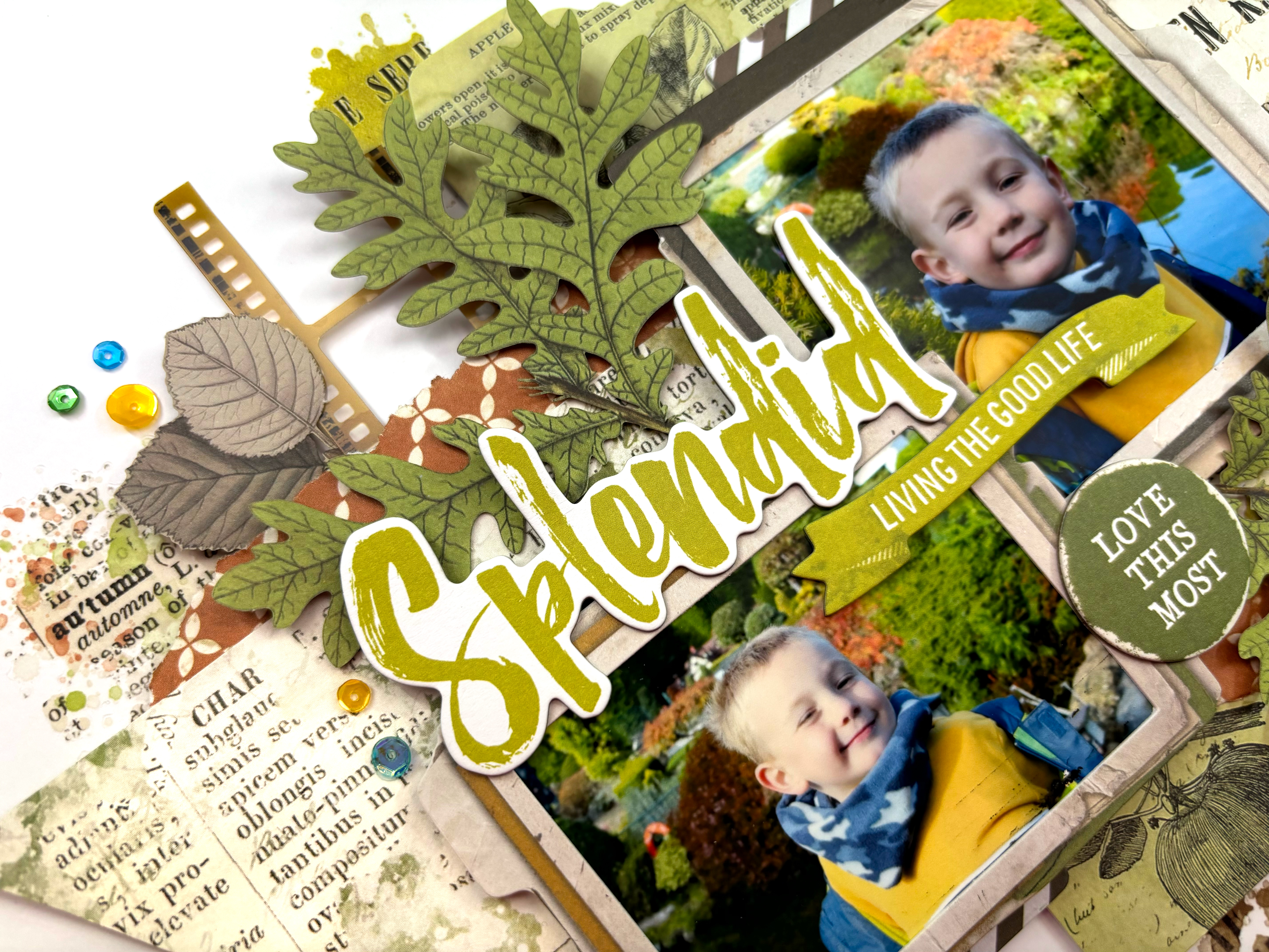
Splendid - 49 and Market - Vintage Orchard Collection

Hi everyone, it's Rebecca with you today sharing my first layout created with 49 and Market's 'Vintage Orchard' collection. The weather has certainly changed and Autumn is on the way. As sad as I am to say goodbye to Summer (although did it ever really arrive this year?!), Autumn is my favourite season to scrap so this collection was right up my street! You can find it in the store here.


I started with the 'Nestled' patterned paper - one of my favourites - and cut a 3 inch wide strip. I trimmed down either end and cut fish tails to make it more like a banner. I placed this in the centre of a sheet of Premium White Cardstock with some torn sections of the 'Painted Foliage' above and below it for contrast. At this point I hadn't stuck anything to the white cardstock - I was just sticking everything together and working on layers.


Behind the fishtail banner, I positioned one of the larger cards from the Ephemera Bits pack. This pack is amazing and includes 96 different elements so it will last a long time! 

On top of these layers, I added my photos, housed in two of the Stacked Frames. I've raised both photos up using foam to add in some dimension between the layers. I was then able to add in some smaller layers, including some striped frames from the Ephemera Bits and some filmstrips from the Acetate Assortment Set. I love how these little layers make all the difference.


I've used one of the Chipboard Words for my title, picking not only a phrase which works for the photos I'm documenting, but also a colour which matched my photos and the other elements on the page.


With these larger elements in place, I turned my attention to embellishing, which for me is the fun part and where the layout really comes together. I selected some gorgeous green leaves from the Laser Cut Wildflowers. This is another amazing pack which includes 92 pieces so is really good value for money. 


Once I'd gone through and adhered all these pieces together, I was able to see how much of the white cardstock my layout was covering. This makes it so easy to add details to the background because I can move everything on and off the page in one piece. The Vintage Orchard collection includes 3 sets of rub-on transfers. I selected some from the Blendable Rub-Ons and the Essentials Rub-Ons and applied them to my background. I love how easily they apply, and they don't really leave an 'outline' as such, so they really do look like stamping and mixed media (just without all the effort and mess!).


I finished off with a couple of laser cut butterflies and some sequins for a little bit of sparkle!

Thanks so much for reading! I hope you've enjoyed this layout and it offers you some inspiration. Vintage Orchard is a stunning collection and is available in the shop now.


Take care

Rebecca x 

@preciouspagespapercraft


Friday, 24 May 2024

Joyful - 49 and Market - Krafty Garden Collection

Hi everyone, Rebecca with you today to share my latest layout created with 49 and Market’s Krafty Garden collection. I’m really enjoying this collection and feel like I can use it to scrap so many memories. You can find the full collection in the shop here. 


To begin, I selected a couple of patterned papers and cut pieces from them, before creating a notebook edge using a border punch. I placed these in the centre of a sheet of Premium White Cardstock with my photo on top - housed in one of the Stacked Frames. To introduce some dimension to the layout, I added some adhesive craft foam behind my photo. This also helps when it comes to tucking embellishments in and layering them!


With my photo in place, I selected a title from the Chipboard Word Set and placed it to the bottom right of my photo. I always love how universal these titles are - they can be used for almost anything! 


Next, I selected some of the Laser Cut Outs Wildflower Elements and positioned them either side of my photo, with the flower heads raised up on foam pads. 


To the top and bottom of the arrangement, I tucked in some tags from the Ephemera Bits and above and below my photo, some lace trim from the Laser Cut Out Elements.


To help elevate the layout and make it more interesting, I then added several rubs ons around the edges of the patterned papers. I absolutely adore the 49 and Market rub ons, and I’ve used two different packs on this layout - the Blendable Rub Ons and the Essentials Rub Ons. 


I finished up with a couple of laser cut butterflies, carefully selected to match my colour scheme. 


Thanks so much for reading! I hope you like my layout and it gives you some inspiration and ideas. 


See you next time!


Rebecca x

@preciouspagespapercraft