Friday, 16 July 2021

Papermaze July Kit - Part 1

Lynn here today with the beautiful July Kit and my first pair of layouts for this month. The pretty kit has a selection of dreamy, watercolour effect papers, which are great for feminine, romantic, family history (and many more) layouts. The kit is now available in the shop or online.

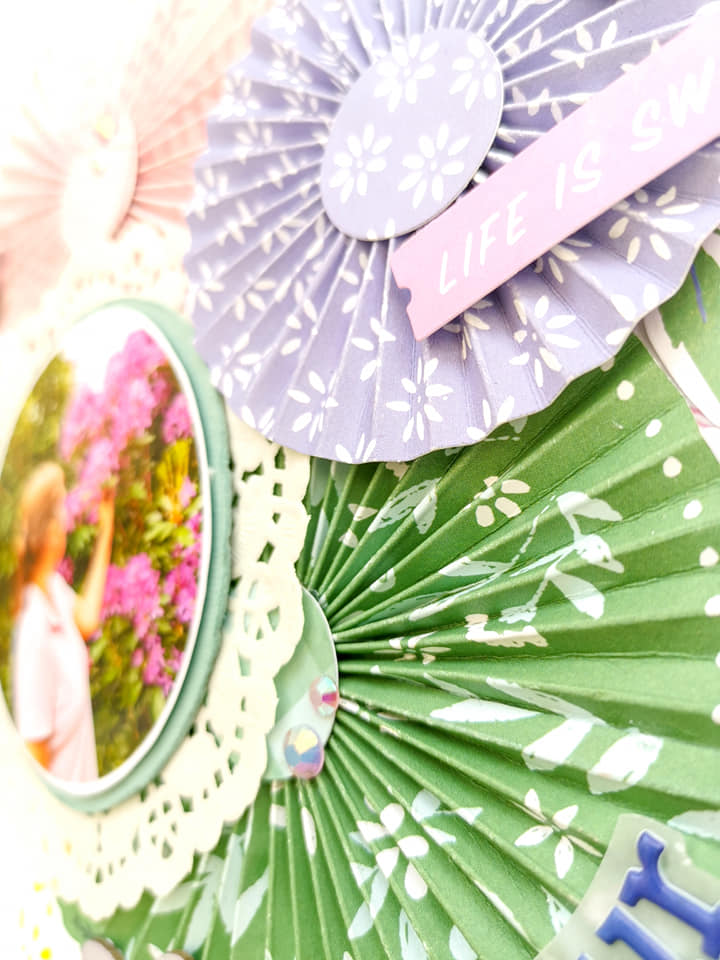
For today's layouts I have chosen floral papers and embellishments.

Before looking at how they are made, here are the details of the kit:

Patterned paper:
P13 - When We First Met collection - #03 & # 06
Prima - Watercolour Floral collection - Dreamy Florals & In the Water Garden (both foiled)
American Crafts - Maggie Holmes' Garden Party collection - Blossom in Blue
Pinkfresh Studio - Keeping it Real collection - Deep Breath
Bazzill Bazics Cardstock - Avalanche & Boysenberry Delight

Reverse side of papers:

Embellishments:

Sheet of 49 & Market rubons, 12" washi tape, 2 Prima Waltercolour Floral flowers (1 glittery), 6 wooden hearts, 1 star, 7 pieces Prima Watercolour Floral ephemera, 5 silver heart stickers, a pinch of sequins

Extra Bazzill Basics Cardstock pack:

Romance, Wildberry Pie, Aqua, Heidi

Roses Around The Door - The photo for this layout shows the progress of the climbing roses around the arbour in front of our door, after three years.


The base for this page is the Aqua Bazzill. The papers were distressed and inked with Iced Spruce Distress Ink.


With the sheet of 'Dreamy Florals' paper, I picked a few of the images I wanted to use and cut them out. Then preserving a few more images for later use, I backed my photo with the remains of this paper. With a circle template, the photo and images arranged in place, I outlined, with pencil the space where I wanted the stencil to show.

The photo and images were set aside. With the Tim Holtz, Layering Stencil - Scribbles (I think this looks like roses.) and texture paste mixed with Distress Stain - Worn Lipstick; I worked this through the stencil to fill the space marked out. I altered the strength of the stain to vary the colour of the 'roses'. I also made two small areas of stencilling on the edges of the cardstock - I set this aside to dry.


Once I had adhered the images and photo in place, I added a selection of paper roses from my stash (in shades of pink and cream). I worked around the stenciled area, between the images. A few roses were also added to the areas of stencilling on the edges of the cardstock.

I scattered a few roses among the images too. The title was made with some scraps of Pinkini Bazzill from a previous kit and some Sizzix alphabet dies. Finally I added the date with some alphabet stickers.


Christine - Another black and white negative found among my Dad's collection - this time his cousin Christine. Another relative found to add to my family scrapbook album.

I started by making a 2.5cm frame with the Boysenberry Bazzill. Over this I placed the P13 - #03 paper, which I trimmed by 0.5cm on all four sides. I cut four notches into the edges of this
paper and trimmed behind these with a little lace. I distressed the edges of all the papers and card. 

With Distress Oxide Inks in Dusty Concord and Faded Jeans, I brushed some colour onto the background, then splattered it with water, and black ink.

The photo was mounted onto scrap white card, then onto Boysenberry Bazzill. I placed this where it was to go and arranged some burlap, corrugated card and cheesecloth under the photo. Once arranged it was all stuck in place.


Then came the embellishments - I created two large clusters and one smaller cluster of flowers by using a selection of the following:
Fussy cut rose clusters from P13 - #06, inked and raised on 3D foam pads
Two Prima paper roses from the kit
Additional paper flowers from my stash
Silver stamen
Rose ribbon
Owl Charm and purple Baker's Twine
Sizzix Thinlits - Tim Holtz Wildflowers set and Boysneberry Bazzill and scraps of P13 - #06 - all inked with the Distress Oxide Inks.


Finally I added the title - 'Christine' with some alphabet stickers.

That's all for today, back with more from this kit soon.
Thanks for looking
Lynn x

Thursday, 15 July 2021

Pinkfresh Studio - Happy Blooms - Tea for Two

Hello everyone,

Claire here with you again sharing my second layout with the Pinkfresh Studio Happy Blooms collection.  You can find this gorgeous collection in the shop here.

Now, for this layout, I wanted to make some paper straws, and base my design around them - here's how it turned out:


I started with a piece of Premium White Cardstock, and begun to make the straws with that stunning striped paper called Handkerchief (it's the B side of the bold green patterned paper). 

I cut strips of about 2.5 inches wide in various lengths and rolled them around a paintbrush to create the straw, securing in place with red tape.

Now, I will say that the quality of Pinkfresh Studio papers is second to none - the papers are a little bit thicker than standard patterned paper which did make rolling the paper trickier than I expected, but I took my time and they worked perfectly.

I tried various designs, but in the end settled on a circular layout (I'm loving circles at the moment), and cut a circular mat from the Daydream paper to use as the anchor of my page, distressing the edges before placing centrally on my page.


I laid my straws in a staggered design to the left hand side of the circle, securing in pace with Glossy Accents. Next, I matted my photographs, using the green side of the Handkerchief paper and Heirloom paper.  I placed one on the circle base with foam pads, and the second laid flat on top of the straws. The overlapping of the pictures on different levels of the page created fabulous volume and dimension.

With the design now complete, I began to embellish.

I made a tag from the Homegrown cut apart paper and added an eyelet and string from my stash, tucking it under my photo.


Next, I took some flowers from the Floral cardstock Ephemera pack, curling the flowers and placing them around the outer edge of the circle and around the straws.

I also took some strawberries from the Cardstock Ephemera Pack and placed these on top of my straws, along with some of the flowers to create a cluster around my photograph.


Opposite, I created another cluster, using some of the food and drink elements from the cardstock ephemera pack, to sit alongside my photos of our cream tea.


For my title, I used those beautiful bold green Puffy Alpha Stickers - these are fabulous! They're one of my favourite alpha sets. They create such striking titles.


To finish the page off, I placed a banner from the Journaling Bits pack across the straws, distressing and curling this at the edges to create movement. 


Finally, I added some die cut leaves from my stash and some of those unbelievably amazing New Pinkfresh Jewels in Ballet Slipper - Trust me, you need these!! :) 

So, that was the page complete. I think this collection is my new favourite. The colours, paper patterns, alphas, journaling bits, ephemera and stickers provide so many options. I think it's all just stunning.

I hope this has given you some inspiration. I will be back with one more layout later this month with this collection and I have set myself a challenge - no white cardstock! 

See you soon.


Claire.

Time to Travel to Wales with Photoplay

Good Evening and welcome back to Papermaze! ScrappyAdam here with you sharing my first layout of July! I can't quite believe we are in July already! Where has 2021 gone!? 

Have you seen all the new collections instore from Photoplay? There are so may to choose from - it's hard to decide which to go for... so I went with them all! I have started the month off with 'Time to Travel' and added in some patterned paper from Snail Mail and Birds of a Feather! The latter two collections mix together perfectly for sure. 


I started this layout with some inspiration from Scrap Squad's 12 Days of Summer Lifts and I decided to have a play with Day 7. I absolutely love this design and will be playing with it again soon! The original layout which I took inspiration from/scrap-lifted had just the one photo but I adapted it and used two photos. That's what is great about taking inspiration from scrap-lifts - you can lift it exactly or change it to match your style, your photos, your stash!

Do you ever use layouts from other creatives or sketches as inspiration start points for your scrapbooking? Or do you prefer to start your own way? I have to admit, I never got on with either but I am finding it great fun using both and adapting it to my photos, stash and more is more style! 

So, I started with a full sheet of the B-Side of 'Pack Your Bags' as my background. I took a Pinkfresh chevron stamp and stamped chevrons in two areas - coming out (approx.) from where my photos/clusters/layers will be and added a 1" strip of 'Tourist Mode' across the page - slightly more upwards than centre. This red strip is actually one of the four 6x6" patters on the B-Side of Tourist Mode and so I simple adhered them together and then stretched them to make it look like it goes from one side to the other! You can see the join in the middle but I am ok with that!


I went crazy with lots of patterned papers - I started off with sticking with the inspiration layout then went my own way, cutting lots of different papers in different sizes. 


I used two 3x4" photos - one on each side, I didn't mat my photos since there were already a lot of patterned paper layers. There are lots of torn paper layers too!

Then it was my favourite part - embellishments! I fussy cut a few cars and caravans from 'Let's Go' which are perfect for fussy cutting. They seemed appropriate as we were travelling for a short caravan break! I have stuck some embellishments down with foam to add dimension along with the torn paper. 


I mixed up embellishing from the stickers and ephemera. I added in some Bramble Fox cars and geotags as well as three flair from Dotty About Flair. I did bring in some stickers from Echo Park too as well as some washi tape. 

Thanks for joining me today. I will be back soon with another Photoplay layout - using another new collection! Until then, take care and stay safe!

Adam x


Monday, 12 July 2021

Bee Awesome - Photoplay 'Sweet as Honey' Collection (Tulla & Norbert)

Hi everyone, Rebecca here with you today sharing my first July layout. I really can't believe we are over half way through the year already - and halfway through summer... how did that happen?!

I'm working with a new collection this month - it's one of the 'Tulla & Norbert' collections from Photoplay, and it's called 'Sweet as Honey'. Now, I have a confession to make - I'm not a fan of gnomes or gonks (ssshhhhh don't tell Tulla or Norbert!) and as much as I loved the look of this collection, I was a little worried about how I might use it. But I was worrying over nothing - yes, there are a few gnomes, but there are also plenty of bees and florals, and many of the B sides of the papers were patterns without gnomes, so it was actually a pleasure to work with and I really love a lot of the papers.


I started by selecting a couple of my favourite papers - 'Buzzing By' - which is a gorgeous woodgrain paper with really cute bees and beehives on it, with a mustard yellow honeycomb pattern on the B side, and also 'Sweet Pollen' which is a black paper with beautiful yellow, white and green floral clusters on it. I used my metal nesting Hexagon dies to cut some hexagons in three different sizes from these papers, and also cut my photo into a hexagon shape. I also pulled out some floral metal dies to make myself some embellishments from the same papers.


Using my edge distressing tool, I added some texture to the hexagons and then arranged them horizontally across the centre of my page. I added some craft foam behind them all to introduce some dimension to the layout before sticking them down with double sided tape.

I scattered the die-cut flowers around the hexagons, layering some of them up to add some interest. Above my photo, I added a little tab that says 'Bee You' - this is from the Cardstock Ephemera pack. It's a great little pack with 26 pieces in it. I also added a ticket from the same pack which says 'Bee Awesome' and I'm using this as my title. I added foam behind it to help draw the eye to it. I found some really sweet little wooden bees in my stash to I scattered a few of those on the page too.


I have a mini stencil by Creative Expressions called 'Honeycomb' which works really well with my hexagon theme, so I pulled that out along with a Distress Ink in 'Mustard Seed' and added a few individual hexagons around the patterned paper hexagons. I used a blending brush to add the colour through the stencil, and then used a black gel pen to trace the outline of the hexagon to help them 'pop'.


There is a piece in the ephemera pack with a gorgeous beehive on it that I really wanted to use, so I fussy cut the beehive and stuck it to the right of my title, dangling down, raised on foam pads.


At this point, I decided I wanted to have a border around the edge of my layout. I was going for a minimal look with plenty of white space on this layout, but I felt like the layout needing framing, and using patterned paper is a great way to do this. I always 'gut' the middle of the patterned paper to preserve that for another layout, then trim down my white cardstock by about 1/4 inch on all sides, and then adhere that to the frame. Obviously this is me - so I distress all the edges of the white cardstock too for a bit more texture. I then finished the edge of the layout off with a black doodled border.

I wanted to add a little bit of sparkle to my layout so I pulled out some sequins from my stash - they have a lovely woodgrain pattern on them to match the 'Buzzing By' patterned paper. I scattered a few around the layout and that was me finished!


Thanks for stopping by to have a read - if you'd like to watch the layout come together then there is a process video up on my YouTube channel, which you can find here.


I'll be back later in the month with another 'Sweet as Honey' layout so until then,

Take care

Rebecca x


Saturday, 10 July 2021

Carta Bella ~ Summer #2

Hi, it’s Anna back with you today! I’m sharing a second layout using the Carta Bella Summer collection. You can find it all in the shop here


For this layout, I started with the b side of the summer stamps patterned paper and tore it diagonally from one corner to the opposite corner. I adhered this to some white bazzill cardstock. 
The remaining corner of the layout was looking a little bare, so I added some stitching around the boarder. 


I used a 5x3 photograph, mounted on sunflower bazzill and the b side of summer strawberries.  
I cut out three of the large clusters from the summer day floral patterned paper and arranged them around my photographs. 


I tucked a few elements from the frames and tags cardstock pieces around the photograph.
I cut out one of the cut apart pieces from the multi journaling cards and tucked it in to the right of my photograph (I journaled after taking the pictures). 
For my title, I used a foam sticker from the simple stories simple vintage cottage fields collection. I also added in a few of the hearts and a butterfly from the foam stickers too. 


Thanks so much for looking, see you again soon with one more layout from this collection. 
Anna
X


Friday, 9 July 2021

Pinkfresh Studio Happy Blooms - Find your Inner Peace

Hi everyone!

Claire here with you and I'm sharing my first project made with the Pinkfresh Studio Happy Blooms collection.

Pinkfresh is one of my favourite brands and this collection does not disappoint! It's full of spring vibes, lots of florals, butterflies and pretty patterns. You can find the full collection here.

For my first layout, I wanted to document a recent trip to the UKs oldest blueberry farm and their flower fields which I saw an article on in a magazine.  I didn't realise it was only 25 minutes down the road so off we set!


I started with white textured Bazzill cardstock from the Matchmaker Pack. I printed the photo in a circle so wanted to mirror the shape across the page.  I found a template for some paper rosettes on my cricut, which cuts the strips and adds score lines which you then fold manually, and glue together to crease the rosette shape. You don't need a machine however, and can find lots of tutorials on YouTube.

I used the pink Cottage paper, green Handkerchief paper and the beautiful blue Garden paper to create the rosettes, before adding a small circle of paper to the centre with a hot glue gun to secure in place.


I layered these in a vertical pattern down the centre of the page and cut a few flat circles to place as a mat underneath, creating a base to add floral clusters.


I used the A and B side of the Embroidered paper and the Heirloom paper for this.

I had left a space for my circular photo, which I mounted on a piece of teal green cardstock from the Matchmaker Pack. I distressed the edges and lay it onto a doily from my stash.


Next, I selected some florals from the Floral cardstock Ephemera and arranged these around the rosettes and paper circles to create a bit of interest and help frame the design. To this, I added some butterflies, fussy cut from the Homegrown paper.


I created my title using multiple fonts from the coordinating alpha sets - the larger green Puffy Alpha Stickers and the mini puffy alphas. To help the smaller alphas stand out against the green rosette, I mounted these to a small piece of vellum first and then laid in position.


I added a small sub title to the rosette, using a phrase from the Cardstock Ephemera pack and a chipboard butterfly from the Tando Creative Chipboard Butterflies, which I pained with Shimmerz paint.


As a final touch, I used some of the new Pinkfresh Studio Essentials Crystals Mix in Ballet Slipper, scattering them around the page for a bit of sparkle - Keep an eye out for these - they'll be hitting the shop soon, and in my opinion, these are of of those "need" items!! They are awesome!


And that was it for my first page! I really love how this one turned out and am looking forward to sharing more of this gorgeous collection with you soon.

Take care,
Claire