Monday, 14 February 2022

'Dry' Mixed Media - Using Distress Oxides - Vicki Boutin - Fernwood Collection

Hi everyone, Rebecca with you today coming at my blog from a slightly different angle! Papermaze stock so many amazing mixed media products that I thought it would be a good idea to show how you can use some of them. In this blog, I will focus on Distress Oxide Ink Pads.


Distress Inks vs. Distress Oxides

Most colours/shades are available in both ink format and oxide format. Which one you use will depend on the effect you want on your page! Distress Inks are thinner, water-based dye inks. They dry really quickly and I find they give you a much more vivid colour. Distress Oxides are thicker, creamier and almost chalky. They are a mix of dye and pigment inks and react really well with water - they do however, take slightly longer to dry. I find if you are trying to blend colours on a page using a blending brush, oxides blend much more naturally and look less 'patchy' as they seem to spread more evenly.

Here is the colour 'Mermaid Lagoon' in both Distress Oxide (left) and Distress Ink (right). I have applied both of these dry - meaning I've just used a blending tool to add the colour to white cardstock without adding any water. You can see how much thicker and creamier the oxide looks.


When I first started dabbling in mixed media, I made the decision to get Distress Inks instead of oxides as I preferred the more vivid colour. However, I quickly discovered that I wanted oxides as well and now I'm building a stash of those too! Both do give very different effects and whereas I prefer to use my Distress Inks for 'wet' mixed media, I prefer to use Distress Oxides for 'dry' mixed media. So in short - I think everybody needs both!!


I recently bought a few papers from Vicki Boutin's Fernwood collection and I've been desperate to use the paper with the coloured hexagons on it. I thought this was the perfect opportunity to add some dry mixed media to my background using Distress Oxide Ink Pads. I managed to match the Ink Pads to the colours in the Hexagons really well. I used the following Distress Oxides - Barn Door, Rustic Wilderness, Broken China, Mermaid Lagoon, Chipped Sapphire, Ripe Persimmon and Picked Raspberry. 


One of the best investments I've made recently was a set of blending brushes with white heads and coloured handles. It means I can dedicate one brush to each ink pad and therefore keeping them 'clean'. The white bristles mean I won't get them mixed up and dunk the wrong one in the wrong ink pad! These brushes are similar to the foam pads and domed pads you can buy, but I prefer them as they give me more control and I feel like I can apply more even pressure.


For this layout, I cut out the hexagons from the patterned paper, distressed the edges and arranged them on my page. I then drew around them and matched my Distress Oxides to the hexagons. Using my blending brushes in a circular motion, I added some colour to my background making sure to add the right colour in the right place. I generally start my inking in an area I know is going to be covered by my photo, patterned paper or embellishments etc so that I can get the pressure right, and then I spread the colour out to the area where it will be visible on my layout. I start off by pressing quite lightly and then I can build the colour up. It's possible to increase the intensity of the colour, but once it's on the page you can't take it away! You'll see from the photo below, the finished mixed media looks like a total random mess on my page - and this is often the case with mixed media. Once I start building my layout on top of it though, it will look a lot better!


Once all my colour was in place, I took a paintbrush and some water and added water splatters all over the oxides. This is where the magic happens with oxides! Water lifts the colour and creates a really cool effect in the ink. This doesn't really happen as well with Distress Inks - I've read that it's because the dye in the Distress Inks doesn't oxidise. You can see below the different effects adding water splatters has on Distress Inks vs Distress Oxides. 


I paused my mixed-media here and stuck all of my hexagons in place, and embellished with some Fernwood Icon Ephemera. I also fussy-cut some of the butterflies and dragonflies from the Speciality Vellum and stuck them onto some of the hexagons.


I finished off my layout by adding some splatters to the page. Splatters are one of my favourite ways to complete a layout. They are the perfect finishing touch, and a great way to add some subtle wet mixed media to a page without going mad! 


I used my Distress Oxides to add some coloured splatters tone-on-tone to the areas around my hexagons. This is really simple to do - just stamp the ink pad onto some plastic packaging or a glass mat, and spritz a bit of water on. Then mix it up with a paintbrush and splatter away! The smaller the paintbrush, the finer the splatters will be. 


I then added more splatters - you can never have too many splatters! Firstly, I added some white splatters. For this, I like to use watered-down white gesso. I find that gesso works better than white acrylic paint as it doesn't soak into the background or patterned papers. It sits on the surface and dries, therefore staying more white.  I try not to water it down too much as the thicker it is, the larger the splatters will be. And finally, I added gold splatters. Gold seemed like the obvious choice because there is gold foiling on the speciality vellum. For gold, I always reach for my metallic gold acrylic paint because it's nice and thick and leaves nice big splatters. I love the way that the white and gold splatters finish this layout off and give it a more 'rustic' or 'weathered' look.


I hope you've enjoyed this layout and found the blog helpful. I love mixed media, and if I can give one piece of advice to anybody who wants to dip their toes in but may be a little nervous, it would be GO FOR IT! It's great fun, and you have a lot more control with dry mixed media so it's not so scary! It's just cardstock, so have a play!

I'll be back layer in the month when I'll be getting a bit messier with some 'wet' mixed media using Shimmerz products.

Take care,


Rebecca x

@preciouspagespapercraft 


Saturday, 12 February 2022

Pebbles ~ Kid at Heart 💜 #1

Hello! 
It’s Anna back with you today and this month I’ve been working with the bright and colourful Pebbles collection -Kid at Heart collection. 
I love colourful collections, so I was so pleased to be working with these beautifully bright papers!
So, as I looked through the papers Hi, Friend really stood out at me. All the little squares were calling out to me to be cut out and made into a grid layout. 

I decided to document our staycation last year. I always create a separate album or mini book for a holiday. But I like to have one page like this in my regular yearly albums to document a holiday. 
I began by printing out 2 or 3 small square photos from each day of the holiday. I then cut out some of the Hi, Friend 2x2 squares and selected a few pieces from the phrase ephemera pack.


I assembled each element on a sheet of white 12x12 bazzill cardstock, laying them out in chronological order. Once I was happy with the layout, I began to adhere all of the elements to my layout. 
I then added in a few more pieces from the phrase ephemera. I particularly loved the days of the week words, which went perfectly with this layout, enabling me to define each day. 


I added a strip of the scalloped paper from the Playful patterned paper along the top edge of the layout. 


Finally, I added a title using Simple Stories colour vibe alpha stickers. 


See you soon with another layout using this collection! 
Thanks for looking! 
Anna
X

Wednesday, 9 February 2022

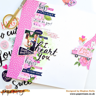
'I Heart You', using Happy Hearts from Simple Stories by Meg

Hey all - it's Meg here today sharing a layout using the very sweet Happy Hearts collection by Simple Stories! 

I just LOVE Simple Stories collections, they're always so bold, bright and versatile and Happy Hearts is no exception. 

This page was a really fun page to put together and I absolutely just went with the flow - I started by fussy cutting a strip of the roses from the Sweetheart paper. I often start by fussy cutting and inspiration will strike afterwards! 

I decided to do a vertical layout and I tore a strip of the Sweet On You paper and vellum to layer on top of the fussy cut Sweetheart roses, which I stitched on top of and I distressed some of the edges. I tore another smaller piece of Sweet On You to go on the opposite side of the page, to balance it out a little. 

I had some photos already picked out to go with this collection and so I sifted through and picked out this one with my husband and son on our wedding day, which is one of my most favourite photos ever! I double matted it with white cardstock and vellum before adhering it to the page and embellishing around it. 

At this point I decided to use some watercolours to just add a little green and pink on the page behind the roses, then I began sticking down word phrases from the Combo Stickers sheet and the packet of Bits And Pieces. The title 'I Heart You' actually came from the Combo Stickers sheet but I added the 'Heart' from the Foam Stickers sheet on top to add some extra dimension. The 'Happy Heart Day' and 'xoxoxo' stickers were from the pack of foam stickers too. 

I then focused on the little cluster on the right hand side of the page, popping up a little 'Love You' van from the Bits And Pieces pack plus a few stickers from the Combo Stickers sheet. 

And voila! I added some journaling and the page was finished. 

I really hope you like my page as much as I enjoyed creating it! Thank you for stopping by :-) 

Take care, 

Meg x 

Monday, 7 February 2022

Echo Park - Day in the Life - Smile!

Hi everyone,

Claire here sharing my first layout for February!

I'm still thoroughly enjoying the Day in the Life collection by Echo Park which you can find in the shop here. This collection offers endless possibilities - it's perfect for pocket life pages with cut apart sheets and the months of the year, whilst also providing beautiful colours and patterns for more generic themed scrapping.

I've opted to create with the b sides of the collection, focussing on pretty spring colours.


I opted for come colour blocking, creating a mixed media background behind each of my 4" squares. For the mixed media, I used art crayons, but you could just as easily use Distress Oxide inks to create the same effect.

I used a cut apart from the February Paper saying 'Hello Sunshine'. The beautiful striped colours inspired my colour scheme and design.


I cut the same sized squared from the April, June and October papers, and machine stitched around each square, distressing the edges for additional texture.


I matted my photos on some white tissue paper and positioned these to overlap the squares. They are slightly smaller at just under 3".

To embellish, I fussy cut some flowers from the January paper and rained these on foam pads around my photographs.


Next, I took the Element Stickers, mounting the camera on foam to pull all the colours together and create some extra dimension.


I also used some banners, word phrases, tabs and clips from the sticker sheet, adding extra interest across the page.


As a final touch, I added some large white Alpha Thickers from my stash to create my title ' Smile' - perfect for our selfie photos and happy vibe of this layout.


And that was the page done! Hope you like it and it gives you some inspiration on how to use this versatile collection.

See you soon.

Claire xx


Saturday, 5 February 2022

Some Bunny Loves You

Hi There

It's Anita here today with a layout to share using the Graphic 45 Woodland Friends Collection.

 What a delightful design on these papers...full of foxes, playful deer, bunnies, racoons and tiny birds all hiding in amongst the foliage, toadstools and flowers. And it was perfect for scrapping this photo of my dear little Grandson and one of his favourite bunnies.


The layout was based on a sheet of Be Wild and I gutted a large section fro the centre of it and popped it to one side for fussy cutting later. Using a sheet of Bazill Cardstock in the shade of Springtime  I trimmed approx 1cm off the top and also the left hand side of the sheet so that when it laid onto the backing sheet it allowed a frame of the patterned paper to show all around the edge.
I also gently splattered some fine copper paint splats using an artists fleckle brush.

 I wanted to add a large dimensional element to my layout and chose the sheet called Be Kind

With the bunny side facing me I folded each side into the centre until all 4 joined and I used a bone tool to make the creases nice and sharp. I then folded each side back out as shown below. The exposed the bunny design and also added some nice dimension to the layout without actually being all bulky.


After matting the photo on some matching cardstock, I popped some 3d foam pads under it and placed it in the centre of the aperture. Even though I thought he looked incredibly cute surrounded by all those little bunnies I really loved the other animals on the sheet that I had gutted earlier, so I then sat and fussy cut several of them out .


They were then layered around the edge of the folded frame in various places.

I also cut some strips from the sheet of  Be Carefree and used them on the top and bottom section of the layout. G45 are typically known for their very *busy* papers and sometimes they can be quite over powering when you first see them. But they are a delight to fussy cut and use for embellishing various areas of your pages and cards.


I cut the * You Make My World Happy* panel from the same sheet and added 4 copper brads onto the 4 corners. Then placed it at the top of the layout. I guess I thought of it as a title for the page really


I finished the page by using a couple of stickers one of which is a tag, so I added some raw silk ribbon and finished it with a copper brad.

So that's my 1st layout using this gorgeous collection. There is a great selection of G45 products in the shop.....along with lots and lots of other manufacturers....and with New Stock constantly arriving Why not go grab a cuppa and sit down for browse....you deserve a treat!


Happy Crafting!

Warmest wishes

 Anita xxx


Friday, 4 February 2022

P13 There is No Planet B - Let's Make Lemonade

Hello, Karen here again with another scrapbook layout using P13's There Is No Planet B collection. Today I am documenting an afternoon spent making lemonade and have chosen items from the collection which fitted that theme.


I started my layout with a sheet of pale blue Bazzill Basics cardstock and in the centre of this I layered a sheet of white cardstock which I trimmed slightly so that a narrow border of blue showed round the edges. Torn strips of washi tape (from my stash) were stuck to some of the edges and then I machine stitched all the way round the layout using white thread. Pale blue watercolour paint was painted onto the background where I planned to position my photos and patterned paper.


I cut a couple of the panels from paper #01 and positioned these onto the background to look like shelves. My four 2.5" x 3.5" photos were matted using some of the journalling cards from paper #05 and these were placed on the 'shelves' with 3D foam underneath to raise them up a little.


More torn washi tape strips were added below the shelves. 


Extra images of lemons, bottles and plants were fussy cut from paper #07 and added to the shelves.


Peach coloured foam letter stickers were used to create the title which was positioned underneath the top shelf.


Finally, I fussy cut a clothes peg from paper #07 and the words 'Home Made' from one of the decorative tags and using some natural coloured twine I created an embellishment cluster in the top left corner of the layout.


I'm really enjoying using this collection. Using soft colours rather than bright vibrant colours on a layout is a refreshing change for me and it's good to step out of your comfort zone every once in a while. Vanessa stocks lots of other yummy P13 products which can be found in the shop here.

Someone else will be along soon with another project and I'll be back later in the month so until then, take care. 

Karen x x

Wednesday, 2 February 2022

Papermaze January Kit - Part 2

Lynn here today with my second pair of layouts made using the January's kit which is now available to buy from the shop or online. Vanessa has put together yet another beautiful collection, including exclusive knitwear stencil.

Both my layouts have photos of my nephew when he was a little boy.


Here is what is in the kit, for more details, please see the earlier Blog entry HERE and the shop -
January's kit.


You Are Amazing - This is one of a series of images taken by my father when doing a photo shoot in preparation for painting Mark's portrait.


All the cut edges of my papers were inked with Forest Moss Distress Ink.

I started with a sheet of white Bazzill as a base. With the 'Wonderful Things' paper cut a piece 15cm wide and 23cm deep from the script side. I arranged this 4cm in from the left 4cm down from the top, but didn't glue it in place at this stage. From what was left I cut the chevrons section of the paper and split this so I could place it either side of where the script paper will be placed. The chevrons were glued in place.


Then with a Tim Holtz Layering Stencil and some texture paste, I created some randomly along the bottom of the paper, overlapping the cardstock. Once the past was dry, I sprinkled some Emerald Isle Infusions along the top and bottom of the page, then sprinkled the grains with water so they could create their magic!


I place the script paper in place and glued it down. 


From the scraps of Gather at Home '4 x 4 cards' paper I fussy cut fronds of leaves and arranged them so they run up the left side of the page. I added the 12 blue pearls from the kit and some flower stamen from my stash.

I placed my photo to the bottom left of the script paper.

Using the detail strip from the 'Wonderful Things' paper, I trimmed each phrase and mounted them onto the remaining scraps from the same sheet of paper. These were then placed in a row to the right of the layout.


My title was made with a phrase from AC Thickers, Color Study - The Details.  The name and date are Tiny Type alpha stickers.


Handmade Fun - Another layout for Mark - This time at Christmas, wearing a rainbow jumper I had knitted for him.


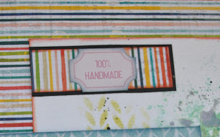
I loved both sides of the 'Simple Pleasures' paper, but decided to use the stripe side as it worked well with the colours of the jumper in the photo. 

I gutted the Amber Bazzill to make a border 2.5cm deep. I trimmed a sheet of Black Bazzill to measure 29.5cm x 29.5cm and gutted this to 2.5cm deep. The 'Simple pleasures paper was trimmed to 28.5cm x 28.5cm. These were mounted one on top of the other.

I cut a piece of white Bazzill to measure 22.5cm x 22.5cm, and with a selection of Distress Oxide Inks placed on a craft mat, spritzed with water and transferred to the cardstock with a piece of plastic bag. When this was dry I used the exclusive stencil and with a blending tool, stencilled more of the same Distress Oxide Inks onto the cardstock. I inked the edges of this piece and placed it to the right of the page.


I mounted my photo onto black Bazzill, then a scrap of 'Happiness Blooms' paper. This was placed to the left of the layout.


My title was created by cutting the letters twice and offsetting them. I used Black and Whirlpool Bazzill and a Sizzix BigzXL alpha die - Handmade. 


With the strips trimmed from the 'Simple Pleasures' paper, I mounted them on black Bazzill and used them to add details using some old Pinkfresh Studio Mini Puffy Alpha Stickers. These strips were trimmed and added to the layout. Finally I added two of the P13 Ephemera Tickets from the kit.


That's all from the January Kit, although I have plenty of bits left over to make something else.
Back with the February Kit soon.
Thanks for looking.
Lynn x