Showing posts with label PaperArtsy. Show all posts

Wednesday, 4 April 2018

Creating a Scrapbook Layout with Distress Oxide Inks

Hello - Lynn here today, I'm pleased to share with you the latest set of Distress Oxide Ink pads to be released by Ranger. I have created a background for a layout using several shades. 


For details of the properties of these inks which are a mix of ink and pigment, please see the review I wrote last year, when the first set of 12 colours was released. All 36 colours can be found in the shop HERE.


This time it's lovely to have some of the more pastel shades to add to the previous 24 colours, with the addition of TATTERED ROSE, SQUEEZED LEMONADE, SHADED LILAC and BUNDLED SAGE. In addition to the latter there are more lovely blues and greens in the form of EVERGREEN BOUGH, BLUEPRINT SKETCH, MERMAID LAGOON and FOREST MOSS. Then the bright orange that is CARVED PUMPKIN and some neutral colours AGED MAHOGONY, HICKORY SMOKE and GATHERED TWIGS. I have made some more swatches for the shop so if you visit you can see what the colours look like when used on white, kraft and black cardstock. Some of the lighter shades need a couple of coats on the black card.  The idea for the swatches came from Jennifer Mcguire's blog, she has some great storage and organisation posts, with downloadable swatches. However the swatches for the latest collection are not available yet so I set about making some myself. 


To make the background for my layout I selected colours that worked well with my photo.  Choosing 3 colours from the new range and 2 colours from previous collections.
I decided to try using Distress Micro Glaze as a smudge resistant, waterproof mask. Micro Glaze works when using a variety of inks, markers, stains, paints and more, it also works well as a sealant to protect projects. 


I used a blending tool to rub the glaze through a Layering Stencil onto the smooth white Bazzill cardstock. 

TIP: Dedicate a blending foam pad to this product, it can be stored inside the jar for future use. If a light coat of Micro Glaze is used, it will dry quickly and be very effective.


Then with the coloured Oxide Inks, and blending tools apply colour to the page blending the colours well where they overlap. This will give a seamless graduation of colour. 


My photo was cropped and added to the page, then I stamped around it with the brush and pencil stamps from the Tim Holtz, Stampers Anonymous Crazy Things Stamps. These were coloured in directly onto the layout using the Distress Oxide Inks. The beauty is that as long as the background layer of ink is dry you can layer the ink and you will get the intended colour, they will not mix with the underlying ink. 


For my title I used some PaperArtsy stamps by JOFY to stamp out the words onto the layout in Archival black ink. Then I stamped them onto white card. To add colour to the letters, I added some oxide ink to the craft mat and with a little water I painted each letter. These were cut out and stuck over the letters on the layout. 

To finish off I added a few drops of Nuvo Crystal Drops here and there.

I wrote the original review when the first 12 colours were released, and today's post is about the most recent, so not to be left out here are the 12 colours which were released later on last year. They included: PEACOCK FEATHERS, SEEDED PRESERVES, ANTIQUE LINEN, FRAYED BURLAP, BLACK SOOT, PICKED RASPBERRY, CANDED APPLE, WILD HONEY, TWISTED CITRON and LUCKY CLOVER. 
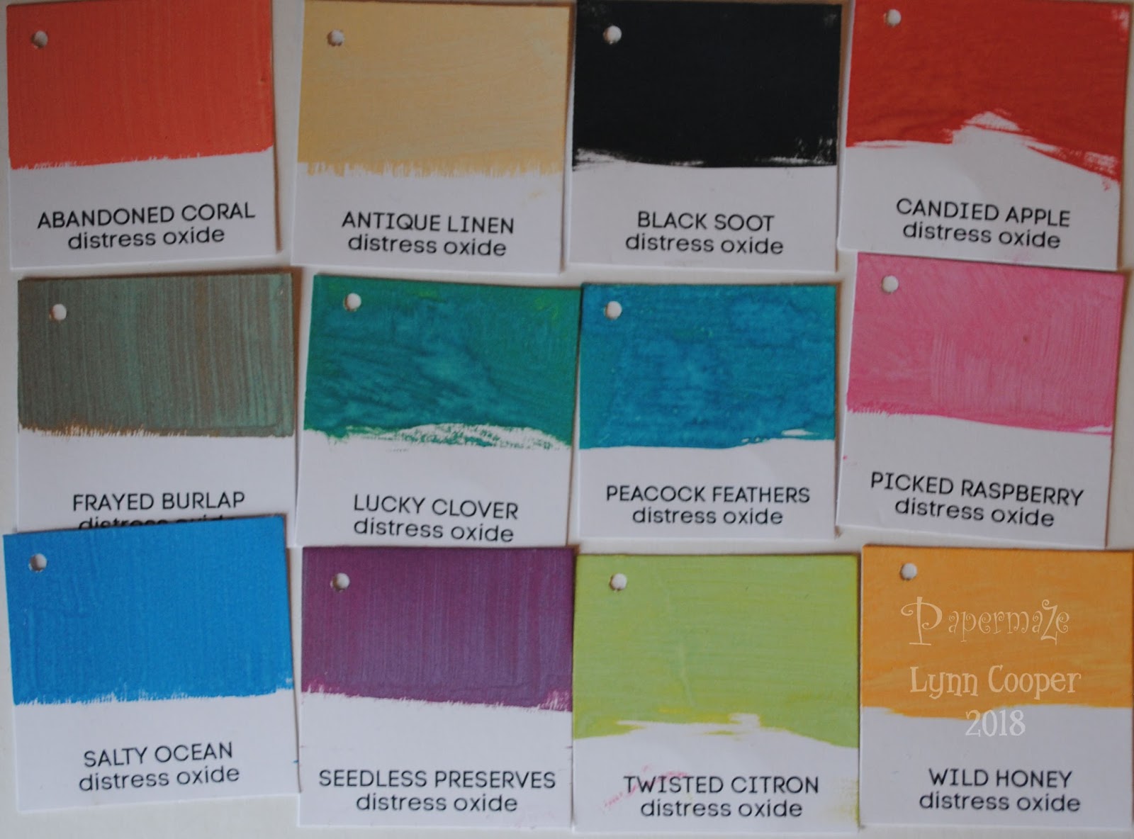

 
This experiment prompted me to make a layout that is very different to my normal style, it was great fun to create by playing with these great inks and so much wonderfu colour!
Back with more projects using these inks later in the month.
Thanks for looking
Lynn x

Monday, 17 April 2017

Distress Oxide Inks - A Review

Hello! - Lynn here today - I have been trying out Ranger's new Tim Holtz Distress Oxide Inks, to bring you this review, and a few ideas of what you can create with them. I'm really pleased with the results and love the many effects.


Distress Oxide Ink is a fusion of die and pigment ink, which can be used by itself or mixed with other products. The ink is reactive with water and the resulting oxidization process produces a chalky effect - it feels and looks chalky but will not rub off the surface as chalk would. The more water added to the ink the more the dye seeps out.

The oxide ink is shiny when wet but dries opaque so can be used on dark backgrounds (see below for samples). 
Just like the Distress Inks, Oxide pads are felt and not foam like most pigment based inks, this means they are a good firm surface to work from.

Once dry the inked surface can be written or stamped onto. You can also stamp images with these new inks. The Oxide Ink takes a little longer to dry than dye inks, so is ideal for heat embossing. 
Water can be added to the ink once applied to the work surface. Water can also be added to your card once the ink has been applied.

The Distress oxide ink pad will appear to be stained if you touch it against another colour, but this can be wiped off.

There are twelve colours available - so far.... Work Lipstick, Fired Brick, Spiced Marmalade, Fossilized Amber, Peeled Paint, Cracked Pistachio, Broken China, Faded Jeans, Wilted Violet, Iced Spruce, Vintage Photo and Walnut Stain.

From this image you can see the similarities and differences in the Distress Oxide Ink and Distress Ink pads. The new inks come in the same containers, but they are grey instead of black, so easy to spot in your collection.


I created these Ink swatches using the excellent set of printable blanks, designed by Jennifer McGuire - free and downloadable from her blog
The image below shows the new Oxide Inks compared to the Distress Inks when swiped onto white card. The effect is more vibrant and solid.


Below you can compare the use of the opaque oxide inks swiped onto white, black and kraft card. The effect varies slightly but good colour is achieved on all surfaces.


Stamping with Distress Oxide Inks
You can see the ink clearly on the stamp itself and you get a nice solid crisp image which can be heat embossed. If you add a little water to the stamped image it will start to oxidise and gives a unique chalky finish. See the three samples below.

Stamped in Fired Brick
Stamped as before and embossed
Stamped and spritzed with water
Creating Backgrounds
Backgrounds can be created by adding some of the ink to the work surface. This is then spritzed with water before dragging the surface of the card through it. Dry the card with the heat tool and spritz with water. The card can be swiped through the ink on the work surface again and again, as long as it is dried each time. You will be building up layers rather than mixing the colours together which could cause a muddy effect. Keep going until you are happy with the effect. 


I stated off using three colours each time and then tried one using a rainbow of colours. 


For more than three colours, the combination was more easily controlled using a glass work surface than a soft mat. This could also be done on a large acrylic stamping block.

All of the above once finished and dry.

Colour wash
To create this effect place some ink onto the work surface and make it wet before using a brush to apply the colour wash to the paper. This wet ink can then be used to create a background or to colour a stamped image. Of course you can do this with the original inks and there is room for both with different results. You get a smoother more opaque finish with the oxide inks and of course you can layer more of the same colour to make it more intense. I tried out a few different colour wash backgrounds. 


Another way of achieving this type of effect is to apply the ink to the paper directly from the ink pad. Take a wet paintbrush and create the wash effect by brushing through the ink with plenty of water.


For the following card I added the Fossilized Amber and spritzed it letting the watery ink run before drying it. Then I repeated the process with a little less ink each time using Vintage Photo and Walnut Stain.


Blending 
The original Distress Inks are excellent for blending with, but you need to try this with the Oxide Inks to be amazed at how much smoother it is.  Using a mini blending tool and a fresh felt pad for the Distress Oxide colour. You will find they blend very well with no marks or hard edges due to the pigment ink in the mix.


Confetti Effect
This was created by adding colour to the work surface, then dipping in a wet brush and flicking it over the paper. It is important to use and dry one colour at a time to prevent the colours running into one another. 


StencilsUse a blending tool to work ink through a stencil onto card, heat set with a heat tool, then spritz with water and dry again. This is quick to do and gives a luminous effect too to the colour.


Inked and heat set
Spritzed with water
Any of the above finished surface can be stamped onto with Archival Ink.


Here are some of my finished cards made from my experiments:


Other items available from Papermaze which I used to make up the cards:
Spellbinders dies, Crafters Companion Dies, Memory Box dies, Tim Holtz/Sizzix - Thinlits dies, PaperArtsy Stamps by JOFY, Tim Holtz Stampers Anonymous Stamps, Tim Holtz Layering Stencils.

I found using these inks great fun and so inspiring, the more I created with them the more I wanted to try out - the possibilities are endless! I think they will be appearing in future blog posts.

Thanks for Looking
Lynn x

Wednesday, 22 March 2017

More Fun With PaperArtsy (JOFY) Stamps

Hi, Lynn back with another post for March, still using the same PaperArtsy stamps and technique as before, but decorating a different IKEA product this time.


I had a few old KNUFF magazine folders left empty when I sorted out some craft magazines. These were looking a bit tatty so I decided to treat them to the same technique as the bead chest I decorated at the beginning of the month. I made a start by allocating one to each colour of my stash of A4 coloured papers and cardstock.


I gave each box a light rub down with sand paper and then treated it to a quick coat of off-white acrylic paint. I kept the base plain this time as I wanted to dedicate each box to the colour of the papers it would store - I intended to display the colour in the images rather than the background.


The next step was to stencil (PaperArtsy) some images with Distress Paint. Then once this was dry I added stamped images and letters onto the box and the cartridge paper. 


The images on the paper were painted using Distress Inks and Markers, with a brush and water. I cut them out and used Gel Medium to stick them to the boxes. The finished boxes were treated to a covering of the Matt Gel Medium to protect them.

The boxes were finished off with a little sparkle from Stickles and texture and shimmer from Liquid Pearls.


This will be an ongoing project, I have completed some and others are in the process of being completed - but you get the idea. I will add photos to this post as I go - so pop back later to see what I did with the rest.


Thanks for looking
Lynn x