

For details of the properties of these inks which are a mix of ink and pigment, please see the review I wrote last year, when the first set of 12 colours was released. All 36 colours can be found in the shop HERE.
This time it's lovely to have some of the more pastel shades to add to the previous 24 colours, with the addition of TATTERED ROSE, SQUEEZED LEMONADE, SHADED LILAC and BUNDLED SAGE. In addition to the latter there are more lovely blues and greens in the form of EVERGREEN BOUGH, BLUEPRINT SKETCH, MERMAID LAGOON and FOREST MOSS. Then the bright orange that is CARVED PUMPKIN and some neutral colours AGED MAHOGONY, HICKORY SMOKE and GATHERED TWIGS. I have made some more swatches for the shop so if you visit you can see what the colours look like when used on white, kraft and black cardstock. Some of the lighter shades need a couple of coats on the black card. The idea for the swatches came from Jennifer Mcguire's blog, she has some great storage and organisation posts, with downloadable swatches. However the swatches for the latest collection are not available yet so I set about making some myself.


To make the background for my layout I selected colours that worked well with my photo. Choosing 3 colours from the new range and 2 colours from previous collections.
I decided to try using Distress Micro Glaze as a smudge resistant, waterproof mask. Micro Glaze works when using a variety of inks, markers, stains, paints and more, it also works well as a sealant to protect projects.

I used a blending tool to rub the glaze through a Layering Stencil onto the smooth white Bazzill cardstock.
TIP: Dedicate a blending foam pad to this product, it can be stored inside the jar for future use. If a light coat of Micro Glaze is used, it will dry quickly and be very effective.

Then with the coloured Oxide Inks, and blending tools apply colour to the page blending the colours well where they overlap. This will give a seamless graduation of colour.

My photo was cropped and added to the page, then I stamped around it with the brush and pencil stamps from the Tim Holtz, Stampers Anonymous Crazy Things Stamps. These were coloured in directly onto the layout using the Distress Oxide Inks. The beauty is that as long as the background layer of ink is dry you can layer the ink and you will get the intended colour, they will not mix with the underlying ink.

For my title I used some PaperArtsy stamps by JOFY to stamp out the words onto the layout in Archival black ink. Then I stamped them onto white card. To add colour to the letters, I added some oxide ink to the craft mat and with a little water I painted each letter. These were cut out and stuck over the letters on the layout.
To finish off I added a few drops of Nuvo Crystal Drops here and there.
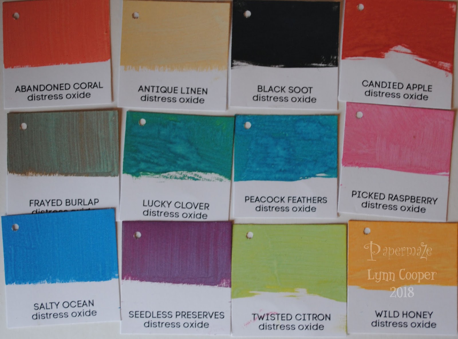
I wrote the original review when the first 12 colours were released, and today's post is about the most recent, so not to be left out here are the 12 colours which were released later on last year. They included: PEACOCK FEATHERS, SEEDED PRESERVES, ANTIQUE LINEN, FRAYED BURLAP, BLACK SOOT, PICKED RASPBERRY, CANDED APPLE, WILD HONEY, TWISTED CITRON and LUCKY CLOVER.

This experiment prompted me to make a layout that is very different to my normal style, it was great fun to create by playing with these great inks and so much wonderfu colour!
Back with more projects using these inks later in the month.
Thanks for looking
Lynn x
2 comments:
Cute layout Lynn and lovely colours.
Super cute photo Lynn and I really like the gentle effect you create with the background xx
Post a Comment