Showing posts with label floral cluster. Show all posts

Friday, 27 March 2026

Simple Stories - Color Me Happy - The Best Memories

Hi!

It's Claire back on the blog today and I have another layout made with the Color Me Happy collection from Simple Stories.

I loved this collection as soon as I saw it, but creating with it makes me love it even more! It's such good fun!


For this post, I'm focusing more on the floral elements which are so pretty. I started with a sheet of plain white cardstock, and cut a circle from the How Cool notebook paper to act as my base layer.


On top of this, I cut a polka dot fishtail banner from the Right Now! paper and lay this across the centre, raising on foam to create separation. To help them stand out, I added a dotted black line with a Sharpie pen to each of the coloured edges.

Next, I wanted some bold pops of colour, so I cut out lots of circles from the All About It? Paper. I positioned 5 along the top, and 5 along the bottom of the banner, again adhering on foam for extra depth.


I cut my photo to the same sized circle and added this along the top of the banner, before creating a pretty floral cluster around it using flowers from the Floral Bits & Pieces.


For balance, I created a second cluster opposite my photo, using this space to house my title. Of course, I opted for the Foam Stickers for the 'Memories' phrase, complemented by a small chevron arrow from the Chipboard Pieces.


To finish, I added a few sequins from my stash to give it that little extra sparkle.

Thank you for joining me on the blog today. Don't forget to check out this stunning collection in the shop here.

Happy scrapping!
Claire x
@scrappysoulmate.

Monday, 24 November 2025

Whispers of Yesterday - 49 and Market - Echoes of Time Collection

Hi everyone,

It’s Rebecca back on the blog with you today, sharing my second (and final) layout for the month. I’ve had such a wonderful time creating with the 'Echoes of Time' collection from 49 and Market. It’s no surprise that some elements from this beautiful range sold out quickly — but you can still view the full collection in the shop here.


For today’s layout, I was inspired by one of my older projects from a few years ago and decided to recreate parts of it using this collection. I began by cutting several strips of paper — mixing both patterned papers and solid cardstocks from the range. The strips vary in width and length, and I cut a fishtail into one end of each for extra detail. I then arranged them across a sheet of Premium White Cardstock, overlapping some for added texture and interest.


On top of these background strips, I positioned my two photos, mounting them with some frames from the Laser Cut Elements to make them stand out as the main feature. To extend the circular design over on the right-hand side, I added two die-cut circles in a contrasting shade from the Solids Collection Pack.

At the bottom of the larger photo, I placed my title, raised on foam pads for a bit of dimension. I chose one of the phrase pieces from the Chipboard Bits — it worked perfectly as my title and added lovely visual depth to the layout.


With the larger elements in place, I moved on to my favourite part — embellishing! I selected several of the larger floral clusters from the Wildflower Laser Cuts and arranged them in two key areas to balance the composition. And of course, I couldn’t resist adding a couple of the adorable owl die-cuts from the Laser Cut Elements — they were just perfect for my photos!


As much as I love a crisp white background, the layout felt slightly unfinished. So I decided to add some light mixed media details to tie everything together. I started by applying a touch of ink using one of the new 49 and Market x Ranger Ink Pads in the shade “Lavender Kisses.” Over that, I added some subtle stamping and a few delicate Rub-On Transfers. I love how these small touches brought the whole page to life and gave it that extra bit of character.

Thanks so much for reading along!

I hope you’ve enjoyed seeing the layouts I’ve created this month using this beautifully elegant collection.

Take care, 

Rebecca xx

@preciouspagespapercraft

Wednesday, 12 November 2025

Memories - 49 and Market - Echoes of Time Collection

Hi everyone!

It’s Rebecca on the blog with you today, sharing my first layout for November. This month, I’m working with the beautifully elegant 'Echoes of Time' collection from 49 and Market. I absolutely love the soft purple and grey tones in this collection — they have such an earthy feel, while the elements give off a whimsical “Alice in Wonderland” vibe. It’s such a versatile range and perfect for documenting all kinds of memories and photos. You can find the full collection in the shop here.


To begin, I cut strips from two patterned papers and one of the more solid cardstocks, layering them in the centre of a sheet of Premium White Cardstock. I tore the top and bottom edges of each strip to add texture and visual interest before positioning my photos on top. I printed my photo twice, with a white border, and layered them slightly offset — one of my favourite techniques at the moment because it adds such lovely depth and movement to the page.


Beneath my photo, I added my chipboard title “Memories” from the Chipboard Bits pack. Behind this, I layered in some Wildflower Laser Cuts elements and then mirrored this cluster in the top-right corner to help balance the composition. I also tucked in a few smaller icons from the Laser Cut Elements for extra detail.


Once all these elements were layered together, I could move everything on and off the page in one piece while working on the mixed media background.

I began by adding some of the new Irresistible Rub-Ons — such a fun addition to the collection! They apply white and resist ink, which really makes them pop. I chose one of the new 49 and Market x Ranger Ink Pads in the shade Lavender Kisses. After watering the ink down slightly, I ran a small brayer through it and rolled it vertically over my background. This created a soft, blotchy effect that faded towards the edges. Once the ink was in place, the rub-ons really stood out beautifully. I finished the background with some subtle stamping using 49 and Market rubber stamps and a coordinating ink in the shade 'Fossil'.


When everything was dry, I adhered my layered photos and embellishments onto the background, adding a little foam behind for extra dimension.

Thank you so much for stopping by today! I hope my layout inspires you to get creative with this timeless collection.

Take care,


Rebecca xx
@preciouspagespapercraft

Monday, 21 April 2025

Good Vibes - Simple Stories - Simple Vintage Flower Shoppe Collection

 Hi everyone,

It’s Rebecca here today, and I’m excited to share my final layout using the Simple Vintage Flower Shoppe collection by Simple Stories. This collection has been such a joy to work with—especially now, as the sun is shining brighter and flowers are beginning to bloom again! You can find the full collection available in the shop here.


For today’s layout, I started by cutting three squares from two different patterned papers. I chose designs that complemented the colours in my photo, then trimmed the photo itself to match the same shape and size. I arranged all four squares in a diamond pattern in the centre of a sheet of Premium White Cardstock. Because of the direction we’re facing in the photo, I positioned it to the left—this way, our bodies are angled inward, drawing the eye toward the heart of the page.


One of my favourite Simple Stories products has always been the Foam Stickers—I love the mix of fonts and styles. For this layout, I picked a title sticker and placed it on the right-hand square to create a sense of balance across the design.


Having already used many of the large florals from the Floral Bits & Pieces pack, I flipped through what I had left and pulled a few smaller blooms. To stretch the collection even further, I turned to the 'Beautiful' patterned paper and fussy-cut some additional floral clusters. This is such a great way to get more from your stash!

I built two main floral clusters using a mix of those fussy-cut florals and smaller ephemera, adding foam pads for dimension. I also added a bold piece from the Bits & Pieces to the top cluster and a large Cardstock Sticker to anchor the bottom cluster.


To create a sense of movement across the page, I fussy-cut butterflies from the 'Dreamer' patterned paper and arranged them in a gentle cascade. I always attach butterflies by gluing just the body, leaving the wings free for a lovely 3D effect—almost as if they’ve just fluttered down and landed on the page.

Although I loved how the layout was coming together, the outer edges felt a little too bare. Instead of framing the whole page, I opted for thin, torn strips of patterned paper along two edges. It adds a bit of visual interest without overwhelming the centre. A couple of smaller Foam Stickers were the perfect finishing touch.


Thanks so much for joining me today. I've truly enjoyed working with this beautiful collection, and I hope my layouts have inspired you to dive into your own creative projects!

Take care,
Rebecca xx

@preciouspagespapercraft


Wednesday, 4 September 2024

Pretty Little Studio - You are my Sunshine - If Mums Were Flowers...

Hello there and welcome back to the Papermaze blog,

It's Claire here today and I'm sharing another layout with the You are my Sunshine collection from Pretty Little Studio. This collection is one of two halves - It has bold bright colours and patters on the one hand, and on the other, it offers softer, more subtle patters and beautifully drawn florals. It also has some pet elements in the collection - What's not to love!!

Given my first layout was bold and bright, today, I'm showcasing the other half of this collection and hope it demonstrates its versatility. 


The layout is mostly made with die cut embellishments showing you only need a few pieces to create an impactful page.

I started with a piece of Premium White Cardstock and applied a thin coat of gesso because I knew I wanted to create a mixed media background.

Once the gesso was dry, I added splotches of watercolour in blue and green tones to match the shades in the collection as closely as I could.  I left this to dry overnight and continued with the design the following morning.

I pulled out the Apple Blossom Floral Die Cuts which contain several large die cut floral clusters that make a real statement. Using 4 of these, I positioned these across the page on top of my mixed media, layering and raising on foam to create a bit of dimension.

On top of the florals, I added some smaller butterfly and bee embellishments, providing additional detail to draw your eye into the design.


In laying my florals across the page, there was a natural gap in the middle to house my photograph.  To draw in all the colours of the collection, I layered up three frames from the Frisbee Frame Die Cuts. I really love this effect and enjoyed using the frames as layering pieces rather than as frames directly.


Creating a little more interest, I adhered a small 'love' sticker to the photo, taken from the Per Lovers Word Stickers.

For that little bit of extra movement, I selected some extra foliage from the Fresh Bloom Stems Die Cuts adding one at each end of the large cluster and one in the middle.


To help ground the design, I added two small strips of the Summer Garden paper, adding a decorate edge with a border punch.  


To create my title, I created a small cluster to sit alongside the paper strip, mounted on top of some mixed media, one of the frames and some smaller florals. The alphas are from my stash (Happy Heart collection by Pinkfresh Studio) but the colours matched so well.


And with that, the page was finished. I hope you've enjoyed reading this blog and seeing how the page came together.

This really is a beautiful collection and I can't put it down - In fact, I will have a third layout to share with you later this month, but until then, happy scrapping!

Claire xx
@scrappysoulmate

Friday, 5 April 2024

Simple Stories - Noteworthy - Memories Documented

Hi everyone,

Claire here today sharing a new layout made with the Noteworthy collection from Simple Stories

This collection is a pocket pages style collection, with lots of cut apart elements.  Although I don't make pocket pages, i'm always drawn to these collections. The patterns on the b sides are so much fun, you can really let your imagination run wild!   Add to that, the cut apart elements give you tonnes of mileage and really let you stretch the collection and bulk out your ephemera. It's a great value option.

I've used three major cut apart elements in this layout, creating a big statement just by fussy cutting.


To the Premium White Cardstock, I added a piece of the March paper, cut to 8.5" square with distressed edges, created by scuffing the edges of the paper with my scissors. Along the top, I used a punch to give a notebook edge look.

Using the cut apart elements from this paper, I cut two tall elements, a spiral notebook and envelope, from the March and June papers, and lay these on top of each other, slightly offset, to create an anchor for my photos to sit on.


I raised the spiral notebook piece on foam and cut right around the wire to help it look more authentic. I also added a foam sticker clip for extra interest. 

To balance the page across the square, I used another cut apart element, this time from the April paper. It had three coloured squares like Post It notes and I thought it would be perfect to house my photos. I flipped it horizontally across the page and adhered my photos on thin foam, showing just a bit of the coloured square underneath to help frame them.


To the left of the photo strip, I created a small cluster using floral ephemera, a sticker from the Cardstock Stickers and a clipboard from the Journaling Bits pack.


I also added a small floral cluster on the opposite end of the photo strip for balance.

Next, I added some of the cards from the Journaling Bits and stickers to the top of the photo strip to replicate a MemoryDex effect. I love how this part turned out - It's pulled all the colours, the paper elements and florals together in a single cluster. I think it's my favourite part of the whole layout.


To finish the layout, I added a bold title from the Foam Stickers, showcasing all the colours in the collection. As a final touch, I added the cute pencils to make it look like I'm ready to add journaling to the page.


This has been a really fun page to create - the colours in this collection are my favourite - lots of pinks, yellows and teals - what's not to love!

I'll be back in a few weeks with a second layout, and look forward to seeing you then.

Happy Scrapping!

Claire xx
@scrappysoulmate

Wednesday, 6 March 2024

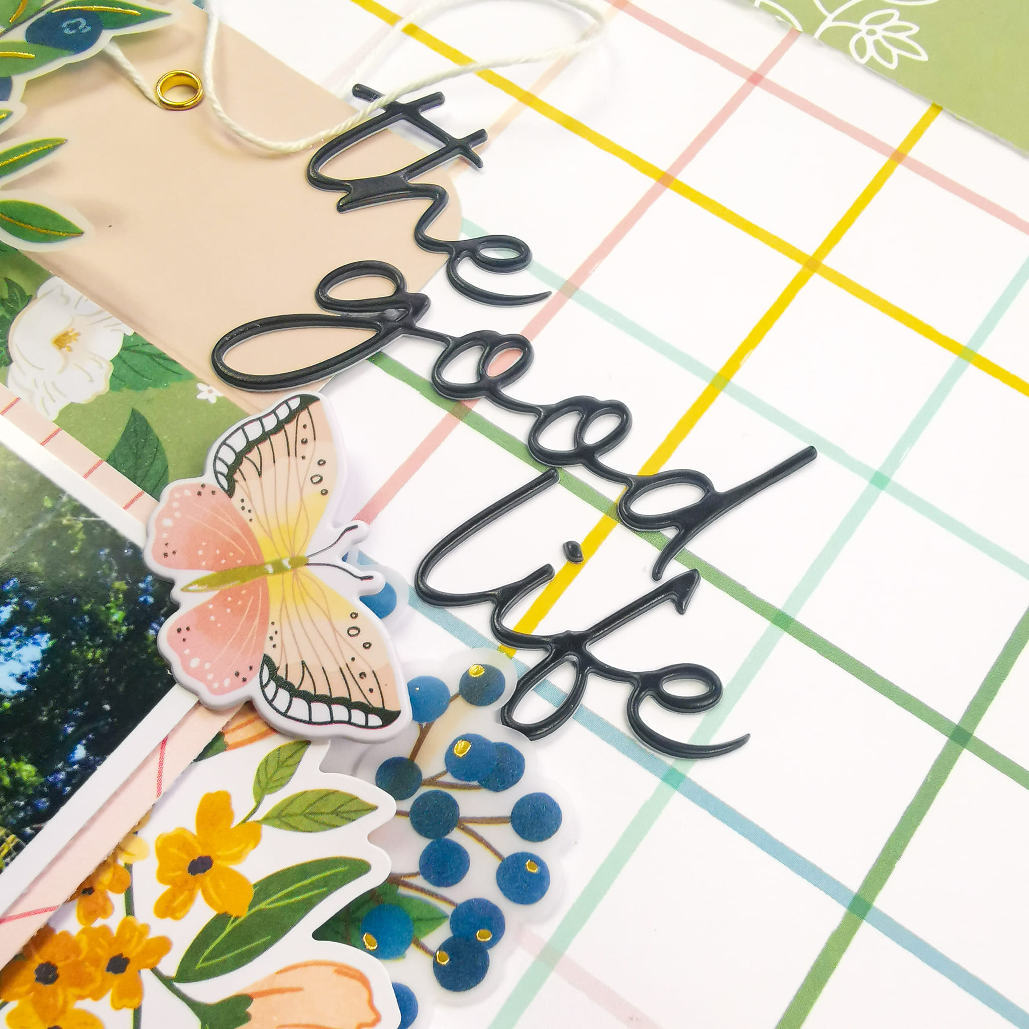
Pinkfresh Studio - Making the Best of It - The Good Life

Hi everyone!

Claire here and this month I am back sharing a Spring layout, created with the new Making the Best of It collection from Pinkfresh Studio.

It's been a minute since I've created with Pinkfresh Studio collections and I've really missed it. This new collection definitely doesn't disappoint. It has a beautiful colour palette, and is filled with gorgeous florals and a mixture of materials with vellum floral embellishments, cardstock stickers, puffy stickers and more! You can check the collection out in full here.


For a change, I steered away from my usual crisp white cardstock background, opting for the Be the Sunshine paper which has this fun multicoloured grid pattern.

To create my layered design, I started with a large envelope and red scalloped card from the Journaling Bits, and used this as an anchor to build from.


I backed my photo with a piece of the Live for the Hope of It paper as the pink tones echo the pink of the envelope and the journaling card. To create depth, I raised the photo on foam before adhering it to the envelope.

The photograph was taken last year in my garden, and just behind the fence is a small river running through a wooded area, so I wanted to try and depict this in the layout. 

I fussy cut the blue scalloped border from the No Risk, No Magic paper, slotting this under the envelope to mimic the stream.


Next, the embellishing - and there are so many options to choose from!

I was immediately drawn to the Vellum Die Cut Ephemera. The florals and leaves are beautifully designed, and the vellum provides great movement and texture for clusters. They even have gold foiling which adds that little something special!


I mixed the vellum florals with a circular sticker from the Chipboard Stickers and added some Die Cut Ephemera and Puffy Stickers amongst the other clusters to add that extra interest created by mixing materials. For example, I also fussy cut some leaves from the Good Feelings paper, echoing the blue tones and adding movement.


To create my title, I opted for one of the Puffy Title Stickers, adding a butterfly from the Puffy Stickers just underneath.


I made a smaller subtitle to sit along the bottom of the photo, using a banner from the Journaling Bits and another Puffy Sticker.  To create extra dimension, I rolled the banner between my fingers to curl the edges.


At this point, I liked the design but it didn't feel finished. I felt like it needed more green to really reflect the photograph, but I liked the central design all clustered together, 

I decided to offset the page, mounting it on a piece of the Beautiful Story paper and it immediately brought the layout to life! I love how this green reflects the envelope and the outdoorsy feel of the photograph.


I hope you've enjoyed this blog post, and I hope you'll check out this lovely new collection. It's honestly been a joy to create with,

I'll pop back later this month with another layout using this collection and hope to see you then.

Happy Scrapping!

Claire xx

@scrappysoulmate.