Showing posts with label white space. Show all posts

Monday, 20 April 2026

Discover - 49 and Market - The Looking Glass Collection

Hi everyone, Rebecca here! I’m a little later in the month than usual, as I was away for Easter visiting my parents. Being away means I’ve come back with lots of new photos to scrapbook—which is always a good thing!

This month, I’ve chosen to work with the 49 and Market The Looking Glass collection. During a recent day out at Blackgang Chine, we explored the park’s Nursery Rhyme section, where there are the sweetest little toadstool houses. They instantly made me think of this collection, so of course I asked Riley to pose in front of each one!

You can find the full collection in the shop here.


To begin, I cut out some of the larger frames from the cut-apart sheet included with the Laser Cut Wildflowers. I arranged these horizontally across the centre of a sheet of Premium White Cardstock, then extended the design on either side using smaller frames from the Laser Cut Elements. I used the central frame to house my photo and backed the medium-sized frames with patterned papers to add extra interest.


Next, I added some of the beautiful laser cut wildflowers, using larger pieces to build fuller clusters. I raised the florals with foam pads to introduce dimension and depth to the layout.

I couldn’t resist including a couple of the treehouse and toadstool designs—they complement the photo perfectly! I placed one on each side of the layout to create balance, then added smaller laser cut pieces around them to form cohesive clusters.


I always love using the Chipboard Assortment from 49 and Market collections—they’re often my go-to for titles. Here, I chose the word “Discover,” raised it with foam pads, and positioned it on the right-hand side of the page. To finish the embellishing, I added a couple of delicate butterfly laser cuts.


At this stage, I felt the page needed a little something extra. Rather than adding more embellishments, I opted for subtle mixed media. I often prefer to add this at the end, once my design is complete and I know exactly where it’s needed. To make this easier, I usually adhere my elements together first, but not to the background. This allows me to move everything aside in one piece, so I can work directly on the background without restriction.

For this layout, I used a Distress Oxide Ink Pad in the shade “Iced Spruce,” which perfectly matches the colour of my son’s coat and helps tie the whole page together. I applied the ink with a small brayer, rolling both vertically and horizontally to create soft, organic shapes. Once dry, I adhered everything in place using Double-Sided Tape.


Thank you so much for reading. I hope you enjoy this layout and that it inspires you to create with this beautiful, quirky collection. I’ll be back on the blog soon to share my second layout.

Take care, 


Rebecca xx

@preciouspagespapercraft


Wednesday, 25 March 2026

Enjoy - Uniquely Creative - Bohemian Escape Collection

Hi everyone,

It’s Rebecca here with you today, sharing my second layout of the month. I’ve thoroughly enjoyed creating with the Bohemian Escape collection by Uniquely Creative—it’s been such a joy to work with. I’m so grateful we’re able to get our hands on these beautiful collections. There are a few in stock, so don’t forget to have a browse in the shop here.


I love how elegant this collection looks when paired with a minimalistic layout and plenty of white space. It really allows the beautiful elements to shine. For this layout, I began by cutting thin strips from several patterned papers. I arranged these strips in the centre of a sheet of Premium White Cardstock, then snipped the ends at an angle to add a little extra interest. I varied the lengths, keeping shorter strips toward the edges and longer ones in the middle. I also removed the centre section to create a horizontal band of white space running at an angle across the design—I had a plan for this area but waited until the page was complete to finish it!


With my photo printed at 3x4 inches, I matted it using a couple of papers from the collection. I chose light blue and beige tones to echo the colours in my son’s shirt. To add a touch of texture, I gently distressed the edges using the blade of my scissors. I then raised the photo with a layer of foam and positioned it on the right-hand side of the layout. I embellished a couple of the corners with florals from the Creative Cuts Ephemera. These die cuts are so elegant and detailed, and I love how they look layered together.


To balance the design, I placed my title (also from the Creative Cuts Ephemera) on the left-hand side of the page. Normally, I might avoid using a solid black title with softer colours, but in this case, I loved how it tied in with the dark sunglasses in the photo and added a bold contrast to the layout.


Although I had plenty of paper strips, I felt the area beneath the title needed a little something extra. To enhance this section, I added a couple of small flowers and some of the beautiful butterflies to tie everything together.

To finish the page, I returned to the white space running through the centre and added dots of Crystal Nuvo Drops in the shade “Mustard Gold.” This subtle sparkle adds an elegant finishing touch.

Thanks so much for reading. I hope you’re enjoying creating with Uniquely Creative as much as I am. I noticed Vanessa has already added another collection to the shop, so be sure to head over to the website and check it out before it’s gone!

Take care,
Rebecca xx

@preciouspagespapercraft 


Monday, 24 November 2025

Whispers of Yesterday - 49 and Market - Echoes of Time Collection

Hi everyone,

It’s Rebecca back on the blog with you today, sharing my second (and final) layout for the month. I’ve had such a wonderful time creating with the 'Echoes of Time' collection from 49 and Market. It’s no surprise that some elements from this beautiful range sold out quickly — but you can still view the full collection in the shop here.


For today’s layout, I was inspired by one of my older projects from a few years ago and decided to recreate parts of it using this collection. I began by cutting several strips of paper — mixing both patterned papers and solid cardstocks from the range. The strips vary in width and length, and I cut a fishtail into one end of each for extra detail. I then arranged them across a sheet of Premium White Cardstock, overlapping some for added texture and interest.


On top of these background strips, I positioned my two photos, mounting them with some frames from the Laser Cut Elements to make them stand out as the main feature. To extend the circular design over on the right-hand side, I added two die-cut circles in a contrasting shade from the Solids Collection Pack.

At the bottom of the larger photo, I placed my title, raised on foam pads for a bit of dimension. I chose one of the phrase pieces from the Chipboard Bits — it worked perfectly as my title and added lovely visual depth to the layout.


With the larger elements in place, I moved on to my favourite part — embellishing! I selected several of the larger floral clusters from the Wildflower Laser Cuts and arranged them in two key areas to balance the composition. And of course, I couldn’t resist adding a couple of the adorable owl die-cuts from the Laser Cut Elements — they were just perfect for my photos!


As much as I love a crisp white background, the layout felt slightly unfinished. So I decided to add some light mixed media details to tie everything together. I started by applying a touch of ink using one of the new 49 and Market x Ranger Ink Pads in the shade “Lavender Kisses.” Over that, I added some subtle stamping and a few delicate Rub-On Transfers. I love how these small touches brought the whole page to life and gave it that extra bit of character.

Thanks so much for reading along!

I hope you’ve enjoyed seeing the layouts I’ve created this month using this beautifully elegant collection.

Take care, 

Rebecca xx

@preciouspagespapercraft

Wednesday, 12 November 2025

Memories - 49 and Market - Echoes of Time Collection

Hi everyone!

It’s Rebecca on the blog with you today, sharing my first layout for November. This month, I’m working with the beautifully elegant 'Echoes of Time' collection from 49 and Market. I absolutely love the soft purple and grey tones in this collection — they have such an earthy feel, while the elements give off a whimsical “Alice in Wonderland” vibe. It’s such a versatile range and perfect for documenting all kinds of memories and photos. You can find the full collection in the shop here.


To begin, I cut strips from two patterned papers and one of the more solid cardstocks, layering them in the centre of a sheet of Premium White Cardstock. I tore the top and bottom edges of each strip to add texture and visual interest before positioning my photos on top. I printed my photo twice, with a white border, and layered them slightly offset — one of my favourite techniques at the moment because it adds such lovely depth and movement to the page.


Beneath my photo, I added my chipboard title “Memories” from the Chipboard Bits pack. Behind this, I layered in some Wildflower Laser Cuts elements and then mirrored this cluster in the top-right corner to help balance the composition. I also tucked in a few smaller icons from the Laser Cut Elements for extra detail.


Once all these elements were layered together, I could move everything on and off the page in one piece while working on the mixed media background.

I began by adding some of the new Irresistible Rub-Ons — such a fun addition to the collection! They apply white and resist ink, which really makes them pop. I chose one of the new 49 and Market x Ranger Ink Pads in the shade Lavender Kisses. After watering the ink down slightly, I ran a small brayer through it and rolled it vertically over my background. This created a soft, blotchy effect that faded towards the edges. Once the ink was in place, the rub-ons really stood out beautifully. I finished the background with some subtle stamping using 49 and Market rubber stamps and a coordinating ink in the shade 'Fossil'.


When everything was dry, I adhered my layered photos and embellishments onto the background, adding a little foam behind for extra dimension.

Thank you so much for stopping by today! I hope my layout inspires you to get creative with this timeless collection.

Take care,


Rebecca xx
@preciouspagespapercraft

Wednesday, 3 July 2024

Echo Park - Summer Vibes - Beach Vacation

Hi everyone!

It's Claire here and today I have a bit of a different blog post for you, designed to help you use those last few leftovers from a collection. In this post I'm using the fun Summer Vibes collection from Echo Park. You can find it in the shop here.

It often happens to me that I have oddly sized scraps of patterned paper and a whole host of ephemera pieces leftover that sit on my shelf waiting to be used. So, before I move on to a new collection, I'm challenging myself to use those scraps - and I love the final result!


I started with a crisp clean sheet of Premium White Cardstock and then went to rifle through my scraps. The piece of paper I came to first was this Cool Shades paper which has a cute wave pattern on the B side. It's roughly 8"x4".


I distressed the edges and wrapped a piece of twine round the top to mimic rope you'd find at the beach. 

The next scrap of paper I came to was an L shaped piece of the 4x4 Journaling Cards - Again on the B side, this paper has a bold stripe which I love! You probably know by now that I can never resist a stripe!

I knew I wanted to try and use three photos but because of the shape and size of the scrap, they wouldn't all fit. To make it work, I mounted 2 photos with the stripe horizontally and one with the stripe going vertically. It was a happy accident born from necessity, but I love how this breaks up the pattern behind the photos.

I raised the paper and photos on foam, adhering them in the middle if the page to create a central column.

Next came the embellishing! I had some leftover Chipboard Phrases, some stickers from the the Element stickers sheet and the Sticker Book from this collection as I loved the icons so much, so there was ample to choose from. In reality I only need a few pieces - I would have had more than enough with any of these options.

I wanted my title to sit at the top of the page, so using 2 stickers from the sticker book. I raised both of foam, with the beach arrow slightly offset across the edge of the pattern paper. A snorkel from the chipboard help finish the title. 


Around the photos I made three small clusters. To the left, I opted for surfboards - one from the sticker sheet and the other from the chipboard.


In the centre panel, I again mixed the embellishments using that cute van from the Elements Sticker Sheet with a small circular subtitle from the chipboard. 


And to the right, both the lilo and flip flops are from the chipboard pack. The lilo is stuck flat whilst the flipflops are raised on foam for extra dimension. 

To bring the page to life, I wanted to create some sand and help anchor the design by brushing on some dry Distress Oxide ink in Fossilized Amber. I love it! It's the perfect shade to match this collection!
I didn't need to gesso the paper first as the ink is relatively dry, applied in small circular motions with a dry mini stencil brush.  

To create a mottled effect, I splashed a few drops of water over the ink with a small paintbrush, left for 30 seconds and then dabbed it up with a paper towel. The water reacts with the Distress Oxide ink, removing it from the page, giving the page more depth and interest.

As a finishing touch, I grabbed a few of the Pinkfresh Studio Matte Gold Pearl Essentials, scattering around the design.

I hope you've enjoyed this bonus layout, and it has inspired you to get the most from your collections.

You can check out the Summer Vibes collection here.

Until next time, happy scrapping!

Claire xx

@scrappysoulmate


Friday, 26 August 2022

Photoplay - Bow Wow - Love you!

Hi everyone,

Happy Friday! Claire back with you today, sharing my second layout using the Bow Wow collection from Photoplay.

This collection is a lot of fun! So many vibrant colours and playful patterns, its perfect for a whole range of topics, but especially for capturing the antics of our furbabies as I have done here.


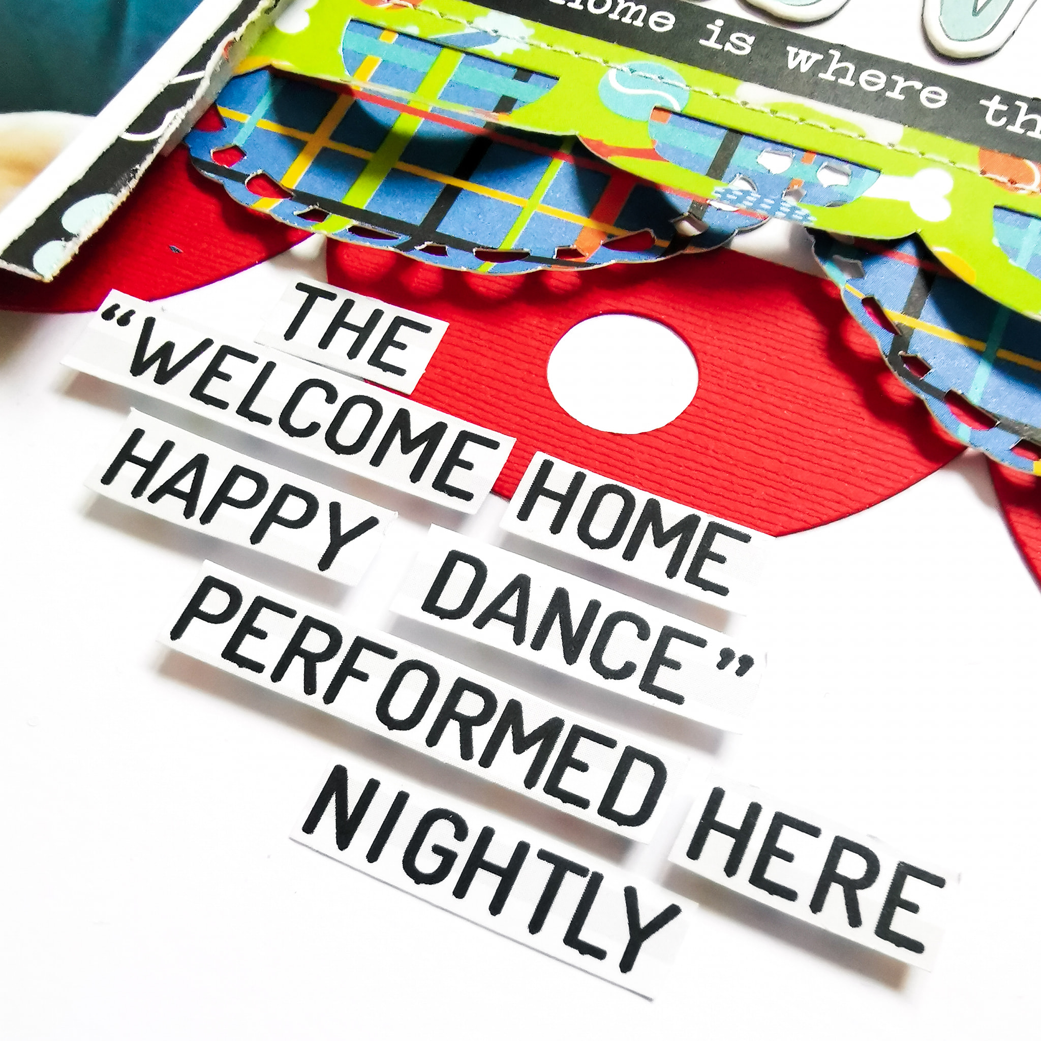
As always, I started with my favourite premium white cardstock and this cute dog house cutfile from Peartree Cutfiles. I cut the file in Premium Black Cardstock (another staple of my craft room!) and backed the file using the b side of the Dog-O-Mania paper which features a colourful polka dot design, and used the blue plaid pattern from the b side of the I Love My Dog paper to create the blue trim.

For extra dimension, I drew around the bone onto the coordinating red Bazzill cardstock from the Matchmaker Pack, raising it on foam pads for extra height. I also drew a squiggly border around the outside for a bit more depth.


I worked out where the file would sit, and brushed some dry Distress Oxide ink in Tumbled Glass onto my card, creating an anchor for the base of my main element.

Next, I created multiple mats for my photo. I used both sides of the Dog Treat paper, lightly distressing the edges for a ruffled, slightly 'dog chewed' feel. I cut each mat in the same size of my photo (roughly 3" square), offsetting them to create a stacked effect. 


For an extra pop of colour, I went back to the Matchmaker Pack and created a mat on my Cricut using a scalloped frame. Once the elements were all layered together, I added the cute #Rescued tab from the ephemera pack.

I really loved the look of the scalloped edge ,so set about finding scalloped designs in my Cricut library. You could create the same effect using punches or drawing round something circular like a small pot to create a similar look.

I chose three  designs and cut them in different papers from the collection; The red Bazzill cardstock from the Matchmaker Pack, the I Love My Dog paper and the Chow Time paper.


I only stuck the top of each strip down so that I could ruffle the edges for extra texture. Once in place, I added machine stitching to the top row and positioned my photo cluster on top.

To create my title, I used some Thickers from my stash and some small alpha stickers from the Simple Stories Color Vibe Sticker Book


To add a bit more drama, and to echo the black of the cutfile, I added a sticker from the Ephemera Pack which brings both sides of the layout together.

Underneath my photo cluster, I wanted to create some movement, so added these gorgeous 'WOOF' flags, again from the Ephemera Pack, stitching through each letter to create a banner and curling the edges off the page slightly.


I also added a heart from the ephemera pack and a small fussy cut dog from the Dog-O-Mania paper.


As a final touch, I fussy cut this awesome statement from the Lucky Dog paper. It's so appropriate, although in my house it's performed much more regularly throughout the day and is very typical of my furbaby!! It captures her love of life perfectly :)


I love how this turned out. Those bold colours and shapes against the crisp white cardstock really pop and look very striking in real life.


This collection has been so much fun to create with. I hope my designs have inspired you to create and enjoy some scrappy time this summer.

Until next time,

Claire xx

@scrappysoulmate