Saturday, 31 October 2009

November workshops

This month we have 3 workshops to do.

THe first one is on the 11th November.
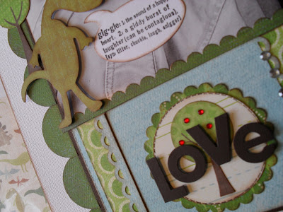
It is a page that has a mini album on the actual page. This workshop starts at 7.30pm. Bring with you your normal cropping tools and a big photo nearly an A4 size. The colours of this page are green and blue.

The 2nd workshop is a christmas cards workshop. We will be making 'special christmas cards' on this evening.
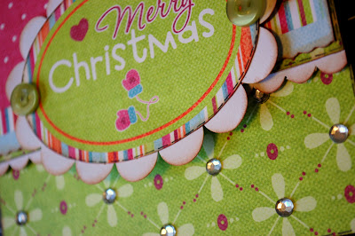

This is going to take place on the 18th November and starts at 7.30pm. Bring with you your normal cropping tools. We will only hold this workshop if we have enough people.

THe third one is a page based on puzzle shapes.
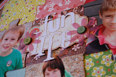
It is done using the new Basic Grey Nook and Pantry line. Again you need to bring your normal cropping tools and it starts at 7.30pm on the 25th November.
You will need several pictures for this one. I have used 4 photos on this one, but you can add more if you wish. The size of the puzzle shapes and there fore the photos are roughly about 10.5 cm by about 13cm. Preferably portrait size.

If you have never been to one of our workshops before, they are held in the shop, we have tea, hot chocolate, lots of gossiping and laughing. They are great fun, and dont worry if you have no one to come with it is a very easy and friendly place!!! lol. Hope to see you there.

Friday, 30 October 2009

Easy Mini Books (with the help of October Afternoon)

Hi, I want to show you my quick way of making mini books. They don't have to take days and days. I used to be terrible at starting these projects but then never finishing them. So here's how I make my quick and easy mini books in an afternoon.

Firstly, once you've decided on which photographs you want to scrap (I like to print mine off the same size for these simple mini books) then cut your card stock to size. This one is 5.5 inches square. I've then inked the edges. I personally love the cats eyes ink pads for this job.


I've stuck to the October Afternoon Road Map range for this project. Again this makes it more simple to make not having to fuss and decide which papers and embellishments to use.

The journal cards are perfect for mini books. As everything coordinates so nicely, I wanted them to stand out of this album rather than hide them away inside.

I've then added the matching stickers throughout the book.

And the mini alphas are another favourite of mine when making mini books.
I've used the Bind it all to hold it all together.

So, simple, effective and can be achieved in an afternoon.

Thanks for looking, Lisa x

Tuesday, 27 October 2009

Apologies!

I must apologise to everyone for not posting the results of the Autumn Layout competition that we ran. Sometimes life just takes over - we are having some extensive building work done which has been taking up all of my time and concentration, and I was reminded earlier this week that I hadn't announced a winner!

Anyway, we had some fabulous entries - I have posted some of my favourites below:

Rebekah


Anita


Louise

Anna

And the winner, whose name was drawn at random by my husband - Morag

Congratulations Morag - a pack of Indian Summer will be winging its way to you - just drop an email to vanessa@papermaze.co.uk with your address!

And apologies once again for keeping you waiting - the building work is well underway now so I hope to be able to turn my focus back to the shop again!!

Sunday, 25 October 2009

Dahlia flowers

OOH I was sent these awesome Jenni Bowlin papers to play with. I love this range so much - you need to go check out the chipboard buttons they are a must! I made a dahlia flower for my page - using one on your layout gives the page that extra something.

For the layout:

1: start off by cutting your circle paper as shown then glue this onto your card stock using a craft knife cut all the way down in the middle of the circles but leave about one centimeter at the top and bottom.

2: cut a strip of patterned paper and glue this onto the back of your layout curl and tear the card stock to get the effect as shown.

3: cut a strip of patterned paper and card stock overlap as shown then glue your photo into place.

Now to make your dahlia flower:

Cut six circles out either using a circle punch or a compass. Take a chalk block and ink the back of each circle as shown.
Fold the circle in half so you have a crease to follow.

Open the circle back out and fold the two corners as shown so the start from the crease you made earlier.
Now turn it over and lie this part of the flower flat to the table and fold the two half's into the centre again. Repeat for the rest of the petals.


I know seeing photos and step by step instructions can sometimes be a little daunting so i have done some research if you google search making dahlia flowers there are videos in that listing on you tube so i hope this is a bit of extra help!

To finish the layout place your dahlia flower around the right hand side of your photo and add embellishments for more detail.

Using double dmc thread stitch a cross stitch shape as shown and finish off your layout by adding your title.

Sunday, 18 October 2009

Big and Bold Patterns

Sometimes paper ranges are released with big bold patterns that are gorgeous to look at, but can be intimidating to actually scrap with. Some of the papers in the My Mind's Eye Ooo La La range fall into this category. So how should you approach a layout using these kinds of papers? One thing you can do is to make sure that your photo is bold and bright enough to stand up for itself amongst all of these loud prints! I had a picture of one of my cats with a fuschia pink throw as a backdrop. Lots of papers just wouldn't be able to stand up to the colour, but the bold patterns of the Shabby Chic paper were more than a match for it!
Another tip would be to try to include some single blocks of colour on the layout too. On the layout above, I have included a block of pink to frame the photo so it isn't totally lost, as well as leaving a border of white around the photo to give it further emphasis.

I have also contained the paper itself in a white cardstock border to tone down some of the impact, and made sure my title stands out by using bright white lettering and raising it from the page on foam pads.

On this page, I used the Summer Days paper to create a simple 6x12 layout. When you have bold and bright patterns, it is sometimes best to keep the rest of the embellishment fairly simple. I used a diecut from the same range to make a flourish to underline the title, and then reserved most of the embellishment to one corner of the layout, where I created a cluster of toning embellishments with a 3D effect. I have also made sure that the photo had the strong contrast needed to hold its own on the page, in this example by choosing a photo with a dark background which frames the subjects. I have also toned the photo with the paper as the eye-shadow I'm wearing matches the colour theme of the page!

So don't be intimdated by bold patterns - they can often make for eye-catching and exciting layouts, and with careful image selection and framing you should find that your photo still remains the focus of the page.
Posted by Picasa

Sunday, 11 October 2009

October workshops

I am sorry these have not been up earlier. This has been due to illness in the family.

The first one is the 14th October.

This is done using some My little Shoe Box pattern paper and one of the Cosmo Cricket spinners. The photos you need are 4 wallet portrait sizes and if you can they should be photos of yourself as that is the theme of the photograph. These are the colours that are being used on this page.
The workshop starts at 7.30pm, bring your normal cropping tools with you.

THe next workshop is on the 28th ( amended from the 21st ) October. This is a birthday page done using these pattern papers
You need to bring 2 photos sized 7.5cm by13 cm and one small wallet size photo, although if you didnt have a small wallet size one you could another one of the bigger sizes as it would probably fit on. THis workshop starts at 7.30pm and bring your normal cropping tools with you.

Here is a sneek of one of the workshops that is being done in November....

This is a page with a mini album actually on the page and a photo nearly an A4 size.The date of this is still to be decided but i will let you know. Hope to see you at the workshop xxx

Wednesday, 7 October 2009

How to Stretch the Stash - Part 1

We all like to get the most for our money, don't we?! Or sometimes you may just love your piece of patterned paper so much that you don't want to use it all up on just one LO. So I thought I'd share some of my 'Stretching the Stash' secrets with you.

My first is cutting up into squares to form a grid. (see LO above) This is so effective and very easily achieved. I've used the My Little Shoebox papers on my projects which are such a pleasure to work with. They are so fun. I've finished this LO with a matching journal tag.


My next LO I've used one of the die cut journal pieces which come on the same sheet but before sticking down I've turned it the wrong way and dabbed some paint around the edges so when you lift off you get just the outline. A great way to make your own patterned paper.
I've taken a piece of die cut paper and cut it down. A good way of getting 2 or 3 projects out of the 1 piece.
And don't you just love the mini alphas?? I can't get enough of these lately. I've used the little alpha stickers, also from My Little Shoe Box. They are really good value and last for quite some time too.

My last making today is this birthday card. The patterned paper is some of the left over from the die cut paper. The strip is from the 12x12 sheet of journal bits and the cup cake is cut up from the left over paper I used from My Little Shoebox. It's always worth keeping the leftover bits.
Have fun stretching your stash xx