Wednesday, 31 August 2016

Kaisercraft - Mademoiselle Collection - Part 2

Hi Lynn here! Back with a second post and two projects I have created with Kaisercraft Mademoiselle collection papers. I made a scrapbook layout and a framed picture.

Tempus Fugit Layout


Time certainly did fly for our four day break in New York City last year, and since we returned as this is the first layout I have made using the photos form the trip. We visited Grand Central Station one evening and would have liked to have gone back to see it inside in better light, but we did manage to take a few photos. 

For this page I picked out the time and butterfly elements from this line of papers. I used the wood grain paper (Mahogany) for the background and gutted a piece from the centre to use as one of my many photo mats. I cut a 11.5" x 7.5" piece of Timepiece (reversed) and arranged this about 1" from the top. Then taking strips of other papers I tucked them behind the top and bottom of the first piece. I used papers left over from my canvas project - Blossoms and Mannequin, then added both sides of a new sheet - Floral Spray.  All these papers were heavily distressed.


I cut some of the smaller butterflies from the Flutter paper and clock faces and flowers from the rest of the Timepiece sheet. Several of the smaller clock faces were taken from the Mademoiselle Sticker Sheet, these were given a glassy effect by adding a thick layer of Glossy Accents. 

A gold doily was cut up and the sections were tucked between the photo mats and under the tears created in the layers of papers.


I used a Tando Creative Small Clock Face to the top left of my photo, having first treated this with gold embossing powder, then a sprinkling of Stampendous Frantage Shabby White Embossing Enamel which also gave the piece some extra sparkle!


I layered my photo up on various papers (scraps) cut to roughly the size of my photo - Mahogony, Threadwork and Blossoms, these were also heavily distressed.

To finish off a little Liquid Pearls and Stickles - the title was created with some old Making Memories Rub - On letters from my stash.


Framed Butterfly Picture


I saw an idea in the July Kaisercraft Work Shop Magazine (downloadable from the link), using one of their frames and covering it with papers and centering the large butterfly from the Flutter paper inside. I already had a deep RIBBA frame from IKEA and thought it would be good to keep the paper uncut for the bottom layer and leave my frame and mount white.  I cut another large butterfly from the second sheet and stuck it down but the body using glue. I then built up the wings with 3 dimensional foam pads. The details were highlighted with Glossy Accents, Liquid Pearls and Stickles glitter glue. 

close up view

Please visit the shop by following the links to find the products used.

Back next month with a review of Ranger's New Enamel Accents.

Thanks for looking.
Lynn x

Monday, 29 August 2016

If i had wings....

For this post i have continued to use the prima papers vintage emporium but rather than a scrapbook page and have used a cheap wooden  15cm x15cm frame.
Firstly i painted the frame with a  piece of cut and dry foam.
I then layered with silicone glue two pieces of distressed patterned paper on top of each other. I used a distressing tool but the side of a pair of scissors will have the same effect along with some distress ink.
I then added to strips of patterned paper roughly on the middle of the background paper.
Cut a chipboard butterfly in half  and added that to one side of my strip.
My mini photo's are printed of at 5cm by 5cm which
i have done by using a project life app on my tablet.
Backed the photos with hessian. Added a label and post mark. cut up a resin frame and added my title. Lastly added some tissue tape to the sides of my frame


Close up pictures

really loved how this turned out, using my scraps left over from my layout

Wednesday, 24 August 2016

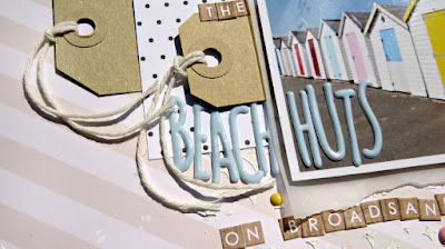
At the Beach with Pebbles Spring Fling Collection

Hi Tracee with you today to share a layout I created using the gorgeous Pebbles Spring Fling collection


I used the pastel and kraft tones in the paper to give a soft look to the bright beach huts in my photograph. My background paper is actually from an old Christmas line by MME. I used some texture paste through a stencil to add a little texture to the background.


Included in my goodies this month was a sheet of alpha stickers by Websters Pages, I was able to spell out both my title and my sub title with them. It's amazing how far they will go! I love to put tags on my pages and am always happy to see them in my pack.


I think my favourite paper in the Spring Fling collection has to be the the tiny hearts on the kraft coloured background, I was really loathe to cut this paper up. I fussy cut the little birdhouse, which perches nicely on the chipboard stickers that I found in this pack.


I loved working with this collection and I hope it inspires you a little.
For this page and all your crafting needs please visit the shop


Monday, 22 August 2016

Magical Tips and Tricks

 
Today I am scrapping a magical memory. The morning that we entered Disney's Magic Kingdom before park opening.

You can watch me create this page on YouTube here.

I have used some of the Amy Tangerine 'Finders Keepers' papers for this page. They are just so perfect for scrapbooking fun and magical memories. I love how bright and happy they are.
I love this 12x12 die cut card, it's so much fun to use.

 
I've taken this piece from the die cut card and placed a piece of green paper and stuck behind the word 'lovely' to help it stand out more.
I also cut some of the cameras out from the patterned paper so embellish my page.


I printed my journaling on my pc and cut into strips and punched out some circles using a small circle punch and some of the patterned paper.
 
I hope you enjoy the video.
 
Thank you, Lisa x


Friday, 19 August 2016

August Crop

It's crop day again tomorrow, and while the cakes are in the oven I thought I'd put up this month's kit.  Lesley has been inspired by one of Anita's DT pieces to produce this using the lovely Timeless papers from Blue Fern. 


As usual we'll be meeting in Otley Village Hall from 10am until 5pm with refreshments available and a discount in the shop!  Hope to see you then!

Wednesday, 17 August 2016

Back to basics

Hi, Carol with you today on a trip down memory lane….

We all learn different techniques on our crafting journey, some we use every day and some we store for the odd occasion and some we think are just not for us and are shelved…

Back in 2004, 3 brand new, really different, ink pads were introduced…can you think what they were? …who guessed distress ink? by the very new, and really popular, designer Tim Holtz…what followed was a massive range of distress inks, and over the 12 years that has followed lots of different distress products, and of course loads of new and different techniques for us to try all detailed in Mr Holtz's books… so, whilst pro-craft-inating in my craft room, I decided for this post I was going back to my roots and playing with the first techniques I learnt all those years ago. (Actually its quite scary, I'd been crafting for quite a few years prior to distress ink hitting the market and to think that was 12 years ago I must have been crafting for nearly 18/20 years how has that happened?)

So, using my craft mat I swished my inks, added water, and added card stock - I then splashed water onto the cardstock to create clear patches.… I used two different colour ways - one reds, green and blue and the other brown, amber and blue.

These are  my swished pieces…


I then added distress ink to my cardstock, to fill missing pieces.

So, my plan was to make a card and tag for a friend and a male card for a family birthday coming up…

Ladies first:-
I cut my cardstock to size and then stamped with a background stamp and candid apple distress ink, some stencilling was then added in the middle…using a crafters workshop doily stencil and candid apple distress ink….I then added black soot to a face stencil and added hi-lights with a white pen.  The edges were then given an edge of candid apple distress ink darkening up some of the edges with my old time favourite (and used on almost every project) walnut stain…(which just happens to be one of the first three colours).  Doodling was also added to the edges.

The base was then matted onto black cardstock.  I stamped a sentiment onto left over cardstock and matted - the flowers are by prima and the black fern was cut using wildflowers die by Tim Holtz alterations.  Some washi tape was added along with some small pieces of bling.


The tag was made using the same process and I added some distress ink coloured ribbon with some beads attached just to finish off the tag.


Male card:-
the background was made in the same way although this time I spritzed water thro' a tando mini stencil - bricks, and left the water in situ whilst gently lifting the stencil, flipping and pressing down onto the ink base - this removes the colour and leaves a lovely effect - its clearer to see on the tag….


On the main card I added some second and third generation text stamping before adding a handcut stamp image… The edges were inked and doodled as before.  Using left over cardstock I stamped and cut a crazy bird and then added a hat and balloons from the accessories set.  A stamped, and matted, sentiment, finished off the card.


The tag was made in the same way.

Product used:-

TFL xx

Monday, 15 August 2016

Marvellous Metallics

I am a great fan of patterned papers, infact, if I am honest, I really struggle to use plain cardstock full stop. And even with pattern papers I often find it hard to keep them *clean* by not inking, spraying or painting them somewhere! I really like using acrylic paints on my pages and often just use standard matt colours.....so i thought I would break out my metallics this time and jazz up a sheet of Blue Fern Studios paper from the Tranquility Range.....I didn't manage to stop at just using metallic paints though as you will see!


This photo was taken on a holiday to the beautiful Camber Sands a couple of years ago and was on our last evening there. The sunset was very pretty and I wanted to try out the self timer on my new camera..... and i really liked how the photo turned out so thought I would scrap it.


I created the background by sponging acrylic paint in various metallic shades onto some bubble wrap and stamping it onto the page....I then repeated this, but used the gilding flakes glue instead and then added the flakes to the page and to some strips of paper.


The title was created by using letter stickers, which I sponged paint over and then when dry I peeled up the letters and threw them away( this is a good way to use old stash and also doesn't matter if they are from different sheets in different colours)  and using a fine marker pen, I edged the letters to make them stand out a bit more. It was great to actually use up some old stash that I have coveted for soooo long!!


I also used some Distress Stain dabbers in various places and added several mixed pearls, gems, metal photo corners and other bits and bobs to complete the page.


Do you use acrylic paint very often? And if so, do you tend to use standard colours or do you like metallics too?

Thanks for looking.
Warmest Wishes
Anita xx

Friday, 12 August 2016

Kaisercraft - Mademoiselle Collection

Hi Lynn here! Today I'm sharing my latest creation with the elegant Kaisercraft Mademoiselle collection together with a canvas and an embroidery hoop. This lovely collection has several themes including needlework, flowers, butterflies and time pieces. This makes it ideal for many different themes - be they heritage or modern.


My 12" x 12" canvas was treated with gesso, texture paste through a stencil and acrylic paint. Then a little splash of ink and some stamping around the edges.
The wedding photo was mounted onto a 7" embroidery hoop - the inner hoop had been covered with a circle of paper which I had distressed before using glue to hold it in place. 

I used papers and stickers from the Mademoiselle collection, many of which had the fussy cutting technique, before being inked and stuck into place. Some were glued and others were adhered with foam pads to give dimension.

finally I added a lot of tiny embellishments including roses made with scraps of Bazzill cardstock and the Tiny Tattered Florals die set.


Here is a list of the items used with links to the shop:
Thanks for looking
Lynn x

Wednesday, 10 August 2016

fun with prima

this month i have worked with some beautiful papers from prima vintage emporium. There are a few processes in this page, so I'm going to number each process in the hope i do not  forget anything
1. Used the opera seria patterned paper and covered it in clear gesso.. This allows me to add paint effects without saturating the page and losing the patterned paper underneath.

2. Next i have used texture paste through the Tim Holtz  flourish stencil                                                                                                                       
3. Using various mica sprays, powders and inks i began adding them to my patterned paper randomly and then using a paint brush to move the colour around. 

4. I have then used the puccini paper from this collection, added strips vertically, but also torn and distressed them. And also torn a matt from this paper to place my photo on with silicone glue.

5. Once I decided where my photo was going, i could then add my lace appliques from my own stash. then add my photo
                              
6. Add the rest of my embellishments, paper flowers, thread, cork, a tag, wooden pieces, and micro beads.( ones used for nail art)

7. Finally some flicks of ink and some old rub ons from my own stash, distressed the edges of my layout and matted on to a mustard coloured card stock


Close ups
 Close up of the embellishment cluster


Tuesday, 9 August 2016

*Magical Adventure*


Hi, it's Anna with you today. I've been working with the Echo Park Magical Adventure Collection this month. Anyone who knows me will tell you that one of my favourite things is all things Disney. I've been lucky enough to visit Walt Disney World in Florida as well as a few trips to Disneyland Paris, most recently last summer. I'm still working on my photographs from last year so once again I was keen to get my hands on the latest Disney themed collection to be released. I used a piece of patterned paper from an older Disney themed collection Say Cheese II by Simple Stories on white bazzill cardstock. I added my photograph and used the elements stickers around my layout. 


Supplies Used:


Papermaze stock several great collections of Disney themed scrapbooking ranges. Take a look at these if you've got Disney photos to scrap! 


I'll be back with another layout using Magical Adventure soon. Thanks for looking. 
Anna 

Sunday, 7 August 2016

Fun Lip Balm Purses with Pebbles Spring Fling

Hi Today I am going to share with you a simple project I created using my Cameo and a sheet of paper from the Pebbles Collection Spring Fling.

Lip Balm Purses by Tracee


These cute little purses are a perfect thank you gift for my Granddaughter to give to her friends after their sleepover, I created them using a cut file by Jennifer Wambach that I purchased in the Silhouette store.


As you can see the lip balm fits perfectly and the double sided Strawberry Fields sheet has a strawberry pattern one side and polka dots the other, did I mention I am a little addicted to polka dots?


I embellished them with a few wooden buttons and some enamel dots. I cut the "thanks" sentiments from the Me To You sheet and cut the side to fit the curve on the purse.


I love to make simple things that look cute & I hope you enjoyed my project today
Have a great weekend & don't forget to pop over to the SHOP for all your crafty needs.


Monday, 1 August 2016

Daddy's Girl - Blue Fern Studios and Kaisercraft

 Hello again, Anita here today.
Do you have certain photo's that you are happy to scrap more than once? I do ....and this is one of them. Me with my Daddy, when I was just a toddler and my parents had a photographer come to our home for a little photo shoot.
(Apologies for the poor quality and slightly off set photo of the layout, I am having a few technical problems at the moment)
I decided I would mix up a couple of manufacturer's papers for this layout and I have used both Blue Fern Studios (Tranquility) and also a little bit of Kaisercraft (Cottage Rose).


I took a sheet of Tranquility - Hushed  and used a Martha Stewart Punch Around the Page set and some scalloped edge scissors all around the edge of the sheet, I then stuck it to a sheet of Juneberry cardstock  so that there is a little frame of deep, dusty pink. I also used the same card to die cut some branches with leaves and I dry brushed then with white acrylic paint....I also dry brushed the photo edges to give a softer feel to it.

I wanted to add lots of texture and dimension to my page so created a fabric photo mat using cheesecloth, layered up and mixed with texture paste. I then spread some texture paste onto a square of bubble wrap and stamped it onto the page. Before the cheesecloth and stamped area dried, I drizzled some Microbeads in various colours on and they set as it dried.


I had some flowers to use but felt that the black one was too harsh for the page....this was soon remedied by spritzing it liberally with a Cosmic Shimmer spray mist  
....end result much prettier and co-ordinates much better with the page I thought.


I made some bunting using various frames cut from a sheet of Kaisercraft Cottage Rose - Framed and tied them together using lace which was then knotted at each end. The little girl on the bottom left of the photo was cut from a sheet of Tranquility - Calling Cards and I also printed out some various butterflies to use on the page, to which I added some pretty crystal swirls, leaving delicate trails behind them..
Once again it's been a pleasure scrapping with Blue Fern Studios.....and you can find all their products and many others besides all over at Papermaze.

Wishing you all a super, summery August.
Anita xx