Wednesday, 31 May 2023

Documenting All The Memories


Hi, Lisa here.

Today we are chatting about telling lots of stories and adding lots of photos, all on the one page.

Remember this journal here?


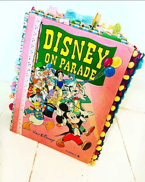
If you haven't seen it before, I turned this old hardback vintage Disney book into the biggest journal ever!

I have a video here if you'd like to see it being made.

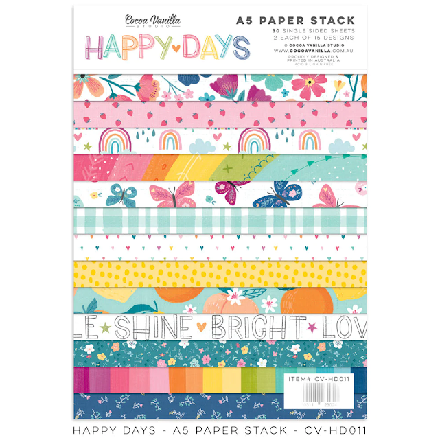
This is the journal that we are working in today and we are using the Happy Day collection from Cocoa Vanilla Studio here. 


Look how fun!!


This journal is seriously so big, even 12x12's are small : )
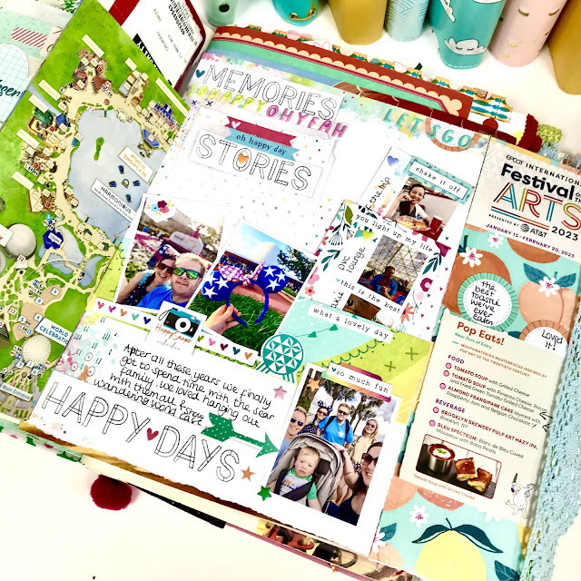
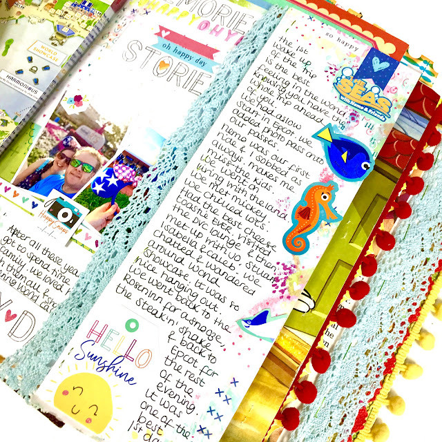
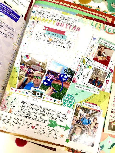
This is the page I ended up  creating.
The Epcot map pulls out on the left of the page.

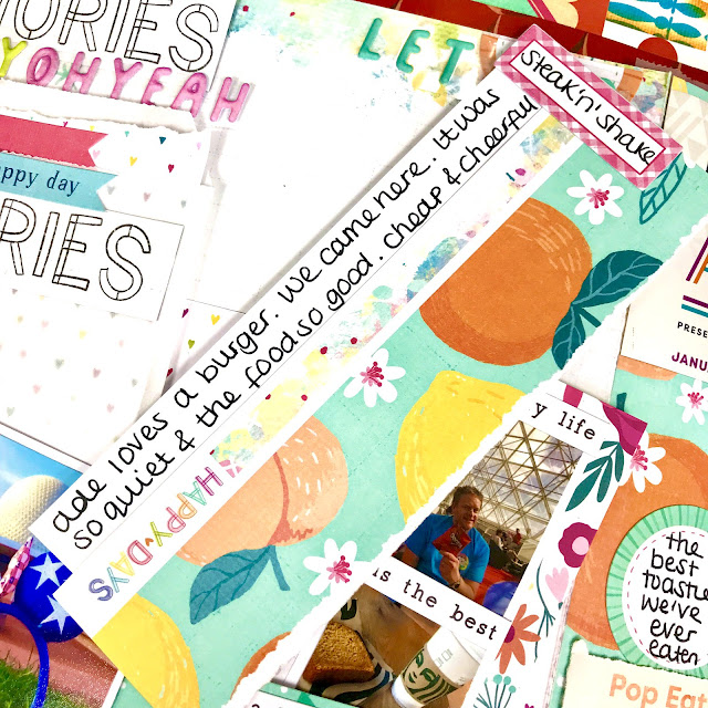
I wanted to document the whole day. It was the first day of our trip so was ram packed of stories, so I knew I had lots to journal.

I created a pocket on the front so I could pop lots of bits inside to make it feel less cluttered.


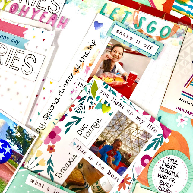
I printed off mini photos to make photo strips and made these photo strips on scraps to pop in the pocket.


And I journaled on the backs too.

A great way to keep a page tidy.


This paper here is my favourite.

I may have to stock up on extras.

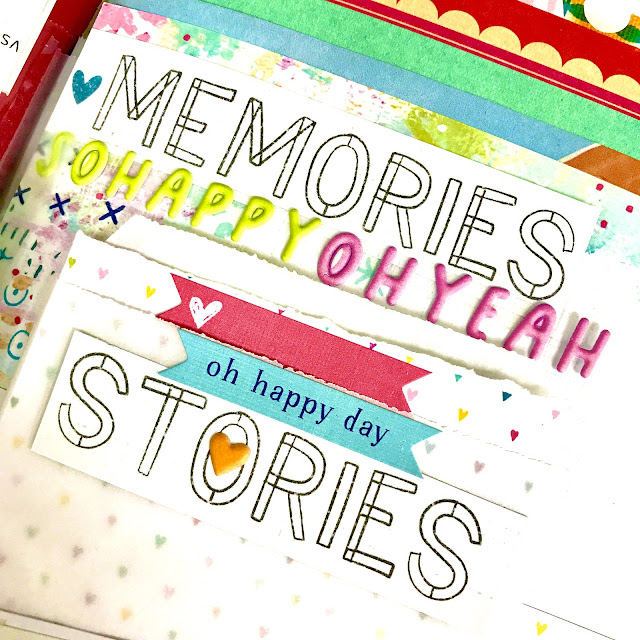
Great to use as titles, colour them in too or layer up as I have done here.

You can also see the Rosie's Studio puffy words here

Little Tip! I leave them on the acetate packaging and stick the plastic straight on the page with double sided sticky tape.
It works so well. Helps keeps them secure and in place, all in a straight line and it's so much quicker too.


And then as I has SO many stories to document, I stuck on a flip piece and told the story of our day.

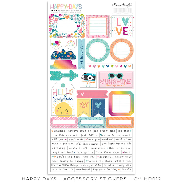
I used quite a few of the coordinating stickers on this page.


Love these!


So that's my finished page. I added some memorabilia from the park that I picked up too.

I hope you like my page and I hope you feel inspired.

If you'd like to see this page being made, here is the video.


Have a great week.

Lisa xx

@lollipopboxclub


Monday, 29 May 2023

Crate Paper Gingham Garden - A Moment Captured

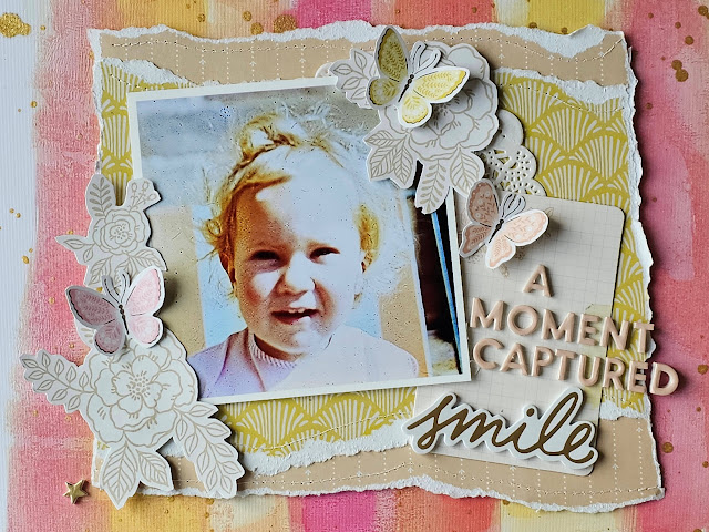
Hello. Karen here. Today I have another layout to share using the beautiful Gingham Garden collection from Crate Paper and this time I've scrapbooked a photo of me as a child.


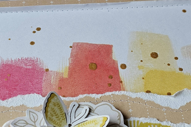
For my background I used a ready-to-use Mixed Media Paper from a pad by Vicki Boutin. The pad I used isn't available in the shop anymore but you could instead use a similar paper (like these from 49 & Market) or you could get messy and create your own background using paints. 

I trimmed the paper down by 5mm on each edge and matted this onto a sheet of the Gingham Garden Fresh Air paper. 


I then splattered the layout with some gold mist. 


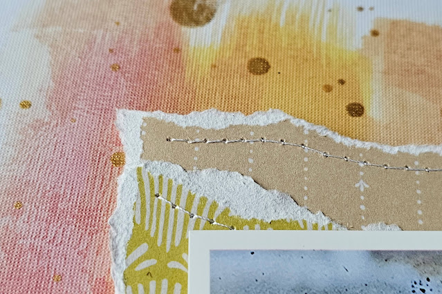
In the centre of the layout I created a large photo mat from torn pieces of the Fresh Air and Nostalgia paper. To add some extra texture I machine stitched the torn edges and the edges of the layout with white thread.


My square photo was printed with a white border and added to the photo mat with 3D foam underneath to add dimension.


Beside the photo I placed a journalling card from the Ephemera pack and used this as a place to put my title.


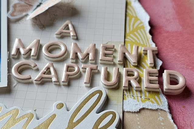
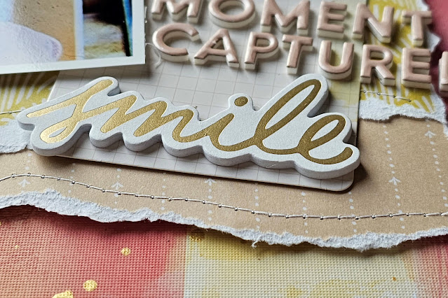
The title was created with some tiny foam alphabet stickers from my stash. A word from the Happy Life Phrase Thickers was added as a sub-title. Some of the Phrase Thickers are gold and really shine.


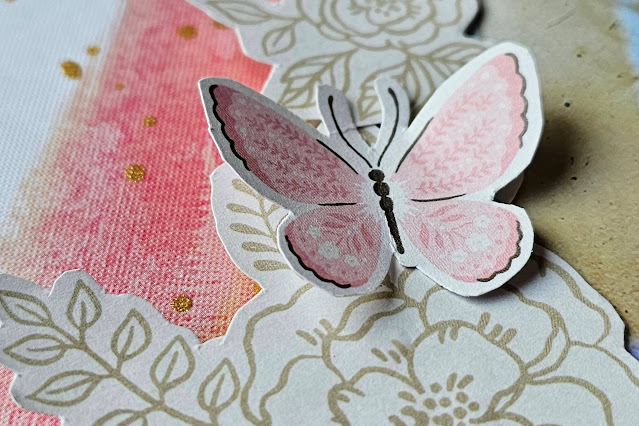
To embellish the layout I fussy cut some flowers from the In the Shade paper and butterflies from the Alight paper, and placed these beside the photo.


Finally I added the date at the bottom of the page with more foam alphabet stickers and dotted some gold stars from the sheet of Thickers here and there,

I hope you like this layout and that it had given you some inspiration as to how to use the gorgeous Gingham Garden collection.

Until next time, Take Care
Karen x x

Sunday, 28 May 2023

American Crafts - Maggie Holmes ~ Woodland Grove 🌿

Hello! It’s Anna back with you today and I’m sharing my second layout using Woodland Grove by Maggie Holmes and American Crafts. 

I recently went to visit some Bluebell woods and wanted to use this collection to scrapbook one of my photos. 


I used a sheet of white 12x12 bazzill as my base. I then trimmed down ‘Day Dreamer’ (roughly 2 inches horizontally) and adhered it centrally to the cardstock. 


I then used my silhouette cameo to cut a floral wreath cutfile by Paige Evans onto some green bazzill cardstock. I wanted to incorporate some of the green from my photo, so I chose to use green rather than white, which I would normally use for cutfiles. 


I mounted my photograph on to the b side of Wildflower


I then selected lots of die cut flowers from the Rosie’s Studio Simply Charming Die Cut Ephemera creating a frame with them behind my photo.


To complete my layout I added some enamel dots to the centre of some of the flowers on my cutfile. 
I also added a title from Simple Stories Vintage Fields Foam Stickers. These stickers are sold out but Papermaze have lots of other foam word sticker packs by Simple Stories available here


Thanks for looking! 
I’ll be back again next month when I’ll be working with Cocoa Vanilla Studio - Happy Days.
Se you then! 

Anna 

@acraftylifewithanna

Saturday, 27 May 2023

Dream Big Little Girl

 Hello!!

Lisa here and I'm creating in my Disney journal today.


This journal is getting so full now and the pages are quick tricky to work on.

I think I should have made a larger journal : )


I'm working with the leftovers I have from the Echo Park collection here,  'Dream Big Little Girl'.

I used loads of it when I created a new journal recently which you can see here.


This collection is just so sweet.

It was so fitting for a page about my sister. 

That's why I chose my Disney journal. She provided us with so many funny stories on our Disney trip, rather than spread them out over multiple pages, as this journal is already so full, I'm creating a page to tell lots of stories.

That's what I love about journaling, you can cram so much on one page : )


For example, I used this from a patterned paper as a small flip.


It then flips open like this.

This 12x12 sheet of stickers is so cute!

I used the large 'girl' sticker over my photo.

And I created a little pocket on the right with a pull out tag for a photo one side and story the other.


Here's the little tag and I've used the papers and stickers underneath here too.


And I did the same on the other side.

Made a pocket and little tags.


I used my tab top punch on the papers too .

I'm so pleased how this all turned out.


There art so many cute bits and pieces in the collection.

It's perfect for your story telling.


Have fun!

Lisa x

Friday, 26 May 2023

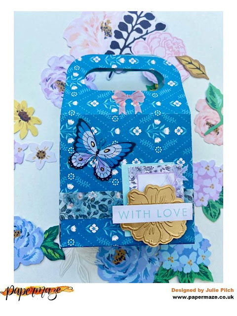
Maggie Holmes Woodland Grove Gift Bags

Hello, it's Julie here with a quick project using the beautiful Woodland Grove by Maggie Holmes.

I created two small gift bags using Walk In The Woods  and Garden Grove.  The bags are approximately 3 1/2" square bags with a small handle that can be decorated with ribbon or washi tape.  They are a lovely personal touch when giving a small gift.

I found a cut file on Silhouette Studio for a gift bag and cut two from the Woodland Grove papers. 

For the first bag I added a simple shaker pocket as a base.  There are a few different ways to make shakers but I find the simplest is to use a small plastic pocket (I use something similar to these).  Using these plastic pockets it means that you only have to seal one side, I stitched mine up with a sewing machine but you could use glue or a Fuse tool.  I then used some washi tape and layered stickers from the Woodland Grove sticker book and a beautiful flower on top of the shaker pocket. 


Finally for the handle I layered some leaves and flowers from the floral ephemera and added it as an accent to the black and white background paper.

For the second bag I kept it super simple and layered some washi tape from the sticker book and some stickers to create a cluster at the bottom of the bag.  I actually used a sticker with a leopard on it but knew I just wanted the background colour and covered it with another label sticker.  I used to be worried about hiding part of stickers, or couldn't see another use for some brighter stickers but I have found layering is a great way of using what you have in another way.  I then put a gold flower from the floral ephemera on some foam tape and added a "with love" sticker on top of it.  It came together so quickly and simply but it looks so effective.


Thank you so much for joining me in using Woodland Grove, please come back next month when I am using Retro Summer to make an ice cream truck!

Wednesday, 24 May 2023

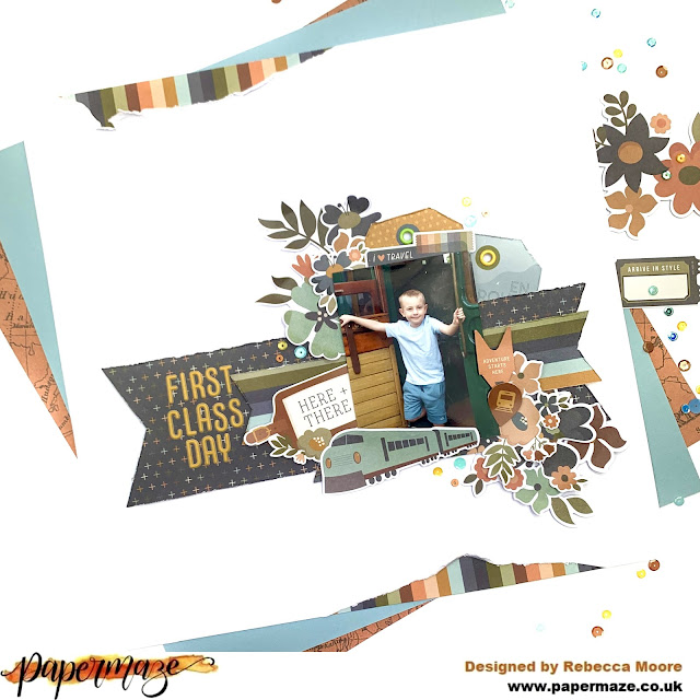
First Class Day - Simple Stories - Here + There Collection

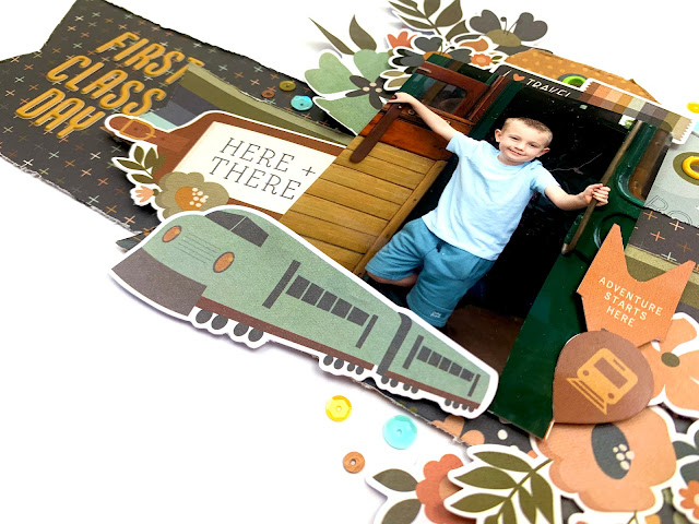
Hello, it’s Rebecca back with you today sharing my second layout created with Simple Stories ‘Here + There’ collection. The photo I’m scrapping today is of my son on a heritage steam train and is the reason I chose to create with this collection this month! I thought the colours were perfect and I had my eye on that train die cut! You can find the collection here.


I began by cutting some strips from the patterned papers - one larger to anchor the page - and a couple of smaller. I cut fish tails into all the ends to turn them into banners and layered them on top of each other. 


As my son is facing slightly to the left, I decided to place my photo on the right hand side of the page so that he looks like he’s facing towards the centre of the layout. Behind it, I added two tags from the Tag Elements patterned paper. Using my crop-o-dile, I added metal eyelets to both tags. I always feel like I need to do something to tags - either add an eyelet or some thread. They just look unfinished to me if I leave them ‘naked’. 


I knew I wanted to add the train die cut from the Bits & Pieces pack but I initially struggled to find a place for it. After moving it around a bit, I settled for along the bottom of my photo. 


Using lots of florals from the Floral Bits & Pieces  pack, I created two clusters going diagonally through my photo. I layered them up further by I including some florals from the Cardstock Stickers . 


I really adored the luggage tag sticker and so really wanted to include it on this layout. I added it to the left of my photo, nestled in behind the train die cut. 


For my title, I used some alphabet stickers from my stash. I wanted to bring some of the mustard colour to the left of the page so these worked really well. 


I felt like the outer edge of the layout needed something to frame the page - so I cut out two small areas of the white cardstock, and backed it with patterned paper. It was really simple to do and really made a difference to the page. 


I finished the layout off with the addition of some sequins in three small clusters. 


Thank you for reading! If you’d like to watch this layout come together, there’s a process video over on my YouTube channel. 


Don’t forget to check out this collection in the shop! 


Rebecca x

@preciouspagespapercraft

Monday, 22 May 2023

49&Market - Vintage Artistry Everywhere - World to See

 Hi everyone,

Claire back with you today and I'm excited to share another layout with you using the Vintage Artistry Everywhere collection from 49&Market.

I've had this collection for a while now and I cannot stop creating with it - It's a must have collection for scrapping your travel memories.

After focusing on those gorgeous patterned papers in my last blog post, today I'm focusing on the embellishments, and creating a much softer page.


As you may have guessed, I started with a piece of Premium White Cardstock - my 'go to' for most of my layouts.

I pulled out a range of Distress Oxides in colours that I though would create a beachy feel, so I opted for Antique Linen, Speckled Egg and Stormy Sky. I started with the palest colour - Antique Linen, then Speckled Egg and finally Stormy Sky, applying them dry with an ink blending brush. 

When applying the ink I first tap off the excess onto a piece of tissue and then work in a light circular motion, building the colour gradually. This will avoid leaving harsh lines on your paper and allow you to blend more easily. I complemented the dry mixed media with some wet splatters in Stormy Sky and white acrylic paint.


To add an extra layer of interest, took a geo tag stencil and brushed some Saltwater Taffy Distress Oxide through it, which echoes the colour of my top in the photo.

Next came the fun part! I pulled out some of the 49&Market rub ons! I think these are my favourite elements in this collection. I used a combination of the 6x8 Rub-On Transfer Set and the Defining Words Rub Ons.


I double mounted my photograph by layering some torn patterned papers. I used Mapping The World for the bottom layer, and The Unknown for the second. This allowed me to used the soft blue, cream and pink tones of those papers to reflect the colours in the background.

I layered some tags from the Tag Set and Ephemera Bits behind my photo along with a small tab to which i'll add the location and date. 


On the bottom right corner of the photo, I also added a small cluster using elements from these same sets.

To the bottom left of the photo, I created another cluster, this time using the Chipboard Set. I also added a white geotag from the Geo frames Set and coloured this with the Saltwater Taffy Distress Oxide and placed the chipboard compass piece inside to create a layered cluster with extra dimension.


The final stage was to add my title. Now I absolutely love Disney's Moana movie, and as the photo is of me looking across the sea to the horizon, there could only be one title!! I used a combination of old mini alphas from my stash. The white alphas are similar to this set from Doodlebug, and the coloured set similar to these Pinkfresh Studio alphas.


I really did love creating this page. It's not often I create with mixed media and embellishments with minimal paper, but I thoroughly enjoyed it and hope this layout will inspire you to create.


Until next time, happy scrapping!


Claire xx

@scrappysoulmate