Friday, 27 September 2019

Searching for Fossils - Scrapbook Layout using Shimelle's 'Field Trip' Collection

Hello! Rebecca back again with another exciting layout created using the Shimelle 'Field Trip' collection by American Crafts. I am loving this collection because it is full of bright colours and all the things my little boy loves!

I wanted this layout to be bright and busy to reflect the kind of day we had in the photos! We went to our local Natural History Museum for a Dino Day and we had so much fun. I've called this layout 'Searching for Fossils' and the photos are of my son doing just that!


For my background I used a sheet of 12x12 Bazzill Basics cardstock in the shade 'Admiral'. The first thing I did was cut a couple of strips from some of the patterned papers in the collection, and also a strip from the Hear Me Roar paper with the white text on coloured backgrounds.


I placed these strips along my background and added some really thin Washi Tape with a shiny foil effect to add some interest and bring the strips together.  I also added a strip from the Accent and Phrase Stickers sheet which had dinosaur skeletons as I felt this fit the fossil theme perfectly. It wasn't quite as long as 12 inches so I trimmed it down, and used two more dino skeleton stickers from the Photoplay Jurassic - Elements Stickers sheet and placed one at either end.


I matted my photos on white cardstock to help them pop off the page, and also cut out and matted the 'Lets do this' card from the 'Hear me Roar' patterned paper. I added some twine around the green card to add a little more interest to the layout. I cut out a 'Museum of Natural History' record card from the 'Check It' patterned paper and used this to add my journalling. (Yes... even though I went to the NATURAL history museum, and the card even says 'Natural' - I still managed to write 'National' on it!! I will find a way to cover this and rectify it at a later date!)


I added a few bits of ephemera - most of which I'd fussy cut from the 'Between Classses' patterned paper and a few word stickers from the Accent and Phase Stickers sheet.

I created my title using the Curious Foam Thickers from the collection and also a sticker from the Photoplay sheet.

I finished my layout by adding some white Enamel Dots and drawing some white dinosaur footprints using my Uni-ball Signo white gel pen.


I hope you've enjoyed this layout. It's very 'busy' for me - but on this occasion that's exactly what I was going for so I'm really happy with it!

Don't forget to check out this wonderful collection here!

Take care,

Rebecca
x

Monday, 23 September 2019

'The Sound Of Autumn' a couple of cards...Ciao Bella

Hi There

 It's Anita here with you today and just for a change I have made a couple of cards to share with you. I have used the stunning new collection from Ciao Bella, The Sound of Autumn 

Autumn is my most favourite season of all. I absolutely LOVE the colours and how they change, the gorgeous scent in the air and the golden haze of the sun and how it lights the trees.
I was delighted to see this gorgeous new selection of papers and as I wanted to make a birthday card for a lovely friend who also loves Autumn, I just knew that this was the perfect opportunity.


Both cards were based on ivory coloured 6" x 6" card blanks and each element was matted on gold mirri board ( something I very rarely use, however I felt it worked well with these papers)


I used some Stampendous Frantage Embossing Enamel in Gold and lightly sprinkled some loose onto a couple of areas. I then heated from underneath until the granules melted and turned to liquid gold ( it takes longer than heating normally from above, however normally you would use an embossing ink to hold the powder in place where as this is loose and would instantly blow away)


It gives a nice random effect this way and just leaves little scattered sprinkles. I chose some different panels and elements from different sheets, mounted them on mirri board and layered them up. Some were raised on foam pads to create dimension and I added a gold glittery doily in between the layers.
The card was finished by adding some gems and bow made from raw taffeta.

The 2nd card was made the same way just with different elements, ribbons and trim. And again I used the same technique with the Stampendous Frantage Embossing Enamel except this time I used Silver aswell as the Gold


Between the 2 cards I used these sheets of papers :

The Sound of Autumn - Autumn Cards
The Sound of Autumn - Autumn Tags
The Sound of Autumn - All at Once Summer Collapsed into Fall


Ciao Bella have created an amazing selection of papers and you can see the stock carried in the shop HERE

At the moment the SUMMER SALE is till on, so why not pop over and have a good look and grab a bargain before the sale finishes.

Happy Crafting!
Warmest Wishes
Anita xxx

Friday, 20 September 2019

September crop

We are cropping tomorrow, at Otley Village Hall as usual, from 10am until 5pm. Our lovely kit this month has been designed by Michelle using the beautiful Kaisecraft Morning Dew papers and distress oxides...


As always there will be homemade cakes and a shop discount - hope to see you there! 

Wednesday, 18 September 2019

September Papermaze Kit

Hello, Lynn here today with part one of the September Papermaze kit. Lots of blues, beige and a little glow of golden yellow. This kit has a mix of bold modern and romantic heritage style papers.
Here are my first two layouts:


Before looking at how the layouts were made, here is a list of what you will receive in the kit.


Patterned papers:
Authentique - Poised - #1 Dress Form
Bo Bunny - Bee-utiful You collection - Charming
Ciao Bella - Broccato Estense - Rinascimento Estense
Kaisercraft - Journey collection - Globe Trotter

Pink Paislee -Indigo & Ivy - #02
Stamperia - Blue Land - Flower

Bazzill Cardstock - Twig and Wildberry Pie

Reverse side of patterned papers
Bazzill Cardstock
Admiral, Candle Glow Medium, Brown and Stonehenge

Embellishments
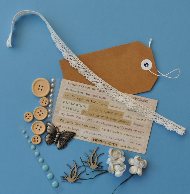
1/3 sheet of Tim Holtz clippings, 1x kraft tag, 6 wooden buttons, 3 paper flowers, 12" lace, 2 Dusty Attic chipboard pieces, strip of Doodlebug enamel dots, strip of pearls, Tim Holtz metal butterfly.

Daring Duo
This layout shows a photo taken at my daughter's wedding in July. It features my two great nieces, climbing a tree in their wedding finery!


This layout was inspired by a Page Maps Sketch from July 2019.


I started off with a sheet of scrap paper 12" x 12" on which to mount the cut down papers and card. I cut the Stonehenge Bazzill into a strip 12" x 2.5" to place along the top and a piece 12" x 3.5" to place across the bottom. Then I machine stitched in navy all around the page about 1cm in from the edges. 

Making sure the stripes and the script run horizontally, I cut the Globe Trotter paper as follows:
Cut off and keep the manufacturer's strip.
Script side piece measuring 12" wide x 7" deep
Strip side 5" wide x 12" deep

I stuck the stripe paper in place (Avoiding getting adhesive near the edges to allow for stitching and tucking elements under later.) - about 1.5" in from the left. I stitched around the edges. Then I placed the script paper across the centre to cover the scrap paper gap. This is about 2" down from the top, again I stitched around the edges.

I tore a sheet of lined paper from a spiral bound notebook, and trimmed it to 4.5" wide x 5.5" deep and stuck this on the left side of the layout, over the script paper. I mounted my photos onto the Candle Glow Medium Bazzill, making a very narrow border to make them stand out from the navy paper. These were stuck side by side to the right of the lined paper.

Then with the quote from the manufacturer's strip, I divided this up and placed the words in a row down the right side of the lined paper. Then I added my journalling to the left of the lined paper.

Using the Tim Holtz Sizzix Thinlits Crochet die set, picking the large and small die of the same lacy design, I cut my lace from Bazzill. The smaller die and Admiral Bazzill and the larger die from Stonehenge Bazzill. I added pieces of the Admiral lace wither side of the stripe paper, and the Stonehenge lace along the bottom of the lined paper and photos.

I added the pearls from the kit, adding a few smaller pearls from my stash.


Finally I cut my title from more of the Admiral Bazzill, using a Tim Holtz Bigz XL Handmade Alpha die.

 
Notre Dame
This layout shows two images from our Paris trip in 2004.


To start I gutted the
Wildberry Pie Bazzill, creating a frame 1" wide all the way around.
I inked all the edges with Chipped Sapphire Distress ink.

Onto this I placed the Ciao Bella paper, please note this paper is 12" x 12", but the measurement includes the manufacturer's strip on one side. I tore around the edges of this paper and the resulting piece is about 11" x 11". 


To make the central panel, I tore the lace area from the Stamperia paper to make a panel 11" x 2.5", then I added narrow strips torn and left over from both papers
and attached these either side of the wider strip. I wanted to show a variety of different designs from the papers. The whole panel was attached about 3.5" in from the right side of the edge of the layout. I trimmed the right side of this panel with the cotton lace from the kit. 


I placed my photos where I was planning to stick them later, so I could arrange the other elements. I fussy cut the flowers and butterflies from the Stamperia paper and placed them onto the layout.

From the remains of the patterned paper I die cut some Wildflower Stems using Sizzix Thinlits dies. I also cut some Vintage Lace edges to trim the top and bottom of the panel. I used a Sizzix Decorative Sizzlits Die. Then all this was stuck in place with the addition of the three paper flowers from the kit.

I used some Scrapiniec Die Cut Decorative Chipboard pieces from the shop to add to the page - a circular one to highlight the lamps on the photo, and others top and bottom of the panel and one in each corner. 


My title was cut from scraps using the Tonic Studios Windsor Alphabet dies for 'Notre Dame' and Pink Fresh - Indigo Hills, mini puffy alpha stickers for 'Paris'.

Finally I added some Stickles to the flower centres and butterfly wings, and some Nuvo Crystal Drops dots around the leaves. 


That's all for today, I will be back with another pair of layouts from this kit in about two weeks.

Thanks for looking.
Lynn x.

Monday, 16 September 2019

Pebbles 'Oh Summertime' - Summer Fun

Hello, Karen C here again. With the September Equinox at the end of this week officially marking the end of Summer and the start of Autumn, I thought I would make one last summer themed layout using the beautiful Oh Summertime collection from Pebbles.


I started with a sheet of white Bazzill cardstock and to the top and bottom of the page I stuck wide strips of the Summer Bouquet (B Side) paper. The branding strips on the papers in this collection have cute words and patterns on them and so I added  three of them to the layout as well as narrow strips of bright pink cardstock.


I cut the word 'Summer' from white cardstock using a cut file from the Silhouette Studio and backed this with papers from the collection. The cut file was then stuck to the layout with 3D foam underneath to add dimension.

Two 2x3 photos of my daughter playing with the hosepipe in the sunshine were matted on white cardstock and stuck to the right side of the layout, with 3D foam underneath.


I fussy cut some flowers from the Summer Bouquet paper and used these as embelishments.


Using a circle punch I punched the words 'Smile Big' from the Hello Summer paper, matted this on a circle of white cardstock and added it to the layout. Two die cut birds from the Simple Stories Oh Happy Day Bits and Pieces were added.


I completed the layout by adding the word 'Fun' using some very old foam Thickers from my stash and journalling strips printed on white cardstock on my computer.

I hope you like this layout and feel inspired to scrap those summer photos. There are lots of gorgeous supplies in the shop and I'll be back again soon with another layout.

Take Care,
Karen x x 


Friday, 13 September 2019

Echo Park ~Teen Spirit #1

Hi all, it's Anna back with you today. How did it get to be the middle of September?
Today I have a layout to share with you using the new Echo Park Teen Spirit collection.
The collection is aimed at teenage boys, but is perfectly suitable for younger children too, or various other themes.

Here is what I've been working with this month which includes:


Take a look in the shop for all of your scrapbooking product needs - here.


My layout is below...


I began by using bazzill cardstock as my base and gave the white cardstock some colour with some dylusions spray. I then cut six squares out of various pieces of patterned paper (6x6cm) and distressed the edges slightly.


I love these pretty little studio die cuts. I added some freckled fawn stars and some nuvo drops around it.


I mounted my photograph and cut out the ''right now'' card from the journaling cards. After I'd photographed the layout I asked my son to fill it in with details of all of his favourite things.


I used various stickers from the elements stickers sheet.


Have a great weekend!
Thanks for looking!
Anna
X

Wednesday, 11 September 2019

'Explore Mode' - Scrapbook Layout using Shimelle Field Trip Collection

Hello, Rebecca back with you again with a brand new collection this month. I'm super excited to be using the new Shimelle 'Field Trip' collection by American Crafts. This collection is perfect for me as it's full of 'little boy things' such as dinosaurs, space rockets, bugs.... I'm in love!

I've created my first layout 'Explore Mode' using the Color Wheel Die Cut.


This was a bit of a labour of love, but totally worth it in my opinion! I started by extracting all of the coloured parts from the backing cardstock they come in, and then using paper clips to hold it in place, secured it to my black cardstock. I then placed all the coloured tabs back into position!


I knew I wanted to use two photos so I had to chose 2 coloured sections to leave out. I decided on purple - purely as its the most girly colour in the wheel, and the red section - because red is my least-favourite colour! These 2 sections sit next to each other on the wheel so I had to move some sections about so that my photos could sit at opposite sides of the page. I then backed each and every coloured 'tab' with foam and double sided sticky tape and stuck them into position, before removing the backing cardstock.


I then used the discarded backing cardstock (only discarded for this layout.... I WILL be using it at some point!) as a stencil to cut my photos to the right size and shape. Because all of the coloured tabs have a white outline, I decided to matt my photos on white cardstock before adhering them to the layout with a layer of foam behind them to raise them to the same level as the tabs.

I knew I wanted to add some tone-on-tone embellishments and the amazing 'Between Classes' patterned paper in the collection just screams out to be fussy cut - so fussy cut I did! I kept a white outline on the bits I cuts out to keep the layout consistent, and then added them to the corresponding colour on the wheel. As the wheel itself was raised with foam, I decided to stick the embellishments flat.


I used the word 'Explore' from the Puffy Sticker sheet as part of my title and cut the word 'Mode' from one of the sentiment/word stickers from the Accent and Phrase Stickers sheet.


I completed my embellishing by adding some Enamel Dots and some puffy star stickers from the Puffy Phrase Stickers sheet. Finally, I added our location in the most amazing white pen I've ever found! I've tried a few white pens but none of them have ever shown up on my layouts but the Uni-ball Signo White Gel Pen is fabulous!


I hope you've enjoyed my layout and I hope it's inspired you to have a play with this fun and brightly coloured collection! Everything I've used here is available in the shop.

Take care, and I'll be back later in the month with another Field Trip layout, which I'm already excited to share!

Rebecca
x


Friday, 6 September 2019

August Papermaze Kit - Part 2

Hello, Lynn back today with more of the bright and colourful August kit. This kit contains an amazing rainbow of scrapbooking goodies.

Here are my second two layouts:


Before making the layouts here is a reminder of what you will find in the kit:


Patterned Papers:
Cocoa Vanilla Studio - Happiness collection - Botanical Bliss & Good Vibes
Jillibean Soup - Rainbow Roux collection - Bite Size Bits & Pinch of Colour
Kaisercraft - Morning Dew collection - Rejuvinate
Pink Paislee - Paige Evans Horizon collection - #3
Bazzill cardstock:
Rain & White


Reverse side of papers
 

Embellishments:
Set of chipboard frames, doily, Heidi Swapp glitter word, 3 chipboard banners, 3 Studio Calico wooden stars, strip of rainbow heart stickers, 2 acrylic hearts, pink acrylic butterfly, rainbow sticker.


A pack of matching extra Bazzill is also available and contains a sheet each of four colours:
Breaker Bay, Desert Sun, Piglet and Grenadine.

Beach Huts - These photos were taken on a road trip when we spent a few nights at Scarborough.


I took the gutted piece of Cocoa Vanilla - Good Vibes from the 'Happy' layout made in part 1.

The Rain Bazzill was cut to 28cm x 28cm an gutted to leave a frame of 2.5cm.

Then the sheet of Jillibean Soup - Rainbow Roux (yellow hearts side) was trimmed to 27.5cm x 27.5cm. All three were then layered upon each other.

I trimmed my photos and then made a mat for each with the remains of the Rain Bazzill.

From the Jillibean Soup Bite Size Bits paper, I cut a tag which I added the title with some letter stickers and journalling. I drew around the white letters with a fine marker pen. I punched a hole and threaded through some Baker's Twine.

I cut the rainbow strip from this sheet and added pieces from this to the layout. I added the acrylic hearts to these strips. Then I cut all the multi-coloured quotes and strung them along the top of the page to create bunting. I joined them with more Baker's Twine and some colourful brads from my stash.

Finally I cut a few more quotes from the Bite Size Bits paper and added them to the photos.

Florist - A photo I took a few years ago with permission of the florist for our scrapbook group 'The Blossoms'. The florist is Blossoms in Crayford High Street.


For the background of this layout I used the sheet of Cocoa Vanilla - Botanical Bliss. I gutted it to make a wide frame of 4cm. Then set aside the rest for later. The next layer was cut from the sheet of Kaisercraft Rejuvinate trimmed to 26.5cm x 26.5cm. This was also gutted, to make a frame of 2.5cm.

The centre of the layout is a piece of White Bazzill trimmed to 25cm x 25cm. I sprayed and dripped some Picked Raspberry Distress Stain to the Bazzill and used the same colour of Distress Ink around the edges.

From The kit I used the doily, wrong side up, to give a paler shade of pink. I tucked this under my photo and added the rainbow sticker to it. The title was added in line with the doily using Pink Fresh Studios Mini Puffy Alphabet. 


I painted the chipboard banners with Distress Paint - Abandoned Coral, Cracked Pistachio and Picked Raspberry.  These were arranged across the top right corner with 3D foam pads and I joined them with Baker's Twine.

I fussy cut some blossoms from the remains of the Botanical Bliss paper. and arranged them around the bottom of the photo, some were glued to the page, others were attached with 3D foam pads.


I added tiny dots of Nuvo Crystal Drops - Liquid Mercury in and around the blossoms.

With some peach cherry blossoms from my stash I added a few among the blossoms and between the Banners.

Finally I added the tiny pink acrylic butterfly from the kit.

Thanks for looking, back soon with the September Kit.
Lynn x

Wednesday, 4 September 2019

GreenHouse Collection from Kaisercraft.

Hello There
 Its Anita with you today and I have a layout using the slightly older Greenhouse Collection from Kaisercraft. This is a lovely range, paler in colour than I would normally choose, with a range of succulents, terraniums and cacti with a mix of water-colour pastel.


I based the layout on a sheet of Yucca and added a section of white canvas cardstock ( approx 10" wide) Using a Martha Stewart Deep Edge Punch I punched along both the long sides to create a frilly edge.


Using Tim Holtz Distress Stain in Cracked Pistachio, I dabbed a few random splats across the page, this colour works so well with the soft range of colours in the paper collection.
In my stash I had a few wooden die cut words and I chose the word LOVELY to use on my page. I glued it on initially and when that was dry I used some metallic sparkle thread to add a few oversized cross stitches across the letters


The sheet of Succulents has a mass of flowers all over it so I chose a few little bits and fussy cut them to add to the layout. I also added a couple of the quote strips that are found on the cut off manufacturers strips at the bottom of each sheet.


I added a few sparkly embellishments and finished it off by cutting the long garland of succulents from the sheet of Conservatory  and adding it across the lower part of the page.

There are lots of gorgeous new products available in the shop....but don't forget to check out some of the older ranges whilst you are there and also of course that there is a still a huge SUMMER SALE 
running with an amazing selections of bargains .

Happy Crafting!

Warmest wishes
Anita xx