Wednesday, 30 November 2016

You Are Awesome - with Pink Paislee

Hi Tracee here to share with you today, I know that Christmas is fast approaching but I am not quite up to speed with it yet and so my layout today is still in summer mode. I have used Pink Paislee products from a few different collections.

You Are Awesome - by Tracee Provis


My background paper is from the C'est La Vie collection, I didn't add any type of mixed media as the paper has it's own fading in places and I liked how it looked. 


These wood veneer ephermera pieces formed the "you" part of my title, I used the chipboard sticker awesome word from the thickers pack as well. I couldn't find the right green letters so I simply added some white ink to foam thickers and I achieved the perfect colour I was looking for.


I fussy cut lots of flowers from the #2 sheet of the Take me Away collection and I layered my title over them. I used more wood pieces this time from the Pink Paislee Citrus Bliss collection, how cute is the flamingo? I added a few gold chipboard accents and my page was complete.

I hope you have enjoyed your visit today 
For this page and all your papercrafting needs please pop over to the shop, the autumn sale is still on and there are plenty of bargains to be found.


Monday, 28 November 2016

Jack and Julie - Doodlebug Here Comes Santa Claus

Hello Julie here, this is my second post using the wonderfully festive Doodlebug Here Comes Santa Claus collection.


For this layout I wanted to try and make a wreath like frame for my photo of myself and Jack Skellington to make a real focal point.  I wasn't trying to make a circular wreath just a frame type shape.  To achieve this I used a wreath die that came with individual boughs, we have many lovely wreath dies on the website and alternatively this effect could be achieved using a twig die, foliage dies or even tree dies.  I cut alot of individual sections using Happy Holly Days, So Dear and some gold glitter cardstock that we stock in the shop.  I then added some red enamel dots in the corners for holly berries.


In the top and bottom corners of the "frame" I used snippets of card from the Santa's Sweets piece of cardstock and some of the Jolly Holly washi tape.


To add even more texture to the base cardstock I pulled out my favourite Heidi Swapp Gold Texture paste and put it through the brilliant new Creative Expressions Mini Stencils in Star Ring and my trusted Creative Expressions Small dots mask.  The quality of these masks is just fantastic, the texture paste goes through them smoothly and they wash up brilliantly.

Products I used:-
Doodlebug Here Comes Santa Claus Collection
Wreath dies
Heidi Swapp Texture Paste
Creative Expressions Masks

Friday, 25 November 2016

Gotta Lotta Bottle ........ with Blue Fern Studios

Hello There, it's Anita with you today and it's my last post for November.


Today I am using my left over bits and peices of beautiful Seaside Cottage from Blue Fern Studios. This is such a lovely manufacturer and their collections are second to none, combining the beauty of shabby chic with various themes and all such wonderful quality! There is a lovely choice to pick from in the shop HERE


I had a couple of glass bottles at home in my window sill that I had some small bunches of gypsophelia in and thought they could do with 'prettying' up a bit. So I combined them with the papers, acrylic paint and items from a little glass jar that we have popped small shells and sea glass in over the years whilst on holiday when our girls were small.


I painted each bottle a different colour ( one blue, one rose pink) then when that layer was dry, I dry brushed over the top with white paint to give the shabby effect.

Starting with the pink bottle, I added  a wrap using some of the Glory sheet, I inked the edges and stuck it round the centre of the bottle, then popped on some hessian ribbon and some lace around the top of the bottle. I made a tiny tag using a clipping from the Calling Cards sheet and then finished the bottle off adding various blossoms, crystals, frills and shells and a sprinkling of Icicle Stickles.


I decorated the blue bottle in pretty much the same way, using the reverse side of the Glory sheet and a couple more items from the Calling Cards Sheet. I also made some rolled paper roses to add to the neck of the bottle with other little bits and bobs and then made a seed bead, pearl and crystal bead dangler to drape around the neck.


I hope you like my bottles I have *prettified* and if you have a go yourself I would love to see them, so please leave a comment with either a photo of them or a link so I can come and have a look.
Wishing you a wonderful and creative weekend...
Warmest Wishes
Anita xx

Tuesday, 22 November 2016

Simple Stories ~ Posh

Hi, it's Anna here. Today I have a layout to show you using the lovely Simple Stories 'Posh' collection. While looking through the lovely papers and chipboard the balloons jumped out at me and made me think about doing a layout of my birthday.


I printed out a selection of square pictures that captured various birthday celebrations. I used a sheet of bazzill as my base, used two large squares of patterned paper and then mounted the photographs onto navy cardstock.
I used a project life card for my journaling, added various chipboard elements from the collection and cut out some arrows from the 'laugh lots' patterned paper. 


Supplies Used:
Thanks for looking.
Anna
X

Monday, 21 November 2016

altered frame


again i have been  working with the new authentique fabulous range, which has a very retro feel about it.
So this time I've taken a very inexpensive frame that i had stashed away, printed off a black and white photo, used one of my circle dies to fit the aperture to cut the photo. Filed the edges of the photo to add a white edge and placed an old coloured overlay from the crate paper DIY collection on top of the photo. Its quite difficult to see but it adds pink, blue an yellow hues to the original photo

Next added lots of  die cut and punched out flowers and leaves made from the paper. Wooden and metal embellishment's, along with some frayed linen. I then added some water coloured paint to my edges of the frame and spots of flicked paint.
 Once my paint was dry i covered the paint and flowers with modge podge to add more texture and rigidity to my paper Here a couple of close ups of the finished frame

Friday, 11 November 2016

November's Crop...

Our monthly crops come round so quickly, I can't believe the next one will be our Christmas crop!  This month we're a week earlier than normal, as the December one is on Saturday 3rd.  Please let me know if you'd like to come to that one, I need to make sure we have enough space for everything!

This month's kit uses the beautiful Bo Bunny Bella Rosa papers and has a photo of my three children on our recent holiday to Rome.  


As usual there'll be homemade cakes, tea & coffee and the shop will be open at lunchtime :)

Thursday, 10 November 2016

Doodlebug Here Comes Santa Claus

Hello there, Julie here kicking off the festive season!

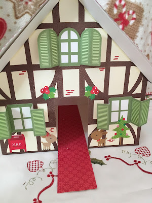
When I saw the gorgeous, whimsical new Doodlebug range Here Comes Santa Claus I knew I had to use it for a blog post but how to use these bright colours and patterns?  I really wanted to use the Christmas Countdown of paper to make an advent calendar, I even went as far as mounting the paper onto cardstock and cutting out all the doors however the end result just wasn't working for me.  As crafters I think sometimes ideas come to us and they don't always finish as we intended however, I encourage you to either tailor what you have done or try again.  In my case I went through my boxes of supplies and found an old advent calendar that I had never constructed and decided to work from there.


I used the wonderfully festive Happy Holly Days as a background for my roof and used the Christmas Countdown paper for the doors.  I then used some enamel dots for accents between the doors.  To add a little bit of interest at the peak of the roof I added some Jolly Holly washi tape to match the paper.  This washi tape is such lovely quality and there is so much of it!


For the edges of the roof I used gold glitter card from the shop.  It is brilliant quality and die cuts go through it beautifully.  I actually used a small cloud die to create the edging for the roof.  To make a continuous cut, I used a low tack tape to tape the cloud border to the card and ran it through my Big Shot, I then moved the die along and taped it down again until I had a length of roofing that I wanted.  I then went one step further and added some Cosmic Shimmer Sparkle Texture Paste through a Creative Expressions Small Polka dots mask to imitate snow.


To add a little bit of interest I used the fabulous Icons Stickers that were released to match the collection.  There are so many stickers on each sheet it is great value for money!  I also sprayed the front of the advent calendar house with Tattered Angels Glimmer Mist that gives a lovely shimmer to the front of the house.


I hope you enjoy this project and I encourage you to have a look through your stash and see what is there that can be altered for a festive project!  See you later this month with another festive project using this wonderful collection.

Products that I used:-

Doodlebug Here Comes Santa Claus collection
Big Shot
Cosmic Shimmer Texture Paste
Creative Expressions Mask
Tattered Angels Glimmer Mist 

Thanks for looking xxx

Friday, 4 November 2016

OOohhhh I LOVE a bargain!


 Hi There, it's Anita here today.

 I don't know about you, but I absolutely LOVE to bag myself a bargain when I can.....whether that be some lovely clothes, shoes or a handbag in a dept store.....or a BOGOF deal when I am doing our weekly food shop....but my favourite bargain of all has to be when some crafty goodies are involved!
I was very excited to see the launch of the brilliant AUTUMN SALE over at Papermaze...so I grabbed a cuppa, some biccies and sat down for a casual stroll through the pages...and boy oh boy I was not disappointed!!


 It's so easy to get swept along with all the lush new paper collections that are out there and are constantly being released....but I think we often miss out on some of the older designs that are equally as beautiful ( if not moreso in some cases) and when they are in the sale too it seems such a shame to miss out.


 Do you have a favourite manufacturer? I always loved Basic Grey and they still remain a firm favourite now.....I am so sad that they no longer exist....but luckily there is quite a selection of the papers in the sale.


I quite often like to veer away from just making layouts and thought I would make some more bunting....this time I used some older Christmassy papers and added a photo to the central pennant.


I also popped on a few paper flowers, buttons and sparkly gems and sponged some gold/bronze acrylic paint around all the edges. I think I shall enjoy getting this out to hang each Christmas.


If you pop over to the AUTUMN sale you will find a vast and varied selection of papers and other items to look through....ranging from American Crafts, through to Kaisercraft, Prima, Spellbinders and all the way through to WRMK and everything in between.

So.....when you are next shopping at Papermaze remember to checkout the sales section too.....you won't be disappointed I am sure.

Warmest wishes Anita xx


Wednesday, 2 November 2016

Simple Stories - The Reset Girl - Part 2

These delightful Library Cards from Simple Stories, form part of The Reset Girl collection. They brought back memories of an early Saturday job I had working in the local library. I'm showing my age - it's along time since we needed cards like this to take books out of a library!!


I also loved the planner elements of this collection and thought I would use them to record my daughter's love of her planner, journal and other notebooks. As a writer she is always jotting things down in note books and over the years she has built up a beautiful collection.


For the base of this page I used the grid side of a sheet of Get Your Crafty On paper. I worked on each of the library cards and then arranged them around where I wanted my title to be. 

The library cards are small folders and each hold a card mostly with grids or lines on, others will illustrations and patterns. I used five small photos and trimmed them to fit the cards.


I wanted to use both sides of one of the journalling cards on the paper sheet called 3 x 4" Journalling Cards (with foil), so I typed the quote and printed onto one of the library card inserts. Finished this off using an old fashioned library style date stamp.


The title was made using American Crafts felt Thickers and stickers from the The Reset Girl - Combo Cardstock Stickers sheet. Other elements from this sheet were used to decorate the layout.


Please follow the links to the shop to find the materials I have used.

Thanks for looking.
Lynn x