Friday, 29 September 2023

Summer Stories

 Hello, I'm catching up on documenting our Summer stories today.

How are you doing with you own Summer adventures?


I'm working in my DIY New Home Journal.

It's been quite a Summer for us.

We've sold our home of 25yrs and bought a new build.

I've been documenting the journey here in this journal.


It's so nice have one space to tell a whole story.

I'm so enjoying this journal and I will love looking back on this in years to come.


 I'm using the PinkFresh Studio collection - Sunshine on my Mind here.


I had alot of photos to add today. I used a strip of one of the papers to create this pull out piece with photos both sides.


And then it opens out like this.


I clipped a couple of photos to the top and used a couple of the die cut words from the collection to create a little title.

Using a couple of the papers I decided to do the majority of my journaling on this one page.
The alphabet stickers from Rosie's Studio really make this page.
They needed some help to pop, so I used some of the yellow paper to help them stand out.

Although they stick well, I still use a little hot glue to make sure. 
I hate years later looking back and seeing that I've lost a couple.


And on the other side I've added photo photos.
I love this little house die cut, it's so cute!


I loved creating this page.
It's an important part of our new home story.


Thanks so much.
Lisa xx


Wednesday, 27 September 2023

P13 - Coffee Break - Probably the Best Coffee Ever

Hello everyone, Karen here with another layout using P13's Coffee Break collection.

For today's layout, I used eight images taken from Whatsapp messages which I printed onto photo paper.


I started by trimming 1/4" from all sides of a sheet of smooth white 12x12 cardstock and matted this onto a 12x12 sheet of brown cardstock. 


On the right side of the layout I layered various pieces of paper from the 6x6 paper pad and some of the brown cardstock, which I punched with a border punch to create a decorative edge. Later I was able to cover the joins in the 6" pieces of paper with my photo block giving the impression that the papers were a full 12" in length. Using the sewing machine I stitched a straight stitch along the edges.


My eight photos were matted as a block onto a couple of piece of brown paper from the paper pad. 


Images were fussy cut from a 12x12 sheet of paper #3 and added to the layout.


In my stash I found a wood veneer banner with the word 'Fav' cut into it and added this below the photo block.


Using the Silhouette Cameo I cut the title from some dark brown cardstock. The title was stuck in the bottom left corner of the layout nestling the smaller letters among the word Coffee.


Journalling strips were printed with brown ink onto white cardstock on the computer and placed above the title.


Finally I splattered some brown watercolour paint onto the layout and scattered some gold sequins and brown enamel dots here and there.

I hope you like this layout. I'm really enjoying using the Coffee Break collection and will be back again next month with another project.

Take Care
Karen x x

Monday, 25 September 2023

3D Pumpkin Echo Park I Love Fall

Hello there, I am back again with a super simple 3D project that is great project to display multiple photos.


Firstly, I cut out 6 pumpkin shapes using a large pumpkin die that I had.  You could use a Cricut or Silhouette machine to cut out the shape that you would like to use.  It is best if you pick a shape that can be folded in half and is identical either side.  After cutting the pumpkin shapes out of Plump Pumpkins, Elements of Fall and Crisp Fall Air, I scored each pumpkin on a score board and then carefully folded each pumpkin in half.  I glued each pumpkin shape, one half side at a time, to another pumpkin until I had created a circle of pumpkins (a 3d pumpkin shape).  I then found a centre point of the pumpkin shapes and pushed the entire pumpkin flat and placed a weight on top to ensure that every pumpkin was glued securely.  It is hard to describe but essentially you should be left with a 3d pumpkin shape with 6 sides!


After the pumpkin was fully dried I added autumnal and Halloween photos to each side and used the Element sticker sheet to add decorative touches to each pumpkin side.  I kept it super simple this time but you could add ephemera, brads, enamel dots it is completely up to you!  If you preferred to put your pumpkin away after the autumnal months, the beauty of this project is that it folds flat very easily and can be stored away simply.


I hope you enjoyed this project and I encourage you to get a die that has perhaps been forgotten and to make a 3d shape out of it.  I will be back next month with some spooky Halloween projects.  Thank you for reading xxx

Saturday, 23 September 2023

Faboolous - Simple Stories - Faboolous Collection

Hi everyone, it's Rebecca with you today and I'm not going to try and hide it... I get a little bit excited at this time of year! I absolutely love Halloween, and it's my favourite season (yes, to me Halloween is a season!) to scrap. I'm always drawn to collections which have traditional halloween colours - oranges and blacks, so the Faboolous collection from Simple Stories is right up my street. You can find the full collection in the shop here.


I began with a sheet of Premium White Cardstock and using a craft knife, cut some slashes into it, going diagonally across the page. With the blade of my scissors, I then distressed inside these slashes and folded the cardstock out giving the effect that a monster had slashed across my layout with it's claws. Using several patterned papers from the collection, I then back-filled these areas so that small amounts of patterned papers were showing through. 

Before even starting this layout, I knew I wanted to use the large 'Faboolous' title from the Page Pieces, and so I positioned it diagonally on my page so it was running parallel with my slashes. I raised my title up with foam pads to bring some dimension to the page.

My photo today is 3x4 inches and fitted really nicely tucked behind the end of my title. I adore this photo of my little boy - pulling a 'scared' face during a halloween photoshoot last year! With my photo in place, I then moved on to adding a few embellishments.


I've used some of the Bits & Pieces, arranging them either side of my photo, and introduced a few of the Cardstock Stickers too to build these clusters up. I felt like the layout was getting quite heavy over on the right hand side, so added a little cauldron and spider to the left to help balance everything out.
 

I finished off with a few bats stickers and star die cuts raised up on foam. I always like to finish my layouts off with a few small bits, and the bats and stars were perfect for this.


Thanks for reading! I hope you've enjoyed this layout. It's the first halloween layout I've made this autumn, but certainly won't be the last. Don't forget to check the collection out in the shop.

See you next time,

Rebecca x

@preciouspagespapercraft


Friday, 22 September 2023

Simple Stories - Trail Mix - Let's Go

Hi everyone,

Claire back with you today sharing my second layout with the Trail Mix collection from Simple Stories. You can find it in the shop here.


I'm thoroughly enjoying this collection. As I mentioned in my last post, there's a great combination of earthy colours, alongside some richer warmer tones like I've used here.

The inspiration for my design came from a Post It note wreath I saw on Pinterest, so I decided to replicate it, using 3" squares of patterned paper.

I trimmed the Campfire Stories paper by 1/4" on all sides, distressing the edges and laying it flat on a piece of Premium White Cardstock. I've always loved a woodgrain paper and this one is no exception.

To create my paper square wreath, I cut four 3" squares from each of the Bugs & Kisses and So Outdoorsy papers.

I marked 1" down from two sides of the square and used this as a guide to score diagonally across the corner, creating a folded back edge, showcasing both sides of the patterned paper.


I repeated this for each square and then began to build the wreath, laying each square with the corner to the top left, and arranging these in a circular motion.

I cut my photo to fit in the centre of the wreath, measuring approximately 2.5" in size. I raised this on foam to help it stand proud against the wreath.


I cut the Let's Go title from the Tag Elements paper to create my title.

Once these elements were in place, the layout needed just a few small embellishments. I took a selection of ephemera pieces from the Bits & Pieces pack


I love how just a few small embellishment clusters has brought the wreath to life, and really given it that 'exploring outdoors' feeling.

On the top and bottom square, I added some phrases from the Sticker Book, laying these in the edge of the flap to create a bit of extra movement. 


To help make sure they stayed visible, I added a small foam pad under the folded paper edge to stop it raising too high. This worked perfectly and makes sure you can see the stickers in full.

As a final touch, I added a few die cut leaves from plain white cardstock and added a few splashes of white paint across the wreath.


I hope you've enjoyed this layout. It was certainly a fun one to create!

See you next time.
Claire xx

@scrappysoulmate

Wednesday, 20 September 2023

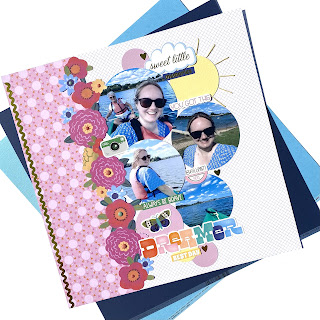
American Crafts - Shimelle Main Character Energy #3 ☀️

Hey everyone, it’s Anna back today. I’m sharing my third layout using Main Character Energy by Shimelle and American Crafts. You can find the collection in the shop here


I used the b side of ‘prop table’ as my base and then trimmed a strip of the b side of ‘after hours’ and adhered it to the left side of the layout. 


I cut my photos into circles and also created some circles out of cardstock from the matchmaker pack. I used a yellow circle to create a sunshine, which I then added some stitched sunbeams to using matching yellow thread. 


I fussy cut lots of florals from ‘prettiest pick’ and adhered them down the meeting point of my two papers. 


I then arranged my circles overlapping them slightly. I added some cardstock stickers on the cardstock circles and layered around them too. 


I added my title using the cardstock stickers and a few of the gold hearts dotted around. 


Finally, I finished my layout by adding some enamel dots to the fussy cut florals. 


Thanks so much for looking. 

I have one more layout to share using this collection, so I’ll see you soon with that! 

Anna 
x

@acraftylifewithanna

Monday, 18 September 2023

P13 - Coffee Break

Hello Karen here. Today I'm sharing with you my first layout using the new Coffee Break collection from P13. This collection is unsurprisingly coffee themed! The papers are full of images of all sorts of coffee products - coffee cups, takeout cups, sweet treats to eat with coffee plus flowers and lots more.

Although I scrapbook in 12x12, I have been using predominantly the 6x6 paper pad plus a couple of sheets of 12x12 papers (#3 & #7) suitable for fussy cutting, some decorative tags and a few sheets of co-ordinating cardstock. Hopefully I can show you that 6x6 paper pads can be used for all sorts of projects including large sized layouts.


I started by matting a slightly trimmed down sheet of white 12x12 cardstock onto a sheet of green cardstock. At the top and bottom I placed some torn pieces of patterned paper and then machine stitched round the edges with white thread.


In the centre of the layout I layered a piece of peach tissue paper, my photo and some frames cut from patterned paper and the green cardstock. Before gluing down the tissue paper I crumpled it a little to add some texture.


Next, I set about fussy cutting some leaves and flowers, a coffee cup and pastry from paper #7 and also from the bonus pages in the front and back of the paper pad.


The fussy cut images were layered across the bottom and right edge of the photo with some 3D foam underneath some, to raise them up. This created lots of dimension.


Among the fussy cut images I nestled one of the tags from the decorative tags pack and strung this with a little bit of green embroidery thread.


In my stash I found some wood veneer leaves and a plaque that said favorite and added these to the cluster of images too.


The title was created using some Pink Fresh Studio Puffy Alphabet Stickers.


Journalling strips were typed on the computer and printed in green onto white cardstock. the strips were glued beneath the photo.


Finally, I splattered the layout with some brown watercolour paint and added a few gold sequins and some brown enamel dots.

I hope you like this layout and will look again at 6x6 paper pads and how to use them on your layouts.

Take Care
Karen x x