Wednesday, 29 November 2023

In the Kitchen - Making Pretty Pages

 Hello!!

Lisa here.

Let's make pretty pages today!


I wanted to document a page in my New Home journal about our new kitchen.

I'm so excited to move. All I think about is the new kitchen.

I'm using the Simple Stories collecion here, What's Cookin'.


This collection was perfect!

I loved the patterned papers so much and wanted to use them all. 

I decided to make a patchwork style page, almost like a tablecloth.

I cut the papers into equal squares and distressed the edges and stuck them down into both sides of my journal pages and then created flips in-between with glassine envelopes.


Behind this glassine is another with a print off of my dream kitchen. 

I found this photo on line around 2018. It's been on my vision board all this time and that's what we are aiming towards. So I wanted to include this vision on my page.

The stickers from this collection were so perfect!


 I've also used the Recipe Cards from the same collection for journaling.

I used the little squares for simple journaling and added some of the stickers to embellish.


And I finished with some Doodlebug Alphas.


I'm so happy with this pretty page and if you'd like to see a video if this being made, I have one here.


Have fun making pretty pages.

love

Lisa xx


Monday, 27 November 2023

Carta Bella Fall Fun - Beautiful

Hello, Karen here again with a final autumn themed layout using Carta Bella's Fall Fun collection. As this is the last layout created from my design team kit, I didn't have any full sheet of patterned paper left so the layout is made from the paper scraps leftover as well as brown and white cardstock and some gold cardstock from my stash.

I started by gutting a 11" square from a 12x12 sheet of brown Bazzill cardstock and set it aside. On top of the remaining brown cardstock I layered a sheet of smooth white cardstock which I trimmed down slightly to leave a narrow border of brown round the edges.

I them added some yellow ink in the middle of the white cardstock using a blending tool. I have to admit it wasn't very evenly blended but as most of it ended up covered it didn't need to be too neat.

With the Loose Leaf free cut file from The Cut Shoppe cut from the remaining brown cardstock, I used scraps of the collection  and some textured gold cardstock to back the leaves.

I made one of the leaves on the cut file into a shaker pocket using sequins from Picket Fence Studios.


I really love the sequin mixes from Picket Fence Studios and if you've not seen them, do pop over to the shop and have a look. The sequin mixes come in sweet little compact cases with clear lids and as well as shaped sequins, the mixes sometimes also include beads and other tiny embelishments. Unfortunately the mix I used on this layout is no longer in stock but there are lots of other mixes which would be equally suitable for Autumnal layout as well as other themes. 

With some 3D foam underneath I attached the backed cut file to the centre of the layout.


My photo was printed with a white border and matted with more of the Autumn Abundance paper and stuck it on top of the cut file. A word from the sheet of chipboard phrases was added to the corner of the photo.


I had some gold die cut leaves left over from my previous layout so decided to add these to the rows of leaves too. They added some extra dimension and interest.


In my stash I found the word Beautiful on a sheet of puffy stickers from Paige Evans. It was rather too pink for the layout and I was surprised that despite it having a shiny texture I was able to easily change the colour of it with a swipe or two of brown ink. The word was stuck to the bottom of the layout.


Using small foam letter stickers I added my dog's name beside one of the leaves.


Finally I splattered a little watered down brown acrylic paint onto the layout, added some orange enamel dots and gold sequins and using a brown gel pen I drew a line all round the layout.

Thank you for dropping by today and I hope you too will feel inspired to scrapbook some autumn photos. I will be back soon with another project and a new collection to share with you.

Take Care
Karen x x


Friday, 24 November 2023

Photographs Treasured - 49 and Market - Vintage Artistry Moonlit Garden Collection

Hi everyone, it's Rebecca with you today sharing another layout created with the stunning Vintage Artistry Moonlit Garden collection from 49 and Market. If you watched the process video for my previous layout, you'll have seen me start my layout, and then rip everything back off the page again! Not wanting to waste those bits of Coloured Foundations Cardstock, I have used them to create this layout. You can find the full collection in the shop here.

I took the torn and distressed sections of paper, and placed them overlapping in the centre of a sheet of premium white cardstock. To the centre of these, I added my photo, matted with some coordinating cardstock. As always, my photo is raised up on foam to introduce some dimension to the page.

Underneath my photo, I have used two different words from the Chipboard Words Set to create my title. I love how the colour of these matches my photo.

I always love the Laser Cut Florals in the 49 and Market collections. They are always so easy to use, and coordinate beautifully with the papers. I tucked two of the larger floral clusters behind my photo, using foam pads behind the flowers to raise them up. 

I didn't want to add too much more to the page as I wanted to colours from the cardstock to be visible, so I selected a few smaller pieces including some Laser Cut Elements, and Chipboard Pieces and arranged these around my photo.

To finish the layout, I added a sprinkling of white splatters using watered-down white gesso.

Thanks for reading. I hope you've liked the 2 layouts I've created with this collection. I'll be back next month with a gorgeous Christmas collection from Simple Stories.

Take care

Rebecca x

@preciouspagespapercraft


Wednesday, 22 November 2023

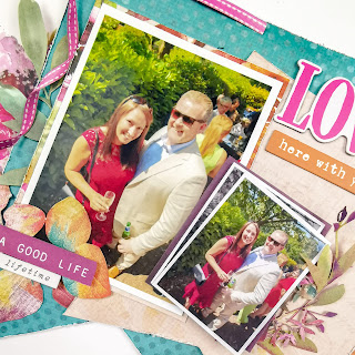
49 & Market - ARToptions Spice - Lovely Here With You

Hello everyone!

I'm excited to be back with you today, sharing my second layout using the ARToptions Spice collection from 49 & Market. You can find it in the shop here.

If you've seen my posts before, you'll know I like a themed collection, but I LOVE a themed collection that can be stretched beyond its traditional theme. With this in mind, today, I'll be using this autumnal collection to document some photographs from a summer wedding - and it does the job wonderfully!


I started with a piece of premium white cardstock. I knew I wanted to add a splash of mixed media, but as it would be minimal, I didn't gesso the paper.

To create an anchor for my page, I cut two large flags, using the Inverted Garden paper, creating a bold bright pop of colour on which to build my layout.

To reflect the colours in the photo (mainly in Mr Claire's suit) I used the b side of the paper to pull out the natural tones, adding freshness to the page.

Once I knew roughly where they would sit on the page, I mixed some purple watercolour paint to match the florals in the collection, and applied lightly with a brayer just so the paint would peek out from the sides. I really like the subtlety of this.

I offset the flags, raising on foam for dimension, and to help me layer and build depth.

To echo the two different sizes of flags, I decided to scale my photographs in the same way, with one larger picture and one smaller picture. For the smaller photograph, I double layered, using a black and white picture underneath, and adding a coloured print of the same photograph on top, creating extra interest.


I mounted these using papers from the 12x12 collection pack and adhered to the flags with foam, distressing the edges for texture.

Then came the fun bit - the embellishing! This collection offers a vast array of options for embellishing, and each one is spectacular - you really can't go wrong. It's a great opportunity to let your creativity run wild!

I started with some 6x8 Rub-ons, layering them on top of the mixed media. I also added a leaf from the same pack which would emerge from under my title, shown below.

On top of this, I added some florals and foliage from the Laser Cut Outs Wildflowers. I love 49 & Market Laser Cut Outs - they're exquisite! So intricate and impactful. You don't need to use many at all to make a real statement on a page.

I also added a butterfly from the Laser Cut Outs Elements, to bring in a little more purple.


Under the smaller photograph, I created a delicate cluster, again using florals from the Laser Cut Outs Wildflowers.


To add a little more colour, I took some beautiful mixed media leaves and used these as a base to hold additional phrases from the Laser Cut Out Elements and Ephemera Bits.


To finish the page, I added a title and subtitle from the Chipboard Word Set and a big pink bow from the Laser Cut Elements.


This collection has been an absolute joy to create with, and I love that it's enabled me to document stories well beyond the pumpkin patch. 


I hope the layouts I have shared have inspired you. Don't forget, you can check out the collection in full here

Happy shopping!

See you soon.

Claire xx

@scrappysoulmate 

Monday, 20 November 2023

Simple Stories ~ Boho Christmas

Hi all, it’s Anna back with you today! 
With the countdown to Christmas officially on, I’ve created a homemade advent calendar! 
For my Christmas posts this year, I’m working with Simple Stories Boho Christmas, which you can find in the shop here


I brought a paper advent calendar base from Hobbycraft.
I started by adding a piece of cardstock to each of the pockets, using various patterned papers from the collection as well as cardstock from the matchmaker pack


I then decorated each of the pockets with some embellishments, which included the cardstock stickers from the collection and some 2x2 elements.


I used the number die cuts to add to each pocket, showing which day of the month each pocket is for. 


To decorate the top part of the calendar, I cut some cardstock to size and added the ‘good cheer’ sticker, along with some punched starts and some Nuvo drops around the edge.


I added some mini chocolates to each pocket, ready to enjoy each day of December!


What kind of things do you make for Christmas? 

Thanks so much for looking! 
See you next time. 

Anna
x

@acraftylifewithanna

Friday, 17 November 2023

Catching Up When You Feel Behind


Hello!! Lisa here with a huge catch up session.

I hate that feeling of not keeping up and it's something that I always tell people not to worry about. 

Life gets in the way and we are busy making memories rather than recording them.
However, I've been so good with my weekly journal this year that I wanted to keep up to date.

I don't stress about the weekly and sometimes I just do 3 weeks on a page spread, but I still wanted to document a few things.


  I ended up creating 3 spreads in the one sitting so I was up to date and that felt so good.


I used the new Christmas collection from Pink Fresh Studio - Holiday Dreams - here.

Now I know these aren't Christmas pages, but I'm not huge into Christmas scrapbooking. I keep a small journal and just do minimal. That way I can keep up and I just don't like documenting December after December, so this way works best for me.

I do however LOVE papers like these. Chrismassy, but not full on in your face Santas and Rudolphs if you know what I mean.

So a collection like this is perfect for me.


Lots of bits to cut out.

These papers were so pretty that I wanted them to be the focal point of this particular spread, so I created flips to hide photos.


And I fussy cut some leaves from one of the patterned papers.


This one here I cut from this piece here.

The green became a great frame for my photo and the JOY was perfect as it was. It doesn't have to be a Christmas page to work.

I had so much fun with this collection and will use the remainder in my weekly journal over Christmas which I will share with you later in December.

If you'd like to watch this catch up journal session, there's a video here.

Have fun documenting your every day stories.
Lisa xx


Wednesday, 15 November 2023

Carta Bella Fall Fun - Crisp Leaves and Autumn Memories

Hello, Karen here with another Autumnal layout using Fall Fun from Carta Bella. I'm really enjoying using this collection which perfectly matched the colours in some photos I had taken during a woodland walk last year.

This layout started out as a scraplift of this layout which I created for the blog in 2019 and whilst the finished layout bears some similarities, it is also quite different. I find that if I am stuck for inspiration, scraplifting a layout (my own or by another scrapbooker) can get the creative juices flowing.

I started my layout by trimming down a sheet of the Freshly Fallen paper by roughly 5mm on each edge,  layered this onto a sheet of mustard coloured Bazzill cardstock and then machine stitched with white thread around all the edges.

Pieces of the Flannel Warmth and B side of the 3x4 Journalling Cards cut apart sheet were then attached to the layout with one piece made into a pocket so that a journaling tag made from more of the mustard coloured card could be slipped into it.


Two photos, one portrait and one landscape, were printed with white borders and matted with the Freshly Fallen and Autumn Abundance papers and mustard cardstock. The photos were placed on the layout with the main portrait photo mounted on 3D foam to raise it up and make it more prominent.


The words from one of the 6x4 Journaling cards were used as a title placed next to the photos with 3D foam underneath. As the word 'Crisp Leaves' in the title were blue I felt that the layout needed some other blue elements so I threaded the tag with blue bakers twine and also tucked some pieces of the B side of the Pumpkin Spice paper underneath some of the paper layers. I think this made the blue in the title look more intentional.


Using some textured gold card from my stash I die cut several leaves on the Silhouette Cameo. Using a scoring tool I scored some veins into the leaves and bent then in the middle to give them some dimension.


The leaves were scattered across the layout from top left to bottom right to give an impression of falling leaves.


Finally I added a journalling strip printed on the computer underneath one of the photos and dotted a few copper coloured sequins here and there.

I hope you like this layout and the Fall Fun collection can be found here in the shop.

I will be back later in the month with another project and until then take care.

Karen x x


Monday, 13 November 2023

November Papermaze Kit - Part 1

Lynn here today, with the new Papermaze Kit for November. Papers, card and embellishments in a collection of bright, cheery colours. Here are my first two layouts:

Here are the details of what you will find in the kit.


Patterned Papers:
49 & Market - Spectrum Gardenia - Painted Foundations Color Wheel
Doodlebug Design - Hello Again - Dainty Dots
Simple Stories - The Little Things - Always Remember
Simple Stories - Simple Vintage Life In Bloom - Make Time
Simple Stories - What's Cookin' - Let's Eat
American Crafts Shimelle Main Character Energy - After Hours
Bazzill Basics - CS White and Hillary

Reverse side of papers

Embellishments

9 frames of Tim Holtz Film strip ribbon, 3 Paige Evans die-cut leaves, heart button, 1m black twine, 1 sheet alphabet stickers, 1 strip of enamel hearts, 1 flair badge, 6 water droplets

Bazzill Basics extra pack - Blackbird, Apricot, African Violet and Petunia

Lego Love Birds - a colourful Lego project completed this summer.

I started off with the 'Colour Wheel' paper from 49 and Market as the base, and matched scraps of Bazzill cardstock to match the colours printed on the paper.

With the Brick Wreath Cutfile from Paige Evans, cut from white Bazzill, I used the coloured scraps to back each of the the bricks. Once complete, I arranged the wreath over the paper and attached the bricks with some 3D foam tape.

I mounted both photos on white and then black Bazzill to create borders, these were arranged within the wreath.

My title was created with Doodlebug Designs Alphabet Soup puffy stickers in Ladybug for the word 'Lego', and Lilac for the date. For 'Love Birds' I used Paige Evans Gathered foam and cardstock Thickers.

Finally I scattered the tiny heart stickers from the kit.

October 2023 - My great nieces enjoying a day out at Tully's farm, to collect some pumpkins.

The African Violet Bazzill in the kit seemed perfect for these photos, especially with Scarlett's purple jumper. I splattered Distress Paint (Pumpkin Spice, Picket Fence and Black Soot) over the card and set it aside to dry.

Using 'Let's Eat' paper I fussy cut the large flower cluster and attached this to the bottom right of the Bazzill using 3D foam tape.

I mounted both photos on the reverse side of the same paper and attached them to the cardstock too.

My title was die cut from more scraps of the paper and also from black cardstock. I arranged them onto the layout with the paper letters overlapping the card letters to create a shadow.

To embellish I used some Nuvo Glitter Drops and Nuvo Crystal drops to highlight parts of the flowers. I also added the flair button from the kit between the two photos.

That's all for today, I have more to share soon.
Thanks for looking
Lynn x