Friday, 31 March 2017

Shiny & New with Simple Stories Posh

Happy Friday everyone, I am here with my last post for the month and I have used the Simple Stories Posh collection on my layout today.

Shiny & New by Tracee


I wanted to keep my page lean and simple, but at the last minute before I glued it all down I decided i wanted some mixed media on my background. I used a stencil for the hearts, there is a huge choice over in the shop here. I then splattered a little gold mist and some paint for a little colour.


My layout was based around a digital cut file, I just love "pie" shapes, I simply drew round the outline of the heart then cut out the shapes in different papers. I used some thickers for my title, once again there is a huge range over at the shop. This page is all about my "shiny & new" kitchen and I thought that was a great title for my page.


I took the 3 x 4 journaling sheet and cut the pretty and posh card into a 3 x 3 square, I layered it onto some white cardstock and then stitched around the edge. I added the cute bird from the sticker sheet, I think she is so cute! Some enamel dots and my page was complete.

I hope you have a Happy Scrappy weekend!
Tracee


Wednesday, 29 March 2017

Prom Night ......with Prima Rossibelle.

Hi Again,

 It's Anita with you today and this is my last offering for March.
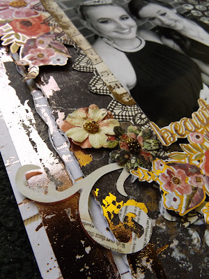
 Last summer it was our youngest daughter's year 11 Prom, such a beautiful evening, full of stunning dresses, sparkly heels, tiara's and of course arriving in magnificent cars!

When I saw the Rossibelle Collection I just fell in love with it....very pretty with the floral designs, but so striking and majestic with the Rose Gold Foil accents and highlights. So I knew that's what I had to use for a prom layout.
Chloe's dress was navy blue and I chose to have a few photos of the evening printed in black and white. I also felt that worked better with this paper range too.


I used a sheet of Nostalgic for the base of the layout and then took a sheet of the beautiful and heavily foiled Notes and Scribbles. This is an absolutely stunning sheet and the foiling is really luxurious. Before anything else i took a peice of bubble wrap and gently sponged some ivory acrylic paint onto it in various places. I absolutely LOVE to use bubble wrap for stamping with, I prefer it to actual stamps because I like that I can change the pressure in different places for different effects, also by popping a few random bubbles can completely change the end result too!
After the paint dried I then repeated the process in some patches using a metallic coppery/gold paint, I re-stamped over small patches of the ivory.
I then trimmed roughly 8mm off of one side of the sheet and the same off of the top of the sheet, this allows a border of the base sheet (Nostalgic) of the layout to show and create a framing effect.


After trimming I cut a fairly large square from the centre of the sheet and then roughed up the the inner and outer edges. You can use a distresser if you have one....I don't own one however and just like to pick at mine til I acheive an effect I am happy with.


I took the 3rd and final sheet which is called Vintage Memories This had various elements on it that I fussy cut out. One I used as a partial photo mat and the others I raised on 3d foam pads and arranged around the layout in various places.


Using some of the left over scraps I die cut out some swirls and added those to the layout and then popped on 3 paper and bead blossoms from the Rossibelle range.....the perfect finishing touch.


This collection is truly beautiful, even more so when you see it in the flesh. It's such a shame I couldn't capture this properly in the photo's but I just know that if you treat yourself to a few sheets at some point you will be glad you did.

 Warmest wishes
Anita xx

Monday, 27 March 2017

natures beauty

for my next couple of posts i am using  Bo Bunny Bella Rosa patterned paper and a dusty attic chipboard frame. Initially i was going to put the chipboard frame on thick acetate but somehow that didn't look right with the photo. So i gently cut my frame to fit about 2 thirds of my patterned paper and went about matting my photo with piece of the shutter and reflections paper. Echoed the same chipboard piece in the bottom corner, with a door image. Did lots of fussy cutting and rolled a flower.
To add colour to my chipboard i mixed some of my inks and mists and dabbed onto my chipboard using a natural sponge and the dry brushed some white paint on top. One of my more simple layouts as i struggled a little with it, but i love the subtle rust colours and wood grain paper


a close up


another close up


Friday, 24 March 2017

March Crop

It's the last Saturday of the month and our March crop is upon us!  This months kit has been designed by Lynn using the beautiful blues and greens of Kaisercraft's Ubud Dreams papers...


As always, we are at Otley Village Hall from 10am until 5pm, with refreshments, homemake cakes and plenty of dies and punches for you to use!  Drop us an email if you'd like to join us!

Wednesday, 22 March 2017

More Fun With PaperArtsy (JOFY) Stamps

Hi, Lynn back with another post for March, still using the same PaperArtsy stamps and technique as before, but decorating a different IKEA product this time.


I had a few old KNUFF magazine folders left empty when I sorted out some craft magazines. These were looking a bit tatty so I decided to treat them to the same technique as the bead chest I decorated at the beginning of the month. I made a start by allocating one to each colour of my stash of A4 coloured papers and cardstock.


I gave each box a light rub down with sand paper and then treated it to a quick coat of off-white acrylic paint. I kept the base plain this time as I wanted to dedicate each box to the colour of the papers it would store - I intended to display the colour in the images rather than the background.


The next step was to stencil (PaperArtsy) some images with Distress Paint. Then once this was dry I added stamped images and letters onto the box and the cartridge paper. 


The images on the paper were painted using Distress Inks and Markers, with a brush and water. I cut them out and used Gel Medium to stick them to the boxes. The finished boxes were treated to a covering of the Matt Gel Medium to protect them.

The boxes were finished off with a little sparkle from Stickles and texture and shimmer from Liquid Pearls.


This will be an ongoing project, I have completed some and others are in the process of being completed - but you get the idea. I will add photos to this post as I go - so pop back later to see what I did with the rest.


Thanks for looking
Lynn x

Monday, 20 March 2017

Having a play

Hi Carol with you today.  

13 years ago Tim Holtz and Ranger introduced to the craft industry a very different ink pad, one that reacts with water, you can stamp with, mix, edge - the possibilities over the years have grown, along with the colour palette and, 13 years later the Distress ink pads and associated products are still going strong.  I, along with some of my crafty friends all bought those initial 4 pads and they are still going!! and as you'll all know, if you follow this blog, I use my distress inks all the time.  So, when the new oxide distress inks were introduced I couldn't wait to get my hands on them.

So, inks in hand (can't get the whole set there appears to be 2 that are being very elusive!), I had a play - tags are a great base to use as they are a great size and can then be used to add to cards, on their own, or cut on your die cut machines or punches…. here is my afternoons work:-


I'm loving the effect they give and the different colours…totally gorgeous.

I also decided to try the ink on a blending tool thro' a stencil with the ink being added after, I forgot to photograph the stages, but once inked and stencil in place I spritzed with water….then added some more ink…. this is the finished card…


I used a craft tag to mop up the ink on my mat, added some stamping from the new Paperartsy stamps and this is the finished tag:-


Pop along to the shop and discover all the latest new products…especially those dioxide inks

TFL xx

Monday, 13 March 2017

Simple Stories Paper Bag Mini Book - With Video Link

Hi it's Lisa here with you today.
I have created a mini book using the Simple Stories - Domestic Bliss collection.


It's been a while since I've made a 'ME' project, so seeing as it's my birthday month, I thought it was  good time to make one. You can watch the video of the book being made here.


I think sometimes it's easy creating projects and documenting other people and we forgot to document about ourselves.


The book started off as a plain brown paper bag. These make excellent book covers.


I've then decorated the pages with the beautiful papers from this collection.


And I've used some of the coordinating stickers and die cuts too. It makes the creative process so much easier and quicker when you have everything coordinating.


I hope you enjoy the video. Thanks for stopping by today.

Lisa x 


Friday, 10 March 2017

I'm Busy with Simple Stories Domestic Bliss

Happy Friday, hope you all have some crafty plans for the weekend.
I am here to share with you a layout I created using the new Domestic Bliss collection by Simple Stories.

I'm Busy by Tracee

I'm Busy scrapbook page tracee provis simple stories domestic bliss

When I first saw the name of this collection I was a little hesitant.... "housework" but really this is collection is full of beautiful colours and lots of neat touches that don't require you to have a photograph of you doing your best hoovering pose lol. 

I'm Busy scrapbook page tracee provis simple stories domestic bliss 02

I took the I can't adult sheet and started by using some mists on my background paper mimicking the colours in the collection.  One of the 3 x 4 journaling card elements was perfect for this photo of my granddaughter "busy doing nothing" on her I pad. The hoover sticker was tongue in cheek as like most 12 year olds, when they are on a electronic device, nothing can interrupt them lol.


I loved these pot plants, I fussy cut them and stood them on top of the American Crafts chipboard sticker. Don't they look cute? I have really enjoyed working with this collection, there are so many cool elements and the colours just sing to you.


For this and all your papercrafting needs please pop over to the shop


Wednesday, 8 March 2017

Beautiful Memories ...Cherry Tree Lane Part 2


Hi There, it's Anita here with you today and I have made a layout this time with the rest of the Kaisercraft Cherry Tree Lane papers. Such beautiful, vintagey colours and patterns and a real pleasure to create with. I decided to use a wedding photo of my Dear Mum with her Daddy, from way back in 1966.


I based the entire layout on a sheet of Kraft cardstock and then laid a sheet of Quill over it, which I distressed the edges on. The photo was a little over a 5 x 7 and I decided to cut an oval aperture for it to sit in. I cut the oval a bit smaller than the photo and then snipped and rolled back several sections to create a curled frame.


 I used a script stencil and added some Texture paste..... unfortunately this just didn't work very well and was rather blobby in patches which is a great shame. But hey ho....never one to be beaten by a crafting product, I just got out some Cosmic Shimmer spray in Gold and sprayed and splattered across the page ( this made me feel a bit better!)

A length of cotton lace was fixed across the whole width of the layout and I then
 took the sheet of  Telegraph and a sheet of Correspondance and cut lots of elements out which I scattered in various place about the page.


By layering up the flowers and letters/ephemara etc it adds a little texture and depth but without adding bulk.


I fnished the page by adding some small pearly swirls, teeny blossoms and a lovely chipboard title (from my stash). I think the Cherry tree Lane collection is absolutely beautiful and you can find it HERE in the shop, along with lots of other Kaisercraft Collections

I will be back later in March,
see you then. Anita xx

Tuesday, 7 March 2017

cards

so for this post i have opted for making a couple of cards left with the beautiful prima papers i have been working with. I always find cards take longer to make, probably because there smaller and i  kind of have have no concept when i start.
As its mothers day at the end of the month, i thought id better get started on making a couple of cards, but as you can see these could be used for anything. I have used my go to flowers dies, leaf Punch, and a memory box die. I have distressed the edges with brown ink to take away  the white edges from the card
But what i want to draw your attention to is the wooden laser cut pieces i have used. They are by scrapinec, and i do believe Vanessa is going to have them in stock, possibly not these frames but other pieces from this company. They are very delicate and add a vintage effect, plus easy to cut apart with scissors and im looking forward to using more of these wooden laser cut pieces on my scrapbooking pages. 


here's a close up


Friday, 3 March 2017

Fun With PaperArtsy (JOFY) Stamps

Hi Lynn with you today - I have been having fun with my JOFY PaperArtsy Stamps. There are plenty of these in the Papermaze shop. I had all my beads and jewellery making materials in a huge under-bed storage box and it always took time to find what I wanted. I had a sort out and once I had organised the content and thrown out the rubbish I was able to fit what was left into an IKEA - MOPPE mini chest of drawers. Mine was old and in need of attention but they are still available - just follow the link.

Here is my finished box - I will show you the main stages to create something like it.


Front


Right end

Left End
Top
The box needed cleaning out - it had had other craft materials and some ink had spilled and some drawers were a little glittery, so a light rub down and vacuum out. 

Then I primed the whole box with a white chalk furniture paint left over from another project. When this was dry, I mixed acrylic paint (Ranger's Tim Holtz Distress Paints) so that I could work in an Ombré effect working from green for the grass through to blue for the sky - I didn't want a defining line between the two.  This has to be done quickly as the paints dry fast. I sponged in a little white to suggest clouds. Using PaperArtsy JOFY stencils I added some wild grasses with the white paint.


Once this was dry I stamped the images I wanted onto the box -  this was tricky over the draws but I didn't worry too much as I was planning to cover the images with paper ones. I wanted to stamp the images on so I had the tiny details that are almost impossible to cut from paper, such as thin stems, insect legs and antenna


As I used each stamp I re-inked it and stamped it onto a good quality cartridge paper, nothing too thick as I needed it to be easy to cut, and flexible when sticking to the box. 


Next I coloured my images using Ranger's Tim Holtz Distress Inks and Markers. I applied the ink to the messy mat and used a water mister to mix and a paint brush to colour the images. Once dry the images were cut out and pasted over the same image on the box. Where necessary I cut them where they overlapped the edges of the box or over two drawers. (Note to self: - not a great idea to stamp the very detailed fence over two drawers and a support - this was very tricky to cut out let alone paste into position!). 

I used Regular Gel (Matte) Medium, this is an clear medium which glues the paper in place and can be painted over the images to give a translucent water resistant finish. I extended this to the whole box when finished to make it more durable.

For finishing touches I added some dots with Liquid Pearls for flower centres and to create the tiny flowers in the grass. I glazed the wings and other bits with Stickles for a little shimmer.


Thanks for looking
Lynn