Wednesday, 27 July 2016

Simple Stories Bloom & Grow - With Sketches - Part 2

Hi, Lynn here! Back with the second of my July blog posts, continuing the theme of sketches and the delightful Simple Stories - Bloom & Grow collection. If you'd like to go back and read the first July post, you can find it HERE (where you'll find a list of links to sites with sketches).

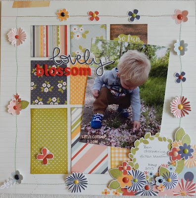
The first layout for today - using another sketch from Page Maps (May 2016).


As you can see from the sketch below, instead of having a large mat around the layout I have used four strips of Dig It! paper. These are raised up on corrugated cardboard, which is hidden underneath, but makes a firm support to a large area of paper. This was mounted onto a sheet of White Bazzill Cardstock. I cut down on the number of squares of patterned paper inside the frame as I felt it would have been too busy, concentrating on using them to mat my photo.  I also changed to position of the title.

I used the following from the Bloom & Grow Collection (mostly scraps of what I had used on the previous two layouts I shared on 8th July.) For the title and the images I added:
·        some elements from the Bits & Pieces pack
·        and some Enamel Dots for the nail heads.


For my second layout I used a double page sketch from Let's Scrap.


I followed the layout of the sketch with a few changes. I used two sheets of White Bazzill cardstock as a base and Stonewash to mat my photos. I inked bricks and vine leaves through a TCW stencil (Mini Tuscan Wall), using Distress Inks (Antique Linen, Crushed Olive and Brushed Corduroy).
Where diamond shapes were indicated I have made a trellis using the scraps of Dig It! paper and a Sizzix -Tim Holtz Alterations - Frameworks Die - Lattice.

I made my title, date and all the flowers and other images with the Fundamentals Cardstock Stickers sheet and the Expressions Cardstock Sticker sheet. I used 3D foam to add dimension to the layout.

Here is each page separately so that you can see more detail.


With six papers from this collection I was able to complete three single and one double layout – with plenty of scraps left over. There are also plenty of the stickers, alphas, bits & pieces and enamel dots, so I picked out another single sketch for a final layout.

This time I used a sketch from Sketch Savvy.


I created a large shape in the background where the Mickey face was suggested on the sketch with a large stylised flower. I made a template from paper and drew around it roughly several times using Distress Markers. I picked out a palate of colour closest to that of the collection - Fired Brick, Mustard Seed, Crushed Olive, Faded Jeans and Spun Sugar. 


I added in some of Chin Up Buttercup! Paper, and the rest was all scraps from the above.

I hope you found this and the previous post interesting. Please share anything you create with this collection or the sketches. In the mean time take a look at some of the sketches available by following the links. 

Thanks for looking

Lynn x

Monday, 25 July 2016

baby shower guest book

I was asked to create a baby guest book for a good friend of mine and it appears they are very popular for baby showers. So i pulled out some grey board for my covers, and cropdile and bind it all tool. 
On the whole i have use the carta bella, its a girl collection along with some older crate paper stickers, papers and some lace trim.


As you can see i have created a border of papers and embellished the left hand side with a wooden flamingo i had in my stash, a flower and a button. Of course lots of stitching around the edges of my paper.

The papers on the inside are also bordered with small stamped and clear heat embossed icons. The stamps are super old and ones i purchased from France, i have not not seen them anywhere else and i have to say worked perfectly for this project.


Saturday, 23 July 2016

Summer opening times

During the summer we will have restricted opening hours, to allow us to spend time with the children :)  

The shop will be open from 9.30 until 2pm on the following days:

Tuesday 26th July
Friday 29th July
Tuesday 2nd August
Friday 5th August
Tuesday 9th August
Friday 19th August
Tuesday 23rd August
Tuesday 30th August 

If you wish to visit us at another time, please contact us to arrange something!

Internet orders will not be affected and will be processed as normal.

Friday, 22 July 2016

July Crop

I hope you are all enjoying the lovely weather we are having at the moment - hopefully it won't be too hot to spend the day cropping tomorrow!  We have something a bit different for our crop kit tomorrow - one of our regulars, Jacqui, is going to share some painting with Dylusions paints, creating this colourful layout - there may even be some finger painting involved if you're feeling brave!!    


Jacqui is going to hold a couple of demos during the day, so do come along and join us if you can :)  There will be the usual home-made cakes, tea, coffee & shop discount. Hope to see you there!

Thursday, 21 July 2016

Echo Park ~ Summer Party

Hi, it's Anna here today with a new layout to show you, using Echo Park's Summer Party collection. 
I've really enjoyed working with this collection, with lovely bright summer colours perfect for summer snaps. Take a look at the collection here. 


Thanks for looking. I'll be back with more from the Summer Party collection soon.
Enjoy the sunshine!
Anna
x

Monday, 18 July 2016

So Full Of Happiness scrapbook layout by Tracee

So Full Of happiness by Tracee Provis


Hi Tracee with you today, and I must say it's a glorious summers day here in Bristol.
I have a layout to share with you today that uses a mixture of collections by Pink Paislee and Simple Stories. To kick start my mojo, which seems to have melted in all this hot weather, I used this sketch .


I used papers and embellishments from both, the Memorandum collection by Pink Paislee and the Life In Colour collection by Simple Stories. 


I loved these diagonal shapes on the Life In Colour - Happy Little Moments sheet and I used the yellow stripe as an oversized corner on my main cluster. I used some of the chipboard stickers also from the Life In Colour collection.


I used another of the stickers to create a title, I added a couple of word stickers by Bella Boulevard to create interest around the page.
I found a few items in my "bits box" such as the flair badge and the tags, there was a tag on the sketch and I wrote my detailed journaling on it then tucked it down behind my photo cluster.
I added mist using the packaging technique (inspired my Missy Whidden) and a little stamping and splatters.

I hope you have enjoyed your visit today and for supplies for this layout and all your crafting needs please pop over to the shop.
Tx


Wednesday, 13 July 2016

Just playin….

Hi, Carol with you today….Have you seen the latest Tando arrivals in the shop? the mini stencils are just great for all sized projects and at a great price too, today I've used mine to make this card and matching tag…


I started off with a 6"x6" card blank and masked off the edges using tape.  I then added tumbled glass distress ink using a distressing tool blending in walnut stain distress ink to the edges…. Using the mini mask, brick wall, and broken china distress ink I added a pattern at the bottom of the card - if you start in the middle and slide your stencil across matching up the bricks and then ink, this will give you a continuous pattern… using tumbled glass ink I added stencilling using distressed sequins mask and mini flourish and then stamped the spiky flowers from paperartsy set EDY14.  I added some mini splats to the wall using the walnut stain DI.  Using black ink I stamped the chevron along the wall and the other flowers from plate EDY14.  To colour these in I mixed Ranger multi-medium matte with pixie powders in purple violet and golden mint and painted the images using a paint brush.  To add more bling to my flowers I added a very small covering of stickles - in stardust.  To finish off the card I added some washi tape and a handcut sentiment banner.


the tag was made in the same way:-


TFL xx

Friday, 8 July 2016

Simple Stories Bloom and Grow - with Sketches - Part 1

Hi, Lynn here! Today is the first of my July blog posts, and I have been using the delightful Simple Stories - Bloom & Grow collection.

At a recent crop, we talked about where we get inspiration for our layouts, and several people said that they like to refer to sketches. There are plenty on offer, and I’ve included a few links below, which I like to use.

Sketches give a great starting point, especially when you lack motivation. They can be followed to the last detail, or you can simply use them to get you started, then develop your layout in your own way - maybe a block of four small photos could be replace by one larger one or you can try flipping the sketch image to give a different perspective. Many of the sketches are designed for 12" x 12" layouts, but could easily be adapted for smaller square pages or for a different format such as A4.

Sketches can be black and white illustrations or elaborate colour diagrams. They might have no notes, or there may be lines and words to indicate where papers, photo, journalling and title go, Perhaps there'll be little details of patterned paper, and some sketches will show details of embellishments such as flowers or ribbons.

Here are a few resources I think you'll like:
  • Page Maps who have been offering sketches for 10 years, 
  • Let's Scrap have a lot of double page layout sketches, if that is your favourite way of scrapping and also if you need to use several photos. 
  • Creative Scrappers - Creating with Sketches have downloads that you can print out to make a book of sketches. 
  • Bo Bunny have a few sketches on their blog
  • Other useful sites include Sketch Savvy, Scrapbook.com and SBC (Scrapbook Challenges).
Here is my first layout using a sketch from Page Maps (March 2016)


As you can see from the sketch below, I have remained fairly true to the plan this time, with only a few of my own little twists. I used the stitching but added flowers where hearts were indicated. I used the patterned papers to create blocks of colour in a similar pattern to the sketch. Instead of two small photos, I used one much larger one and I changed the position of my title.

I used the following from the Bloom & Grow Collection - The base is Bee Happy, for the blocks I used both sides of Green Dot / Yellow Dot, both sides of Let it GrowPuddle Jumper and various bits from 4x4 and 6x4 Vertical Elements Sheet. I also added some elements from the Bits & Pieces pack, the Fundamentals Cardstock Stickers sheet and some Enamel Dots. Finally I added some American Craft Foam Thickers for part of the title.


For my second layout I used a sketch from SBC (471)


The biggest difference in this sketch to the layout is that it uses three photos, rather than the one I used. In my variation, I used white Bazzill cardstock, trimmed down and mounted onto Navy Dot / Red Dot. I stitched the paper strip cut from Puddle Jumper paper before attaching the bubbly sticker strip from the Fundamentals Cardstock Stickers sheet. The title is created with the Expressions Cardstock Sticker sheet and some American Craft Chipboard Thickers.


I hope you found this post interesting and that you like, and maybe use the sketches and layouts. I will be back later in the month with more sketches for inspiration. In the mean time take a look at some of the sketches available by following the links above - and do share your creations!

Thanks for looking
Lynn x

Wednesday, 6 July 2016

bo bunny wallet album and memory box

this is my last project made with bo bunny beautiful dreamer collection, and this time i have made a wedding memory box and a wallet album.
Firstly the box is a Kraft  box from paperchase that i painted and  then decorated with the bicycle paper as the focal point due to the theme of the wedding being bicycles and purple. 
I have used tim holtz book plate die in the corner and made some rolled flowers and leaves with the patterned paper


Here's a close up of the rolled flowers and leaves made using my own dies, i also added some small pearls in the center of each flowers. Added love cut from sparkly silver paper. Then the decorated box lid was sealed with matt  modge podge.


Now onto the wallet album. Unfortunately i cant remember the dimensions but i recall i used a template that i found on pintrest and a tutorial on u tube as my starting point. The base of the album and the file folders are made using 2 sheets of 12x12 purple card stock. The papers used to cover the album and tags were mainly from the beautiful dreamer collection along with some tags and a small paper pad i purchased from a pound store. The tags flip open and show important moments of the day
The photographs were taken by a local photographer Neil Baxter ( www.NeilBaxterPhotograpy.com ) and i have to say the photos are stunning and easy to work with.


One of the pull out file folders with the couple having there first dance and on the other side the lyrics i found to the song they danced to. Which i was able to print out on a clear overlay. Sequins added for interest.

Close up of the file folders, with photos and mounted word stickers


Last page with pull out tags and pockets


Monday, 4 July 2016

Dino Friends - Part 2

Hi, it's Anna here with my second layout using the Echo Park Dino Friends Collection. Last time, I kept my layout Dino free, showing how it could be used for many picture themes. 
But today I have a dinosaur layout, which will hopefully show you lots of the cute dinosaur details. 


I used the patterned paper in three strips. You can find the Dino Friends Collection here, where you can take a closer look at all the collection has to offer, including lots of lovely patterned papers. 
I used a few of the stickers from the elements sheet which can be found here, I also love this washi tape from the collection.
That's it from me today, next time I'll be showing you what I have been working on using the Echo Park Summer Party Collection. 
Anna 
X

Friday, 1 July 2016

Tranquility.....from Blue Fern Studios

Hi There, it's Anita here again and I am starting July off with some beautiful papers once again from Blue Fern Studios. If you haven't already had a play with these then I highly recommend them, they are really fabulous quality, nice and thick, double sided and beautiful designs throughout each range.

This time I am working with the Tranquility collection which will be in the shop soon and I thought this photo of my 2 girls, taken a few years ago now, at Virginia Water in Windsor Great park , would work well with it.


I used 2 sheets of Tranquility *Calm*, one to base the layout on and the other to cut a circle from and use the reverse side. I gently sponged some white acrylic paint through a script stencil that I have and also sponged around the outside of the photo and edge of the layout too.

I can never resist a bit of bling, so I stuck tiny crystals all around the circle and then used Stickles to add sparkle to some butterflies that I printed out at home .


In a couple of places i rolled some of the edge of the layout inwards and popped some fine mesh behind, leaving some poking out to soften the edge.I then added a few hand sewn stitches in various places about the page, including over a chipboard title that I had sponged white first. I added a section from the Calling Cards sheet of paper and gently inked and Stickled the edges.


I was given a couple of heart embellishments that were made of bark of some sort and whilst very pretty left natural, I decided to spray mist with some Cosmic Shimmer Spray in blue to work better on the page.


I really like making flowers in different ways and one of my favourites is to cut circles in various sizes out of voile or satin fabrics and melting the edges over a flame ( tea lights I find are best) to seal the edge and stop it fraying.  When they are all done you simply layer them up and hold together either with a stitch or a brad.
 

I used some voile for these ones and cut some fine white mesh for a couple of layers too, then used a large Kaisercraft brad to hold the layers together. Here is a quick step by step to make this type of flower ( image taken from Pinterest)


Would love to hear if you have a go at making some of the singed edge flowers. They are very versatile and could also be added to head bands, made into brooches or bracelets or added to the outside of a present to 'pretty' it up.

Have a super weekend xx