Friday, 30 July 2021

Pretty Pockets & Photo Booths

 Hi Everyone,

It's Lisa here today with the prettiest paper collection.

Happy Blooms from PinkFresh Studio.

I was so drawn to it when I saw it but didn't have any ideas. I just knew I had to have it.

I ended up creating a double page in my Florida journal.


The colours just go so perfectly.

I do have a process video here if you'd like to watch it come together.


I recently found a box of old photos when I was decluttering a cupboard. I'm trying to use those photos. So I went through to see what took my fancy and I pulled out these photo booth strips from Disneyworld. I thought they'd be perfect. The kids always have so much fun making these photos.


I had the pack of pockets from this collection so decided to use one to hold the photos so they could easily be pulled out.

I then used some other pieces to embellish.


    I love this page here and knew I'd have so much fun cutting out the word strips. The colours are so pretty and really transformed this page.


I added another pocket on the other side to home my journaling.

I cut out the 'love you' card from this piece here and the cut the 'happy place' piece from this piece here.

I stapled it to the top so it could easily be pulled out.


 I'm so happy with this new page.

This collection is so pretty.

Thank you for being here with me today.


Lisa xx

Thursday, 29 July 2021

Even Monsters Can Look Pretty

 Hi, It's Lisa with a pretty page today.


I found this old photo from 2007 when I was clearing out and thought it would go perfect in my new Florida journal. 

I have so many photos from over the years so I've challenged myself to document them but in no particular order to ease the pressure and I'm having so much fun.

I've used the Maggie Holmes - Garden Party collection here

And I will confess that I used it once and went back and ordered more as I loved it so much.


I created a flip, so the photo page on the left opens out.
Then I had so much fun cutting up the pretty papers to add here. It was like doing a jigsaw making them all piece together.


This collection is just so stunning. I cut lots of elements from the papers to add.


I'm so happy with this page.

It was one of those that came together with little thought, it just felt relaxing.


 I hope you like this fun page too.


Have a lovely day.

Lisa x

Wednesday, 28 July 2021

'Happy' with Photoplay's Sweet as Honey

Hello! ScrappyAdam back with you today and I am continuing on with using various Photoplay collections - mixing and matching them because lots of the new releases work so well together! Today's is a little different because I haven't done much mixing! I have used, almost exclusively, Tulla and Norbert's Sweet as Honey collection - and I absolutely LOVE this collection!


I started with the lovely woodgrain paper - the B side of Tweet Tweet which I used as my background. I then took some strips of patterned paper, using three of the papers (and a mix of A and B Sides) and tore some of the strips. I then used my notebook punch to create a notebook style strip towards the top. For the bold, black strip that I tore, I made sure to gradually increase the width as I went from one side to the other. 

I decided to use three photos and mine are all 3x4" and are matted together on piece of the B Side of Buzzing By. I popped my photos up on some foam for some added dimension. 


It was then a case of embellishing! This collection has a sticker sheet and an ephemera pack and I have used a mix of both on this layout. I created an embellishment cluster at the bottom of the page where I used the sticker sheet to create the title; "Happy" and used some more patterned paper strips. 

I created a circle and then cut it in half and used both sides as some extra interest to the top right and tucked a flair underneath the notebook paper. 


This was a fairly quick layout for me with the strips of patterned paper, photo and title placement doing most of the work. I love this design for a scrapbook layout as it allows your photos to shine but gives you fun with the products!

I will be back in August where I am carrying on with my mix and match of Photoplay because I still have so much left!

Do you like to mix collections? Do you mix collections within the same brand or mix and match completely? I like to do a mix of everything but find stash diving for bits and pieces once I have the base of a layout done so much fun!

Don't forget to check out the shop - there is so many new goodies on their way and arriving everyday! 

Till next time, take care and stay safe - and happy scrapping!

Adam x


Monday, 26 July 2021

Carta Bella ~ Summer #3


 Hi all, it’s Anna back with you today to share my third and final layout using Carta Bella’s Summer collection. 

You can take a look at my first layout here, my second layout here and the collection in the shop here

To create this layout I began with a sheet of 12x12 bazzill avalanche. I then used a sun cut file as a stencil to create the background. I cut it out about an inch smaller than 12x12. I used the distress ink shade fossilised amber and inked through the cutfile to create the sunshine background. I allowed it a short time to dry and then trimmed down the cardstock. I mounted it on the b side of the 4x4 journaling cards patterned paper, gutting it beforehand, to reuse the middle. 

I then selected my photograph, a square 5x5 picture and mounted it on to three of the patterned papers; So sweet tags, summer stamps and summer strawberries (all b side). 

I then selected a couple of pieces from the multi journaling  cards paper, tags paper and ephemera

I created a cluster of embellishments around my photo and adhered one of the cut apart pieces that I wanted to use to the top left hand corner. I added some Pom Pom trim underneath to tie it in with the main cluster on my layout. 

In my main cluster I added a prima flower from my stash and tied a piece of twine around the tag. I added a sticker ‘say cheese’ from the P13 collection summer vibes sticker sheet to the tag.

For my title, I used a foam sticker ‘dream big’ from the Simple Stories simple vintage cottage fields foam stickers. As the photo was taken on the Euros final day, the title felt appropriate for my football mad son. I also added a couple of the hearts too. 

Thanks so much for looking, I'll be back soon with a brand new collection..

Have a great week!

Anna 

X


Saturday, 24 July 2021

Bee Yourself - Photoplay - Sweet as Honey Collection

Hi everyone, it's Rebecca here with you again sharing my second layout using Photoplay's 'Sweet as Honey' collection. 


I was really inspired by one of Claire's recent layouts (you can find it here) and her use of rosettes on the page, so I decided I wanted to make a giant rosette for my layout.

I selected the 'Sweet Pollen' patterned paper as it is my favourite paper from the collection. The yellow and white florals just 'pop' against the black background and just makes my heart sing. I'd used some of it on my previous layout, so I didn't have a full 12x12 sheet left.... so I was dubious about whether I'd have enough paper to make a full circle or not... but decided to give it a go anyway!

I cut what I had left of the 'Sweet Pollen' paper into two strips - approx 4.5x12 inches. I used my paper trimmer with a scoring blade and scored along the 12 inch side of the strips, at every 1/4 of an inch. I then folded the strips back and forward to create 'mountains and valleys' and stuck them together to create one long strip. 


It was at this point that I knew it wasn't going to be long enough to make a complete rosette so I had to get a bit creative in my page design (by 'creative' I mean 'sneaky'!). My strip was long enough to make about 80% of a full rosette, so I punched a circle from some scrap cardstock, and stuck the rosette (with what looked like a pizza slice missing!) onto the circle to help it hold the shape. 

I then had to figure out a way to cover the missing section of the rosette! I printed my photo in black and white and cut it into a circle and used this to cover a lot of the gap. I wanted to add some flowers, and remembered that I had a sheet of yellow and black flowers left over from my Vicki Boutin Color Study kit, so I took some time to fussy-cut some of them as they matched the Photoplay collection perfectly - and they also covered a lot of the gap!!


Because this collection is full of really cute bees, I wanted to add a couple of bees to the page, so I've used a cutfile by Peartree Cutfiles and backed two bees using the B side of the 'Buzzing By' patterned paper. I've placed the bees onto my white background, to the edge of the rosette, to help extend the design out a bit.


I've selected an acrylic perspextive title from Bramble Fox which says 'Bee Awesome' and comes with a really cute little bee. This perspextive set is perfect for this collection - you get a black set and a mustard yellow set so the colours match the collection too! A match made in heaven.


I selected the XXX patterned paper and cut a tag from it, which I placed above my photo with some yellow satin ribbon threaded through the top.


The layout was coming together nicely, but I wanted to add a cluster to the left of my photo. I fussy-cut some really beautiful bird houses and a Bee from the 'You're a Keeper' patterned paper, and added these to the left of my photo.


I was in the mood for some mixed media, so I decided to add some colour to the white background, behind my rosette. I used a Distress Ink in Mustard Seed and brushed some colour on using a blending brush, and then added splatters in yellow, metallic gold and black.


Once my background was dry, I began getting everything stuck down. I've used quick drying tacky glue and foam pads to bring a bit of dimension to the page. I placed my title and flowers strategically to fill the gap in the rosette and now you can't tell there was ever a section of the rosette missing.

I finished my layout by adding a banner from the Cardstock Ephemera pack which reads 'You are my sugar pie honey bunch' and a fussy-cut bee from one of the circular ephemera pieces.


I'm really pleased with how this layout turned out. In fact, I love both of the layouts I've created with 'Sweet as Honey'. The colours in the collection really appeal to me (even if the gnomes don't!!) and I've really enjoyed working with it. 

If you'd like to see how this layout came together, there's a process video up on my YouTube channel which you can find here.


Thanks for reading, I'll see you next month!

Take care

Rebecca x


Friday, 23 July 2021

Pinkfresh Studio Happy Blooms - You are My Sunshine

Hi everyone!

Claire back with you today sharing my third layout with the Pinkfresh Studio Happy Blooms collection. You can find it in the shop here.

For this page, I decided to set myself a personal challenge - No white cardstock!  


To really push myself out of my comfort zone, I opted to create my layout on a piece of patterned paper. I selected this beautiful pale blue paper with a white daisy pattern for my background. It is called Memories, and has a vibrant yellow pattern on the A side as well as this softer pattern on the B side.

I created a fishtail banner from the B side of the Embroidered paper. I distressed the edges and added machine stitching before placing this horizontally across my page on foam pads to create an anchor for my design.

To this, I added a torn piece of the Cottage paper creating an additional textural element and contrasting colour between the two blue patterns.


When designing my page, I decided I would create one large cluster, with my photograph at its core and from which everything else would gather around. 

As the base layer, I chose a pocket, journaling card and a tag from the Journaling Bits pack - I adore these packs. I think they're my favourite part of a Pinkfresh collection.


Next, I placed my photo on foam pads, layering it on a piece of tissue paper for a delicate mat against the pretty papers.

I took a selection of florals from the Floral cardstock Ephemera Pack. In this pack, there are some florals that are full colour and some that appear sketched with a stitched effect that's really pretty.  I have used a combination of both here.

I layered these around the sides of my photograph, complemented by a heart from the Cardstock Ephemera Pack.


To the other corner of the photograph, I added a Cardstock Banner from the same pack saying "You are My Sunshine" and placed a small plant from the Puffy Stickers - perfect for my garden photograph.


To finish the page, I fussy cut a butterfly from the Homegrown paper and added a few Nuvo Drops in yellow as a final touch.


And that is my layout complete - and not a sheet of white cardstock it sight! :) 

This collection has been an absolute joy to create with. I hope you've enjoyed seeing the layouts and they've inspired you to give this beautiful collection a try.

See you in August!

Claire xxx


Wednesday, 21 July 2021

Echo Park A Slice of Summer - Create Your Own Sunshine

Hello, Karen C here with a final layout using the Echo Park A Slice of Summer collection.


I started with a 12"x12" sheet of white Bazzill Cardstock and onto this I placed a sheet of the Summertime paper which I had trimmed about a quarter of an inch from each edge. 


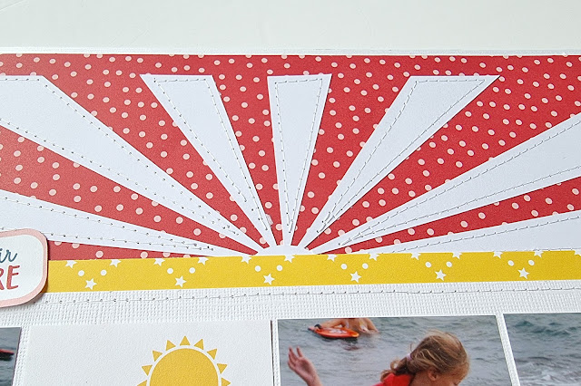
I found a sunburst cut file in the Silhouette Store and cut this from my favourite Craft UK smooth white cardstock. The sunburst was stuck to the top of the layout and using my sewing machine and white thread I stitched round each sun-ray.


I matted three photos which were slightly smaller than 3"x4" in a row on white cardstock and also added machine stitching to the photo mat. A piece of the Squeeze The Day paper was added to the bottom of the layout and the photo mat was placed on top of this.


I also included one of the 3x4 journalling cards in the row of photos which acted as a title for the layout.


I created a cluster with die cuts and pieces cut from the sheet of multi journaling cards to the lower right corner of the layout. I added blue bakers twine to the tag and a puffy camera sticker from my stash to the cluster.


I cut a speech bubble from the sheet of multi journaling cards and added this to one of the photos as well as an epoxy circle with an image of flip flops from my stash. I've had the epoxy circle for ages and thought that this was the ideal opportunity to use it on a layout about my daughter paddling with her shoes on. It also introduced some blue to that area of the layout.


Finally journaling strips were typed on the computer and added beneath the photos.

Thank you for popping by today. I hope you have enjoyed seeing how I've used this collection and that it's inspired you to scrapbook your summer photos. 

Until next time, Take Care.
Karen x x

Monday, 19 July 2021

Bella Blvd - My Candy Girl - 'I DONUT know how I got so lucky!' by Meg


Hello everybody, I hope you are well - it's Meg here sharing my first 12x12 page using My Candy Girl by Bella Blvd!

I was absolutely thrilled to find this candy collection in my July DT box, because I have such a sweet tooth! The colours are fantastic, cheerful and perfect for scrapping every occasion - I can just imagine birthday scrapbook layouts, celebrations, summer fairs, meetings with friends or every day moments like the one I've scrapped here. I'm even thinking this collection could be used for a non-traditional candy themed Halloween page! 

The first thing I did was pick out the photo for my page. I picked out lots of 'sweet' photos that I wanted to use but decided on this photo of my daughter because her pink baby suit just matched the pinks in the My Candy Girl collection perfectly! 


Next I used my Cricut to cut out a doughnut cutfile by Paige Taylor Evans. This actually came as a set of four doughnuts, but I knew I only wanted one larger one as a central element. I backed it using the My Candy Girl
All Girl patterned pink paper, the white border with hearts on from the Borders paper and the heart 'sprinkles' were backed with the multicoloured hearts from the Daily Details paper, which happened to fit perfectly. I added some extra 'sprinkles' from the Sugar Coating Puffy Stickers, using the smaller dots and circle puffy stickers, plus some silver crystal Nuvo Drops for added glitter. 

As I'd already decided on using a doughnut cutfile as my centre, I popped an upside-down bowl in the middle of my page (I used Romance Bazzill cardstock) and daubed and splattered white gesso over the top to create some mixed media interest around my doughnut. I fussy cut lots of little cakes, sweets and ice cream sundaes from the Sweet as Sugar paper to use as embellishments, backed my photo in a yellow Lemonade Bazzill cardstock (which matches wonderfully with the yellow elements in this collection!) and the sprinkles paper from Daily Details. I also cut out the 'Remember' journalling element from Daily Details to layer behind my photo and a few borders from the Borders paper, which became a bold stripe across the page under the doughnut. 

I built up my fussy cut cakes, sundaes and candies underneath and around my photo to create a large, eye-catching cluster and popped lots of puffy stickers in there too. I used alphas from my stash to create my title around the doughnut - 'I DONUT know how I got so lucky!' - which was a little doughnut-related quote I'd found on Pinterest! 

Finally I cut out some L-shaped corners from the Candy Crazy paper to finish the page corners and I added my journaling. And there we have it - I hope you love this sweet collection as much as I do and you enjoyed my page today! 

Take care and have a lovely day - I'll be back soon to show you my second Candy Girl layout!

Meg x 


Saturday, 17 July 2021

P13 Summer Vibes - Fun and Sun by Meg

Hello all! 

Meg here today, sharing my second layout using P13s gorgeous Summer Vibe collection!


I absolutely love fussy cutting P13s papers so that's the very first thing I did here - starting with some beautiful large tropical leaves from the Summer Vibes Paper #07. I picked out Paper #06 as my background as I thought the colourful world map would be great for one of my holiday snaps. 


I always try to incorporate some texture into my scrapbook layouts to stop the page from feeling flat - sometimes I do this by using natural wooden chipboard (like these ones in the Summer Vibe collection), fabric, texture paste or mixed media backgrounds, folding paper. On this page I decided to tear out the middle section and roll back some of the edges, to break up some of the colours in the background. I backed it with my go-to white Bazzill Avalanche cardstock, which has a lovely subtle texture to it and is just great quality. 


After that I picked out my photo and backed it with some dark wood effect cardstock - it was actually the packaging from the Decorative Tags #2 packet, but it just matched the wooden door in my photo perfectly and I liked the contrast with the lighter background. 

I fussy cut some more pieces - some pink Converses, tropical clusters, the wooden signpost, a parrot, some more foliage and a cocktail - from Paper #07, focusing mainly on some of the pink pieces. I arranged my photo and the fussy cut embellishments around the edge of the rip I'd made, with some pieces peeking out from between the sheets and with a larger cluster on the corner of my photo. 

I added a few banners from the packet of Decorative Tags #2 in the top right corner, some journalling and I stamped on my title 'Fun and Sun' onto the wooden signpost and tucked it in behind my photo. I finished with a painted pink border around the whole page to tie it all together, a plane charm from my stash and some flat back gems dotted here and there (I just love a bit of shine, especially on a sunny page)! 


And there we have it - a sunny tropical page for some treasured holiday memories. I hope you enjoyed my page and that we all get some sunshine today worth scrapping! 


Take care and I'll see you again here soon, 

Meg x