Wednesday, 30 August 2023

Making Journaling Easy

 Hello,


Today I'm documenting a fun Summer story.

It's some memories in Magic Kingdom that I wanted to remember. 

Journaling can be tricky sometimes and can feel overwhelming, so I'm sharing so tips today to make it a little easier.

I do also have a video for you here.


 I'm playing with some of the pieces from the new Pink Fresh Studio collection - Sunshine on my Mind.

You can view everything here, it's so perfect for Summer stories.


- One of my journaling biggest tips is to break up the journaling.

Create lots of areas for smaller pieces of journaling.

Here I used some chipboard alphas from Rosie's Studio to help with my journaling.

Replace some of the words with alphas. This can also become your page title.


I've had so much fun with the Ephemera Pack here that coordinates.

And for this little piece of journaling I've just roughly hand drawn my journal lines and scribbled down what I wanted to say. Doesn't get much easier than that.

The tickets flip over and there's journaling underneath.


The next page I have more bits and pieces of journaling.


I used the alphas to kick start my journaling again.

and I had fun with this paper here.

I cut out some of the pieces and created flips.


And then I added a little quote underneath and journaled on the reverse. 

Easy peasy!


I even journaled on the back of this photo.

I've had so much fun creating today and love this collection.

I love these pretty colours.

Hope you do too.


Don't forget the video.


Lisa x


Monday, 28 August 2023

Simple Stories - Boho Sunshine - Its Five O'Clock Somewhere

Hello, Karen here with a final layout to share with you using Simple Stories' Boho Sunshine collection. 

For this layout I created a background by layering a 9.5"x9.5" piece of the Be You paper onto a 12"x12" piece of the Be Kind paper with pieces of black and white cardstock layered in between. A strip of the B side of the Be You paper, matted with black cardstock, was placed horizontally on top.


Using white thread I then machine stitched along all edges with a straight stitch.

The 4"x6" photo was matted with more of the Be Kind paper and placed on the layout with 3D foam beneath to add dimesion.

I embellished the photo with die cuts from the Floral Bits and Pieces pack and a 'love this'  sticker from the Sticker Book

The title was created by die cutting the word 'Somewhere' from black cardstock on the Silhouette Cameo ...

.... and using a manual die cutting machine to cut the remaining words from black fun foam. The title was added to the left and below the photo.

Using scraps of the Groovy paper (left over from a previous layout)  and white twine I created some bunting which I hung across the page above the photo. The ends of the twine were secured to the back of the layout using tape.

Journaling strips were printed onto white cardstock on the computer and added to the layout.

Finally I scattered a few silver and iridescent sequins around the edges of the layout to add a bit of sparkle.

I hope you have liked the layouts I've shared with you using the Boho Sunshine collection and that I've given you some inspiration for your own scrapbook layouts.

I'll be back again soon and until then, enjoy the rest of the summer.

Take Care

Karen x x

Friday, 25 August 2023

Relax - 49 and Market - Vintage Artistry Sunburst Collection

Hi everyone, it's Rebecca with you today sharing a colourful new layout created using 49 and Market's Vintage Artistry Sunburst collection. I've been eagerly anticipating the arrival of this collection, and typically, it arrived whilst I was on holiday, so I've had to wait until I return home to play! It's an absolutely stunning collection and I don't imagine it will hang around in the shop for long, so check it out here whilst you can!


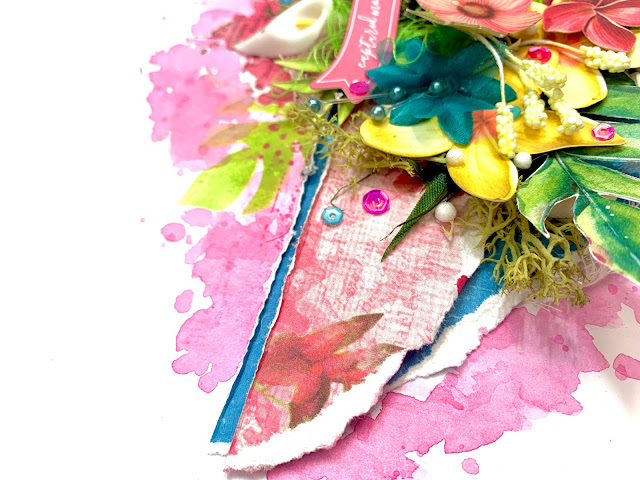
I began by cutting strips from two patterned papers (Butterfly Corsage and Azure Seaside) and then tearing the bottom edges to create some texture. I layered the papers so that the blue was just peeking out along the top, and a tiny bit at the bottom. I chose the blue paper as my little boy is wearing blue in the photo so I wanted to add some accents of the colour to the page. With my papers distressed, I added my circular photo off-centre, with some craft foam behind it to give it some elevation and to introduce some dimension. I needed the dimension to allow me to layer and tuck in allllllll the things I had in mind to use!


Before adding anymore, I wanted to get my mixed media on the page. Using a brayer, I've added some Distress Ink in the shade 'Picked Raspberry' to a sheet of Premium White Cardstock , concentrating the colour to the centre of the page. Once this was dry, I added two of the rub ons from the 6x8 Rub Ons Pack. In hindsight, I should have waited before adding these as I ended up covering most of them up with embellishments! The 49 and Market rub ons are so easy to use, and even come with a plastic tool to help transfer them. 


With my mixed media dry, I adhered my patterned paper strips and photo in place. I needed to get these larger elements stuck down early so that I could work on the embellishing.

The first thing I added was some of the Tropical Foliage Laser Cut Outs. I am always amazed with how many of these die cuts are in a single pack - in this collection there are 70! I arranged the die cuts either side of my photo, only adhering them at the base so that the ends could be turned up to bring in more dimension. In among these die cuts, I've added some fabric and foam flowers. Now, I'm not normally one for using paper or fabric flowers, but I have them in my stash because every now and then, a collection comes along that really justifies them! Papermaze stock a wide range of flowers in a multitude of colours. Because the flowers are on wire, it is really easy to slot them into place. I've gone for white and blue flowers, to break up the pink (there is a LOT of pink on this page!!). I've used a mixture of Glossy Accents and Silicone Glue to adhere the flowers. I love that silicone glue holds its shape so the flowers can sit raised off the page a little - and it gives a super strong hold.


Included in this collection, is a pack of Chipboard Words written in different colours. I've selected a pink one for this layout to match my colour scheme, and also because the gardens we were in when the photo was taken was very relaxing and tranquil (well, they were until we arrived with our 6 year old!!).

In my craft room, I have a draw of 'weird and wonderful' bits - and I decided to crack it open and see what I could find to use on this layout. I found some green moss, which I tucked in and around the floral die cuts. I love the additional texture this brings to the page. I've filled in a couple of gaps with some white cheesecloth too - another fabulous texture. 

You'll see I've added a couple of thread clusters in too. This is something I used to do a lot - but I find it so frustrating trying to get them to look 'right' so I have to really be in the mood for them! I wanted some thread to sit behind the circular die cut from the Ephemera Bits though, so I persevered and I think it looks OK! I also added a green cluster behind a die cut banner from the same ephemera pack. 


I finished the layout off with some die cut butterflies, sequins and some little white foam balls... because why not?!


Thank you so much for reading! I hope you've enjoyed this layout. It's a little different for me, but I thoroughly enjoyed making this layout. So much so, that I decided to make a very similar one to sit alongside it in my album... and there will be a process video for that one too so watch this space!

Take care

Rebecca x

@preciouspagespapercraft


Wednesday, 23 August 2023

Heidi Swapp - Set Sail - Unchartered Escape

Hello everyone,

Claire here, back to share my second layout this month using the beautiful Set Sail collection from Heidi Swapp.

For todays layout, I'm featuring lots of ephemera, offset against a mixed media background.


I took a piece of Premium White Cardstock and applied a generous coat of Gesso all over to help it handle the paints and water I would add to the page.

Once it was dry, I took a large leaf stencil from my stash (similar stencils can be found here and here) and positioned it diagonally, knowing my photo would sit in the middle of the two leaves. I applied some clear embossing paste, leaving to dry.

Using the colours in the collection as a guide, I mixed some blue and peachy watercolours and painted directly onto the paper, using a medium sized paintbrush to guide the paint around the page.

When the paint hits the dry texture paste, it acts as a resist, so you can see the image of the leaf coming through the colour. This is a lot clearer at the top of the page where the paint is darker. When the paint was dry, I added splatters in white and gold to create a bit more interest.

I repeated the paint colours in the top right corner to help balance the page.


I backed my photo using the Strip Page paper and a piece of blue cardstock from the Matchmaker pack. For a bit of extra seaside sparkle, I also added a gold foiled ephemera journaling piece which I used as a layer underneath the top edge of my photo.


To create an anchor for my photo, I tore 2 strips of the Cut Aparts paper as the 'b' side is a sandy coloured paper with a textural pattern. I thought this would look good as sand!

I placed my photo on top, raising on foam and then pulled out all those lovely ephemera pieces to create some clusters.

I used a combination of shells from the Cardstock Stickers and fussy cut from the Logo Cut Apart sheet. I stuck some of these flat, and raised others on foam to create height.

I layered some deco web, art stones and moss around the cluster to create extra interest, and added some small chipboard embellishments from P13 and a ticket, fussy cut from the Tags paper.


To extend the height of my cluster, I pulled out the palm trees form the Ephemera Pack and tucked these into the top of my cluster.


I also added a few small banners just above and of course, one of those lovely seagulls on top.


On the other side of the photo, I extended the ripped paper by adding some strips of coloured paper which I cut form the Strip Page paper. 


I cut the ends into fishtails to create a banner shape, and added some more chipboard pieces from P13.


For my title, I added some of those gold foiled puffy stickers - wow! These are really beautiful, and are such a statement piece for your layouts. They really elevate the page.


To finish, I added some ephemera and a fussy cut ticket into the top cluster, to stretch the design and balance the layout.


I have totally fallen in love with this collection! The colour palette, the ephemera, the gold foiling...really beautiful. 

I hope you've enjoyed seeing the layouts made.

Until next month, happy scrapping!

Claire xx

@Scrappysoulmate


Monday, 21 August 2023

Shimelle ~ Main Character Energy #1 ☀️

Hi, it’s Anna back with you today!
For my next few blog posts I will be working with American Crafts collaboration with Shimelle - Main Character Energy. 
You can find the collection in the shop here


I used the ‘Right on Target’ paper and trimmed it down to achieve various sized wedges. I cut each section out and distressed the edges before adhering to white bazzill cardstock

My layout features a photo from Disney last year with me meeting Olaf! We were given the circular cards with his autograph on and this card just happened to fit perfectly into the pre determined circle lines on this paper. So I chose to centre this card in the middle and place my photo to the left side. 


I fussy cut some florals from the Prettiest Pink paper and placed them above and below my photograph which I mounted onto some orange bazzill cardstock from the Matchmaker Pack


I selected various stickers from the Cardstock Stickers, I placed some of the phrase stickers around the circle and used others to embellish around my photo. 


For my title, I used some phrase stickers by Vicki Boutin and the smaller yellow alphas are by Simple Stories - alpha sticker books


Thanks so much for looking! I’ll be back with another layout with this collection in September! 
See you then! 

Anna 

@acraftylifewithanna

Friday, 18 August 2023

August Papermaze Kit - Part 1

Hello, Lynn here today, with the Papermaze kit for the month of August. Full of tropical papers, card and embellishments. For my first post I decided to make a double page layout to feature a flamingo themed BBQ my daughter and her husband held. This was when the lockdown rules started to change in August 2020, and we could meet outside in groups of six.

 
Before looking at how the layout was made, here is what you will find in the kit.


Patterned Papers:
Prima Marketing Inc. - Postcards from Paradise collection - Floral Paradise & Tropical Vibes
Pinkfresh Studio - Sunshine on my Mind collection - Love This Day & Paradise Found
Pinkfresh Studio - Tourist Mode collection - Sightseeing
49 and Market - Spectrum Gardenia collection - Classics Pink Skies
Bazzill Basics - Avalanche & Aqua

Reverse side of papers

Embellishments: 10 Prima Ephemera Pieces, Prima Harmony Flower, 4 Prima Chipboard phrase stickers, 49 and Market Color Swatch Blossom Tickets Essential, enamel flamingo charm, 5 Doodlebug puffy heart stickers, Rosie's Studio Puffy Scatter Stickers, Pinch of Pinkfresh Studio Jewel Essentials, 2 Rosie's Studio chipboard frames.


Extra Bazzill Basics Pack: Pastel Blue, Watermelon Sensation, Ivy & Pinkini.

For this layout I used a sketch by Allison Davis, for Scrapbook & Cards Today Papercraft Magazine. It is Allison's #4 sketch in the 2023 Summer collection.


To start the process, I created the background for both pages at the same time. I used two sheets of scrap 12" x 12" paper. I the trimmed the patterned papers and cardstock and stuck them to the scrap papers. I created 12" horizontal bands using the following depth measurements - from top to bottom and the same on both pages:

2" Floral Paradise paper
2 1/2" Pastel Blue Bazzill
1/2" Floral Paradise paper
2 1/2" Pinkini Bazzill
1/2" Floral Paradise paper
2 1/2" Pastel Blue Bazzill
1 1/2" Floral Paradise paper


The patterned paper has gold foiling detail, so I wanted to stitch between the bands with gold metallic thread. I used the sewing machine without thread to make a very large zig-zag stitch, which I then stitched by hand.


Six of my photos were mounted with a variety of White, Watermelon Sensation and Pinkini Bazzill.  I then fussy cut a flamingo and balloon from another photo and added them to the photo I had chosen for the bottom right of the layout.


From the 'Tropical Vibes' paper I cut two of the 3" x 4" cards, for my journalling and date and these were placed between the two landscape photos on the right-hand page.


There is a delightful enamel flamingo charm in the kit, which I hang from a length of Baker's twine and wrapped around the first photo of the left-hand page. With Tim Holtz Modern Floristry Thinlits Sizzix die set, I created clusters of leaves and flowers which I placed in various places over the layout. I used the reverse side of both patterned papers to cut the pieces and inked the edges with Distress Inks. With some 3D foam pads, some of the flower parts were raised up off the base of the page. I tucked in a few fluffy lime green feathers among the clusters.


With Tim's Gladys Sizzix Thinlits die set, I created two flamingos from Bazzill and added one to each page.


The title was created with Simply Charming puffy alpha stickers from Rosie's Studio, and Lindsay glitter Thickers.


I scattered Pinkfresh Studio Jewel Essentials - Ocean Breeze over the blue bands of the pages.

That's all for today, back with more another day.
Thanks for looking.
Lynn x