Friday, 28 September 2018

Time for Adventure with Kaisercraft Hide & Seek


Hi Tracee with you today to share another layout I created using the Hide & Seek collection by Kaisercraft. It's perfect for documenting our camping adventures and all the cool places we've gotten to visit. Of course it is much more versatile than just for camping trips, on my last page (see here) I used the pinky elements that come in the collection which gives it a different look altogether.


We recently visited Cornwall and we have some great pics of our time there, this one was at Boscastle where the scenery is of course stunning! The rugged coastline lead me to use just the blues and browns from the collection and I used the Trees sheet for my journaling by fussy cutting out the words and arranging them to suit my needs. 


The arrows were from the sticker sheet and I added some talcum powder to the back of one, this took away the sticky and I was then able to tie some string around it and layered it over the other arrow.  I found a chipboard piece in my stash, so I cut it up and layered it behind my photos. The wooden dots have been in my stash for ages and I thought they went perfectly on this page.

Here you can see more of the Trees paper that I cut up to use as my journaling.


Also here. This photo also shows the real reason I used some here and that was because I made a boo boo by sticking something there, changing my mind and it tore the paper! It doesn't totally cover it but it certainly looks better with it than without. The little bird I found in the 'collectables' pack was a good fit to cover another word that I didn't want showing.


 I have really enjoyed playing with this collection, it's got so many possibilities!
For supplies for this page and all your scrapping needs please head over to the shop.


Wednesday, 26 September 2018

Unicorns and rainbows...

When I popped into Papermaze to grab my design team stuff I found this gorgeous girly line. And I had to pick it up and use it!

I picked up this one by simples Stories called Dream Big. I know this has been out for a while but somehow I missed it. IF you have missed it as well you have to get it. If you know someone who loves all things unicorns and rainbows this is the line for you.

I decided to do some fussy cutting and make a picture frame for my best friends daughters bedroom!

There are a lot of papers in this line that lend themselves to being fuzzy cutting.

Here is what I came up with...adding glitter to this line was adding the perfect touch.

All those pretty unicorns and rainbows to cut out! Add glitter and bling and your away!


Thanks for popping into our blog! And I will see you next week!

Monday, 24 September 2018

Time for an Adventure


 Today it's Lisa with you and it's time for a little adventure.....


I've chosen to work with these 'outsidey' papers from Kaisercraft. The collection is called 'Mountain Air'. You can view the whole collection here.
 
You don't have to have been on a mountain to enjoy these papers. Anything outdoorsy with a little adventure fits perfectly. I'm going to show you today how I made this collection work for me...with no mountain in sight.


We stayed at Disney's Wilderness Lodge in the Summer. It's green and beautiful. I instantly thought of this resort when I saw these papers. The trees, the wood effect, the stags.
 
 
You'll' notice a few red arrows throughout the page. These were actually cut out from a sticker strip from this 12x12 sticker sheet here.  I love this sticker sheet. Never be afraid to cut them up if they don't fit.
 

I did the same thing here. The long word sticker strips were all cut up to fit.

 
I also used some sticky foam pads to the back of some of the stickers to give them some height. Otherwise the page can appear a little flat. Add some foam pads to the back and suddenly the page just POPS!!


It was the 12x12 paper here that inspired this page.
Not all of them suited but I did cut out the ones that did and created this grid. I laid and stuck everything in place before I added the photos and I measured the size they needed to be to fit the gaps and printed them.
 
I love this page and how it came together, I think it really needed the red to break it up a little, so these colours from the collection are so well balanced.
I'm so pleased I picked this collection to work with despite not using any mountain photos. It works so well.
 
Thanks for visiting today and I hope you've enjoyed this page.
 
Lisa x


Friday, 21 September 2018

September Papermaze Kit

Lynn here today, with a beautiful, romantic new monthly kit from Papermaze for September. 

I loved working with this kit and have five layouts to share with you over the next few weeks, here are the first two:


What the kit contains:
September Kit
Six double-sided sheets patterned papers:
Stamperia, Ceremony - Peony & Letters
Stamperia, Garden - Score Watering Can
Kaisercraft, Anthology - Botanist & Herbs
Kaisercraft, Gypsy Rose - Doors
Pink Paislee, Auburn Lane - #3
Two sheets Bazzill Basics Cardstock - Fig Swirl & Brown


Reverse side of papers


The pack of four sheets of extra Bazzill Basics Cardstock: Spice, Yam, Stonehenge & Aspen. 

Extra Bazzill Pack


The embellishments included in the kit:1 sheet Tim Holtz clippings stickers, wooden word, 50cm thick twine, 12" lace, 5 wood buttons, 1 crochet flower, 2 Prima peach flowers, 3 burgandy paper flowers, 1 strip pearls, 2 Prima printed fabric leaves.

Embellishments
My first page today presents a photo of my daughter Emily at a live action role play (LARP) event - Empire 2017, as Lady Geniveve D'Tensiel (Veve), with the Dodo known as 'Grumpy Solomon'. 

 
I started with the Aspen Bazzill and gutted enough from the centre to use as a photo matt.
I then gutted the Kaisercraft 'Botanist' paper to make a 1", 12" x 12" frame, which I distressed and inked with Peeled Paint Distress Ink, before sticking down to the Bazzill.

I cut a piece measuring 10" x 10" from the Kaisercraft 'Herbs' paper and treated it in the same way as the 'Botanist' paper. I stuck this to the centre of the layout leaving the edges free of adhesive so I could tuck in some frayed burlap all the way around the edges.

I made a circle from the twine in the kit and arranged this to the right of where the photo was to go. I stuck the matted photo down with 3D foam pads to add some dimension. A tag was created with a scrap of Natural Bazzill from the previous kit, this was attached to the twine circle.

Then I fussy cut the remainder of the blooms from the 'Botanist' paper, they were inked with Old Paper Distress Ink. Then I layered the flowers up, arranging them around the page. I cut all the extra leaves and tucked them around the flowers. The flower centres were created with glue and some hole-less beads from my stash. I used a few of the sentiment stickers from the kit.

My title was created with an old Sizzix 'Boxed Brush' Sizzlit alphabet die set, and scraps of green from the reverse side of the 'Botanist' paper. I made this shine and added dimension with a layer of Glossy Accents.


My second layout is called 'Mr & Mrs' and is another for my daughter's wedding album. It shows Emily and Jack in the ceremony area when the photographer took them back there in the evening for more photos.

I used just one sheet of patterned paper here - Stamperia, Ceremony - 'Peony & Letters'. This  has a detailed romantic border to the left of the paper. I cut along the lacy frill and around the letters and tucked a large (10.5") paper doily under the cut. I made a scalloped circle template (7") and used this to crop my photo, them I layered this onto the doily.

I created three clusters of paper flowers from my stash, the leaves were cut with dies from the two Prima printed fabric leaves provided in the kit. These are lovely, large, printed leaves, but they were too big for this design so I used them to make smaller leaves with a few of the thinlits dies from the Small Tattered Florals Sizzix set. This method meant I retained the veins and shading printed on the leaves.


Finally my title was created with some gold card and a little of the Spice Bazzill (cut the Spice Bazzill to 11.5" x 11.5" and gut to make a 2" frame, then keep the frame for another layout and use the gutted area for die cutting). For this I used a Crafter's Companion die from the Rustic Wedding range.  

Back soon with three more layouts using this lovely kit.
Thanks for looking.
Lynn x

Wednesday, 19 September 2018

I Love Autumn ..... Simple Stories Forever Fall

Hi There
 Its Anita here today and I have had the pleasure of playing with some papers from the 'Forever Fall' range, recently released by Simple Stories.
 For my first project I have decided to make some bunting and some decorative blocks to start with for my Autumn decor in our lounge.


The papers are really lovely, with rich autumnal colours and images and I thought the panels on one of the sheets lent themselves well to be made into small bunting.
I used a sheet of  3 x 4 Elements to create the bunting panels which i edged with some gold, copper and silver fine flakes before matting them onto some cardstock.


 In between each of the panels I added some rosettes with button centres and the bunting was hung using some raffia


 I have had some word blocks for some time now and thought it was time to 'upcycle' them so I could learn to love them again.

I used a sheet of 4 x 4 Elements for the front of the blocks and then cut squares to cover each of the other sides using a mix of
 Pumpkin Everything
 Autumn Love
Gather Together

These papers were also used to make the rosettes too.


I still have a couple of blocks to decorate, but I may just keep them back and decorate for Christmas instead.


There are several new collections in the shop from Simple Stories, in varying themes.....you can see them all HERE

Thanks for looking at my blog post...I hope it has maybe inspired you a little.

Happy Scrapping
Anita xxx

Monday, 17 September 2018

All pretty in purple...

Do you ever have times where you sit at the table to scrapbook and nothing happens? This was how it was for me this month. I can't tell you how many hours I sat and moved these papers around and around.

This went on for days! and days! and days!

And then I found this paper in the design team kit I selected and ping..and idea came into my head and I went with it.

This is the paper, it is from Pink Fresh Studio simple and sweet.


I saw this and instantly felt the urge to cut out all of those labels. Once I cut them up and placed them on the page I realised that it looked a bit boring and I had some gorgeous new papers to use.

So..I grabbed my knife and cut out all the insides of the labels and used them as a frame and used the are gorgeous paper to fill up the insides. And after far to embarrassingly long time I came up with this page!

The papers I used for this page are the new Amy Tangerine line called Shine On...keep an eye on the website for when it hits the new products page.


DOnt forget to keep any eye on the new products page. I was at Papermaze the other day and rummaged through lots of lovely new boxes!!!!!

Wednesday, 12 September 2018

Doodlebug Design ~ So much Pun

Hi all, it's Anna back with you today, sharing my first layout using Doodlebug Designs' So Much Pun collection. You can see the whole range in the shop here. It really is so much fun, with so much variation on themes from dinosaurs to food to space and animals, which somehow all works together. Do take a look to see for yourself.

So for my first layout, I have focused on some of the food elements of the collection, which worked really well with the photos that I wanted to use.
I did combine a few pieces from an earlier Doodlebug collection - So Punny - including the icon stickers and a sheet of patterned paper, which I used for my base. This collection can be seen here.


I mounted some photos onto cardstock and I added a few of the food element stickers either side. I also used some pretty little studio word stickers and added a title with some doodlebug alpha stickers.


I typed out my journaling and punched out a tab and placed it underneath the journaling. I added a mini clip and another sticker.

Thanks for looking!
See you soon.
Anna
X


Friday, 7 September 2018

Papermaze August Kit - Part 2

Hello, Lynn here with the second pair of layouts using the bright, summery August Papermaze Kit. The first two can be found here.


A quick reminder of the kit contents


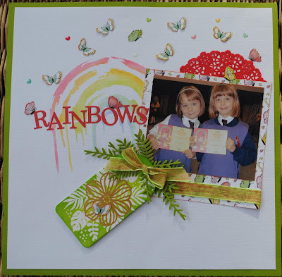
My first layout for today is called 'Rainbows', and shows a photo of my girls the day they enrolled as Rainbow Guides.

I used the 'Intense Kiwi' Bazzill cardstock to make a 1" frame for the layout, by gutting it. Then I trimmed an extra piece of Avalanche down to measure 11.5" x 11.5". 

I created a rainbow to the left of the centre using a new stencil from Stencil Girl called 'Little Painted Rainbows'. I used several colours of Distress Ink and a blending tool.


I made a frame for my photo using some of the Photoplay - 'Encourage' paper (butterfly side up), 5.5" x 5.5". I used some of the ribbon from the kit to run along the base of the mat.

I used one of the Amy Tangerine Resist Watercolour Tags from the kit, and blended Mowed Lawn and Twisted Citron Distress Ink over the surface. More of the ribbon was tied in a bow over the hole in the top of the tag. From the 'Intense Kiwi' Bazzill I cut some fern leaves using Sizzix Thinlits dies from the Funky Florals #3 set.

 I used half of one of the Doodlebug Designs doilies above the photo, tucked behind the mat. My title letters were die cut from 'Blush Red Medium' Bazzill.

I cut lots of the butterflies from the 'Encourage' paper and scattered them at the top of the layout, and one on the tag. Finally, I used the tiny Doodlebug enamel hearts in amoungst the butterflies.

**~~~**

My second page today is called 'Artists at Work', and features my three on the patio in our garden painting at the easels. They were about 2 years old.


To start I took the sheet of Blossom Bazzill. Then the remainder of the 'Life is Good paper, and with the strives running vertically I cut a 12" deep section with a stripe of each colour which made a panel just under 5.5" wide. This was stuck to the left side of the cardstock. leaving the right hand edge unstuck so I could stuck the trimming under later. 

I used Distress Stain in Weathered Wood and Worn Lipstick to daub splats over the pink cardstock. Then I used the Woodware stamps from the kit again and inked and stamped them with Mustard Seed and Evergreen Bough Distress Ink

With the remains of the 'Coral Reef' paper I cut a piece 9" x 5" and stuck this horizontally across the layout from the right side overlapped the stripe paper. Then came the circles. I used a set of nesting circle dies to cut various sized circles using the '3x4 Elements' paper for the sun and the rainbow bordered circle, the pink striped side of the 'Coral Reef' paper and both sides of the 'Tidepool' paper.

My title was added to the circle with the pink stripes, using some very old Sassafraslass pink glitter alpha stickers from my stash. I added journalling notes to the other circles. I cut a doily in half and together with the photos I arranged the circles and on the page. 

Finally I added embellishment with the Tiny Prima Flowers and Crystals to some of the circles. 

The great thing is there is still plenty of kit left for a few cards. Great value for money as the kit is only £10.00 and the additional cardstock is £1.75. Four layouts and some cards or part of another layout.

Back with a new kit for September later in the month. 
Thanks for looking.
Lynn x

Wednesday, 5 September 2018

Pebbles Patio Party from Jen Hadfield - Life is What you Bake of it!

Hello, Karen here again with another layout using the Pebbles Patio Party collection from Jen Hadfield.


My starting point for this layout was the 'Recipe Cards' sheet of paper.


The recipe cards are no doubt intended to be used as they are - as recipe cards or for making a mini recipe book, but I decided to use the cards for journalling about my enjoyment of baking and to also include a bit of family history in my journalling. 


I printed my journalling on three of the recipe cards using my computer. It was a bit fiddly and time consuming to make sure it was positioned correctly, but I think it was worth the effort.


The cards were glued to the left half of a sheet of the 'Fresh Berries' patterned paper which I had trimmed slightly before matting onto a sheet of black Bazzill cardstock


I added a whisk cut from black cardstock to fill the space at the bottom of one of the cards.


4 photos which were roughly 3" x 3" square were attached to the right half of the page and a title die cut from black cardstock was added.


Die cuts from the Ephemera Pack were used to embellish the layout and to make these pop a bit I matted them on black cardstock and raised them with some 3D foam. I also outlined some of the elements with a black fine liner pen.

I hope I've inspired you to try using the Patio Party collection in your crafting and  the products I've used and many more from the collection can be found in the Papermaze store.