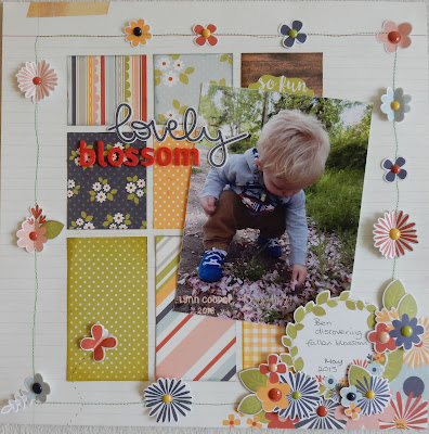
At a recent crop, we talked about where we get inspiration for our layouts, and several people said that they like to refer to sketches. There are plenty on offer, and I’ve included a few links below, which I like to use.
Sketches give a great starting point, especially when you lack motivation. They can be followed to the last detail, or you can simply use them to get you started, then develop your layout in your own way - maybe a block of four small photos could be replace by one larger one or you can try flipping the sketch image to give a different perspective. Many of the sketches are designed for 12" x 12" layouts, but could easily be adapted for smaller square pages or for a different format such as A4.
Sketches can be black and white illustrations or elaborate colour diagrams. They might have no notes, or there may be lines and words to indicate where papers, photo, journalling and title go, Perhaps there'll be little details of patterned paper, and some sketches will show details of embellishments such as flowers or ribbons.
Here are a few resources I think you'll like:
- Page Maps who have been offering sketches for 10 years,
- Let's Scrap have a lot of double page layout sketches, if that is your favourite way of scrapping and also if you need to use several photos.
- Creative Scrappers - Creating with Sketches have downloads that you can print out to make a book of sketches.
- Bo Bunny have a few sketches on their blog.
- Other useful sites include Sketch Savvy, Scrapbook.com and SBC (Scrapbook Challenges).
As you can see from the sketch below, I have remained fairly true to the plan this time, with only a few of my own little twists. I used the stitching but added flowers where hearts were indicated. I used the patterned papers to create blocks of colour in a similar pattern to the sketch. Instead of two small photos, I used one much larger one and I changed the position of my title.
I used the following from the Bloom & Grow Collection - The base is Bee Happy, for the blocks I used both sides of Green Dot / Yellow Dot, both sides of Let it Grow, Puddle Jumper and various bits from 4x4 and 6x4 Vertical Elements Sheet. I also added some elements from the Bits & Pieces pack, the Fundamentals Cardstock Stickers sheet and some Enamel Dots. Finally I added some American Craft Foam Thickers for part of the title.
For my second layout I used a sketch from SBC (471)
The biggest difference in this sketch to the layout is that it uses three photos, rather than the one I used. In my variation, I used white Bazzill cardstock, trimmed down and mounted onto Navy Dot / Red Dot. I stitched the paper strip cut from Puddle Jumper paper before attaching the bubbly sticker strip from the Fundamentals Cardstock Stickers sheet. The title is created with the Expressions Cardstock Sticker sheet and some American Craft Chipboard Thickers.
I hope you found this post interesting and that you like, and maybe use the sketches and layouts. I will be back later in the month with more sketches for inspiration. In the mean time take a look at some of the sketches available by following the links above - and do share your creations!
Thanks for looking
Lynn x


No comments:
Post a Comment