Hello, Rebecca dropping by today to share another layout I've created using the gorgeous 'Never Grow Up' collection by Shimelle. This collection has been great for documenting our recent days out now that the Covid-19 restrictions have been relaxed slightly. We've been back out enjoying our National Trust membership so I've not been short of photos to go with this amazing collection.
I started this layout by cutting and distressing a strip of the 'Forever Young' patterned paper (B side) to sit vertically down the centre of my page. I then added strips of the 'Past Bedtime' patterned paper (B side) either side of it as I felt that the two papers contrasted really well with one being light and the other being quite dark.
In the photos, my little boy is sat on a rustic tree swing made of a plank of wood and some ropes, so I decided to try and mimic this texture on my layout by adding some twine materials. I have a reel of twine netting which I added so that it was peeking out from behind the patterned papers on both sides, and some actual twine which I wrapped around the centre of my cardstock vertically so that they crossed over in the middle. I then dug out an old 12x12 stencil by Kaisercraft of a fisherman's net and pressed some texture paste through it in certain places on my background. Once this was dry I adhered everything down. I used Glossy Accents to stick the twine down as I find it really strong and it holds really well.
I matted both of my photos on white cardstock to help them pop off the page, and then on two different patterned papers from Shimelle's 'Field Trip' collection as the colours complemented the layout perfectly. I distressed all the edges using the blade of my scissors to try and continue with the 'rustic' feel of the layout.
I cut out and distressed a few of the journalling cards from the 'Life is the Bubbles' patterned paper (B side), and tucked them behind the twine so that they would be visible above and below my photos. I then adhered my photos to the layout, adding a layer of foam behind them.
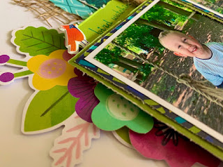
Now on to the fun part of embellishing! I started by painting a ''Tando Creative Chipboard Leaf' with green acrylic paint. It took a matter of minutes to dry, so I adhered it straight away using glossy accents to keep it in place.
I added some flowers from the Floral Ephemera pack, and a couple of insect stickers from the Puffy Stickers sheet.
I finished the layout with some stickers from the Accent and Phrase Stickers sheet, and my title using some mini alphabet thickers by Elle's Studio from my stash.
And that's it from me! I love this layout - the colours, the textures... and of course the photos! I do have a couple more layouts that I have created using this collection (once I received it I just couldn't stop creating!) so there will be a 'bonus' blog at some point next week - so keep an eye out!
I hope you've enjoyed this layout. I really am loving this collection and it's 'outdoorsy' colours and feel. So perfect for us! It's selling fast, so be sure to check it out in the shop whilst you can!
Take care,
Rebecca x


2 comments:
Another cracker! Love the use of the twine to emulate the swing xx
lovely layout Rebecca. Love the colours.x x
Post a Comment