Hi everyone, it’s Rebecca with you today with a bonus layout! I’ve already posted my two for the month, but I love the Simple Vintage Country Harvest collection so much that I couldn’t resist a third! If you’d like to take a look at this gorgeous collection from Simple Stories, you can find it in the shop here.
For my first two layouts, I focused on the pumpkin elements in the collection, so for today’s layout I’ve decided to create using the apples! I had a series of recent photos of my little boy pressing apples at a local village museum and this collection was perfect to get them scrapped!
I began with a 9.5 x 9.5 inch piece of the 4x6 Elements paper (B side), distressed the edges and tacked it to the centre of a sheet of Premium White Cardstock using double sided tape, before using my sewing machine to stitch around the edge of it.
I backed one of the Chipboard Frames with my two 3x4 inch photos and positioned it in the top right corner. The frame had some leaf embellishments adorning it, which didn’t really ‘fit’ my theme - so I covered them up using a die cut from the Harvest Bits & Pieces. This is a great way to make things work for you within a collection! I then added a couple of the apple die cuts underneath it to mimic apples hanging from a tree.
Wanting to have a cluster at the bottom of my page, I fussy cut a doily from the 4x4 Elements patterned paper and raised it up with foam pads. I also placed an apple sticker from the Foam Stickers sheet there.
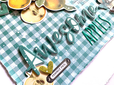
To the left of my cluster I placed the ‘awesome’ title from the foam stickers and added the word ‘apples’ underneath to complete my title. I placed an apple die cut with my title along with a foam heart and a banner sticker from the Sticker Book.
I selected one of the border stickers from the Sticker Book with apples on it and stuck it on the top of my chipboard frame to embellish the top of the page more.
I added some finishing touches using smaller elements - some foam heart stickers, a sticker from the Combo Stickers sheet and then some white splatters.
I finished the layout off by distressing the edge of the white cardstock and backing it with one of the sheets of coloured cardstock from the Basics Kit. I didn’t want a complete frame on the page, but felt like it needed something, so by distressing the edges I was able to reveal some of the coloured cardstock underneath in a few areas.
Thanks so much for reading, I hope you’ve enjoyed this layout. If you’d like to watch the process then there’s a video up on my YouTube channel, which you can find here.
I’m working with another Simple Stories collection next month - Simple Vintage Rustic Christmas so make sure you check back for those layouts!
Have a fab weekend and take care,
Rebecca x
@preciouspagespapercraft


No comments:
Post a Comment