Hi all, it’s Anna back with you today.
I’m working with Echo Park Wizards and Company for my next few blog posts…
You can find the collection in the shop here.
I was keen to get my hands on this new collection to document some of my Harry Potter photos from our Orlando holiday last year.
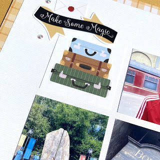
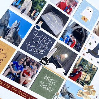
For my first layout, I have created a grid page. This style of page is definitely my go to page design - especially when I want to include lots of photographs. I had lots of pictures from the Wizarding World of Harry Potter as there’s so many little details to take note of.
I used the 2x2 squares on the 6x4 journaling cards paper combined with my photos to create my grid. I used a large square punch to cut out my photos which were printed 3x4 and just trimmed them down slightly to measure the same size as the 2x2 squares.
I arranged my grid in the centre of white bazzill cardstock. I decided that a boarder was needed so I gutted the ‘Lets Fly Away’ paper and mounted my cardstock with the boarder.
I added some stickers from the element stickers around my layout, mostly in clusters at the sides of the grid, but also dotted around on the grid between the photos.
I added a few Pinkfresh Studio Jewel Essentials around my layout too.
Thanks so much for looking!
I’ll be back again in August with more from Wizards & Company.
Anna
@acraftylifewithanna


No comments:
Post a Comment