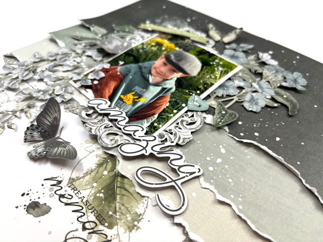
Hello, it's Rebecca with you today, sharing my first layout of November. This month I am lucky enough to be using the Vintage Artistry Moonlit Garden collection from 49 and Market. It's a stunning collection (as are all of theirs!) featuring lots of sage green and duck egg blue... perfect for outdoorsy photos of my little boy. You can find the full collection in the shop here.
I had an idea when I sat down at my desk to create this layout - and it kind of went full circle and on a bit of a journey! I wanted to create a background of torn paper strips, all overlapping and distressed. I selected 3 of the Coloured Foundations Cardstocks and tore them in a way that had the white edge visible. This helps to create texture on the page. I layered these 3 strips at the top of my page, and then increased it to 6... then I decided it might look nice if I cut these strips down to 8 inches wide.... and I didn't like that... so with the cardstock I had left over, I started again creating 12 inch strips across the top of the page!
I placed my photo, matted on white cardstock, over to the left hand side of the layout, on top of the torn paper strips. The white border helps the photo to stand out, and creates some consistency with the white edges shown on the torn strips. Around my photo, I've added some Wildflower Laser Cuts, carefully selecting larger elements to help 'frame' my photo.
Nestled in among the florals, I've added sections of a frame from the Laser Cut Elements. This pack is HUGE and contains 116 die cuts, so will go a long way and is great value for money. I also selected some butterflies and a ticket which says 'living the good life' and positioned them around my photo.
For my title, I've used one of the chipboard words from the Chipboard Words Pack. There are so many titles to choose from in this pack, but I went for 'amazing' as that's how I feel about my little man.
I wanted to add a little detail to my white background, but wasn't in the mood for mixed media. The 49 and Market rubons are perfect in such a situation! The 6 x 8 pack with this collection comes with 6 pages of rubons and they are a great way to add detail to your background. I selected a few and applied them using the applicator tool which is included in the pack. I'm always amazed at how easily they transfer to my layout and how effortlessly they enhance the whole page.
I finished off my layout with some white splatters, using watered-down white gesso. I prefer to use gesso for my splatters as I find it sits on top of the cardstock/papers and embellishments better than acrylic paint. Acrylic paint tends to soak into the papers and then takes on the colour underneath, whereas my gesso stays a much cleaner white.
Thanks so much for reading. I hope you like the layout. If you'd like to watch the process of this layout coming together, there is a video up on my YouTube here.
I'll be back later in the month sharing another 'Moonlit Garden' layout.
Take care,
Rebecca x
@preciouspagespapercraft


No comments:
Post a Comment