Saturday, 30 May 2015

double stencil...

Hi, Carol with you today, bringing to an end my stencil based pieces…

Whilst at crop last week Vanessa showed me the smooth white bazzill cardstock she now has in stock in the stop, well, just had to try some…. so, armed with my Dylusion paints in fresh lime, vibrant turquoise, bubblegum pink I added paint to the cardstock.  This went on really well and mixed brilliantly, try it you won't be disappointed.  The paints are also fabbbbb… 

I forgot to take a picture of my background piece.. but, here it is after having been stencilled.  I started off by stencilling with white linen and then using the bump technique added the other colours...


I then wondered if I could stencil thro' a stencil…


these are the two stencils I used for this piece


Using a black pen I have added some doodles to the page…

TFL 

Wednesday, 20 May 2015

enjoy the little things

Using kaisercraft shine bright for this layout. I used the bumblebee 12x12 sheet as my background with a sheet of dark grey card stock. I painted some of the accetate with distress paint, but  be aware the paint has effected some of the script, which I only realised when it was dry.

I then cut elements from my 6.5x6.5 paper pad. This pad has a couple of sheets of die cut elements as well as smaller versions of the 12x12 patterned papers, making it great value for money.
I then stitched round the edge with black cotton, added strands of black cotton to the edge of my page and the corner of the photo. Added white splatters to my page with white dylsions ink.

Monday, 18 May 2015

Fun in the Sushine

Yes, it's almost that time of year where we can start having fun in the sunshine again.
Sunshine really does lift my mood. Maybe that's why I like creating bright, colourful and happy pages the best.

This is one that I've made to share with you today using Bella BLVD - Simply Spring

 
I thought it would be fun to add a textured edge to my border so I used a piece of 12x12 Dotted Swiss. I cut my white 12x12 down slightly so that it fitted well in the centre.

 
I've taken a Tim Holtz Stencil and a yellow pastel to make the sunshine on the page. One thing I like about using pastels, is that you can take a normal rubber to rub away any excess.
 
 
Don't let seasonal patterns put you off when choosing your pretty papers. My page has nothing to do with Easter and yet I've still managed to use it and have fun with it.


I've used a coordinating piece of paper - Sunshine - for the title. I do love a little fussy cutting.
 
 
My black pen is often my best friend when I'm scrapping. I love to outline and add borders. I've also added some journaling, but did write this out in pencil first.
 
 
A little more fussy cutting from the patterned papers. Popping a little 3d foam tape, really makes the flowers pop.
 
 
Finally I used the arrows from this stamp set here to add a little interest to the LO. These sets are such great value. I also took a few teeny buttons to add to the centre of the flowers, a few matching stickers from the same Bella BLVD collection and then some splashes of ink for that final bit of colour.  
 
Thanks for stopping by today.
Lisa x


Friday, 15 May 2015

stencilling ideas….

Hi, Carol with you today, and I am continuing with the stencil theme…

For this post I'm sharing how I use my stencils with my art journalling….

I started by adding some texture paste onto my pages using the pronto stencils…. I added paste thro' the stencils and also added some paste to my pages and pressed the stencil into it… this gives a smoother pattern…. (I forgot to take a picture at this stage) when the texture paste is dry, I then add paint (have you seen the fantastic Dylusions paints by Ranger? the pots have a really big neck which enables great access for paint brushes, fingers, foam…and the lid is great to create circles on your pages - loads of great colours and a good price too - go take  a look here)… don't forget you don't have to use the entire stencil, its a great look to add sections and leave it uneven...


Once my paint is dry I add paint thro' stencils to create my background.  There are a lot of different mediums out there to use with your stencils to add designs to your pages, but, in this instance I have used paint.  I prefer to add the paint with a stencil brush, but, you can use cut and dry or sponges - just add paint in stages rather than in a thick layer this will prevent seepage under your stencil.


These are my finished backgrounds in my journal, just waiting to be finished off….


I will be back at the end of the month with some more stencilling ideas…

TFL xx

Wednesday, 13 May 2015

Happy Wednesday with Pink Paislee

Hi Happy Wednesday
Tracee back with you today to share another project I created with the Pink Paislee Atlas collection.
I shared a journal (here) that I decorated with the "blue" side to the collection and today I am showcasing the softer slightly muted shades of the collection that include pinks and yellows. I think they look almost like 2 different collections but of course it all coordinates beautifully.

lets go scrapbook layout Tracee Provis Papermaze 01
 
This layout is quite simple in its construction, sometimes when using a patterned paper as your background only a few simple embellishments and a little mixed media is all that is needed to complete your page.
I started by applying some Texture paste through a stencil to the Altitude background paper, I then splattered a little white paint around here and there.
 
lets go scrapbook layout Tracee Provis Papermaze 02
 
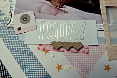
I love these little wood chip pieces by Studio Calico, this one says extra ordinary and it was quite an honour to have this butterfly land on my hand whilst we were on holiday last year.
I added some snippets of doilies and the little acrylic flower was from a previous DT package from the shop.
 
lets go scrapbook layout Tracee Provis Papermaze 03
 
I cut up some of the tags and used them to spell out a title for my page, the row of little hearts is a chipboard piece by Dusty Attic and the frame is an older one by Pebbles that I had in my stash.
I fussy cut some of the cameras from the Souvenir sheet and added them as accents around the page.
That was it really a little layering and my page was complete.
 
Hope you have a Happy Scrappy day and don't forget to pop over to the shop for the supplies for this layout and all your scrapping needs


Monday, 11 May 2015

A Party Page with Websters Pages...

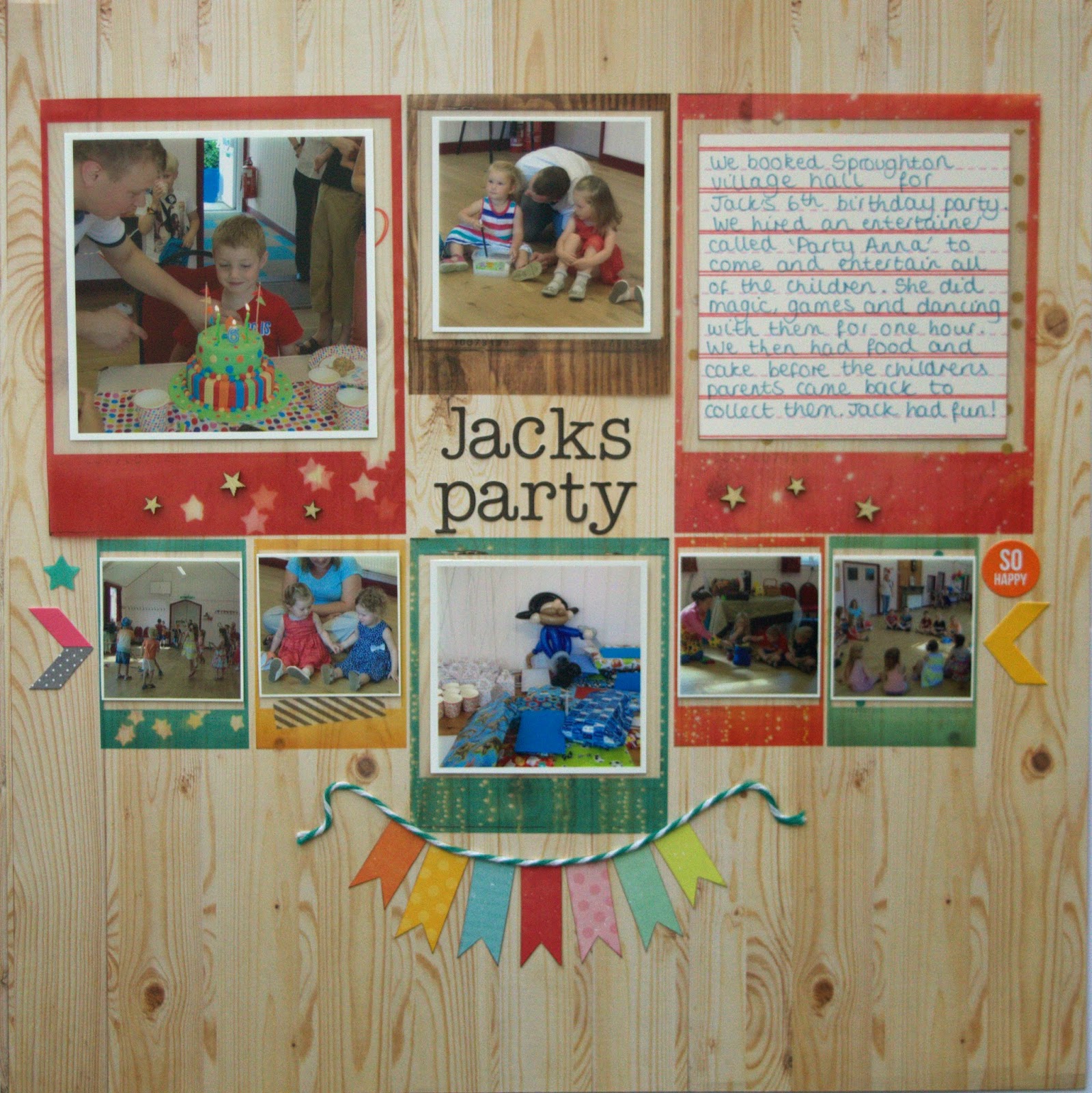
Hi it's Anna here. Today I have a layout to show you using the lovely Websters Pages Hall Pass collection. I have used it to make a party page to document my son's 6th birthday party. The wooden patterned paper sheet made me think of the village halls wooden floor instantly!
I used the sheet of vellum Polaroid frames to create this layout, they are so pretty that you almost don't want to cut them up, they look much better in the flesh too! I cut out a selection of them and printed out some small pictures to fit. 


I used some of these Studio Calico Wooden Stars on the frames and added some bunting made with twine too. 


Thanks for looking! 
Anna x

Wednesday, 6 May 2015

Say Cheese Frame

Hi, It's Lisa here today with a little upcycled project to share.

I've been keeping hold of these Simple Stories - Say Cheese 11 chipboard frames. I knew I wanted to do something with them but I wasn't quite sure what.

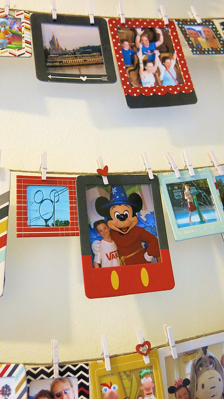
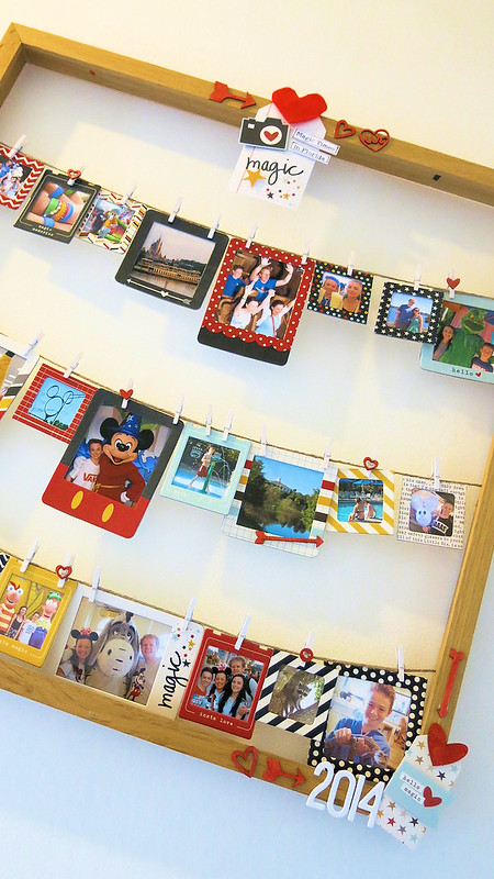
We were decorating my studio recently and I found an old wooden Ikea frame. I was going to freecycle it and then I had an idea. I took out the glass and the backing and turned it in to a photo display.


It was so easy.
 
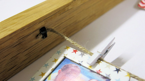
Once the glass and backing were out, I took some string and attached 3 pieces across the back by placing the metal tacks at the back that usually hold the backing in place. No tools needed! I just used a pair or scissors to bend the tacks over.
 
 
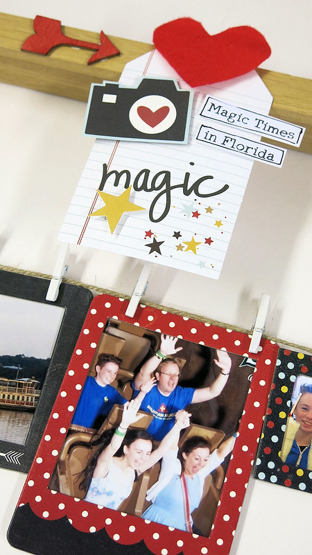
Once the string was tightly in place I added my photos to the frames. I printed off the photos and stuck the frames on top and then cut around the frame.  I then pegged the photos on to the strings.
 
 
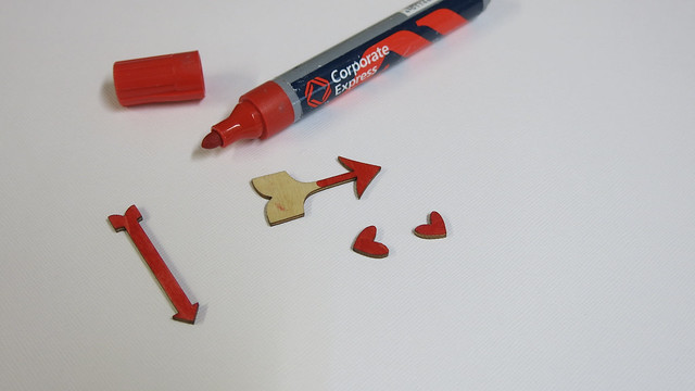
I wanted to turn them red so took a red marker pen and coloured them.
 
 
I added the chipboard pieces to the pegs and the frame.
 
 
I took some of the Simple Stories matching tags and decorated the frame a little too.
 
 
I'm so pleased with this project.


 I'm happy that I kept hold of those chipboard frames now : )
 
Lisa x 


Tuesday, 5 May 2015

Fly Away travel journal

Hi
Tracee here today to share with you a Journal cover that I decorated using the gorgeous Atlas Collection by Pink Paislee.

 
I found in my stash a Kraft covered chipboard journal and thought it would be great to use as a way to record my America trip this summer.
I first created a large tag using cardstock and some of the cut aparts from the Take flight sheet
I painted roughly around the edges of the journal, leaving some areas where a little of the kraft colour still shows through, added a little bit of newsprint washi tape and then layered up the background.
I used the spare cut off strips from the Destination title and tucked them here and there to give the impression of more layers (I am frugal to the last)
 
 
I used the Tag pack and tucked a couple of them into the pocket that I had created from the destination title piece, I used hemp twine to make pulls for the tags and I can add photos or tickets to them at a later date.
 
I will be back later in the month to share a few more projects that I have created using this collection and a few bits from the April kit that I had left over.
 
Have a Happy Scrappy day and don't forget to pop over to the shop to pick up all your supplies.


Monday, 4 May 2015

its a girl!

Hi, Carol with you today - there are lots of different stencils out there and Papermaze have a fantastic selection here… so I thought this month I would share with you how I use my masks/stencils…I decided to start off easy and use distress ink to make a matching card and tag and as a special little girl was born yesterday I decided to make a "it's a girl" card - with many of my friends becoming Grandmas of little girls this year this card will soon be used…

So, today's stencil post is a simple and easy one…. I took a 5" x 7" white card blank and masked off three of the edges using post its - the same as in this post - I then placed one of the new pronty masks from the folded edge of the card to the masked area and added distress ink using a blending tool


I added black doodling around the edges…

I then added some flowers and bling and a stamped handcut banner…

to go with my card I made a tag..

This time I have added distress ink to the tag first and then added the stencil over the top and inked again…


I have added doodling around the edges and stamped with a text stamp with the same colour distress ink…. I then added some flowers, bling, dots of liquid pearls  and a stamped handcut banner…


and here they are together…


TFL