Thursday 28 October 2021

The NearlyWeds Day

 Hello, It's Anita with you today....gosh its been a long time since I was last here. I needed to take a little break...which turned out to be a LOT longer than I intended. 

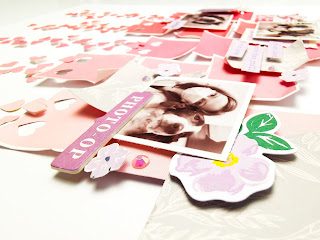
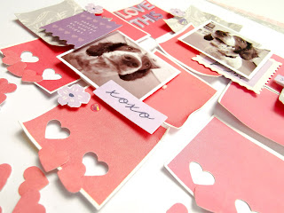
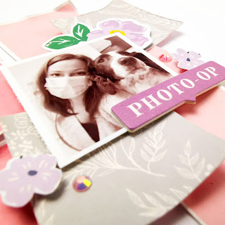
So here is my first layout made in almost a year! I have been creating with the gorgeous Prima's *Hello Pink Autumn* This layout however is actually nothing to do with Autumn at all! I have scrapped a couple of photos to document a day that could potentially have been sad, but we made it a happy one instead!

Our daughter was due to get married on May 31st 2020, after 2 years of planning, creating all the bouquets, decor etc...and then along came Covid and changed plans! Couldn't let the original date pass without some sort of recognition ....so we held a very small celebration for us all and gave them a Nearly Weds Day!


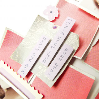
The layout was backed with a sheet of  Sweetheart cardstock, I gutted the middle out and used some of the gutted piece to mat the photo onto before adding a 2nd mat using some music paper and I tore the outer edge on it.  

A rummage through my shelves of inks, paints and sparkly bits provided a pot of copper gilding cream, so rubbed some gently round the outer edge of the cardstock and also the edges of the photo mat.


All of the patterned sheets in the range have some gorgeous rose gold/copper foiled details on them, they catch the light beautifully and really do add a lot to the layouts.

I chose a sheet called Grateful Hearts for this layout and cut a random rippled edge all the round the outside edge, I then carefully cut round the floral section above the word banner and tucked the photo just in behind it


The sheet of Fall Hugs has 4 square panels on one side, I picked the one I liked the most and fussy cut the wreath to create a frame for the 2nd photo to sit in. I love how soft the wreath frame was and that it was a completely different shape than the other photo.

Next it was onto sorting out some embellishments.... this gave me chance to have a really good root about and rummage in lots of boxes and baskets that I haven't touched for such a long time!

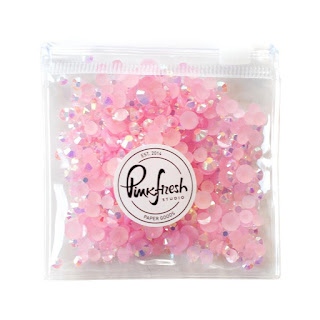
I found a mix of various brads in different sizes and colours, plus some flat backed gems and some photo anchors......and they ended up everywhere!! I do love to add embellies to my pages and projects and half the fun is in the rummaging for them.....it always reminds me of rooting through my Nanna's button tins when I was a little girl!

There is a fabulous range of all the embellishments you could ever need on the shop page go and have a good look and treat yourself.


I couldn't do a layout without adding blossoms and especially with this theme, so I picked a variety to add and also punched out some little fern fronds to add around the blossom clusters.
To finish the page I used a Sizzlet Aphabet in the font Dreamboat, cut from a sheet of Cream Puff to create the title and used the same leftover card to print out my journalling , which I then cut into strips and added to complete my layout.


Well that's it from me, thanks for taking the time to look at my post. 

If you pop over to the SHOP you will find this gorgeous Prima Collection and hundreds and hundreds of other gorgeous things that you NEED in your craft collection....and there is also a fantastic AUTUMN SALE filled with bargains that are too good to miss

Happy Crafting

Anita xx

Monday 25 October 2021

Echo Park ~ Fall #1

 Hello all, 

It’s Anna back today and I’m working with a brand new collection - Echo Park Fall - you can see the whole collection in the shop here

This collection is perfect for documenting the season of autumn, the colours and images are just perfect. So after a trip to a pumpkin patch, I had so many photos to scrap that worked so well with it. Therefore, my first layout is a double page spread! I very rarely do double pages these days, so it’s a bit different for me, but I’m glad I could use several photos! 

I began with two sheets of bazzill white cardstock. To make the double page flow, I went with a mirror image design. I trimmed the b side of the 4x4 journaling cards paper in half and stuck it down in the middle, leaving room around the edges to add in extra strips. I then added strips of the b sides of fall phrases, patch plaid and pumpkin patch. I finished with a longer strip of the red side of  patch plaid with banner edges. 

Left Page:

Right Page:

I mounted my photographs onto coordinating cardstock and patterned papers from the collection. 

I used several of the element stickers and puffy stickers to embellish my layout. I also added in a few of the puffy leaf stickers from the Jen Hadfield Peaceful Heart Collection

I made a hidden journaling box, by combining a project life card with one of the 3x4 journaling cards. I tucked this in behind my largest photo, and it can easily be pulled out to read the journaling.

Lastly, I added in a few Nuvo Drops around some of the clusters of embellishments using the shade of pale gold.

Thanks so much for looking! 

I’ll be back soon with another layout using this collection. 

Anna

X


Saturday 23 October 2021

Halloween - Simple Stories - Spooky Nights Collection

Hello, Rebecca here with you today sharing my second layout of the month using Simple Stories 'Spooky Nights' collection. It's getting closer to Halloween which means I'm getting increasingly excited! For now though, I'm finishing up scrapping my 2020 photos. You can find the Spooky Nights collection in the shop here.


I began with a sheet of white bazzill cardstock, which I trimmed to 10.5 inches squared and framed using the 'BooYa!' patterned paper. I then machine stitched around the edge of the cardstock with black thread to add some drama and texture. 


I purchased a cutfile from the Silhouette Store, which I cut from the B side of the 'One Cool Ghoul' patterned paper. I offset the cutfile and removed all the internal parts which gave me a background piece to sit my cutfile upon. I coloured this piece with a blending brush using a Distress Ink Pad in the shade 'Spiced Marmelade', and then added splatters on top to give it a bit of texture. I layered the two pieces up using foam pads to introduce some dimension to the layout.


I used another Distress Ink in the shade 'Twisted Citron' to add some bright green to my background, behind the cutfile - again using a blending brush and adding some splatters on top. 

The Cutfile offered a natural place for my photo, so I added a layer of the BooYa! paper behind it, and raised it up on foam before slotting it in above the cutfile. 


With the basis of my layout complete, I moved on to embellishing. I used several pieces from the Bits and Pieces pack including a signpost, a bunting piece, a trick or treat bag and a pumpkin.


I also introduced some of the Combo Stickers - but before adding them to my layout, I stuck them to white cardstock and cut them out, giving them a white border to help give them some separation from the background.


I also fussy-cut some haunted houses from the 'Let's Get Spooky' patterned paper in colours to match my mixed media. 


I wanted to extend the design further down the page, so used some of the label stickers from the Combo Stickers sheet with phrases which related to my photo.


I finished my layout off with some black splatters using watered-down acrylic paint.

Thanks very much for reading, I hope you've enjoyed my layouts using this collection. If you'd like to see this page come together, I have a process video up on my YouTube channel which you can find here.

Take care,

Rebecca x


Friday 22 October 2021

Pinkfresh Studio - The Best Day - Love This!

Hi everyone,

Claire back with you today sharing another layout with The Best Day collection from Pinkfresh Studio. You can find it in the store here.


There were a few papers that immediately caught my eye in this collection, and this paper called Cozy Days was definitely one of them. 


The rows of different coloured squares screamed to be cut apart, and that's exactly what I did....and then they sat, stacked up on my desk for over a week! I just couldn't work out how best to use them.  I've seen a few really beautiful layouts with lots of squares, but just couldn't make them work for me.  

Does that ever happen to you?  In those scenarios, I find it best to walk away until inspiration strikes - and a few days later it did!

I kept the squares in their own colour groupings and bent around the edges to create a worn look. I laid three squares of each colour in a vertical design, alternatively laying one square flat, the next raised on foam pads and so on.


On each of the bottom squares, I took a tiny heart punch (I really need to use my punches more) and punched out 2 hearts.  


I then punched out lots more hearts from some of the remaining paper, keeping them in their own colour blocks.

I scattered the hearts down the page, again laying most flat, but raising the last few on small foam pads for extra dimension.  I stuck the hearts as they fell, so some are sideways, some upside down and some the right way up. I love this effect as it helps keep the cascading hearts look natural.


Next, I wanted to add a little contrast to break up the pink tones, so I selected a piece of the Home Sweet Home paper and cut some grey squares 1.5", to match that of the pink. I selected three photos and printed them at 1.5" also, before starting my embellishing.


The 'Photo-Op' chipboard piece was a perfect accent for my first cluster, take from the Chipboard Frames.

I took the purple flowers from the Floral Ephemera Pack and used the large one as a layer behind my photo.  The other, is a taller flower with lots of smaller purple flowers on it. I cut that up and scattered the flowers across the page, raising them on foam pads.  

I also used some of the Floral Ephemera and Cardstock Ephemera as layers in my other two clusters.


Next, I added a small subtitle to one of the squares using one of the Cardstock Stickers.


For my title, I reached for those cute Mini Puffy Alpha Stickers - Love these! I pulled out a mix of the pink, lilac and purple tones as I'm running low now on these but I love the effect the mixed tones brought to the title.


To finish the page, and add a little bit of sparkle, I sprinkled a few Pinkfresh Jewel Essentials in Ballet Slipper. Have you seen these in the store? They come in a whole range of colours and arrive in a cute little zipped pouch - I have had mine for a few months now and still have so many left. I've added a few more colours to my scrappy stash now. They're such great value.

I hope you've enjoyed this page  - I really love the simplicity of the design and especially love those falling hearts. such a lovely technique that would work with so many of my neglected punches. I'll definitely be trying this again.

Until next time.

Take care,
Claire xx

Wednesday 20 October 2021

Carta Bella Welcome Autumn - My Favourite Colour is October

Hello, Karen here today with a layout to share using the Welcome Autumn collection from Carta Bella. As the name of the collection suggests, this collection is autumn themed and the colours are traditional vibrant autumn colours - oranges, reds, rusts, browns and greens  This is the first layout I've created using this collection and the colours were the inspiration for my layout which uses a large 12" x 8" photo taken in October a few years ago.

I used one of my go-to designs for this layout - a big photo and borders top and bottom.

I used a piece of 12x12 white cardstock for my base and stuck my photo about 2" from the bottom of the layout.

Above and below the photo I added strips of the Perfect Pie (B Side) and Autumn Air (B Side) papers. I added some gold and black washi tape from my stash and a punched white cardstock border strip. I also machine stitched with white thread across one of the strips at the top.


The title at the top of the page was created using white foam alphas from Pink Paislee and the word October was cut on the silhouette from white cardstock. I nestled the word October among the foam alphas and let it overlap the top of the photo.

At the bottom of the page I added two tags made from the 3x4 cut apart journalling cards. Foam was placed underneath the tags to raise them up slightly and they were finished off with eyelets and bakers twine.


I tucked a few chipboard leaves and a pumpkin from the Chipboad Accents sheet underneath the tags and also dotted some gold sequins along the bottom.

The layout was completed with the addition of some teeny tiny black letter stickers for the journalling

I really enjoyed using this collection. I like to scrapbook with the seasons and this collection really made me want to dig out some autumnal photos and get creating. I hope you like the layout and feel inspired. This collection as well as lots of other autumn collections can be found in the shop  .

I'll be back soon with another project and in the meantime, Take Care.

Karen x x

Monday 18 October 2021

Adventure! Doodlebug Fun at The Park!


Hello! Happy Monday! Welcome back to the Papermaze blog. ScrappyAdam with you today! I am working with Doodlebug 'Fun at The Park' for October and I have to admit, this is another favourite collection for sure - so cute!


I took inspiration from a sketch from Lisa Sikorski at Scrap a Sketch and a challenge from Dotty About Flair and decided on three papers for my background - Mini Dot (the red that the layout is matted on) and Say Cheese and Movie Stars for the three torn background elements. 

It's quite a simple layout. For the background, I tore both papers together to ensure I got the correct tear on both papers and then used two parts of the B-Side of Say Cheese for the top and bottom and one part of Movie Stars for the middle. 


I went crazy with my matting and have six mats on the photo using various papers from the collection.


I decided to create a shaker pocket for the left of the photo. This was simply done by cutting a frame from B-Side of Mini Dots and a 3x4" piece for the back and then using some acetate to cover and some Buttons Galore and More Mickey Heads as the shaker element. I added a Shaker Pop from the collection on top of the shaker element.


It was then a case of getting to work digging for embellishments! I opted to use some flair from Dotty About Flair for added dimension and they matched perfectly! Most of the embellishments came from the two ephemera packs - chit chat and odds and ends. I did also make use of the enamel sprinkles and some stickers too! I have used lots of phrase strips and banners. My title came from the chit chat pack. 

There is a YouTube video with this layout if you'd like to take a look, you'll find that here. You can find the full collection here as well as all the Doodlebug goodies here

Don't forget, it's the Papermaze Autumn Sale right now - there's tons of goodies at 50% off (I am finding it hard to resist!!).

I'll see you back here for some more Fun at The Park next week. 

Stay safe and take care!


Adam xx

Friday 15 October 2021

Jen Hadfield Peaceful Heart - Dreamer by Meg

Hey everyone, I hope you're well! I've been working on another layout using Peaceful Heart by Jen Hadfield and I'm so excited to show it to you today - I've been enjoying playing with this collection so much, the colours are just so serene and gorgeous! 

So this time round I thought I'd do some squares and fancied doing a bit of a grid layout - I started by picking out some pink and yellow tags that I liked together from the Thankful paper and cut them into squares. I then picked out my photos and cut them into the same size squares, plus three yellow squares cut from Yukon Gold Bazzill cardstock and a square of Look Up

At first I had decided to arrange them all on the left of the page, but after laying them all out I decided instead to stagger them diagonally in a more relaxed form, with a smaller cluster on the bottom right to balance out the page. I added some light pink splatters to the page to add some colour and texture under the squares before adhering. 

I started layering some of the squares with chipboard frames I already had in my stash and Peaceful Heart Icon Ephemera. I tried to arrange the burgundy pink and the yellow colours in triangles around the page to make the page feel more cohesive and draw attention to the centre of the page, where I built my largest cluster with paper and acrylic foliage and a large gold puffy title 'Dreamer', which came from my stash. 

I finished the page by cutting out the duplicate 'celebrate' text from the Thankful tag paper and sticking them down in an arch shape, to add some more dimension to the page. I also added some acrylic hearts from Bramblefox, some gold flat back gems, some puffy word stickers, journalled and a few last splatters of white and burgundy pink paint. 

And there we have it, my page finished! I am so thrilled with how it turned out and I love how different it looks compared to my last two Peaceful Heart layouts. I really hope you feel inspired to give this collection a go!

Take care, I'll be back again soon but with a different collection to show you. Thank you for dropping by! 

Meg x