Friday 29 May 2020

Furlough Fun......Stamperia Face art

Hello again!

It's Anita here to finish off the month and see May out! This year is passing ridiculously fast already isn't it!
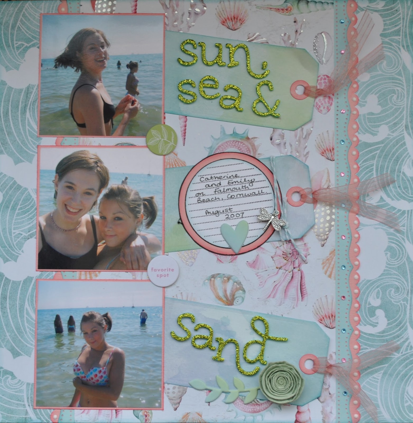
My layout today is about our eldest daughter and the fact that whilst being furloughed from work she wanted something to do and became a Consultant for Body Shop at Home. Initially it was just for something to keep her occupied and help fill her time. I don't think she expected to love it so much, fall in love with the products and enjoy promoting them and selling to others. She has made a whole network of new friends at the same time and is having an absolute ball. She has also introduced our younger daughter to it and she has also become a Consultant too ( I can see another layout in the pipeline!)


I based the layout on a sheet of Stamperia called Face Art and I used the reverse side as I liked the repetitive lacy pattern. Before anything else, I gently sponged around the edge of the photographs with some ivory paint to soften the edges.


I like the texture of corrugated card and thought it would work well on this page, so I tore a strip to lay across the page and dabbed some ivory paint in patches and also some random dribbles of Cosmic Shimmer mists that I dragged across it.


From a sheet of Dream Writings I cut a few panels and words to scatter about the page, some
                             tucked in and others were raised on foam pads to add dimension.


I printed out some journaling strips on the printer and swiped the edges with some Antique copper mist to highlight.

Below shows the mix of Cosmic Shimmer Mists, Stickles and Liquid Pearls I used across the layout.


Aswell as dropping blobs of Shimmer mists in various places, I also used it to drag along the edges of the photos, around some of the sayings panels and also on the 2 Prima Capri Amalfi flowers. When it dried the mica glistened beautifully and really highlighted the edges.


I used the Liquid Pearls and Stickles to create circles of dots, using various lids and glasses as stencils to dot round. I like how the Liquid Pearls stay like raised little domes and once again add a little dimension, whereas the Stickles dries flatter.

I finished by adding lots of bi-colour pearls in various sizes in clusters about the page. Amazingly these arrived through the post on the very morning I was making this layout...and the colour match was perfect!


So there it is, my last page for May. I wonder what June will bring for us all. Hopefully some safer days and we will see a bit more of a return to some sort of normality. Thank goodness as crafters we all have plenty to keep us occupied and gives us a means of escape from everything else eh!

If you feel the need to treat yourself to some new goodies there are always lots and lots of lovely new products arriving in the SHOP, along with a vast selection of great products and monthly kits that are always popular......I believe the popular saying at the moment is Be Kind..... that's a great policy to have.... so why not start by being kind to yourself, you deserve a treat!!

Happy Crafting!

Warmest wishes
Anita xx

Wednesday 27 May 2020

'Never Stop Being You' - 12x12 Layout using Photoplay - 'Little Builder' Collection

Hello, Rebecca back with my second layout created using the 'Little Builder' Collection from Photoplay. This layout came together really quickly (for me!) as I'm finding this collection so fun and easy to work with.


I started by cutting two sections of yellow Bazzill cardstock from the Matchmaker pack and distressed the edges with the blade of my scissors. I adhered these to the top right and bottom left of the layout, at an angle. I then cut two sections of the 'Construction Zone' patterned paper - slightly smaller than the yellow bazzill sheets - and also distressed the edges. I adhered these down simply using double sided tape. I chose this patterned paper to work with for this layout because it has the same 'stop' signs on it that my son is stood with in my photo so they matched perfectly!


I matted my photo first on white card, and then on a piece of blue cardstock from the matchmaker pack. The blue bazzill matches the background of the patterned paper perfectly. I placed my photo in the centre of the layout where the two corners of patterned paper meet. I raised it up on adhesive foam to add some dimension to the page.

I embellished the layout using some pieces from the Ephemera pack and the Element Stickers Sheet either side of my photo to make two small clusters. I placed the two arrows facing inwards to draw attention to the photo in the centre of the layout.


I raised some of the pieces up on foam dots to bring them up to the same level as my photo and to add more depth to the layout.


I finished the layout by adding my title 'Never Stop Being You' using two different alphabet thickers from my stash, and with a doodled border around the edge of the white cardstock background.


This is quite a 'simple' layout for me but I really love how clean and crisp it looks. I'm excited to return next month with some more layouts created using this collection which include some mixed media!

Take care,

Rebecca x

Monday 25 May 2020

May Papermaze Kit - Part 2

Hi, Hope you are enjoying the bank holiday weekend Lynn here today with the second post using the pretty spring May Papermaze Kit. For both of my layouts, I have chosen photos from the children's childhood.


Here is a reminder of what you will find in the kit, please see my previous post for full details of the kit content:


Sun, Sea & Sand - The photos for this layout show my daughters having fun on the beach at Falmouth in 2007. I love both sides of
All The Shells paper, the pretty foiled shells and the waves, so I found a way to have some of each showing. 


For this layout I used a scrap piece of cardstock to 'build' my page on. I cut the sheet of
All The Shells paper dividing it into three pieces. Two strips 6cm x 30cm, were attached to both sides of the page with the waves pattern up. Then the remainder was placed in-between the strips, shell side up.  monthly

I used two different border punches and with Blossom and Ocean Breeze Bazzill scraps I cut some decorative strips. I applied these to either side of the shell paper. 


My three photos were trimmed to measure 9cm x 9cm and mounted them with fine borders of Blossom Bazzill. I added them to the left side of the layout as pockets for the tags, by applying glue to just three sides. 


I cut three tags using the left over
Bloom Street #10 paper and the Sizzix Thinlits die set.
These were placed on the page with the ends tucked under each photo. I cut the reinforcement rings from more Blossom Bazzill and used the ribbon from the kit to loop through the holes. 


My journalling block was created with an old stamp from my stash, I applied this to the central tag, adding some Baker's twine and the charm from the kit. 

The title was divided over the other two tags using Thickers glitter foam stickers. 


Using embellishments from the kit I added the spiral paper rose, some of the Puffy Phrase Thickers and two of Pinkfresh Studio Flair Stickers. From my own stash I chose some pink and blue gems and used white Nuvo Crystal Drops to decorate the punched borders on the right of the page.


Terrific Trio - This layout has a photo of a drawing my father created of my triplets when they were three years old. I have scrapped this before, so now all three of them have a layout of this photo for their collection.


For this layout I used a sheet of White Bazzill, and trimmed the bottom with a strip of Blossom Bazzill 5cm x 30cm. I trimmed the join with the washi tape from the kit. 


I chose a cut file and the Heather Bazzill to make the heart background, and back-filled the hearts with Bloom Street #06 paper. I stuck this to the page and popped a few of the Heather heart cut-outs overlapping the others. 

I trimmed my photo with Limeade Bazzill, and placed it towards the bottom right of the layout. I used the butterfly from the Phrase Thickers at the top of the photo.

I cut a heart from the Heather Bazzill to place behind the centre of the heart doily. I then cut a smaller heart from the Ocean Breeze Bazzill to go in the centre of the doily and wrote my journalling onto it. I decorated the doily with the pink pearls from the kit.

For the title I cut the words using the Cricut from Ocean Breeze Bazzill and embossed it with Embossing Enamel. 


Finally the five wooden heart buttons were all treated with a Baker's Twine bow, each in a different colour of the rainbow. They were then placed down the left side of the page.


This completes four layouts for May, but I do have two sheets of patterned paper and some Bazzill left over, so I will be able to make at least one more page, which I will be back with next week.

Thanks for looking
Lynn x

Friday 22 May 2020

Something a bit different - documenting life in lockdown...

Hi everyone,
I hope you're all keeping well :)
It's Anna back with you today and I have a continuation of my previous layout to show you.
In my last post I had created a rainbow themed layout documenting life in lockdown. You can find it here if you missed it.

In my last post, I explained how important I think it is to document journaling. I would usually do this somewhere on each layout, but I just didn't have the space on my rainbow page. So I explained that I would place it alongside another layout which was more journal heavy as there was so much to say. So much has changed for us all in the last few weeks and I just feel that its really important to document this time, which for me means a lot of journaling as well as the usual layouts!
So here it is, its not a very creative layout by any means, but it serves the purpose of what I wanted to achieve, and incorporates some small details and photos to coordinate with the rainbow layout alongside it.
I simply typed out what I wanted to say, mounted it on cardstock and adhered to a 12x12 sheet of white cardstock. I have created similar pages such as holiday diary's in the past where I have trimmed down smaller journaling strips and added more photographs and embellishments. So it can be as little or as much as you choose!


I added in a few little details that coordinated with my rainbow layout. A few stickers from the Simple Stories Hip Hop Hooray collection and some enamel dots too.


An idea of how the two pages look together in my album...


Have you created any layouts or documented this time?

Thanks for looking! I know its a bit different today. Next time I'll be back with a normal layout and the new Simple Stories collection 'birthday blast'.
See you then,
Anna
X


Wednesday 20 May 2020

May Papermaze Kit

Hi, Lynn here today with the first post using the pretty spring colours of the May Kit. The kit includes papers and embellishments in a selection of geometric patterns, hearts, rainbows and shells.

Here are my first two layouts:

 Here is what you will find in the kit:


Patterned Papers:
Pink Paislee - Paige Evans - Bloom Street collection - #06 & #10
American Crafts - Heidi Swapp - Art Walk collection - Artsy
American Crafts - Dear Lizzy - She's Magic collection - Feeling Fine
Pink Fresh - My Favourite Story collection - Joyful Heart
Prima Marketing Inc. - Surfboard Collection - All The Shells
Bazzill Cardstock - Avalanche and Ocean Breeze


This shows the flip side of the papers:


Embellishments: 30cm washi tape, heart doily, 5 wooden heart buttons, charm, 50cm ribbon, 10 Prima flowers, spiral paper rose, Paige Evans Puffy Phrase Thickers, 1 strip Dear Lizzy Enamel Stickers, 1 strip pearls, Pinkfresh Studio Flair Stickers.


Optional extra Bazzill Pack: Limeade, Heather, Desert Sun and Blossom.


Maypole Dance - I have been sorting out some photos from the children's dance shows and thought it this one was perfect for the rainbow paper. Having the two arcs reflecting the ribbons on a maypole. 


I took two sheets of Bazzill to start with, cutting the Ocean Breeze to 8" x 12" and the Limeade to 4" x 12". With a scrap piece of 12" x 12" paper, I placed the blue at the top and the green as the base. 


From the Joyful Heart paper, I trimmed off the manufacturers strip plus 1" of the paper from the bottom. This strip was then shaped along one side with a Martha Stewart border punch. With the pink dotty side up, I glued this across the green card at the join. I then cut the rainbows from the sheet and arranged them onto the blue card, overlapping them in the centre.


I mounted my photo onto some of the white area of the Joyful Heart paper. I then attached this to the page towards the left side.

With some old Doodlebug Design cardstock letter stickers I created my title. Then I added some butterflies made with the Martha Stewart 3 in 1 butterfly punch and more of the white paper. 

To reflect the fine black lines on the rainbows, I took a fine marker pen and drew lines around the edges of the rainbows, the letters and butterflies. I also did my journalling on the white areas of the rainbow.


The Prima flowers from the kit were added to the join across the layout. The butterflies were embellished with Stickles and Liquid Pearls

Happy Birthday - These photos are from Scarlett's 2nd birthday she was fascinated with this wooden birthday cake and it keeps her entertained for hours! 


This layout was based on a sketch from Pagemaps.
 

For this layout I used the
Bloom Street #10 paper, wanting to use both sides I gutted the paper to give me a 2.5cm frame. I then trimmed the Avalanche Bazzill to 26.5cm x 26.5cm and mounted this over the frame. From the remainder of the #10 paper I flipped it over and cut a piece 13cm x 20cm and arranged it in the centre of the page. 

I cut one of my photos into a 10cm diameter circle. Then both photos were placed into position.

With some Gesso I prepared a selection of Tando Creative Balloons and a chipboard bird branch from my stash. I painted these chipboard pieces with some Distress Paints. These were glued into position on the page and strings were added to the balloons with a fine marker pen. 

I cut my title with a Sizzix Bigz Die - Handmade, from leftover pieces from the first layout and #10 paper. Once all this was glued in place I used Stickles on the letters and Glossy Accents on the chipboard pieces. 

Finally I scattered the
Dear Lizzy Enamel Stickers over the layout. 

I'll be back with more from this kit soon.
Thanks for looking.
Lynn x 


Monday 18 May 2020

Simple Stories Simple Vintage Garden District - Beauty Everywhere

Hello, Karen C here again. Today I have another layout using the Simple Vintage Garden District Collection from Simple Stories. The collection is full of images of flowers and butterflies and so I decided to create a layout using some photos of my garden.


This layout is very simple and uses a sheet of the Never Stop Dreaming paper.  


Using some outline alphabet stamps from my stash, I stamped the quote "If you truly love nature you will find beauty everywhere" onto the layout using some black Memento Ink. This ink is water resistant so it allowed me to go back and roughly colour in the stamped letters using some pink watercolour paint.


Two photos were then stuck to the right hand side of the layout and I carefully cut round one of the butterflies printed on the background paper so I could tuck my photo underneath it.


On the left hand side of the layout I placed a piece of neutral ribbon and I again cut round some of the butterflies so I could 'thread' the ribbon beneath the images. Another small piece of ribbon was tied on for extra interest.


Five natural wooden buttons were added to the left hand side of the layout.


The layout was completed with the addition of a beautiful Tim Holtz Idea-ology Adornments Butterfly .


I thought this would be my last layout using this collection, but I'm really enjoying using it and hope to be back soon with one more layout.

Take Care
Karen x x

Friday 15 May 2020

Gone Fishing!......Stamperia and embossing powders.


Hello again, it's Anita here with you to end the week.

I hope you are all well and keeping safe.
For this post I have been working with Stamperia papers and its made a nice change to go with a masculine page. This is my Dad, who we all miss very much.....he was always at his happiest when he was fishing.


The page was based on a sheet of Blue Calypso Bazill cardstock which I gutted the centre from. I then used the gutted section to matt the photo and also to cut the word FISHING from.
The background sheet was Stamperia Medusa and because  I wasn't very keen on the large robotic jellyfish image that was over a large area of the sheet, I used a combination of copper and bronze acrylic paints and some Gunmetal Sparkle Medium that I spread through a stencil. In the shop there is a huge selection of Crafters Workshop stencils. This created a new background with some added texture. I felt it was a little like fish scales and was very happy with the result.


From a sheet of Stamperia Fish, I fussy cut 2 fish and hung them from some brown twine and stuck on the right hand side of the page. I roughed up the edges of the entire edge of the layout and dabbed copper paint along the edges.


I also sponged some paint very gently round the edges of the photo matt and the word chipboard embellishment and then finished the photo off by sponging some Sparkle Medium onto the corners.


For my title I used some little old Prima letters for the word 'Gone' and I dabbed them with Avocado Liquid Pearls ..... and for the FISHING part of the title I used some of the left over Blue Calypso cardstock and drew round some large plastic letters that I have had in my stash for years....it really makes a nice change to break out some old items and re use after all this time!


Now what I did next was pretty unconventional and unplanned...... I say unplanned because I could not, for the life of me, find my embossing ink pads...not anywhere!!
I had planned using some embossing powders on the title as I didn't really want to leave it as just plain card, but without the embossing ink I wasn't sure what I could do?

So I thought I would try using some acrylic paint to hold the embossing powder.....and it worked! It left quite a nice texture and rippling effect. I gathered a few more powders in various colours and also some UTEE powders too and sprinkled little areas in different colours to see how they blended.

I was then curious to see what wet glue would do with the powder and heat gun on it.....well it was like a little volcano, bubbling away and when it popped or I pressed it down with my tweezers it has left some great textures and I am really chuffed with the end result! I know its not everyone's cup of tea...... but I like it :)


To finish the page off I made lots of little domes in various sizes randomly around the page using Liquid Pearls and Distress Stickles in different shades.

I hope you have enjoyed my post today...and maybe it will entice you to get out your powders out for a play! There is a great selection of them HERE in the shop if you need to top up your collection or even buy your very first one.

Have a great weekend and stay safe.
Warmest wishes Anita xxx

Wednesday 13 May 2020

'Boy at Work' - 12x12 Layout using Photoplay - 'Little Builder' Collection

Hello, Rebecca with you today. I can't believe it's May already! I'm here today sharing my first layout created using the new Photoplay 'Little Builder' collection. These are the first Photoplay products I've ever worked with and I was really impressed with the quality. The collection itself is fabulous - full of all the 'boyish' things my son is currently into!


For this layout, I started by trimming down a sheet of 12x12 white cardstock and distressed the edges using a scissor blade. I added a thin strip of torn orange cardstock underneath at the bottom, and then mounted the whole thing onto the 'All Boy' patterned paper, leaving a larger section visible at the bottom. I made a tear at the top of the white cardstock and slotted a small triangle of orange cardstock in the gap to balance out the layout.

I matted both my photos onto two different colours of Bazzill Cardstock from the Matchmaker Pack and added a layer of adhesive foam behind them to raise them off the layout a bit. Next I fussy cut the orange journalling tag from the 'Hard at Play' patterned paper and placed it to the right of my photos. I added a tag from the Ephemera pack behind it and raised the top of both up with foam dots. I added some embroidery thread through the top of the tag to add a bit more texture to the layout.


I then started working on a cluster to the left of my photos. I added the 'unstopable' tag, with matching embroidery thread and a black and orange striped heart from the ephemera pack and also a couple of stickers from the Elements Sticker Sheet.


I then went back to my right hand cluster and added a blue arrow which I fussy cut from the cut-apart sheet (found here) and another sticker from my stash. This balanced the bottom half of the layout out quite well, but I felt that the top half was looking quite bare.

I added a couple of paper layers behind the top of the photos - I used a small piece of the 'All Boy' patterned paper to match the border, and also a co-ordinating cardstock. I used an American Crafts border punch to make them look like pages torn from a notepad. I used some thickers from my stash to add my title.


I felt like the very top of the layout needed a bit more than just the paper tear, so I added a couple of pieces of ephemera and a strip of 'caution tape' from the Elements Stickers sheet.


I finished the layout off with a few tiny spots of Nuvo Drops scattered around the page in co-ordinating colours.

I hope you've enjoyed this layout. I've been really impressed with this collection so please head over to the shop to check it out.

I'll be back later in the month with another layout created using this fun collection.

Until then, stay safe.

Take care,

Rebecca x


Friday 8 May 2020

Documenting 'Life in Lockdown' with *Simple Stories Hip Hop Hooray* and Scraps

Good Morning everyone!
I hope you're all keeping safe and well and have a lovely day in the sunshine today.

What have you all been scrapbooking lately? I haven't had much to scrap so far this year, but I do think its important to document this time that we are living through at the moment.
So having said that, for today's post I'm going to show you a layout that I've made recently, it documents 'life in lockdown'.
For my last two posts I've been working with the Simple Stories Hip Hop Hooray collection. You can find it in the shop here. I have continued to use this collection for today's layout, along with a few scraps of cardstock from my stash.


I selected a few photos that have represented our time in lockdown so far, Pe with Joe, Zoom with friends and family, the rainbow trail and enjoying the sunny weather.

I think it's also really important to add journaling to my layouts. So although this layout doesn't feature any, I'm going to be placing it along side another layout in my album which will be pretty journal heavy, documenting what's been happening. I'd be happy to show this layout too.


To create the rainbow, I used paper punches to punch out a selection of shapes in different colours. Starting with red and going through the colours of the rainbow. I punched out shapes from the hip hop hooray patterned papers as well as from some of my cardstock scraps.


I drew out two cloud shapes onto white cardstock and used Nuvo glitter drops to outline the clouds.
I added various embellishments to the punched out shapes, including buttons, enamel dots and stickers. I filled in the gaps in between the shapes using small enamel dots and nuvo drops.

Supplies Used:

Thanks for looking, take care and see you soon!
Anna
X

Wednesday 6 May 2020

Simple Stories Simple Vintage Garden District - Beautiful You

Hello, Karen C here again with another layout using the Simple Vintage Garden District collection from Simple Stories. This collection is so versatile and today's layout is a wedding layout using a photo of my daughter when she was a bridesmaid.


I trimmed a centimetre off of each edge of a sheet of the Love More paper and stuck this to the middle of a sheet of peach coloured Bazzill cardstock.


I machine stitched round the edge of the paper which white thread and then roughed up the edges with my finger nails..

My 7x5 photo was printed with a narrow white border and was attached at an angle in the bottom right corner of the layout.


In my stash I found some very old Prima Flowers. The flowers were an off white colour so I used some peach coloured watercolour paint to alter the flowers to fit my colour scheme. Prima flowers are generally made from paper or fabric so they can easily be altered if you can't find ones in the precise colour for your project. The flowers were glued onto the layout to embellish the printed wreath.


For the title I used some Pink Paislee Paige Evans Bloom Street Flutter Puffy Phrase Stickers and some Pink Fresh Studio Puffy Alpha Stickers.


I finished off the layout with some stickles to highlight to some of the flowers, a scattering of sequins and some tiny word stickers.

Thank you for dropping in today. I hope you agree that this collection is really beautiful and I will be back soon with one last layout to hopefully inspire you.

Taker Care and Stay Safe,
Karen x x