Friday, 30 August 2019

Something Different...


Hi everyone, it's Anna back with you today. I hope you all enjoyed a sunny bank holiday weekend and have some special memories to scrap.
Talking of special memories, I have something a little different for my post today.
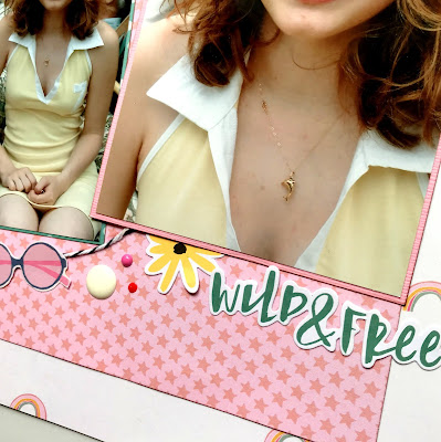
For quite some time now I've been wanting to create a page with a picture of me at each age, up to 30.
Although a simple layout, the most challenging part of it was organising all of the photos, making sure I had one for each age.


To create this layout, first I spent lots of time organising my photos and printing them out at different sizes.
Papers with frames on them have been on my shopping list for the last year, as I knew that I wanted to use them to mount each picture. I've had this layout in my head for the last year or so, so I knew exactly how I wanted it to be and finally its completed!

I used these frames:


Pink Paislee Page Evans Whimsical

I cut out a selection of frames from each of the patterned papers and matched up my photographs to fit with the frames. Where I couldn't get them to fit into frames (as I had to print lots of pictures very small to fit them all on a piece of 12x12 cardstock) I mounted them on different coloured cardstock.


I then used small alpha stickers to title each picture with the appropriate age and finished the layout by adding a selection of enamel dots and a title.


Now I'd like to create a similar page for my son, up to 10 years or possibly for each year of school?
Hope this has inspired you to create your own version.
Thanks for looking!
Anna
X

Wednesday, 28 August 2019

'You are my Sunshine' Scrapbook Layout - Bella Blvd Splash Zone Collection

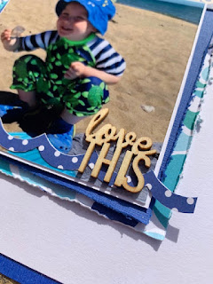
Hello, Rebecca here with my 4th layout created using the Bella Blvd Splash Zone Collection which I've titled 'You are my Sunshine'.


As soon as I saw the Sunny Days patterned paper I knew that I wanted to use it to scrap some beach photos of my son from our holiday last year because the colours in the paper match the colours in his hat perfectly.

I started by tearing the patterned paper in half and stuck the top half to a sheet of white cardstock. I then tore a small strip from the bottom half and tucked it underneath, with the reverse side showing for contrast.

I'm a self-confessed mixed media addict so just HAD to get some inks and paints on the page. I used some shimmery paints and the packaging technique to add the turquoise and yellow to the page and then used a paintbrush to add splatters.

I backed my photos on white card and added a sheet of turquoise tissue paper to help them pop off the page. Before adding them to my layout I added a layer of foam to add dimension.

I added some ephemera pieces - some from the Splash Zone collection and others from a Doodlebug Design Odds and Ends Chit-Chat pack which co-ordinated well. I also fussy cut one of the sun and clouds icons out from the Sunny Days paper and slotted a Doily by Doodlebug Design behind it.


I'm a little obsessed with Nuvo Drops at the moment so added some turquoise drops in several areas. I felt that the area under my photos was a little bare and then remembered the gorgeous chipboard banner pieces that came in the Vicki Boutin Color Kaleidoscope collection. I've tried to use them on several layouts but they've never quite worked, but the colours matched this layout perfectly!


I finished off my layout by adding my title using some teal coloured thickers and some gorgeous Doodlebug Design Clips which I was lucky enough to get in the Summer Sale.


Thanks so much for reading, I hope you've enjoyed my layout. Please don't forget to head over to the shop where you can view and buy the Splash Zone collection.

Take care,

Rebecca
x


Friday, 23 August 2019

August Crop


Our August crop is quite late this year, but it looks to be a hot and sunny one!  We have a lovely blue kit for you this month... 


As usual, there will be home-made cakes, punches and dies for you to use and a discount in the shop!

Monday, 19 August 2019

August Papermaze Kit

Hello, Lynn here today with the bright and colourful August kit. This kit contains a rainbow of papers and embellishments.

Here are my first two layouts:


Before making the layouts here is what you will find in the kit:


Patterned Papers:
Cocoa Vanilla Studio - Happiness collection - Botanical Bliss & Good Vibes
Jillibean Soup - Rainbow Roux collection - Bite Size Bits & Pinch of Colour
Kaisercraft - Morning Dew collection - Rejuvinate
Pink Paislee - Paige Evans Horizon collection - #3 (featured by Karen C back in May)
Bazzill cardstock:
Rain & White
Reverse side of papers
 

Embellishments:
Set of chipboard frames, doily, Heidi Swapp glitter word, 3 chipboard banners, 3 Studio Calico wooden stars, strip of rainbow heart stickers, 2 acrylic hearts, pink acrylic butterfly, rainbow sticker.


A pack of matching extra Bazzill is also available and contains a sheet each of four colours:
Breaker Bay, Desert Sun, Piglet and Grenadine

First Summer At The Hollies is my first layout this month. It shows a selection of photos of the plants we grew in the garden during our first summer living in our new home.


I have seen many layouts created with this amazing paper (Pink Paislee - Paige Evans Horizon #3) over the last few months, including our own DT member Karen C.  So I was really pleased to see it included in this month's kit.

The first step was to do all the cutting - so with the sheet of Horizon #3 - I gutted the paper to leave a frame of 2.5cm, then from the remaining piece I gutted again to leave another smaller frame of 2.5cm. This left a square of approximately 20.5cm for the centre of the layout.

With the Breaker Bay Bazzill cardstock - I trimmed this to measure 28cm x 28cm, then I gutted it make a frame of 2.5cm. The remaining piece was then gutted to make another frame of 2.5cm.

I machine stitched around the edges of the two paper frames, the two Bazzill frames and the paper square with white thread. I then inked all the edges with Chipped Sapphire Distress Ink.

The layout was then built up, by layering the papers and card on top of one another.

I took nine small photos and after mounting them onto white card they each measured about 6cm x 6cm. These were arranged and stuck onto the page.

For my title I used some foam American Craft Thickers.

Happy - This layout shows a photo of my daughter on the Millennium Bridge, with her new umbrella on her birthday back in 2013.


For this layout I started by applying a coat of Gesso to a sheet of white cardstock. Once this was dry I used a blending tool and Distress Oxide Inks to apply horizontal bands of colour. I used Festive Berries, Spiced Marmalade, Mustard Seed, Mowed Lawn, Salty Ocean, Blueprint Sketch and Wilted Violet and I blended these colours where they met. I lightly sprayed some water and added a few drips too, then allowed the ink to run.
I flicked a little Black Marble Dylusions Ink onto the cardstock, and left it to dry.

Meanwhile I used my Cricut and the Edge to Edge 2 cartridge to cut the image 24cm x 24cm from the patterned paper -
Cocoa Vanilla Studio - Happiness - Good Vibes. I kept all the little petal shapes that are left over from this cut for use later. This was then stuck down onto the inked cardstock.

I cut three tags from the paper -
Jillibean Soup - Rainbow Roux collection - Bite Size Bits. I used one tag for my journalling and added some orange Baker's Twine through a small hole I punched into the top. The tags, the photos and the Heidi Swapp glitter word were arranged onto the page.

I used the petal shapes left over from the Cricut cut to make flowers, I used eight petals per flower and mounted them onto the other diamond shaped waste pieces. These were all inked with Distress Oxide inks, and mounted onto the layout with 3D foam pads. I punched some leaf fronds from the
Breaker Bay Bazzill left over from the first layout. For this I used a Martha Stewart Punch. I added a selection of flat-backed pearls and gems to the flower centres.

Finally I used the tiny rainbow heart stickers to scatter across the layout.


Thanks for looking, back soon with more from the August kit.
Lynn x

Friday, 16 August 2019

Life is better with you! ...Kaisercraft Antiquities pt 2

Hello again, it's Anita here today.

Here is my 2nd offering created with the Antiquities Collection from Kaisercraft.
I used the left over bits and pieces of the sheets from the first page I made ( HERE) and added a sheet of White Canvas Bazzill cardstock


We often go for visit to our local reservoir, its such a lovey place and the walk round the outside is lovely. I took these photos on our last walk there and thought they would work well with these papers.
The page was based on a sheet of White Canvas Bazzill that I gently swiped with an old brown ink-pad around the edges.


I used scraps from a few sheets ( making the most of using the patterns on both sides) and just layered them between each other around the page.
I used Heirloom  , Beloved,  and One of a kind


 I raised some bits up on foam pads, just to give a little dimension and fussy cut a few flowers to add little clusters.


 To finish the page I just added a few little flat backed crystals here and there...I love a bit of sparkle!!


You can see the Antiquities Collection HERE and you can find the whole variety that the shop stocks from Kaisercraft HERE

And don't forget there is still a fantastic SUMMER SALE on in the shop too with a great many bargains to be found.

Happy Crafting!

Warmest wishes
Anita xx

Wednesday, 14 August 2019

Pebbles 'Oh Summertime' - Girls Just wanna Have Sun

Hello, Karen C here again. I hope you're enjoying the summer and also finding time to be creative. This month I've been working with the Oh Summertime collection from Pebbles. I love the fun bright colours in this collection and all the summertime icons and images which are perfect for recording your summer memories. Today I have a girly layout using three Polaroid style photos.


I started with a sheet of the Bee Happy (B Side) paper and after gutting it I stuck a 11.5"x11.5" square of pink 'Chablis' Bazzill cardstock in the centre.

I then took a piece of vellum and cut a sunburst shape from it. 


After cutting out the sunburst shape I used a white gel pen to draw faux-stitching around the edges. A piece of acetate was then placed underneath the vellum.


Before putting the vellum and acetate onto my layout I glued some pink, gold and yellow sequins where the 'windows' in the vellum would be. Once the vellum and acetate were attached to the layout it created the impression of a shaker box. The vellum and acetate were attached on top of the sequins with double sided tape which was strategically placed so that it would be hidden when I added embellishments.

I glued three Polaroid style photos to the right side of the layout using 3D foam underneath to give some dimension. Some punched border strips of yellow and pink cardstock were tucked under the sides of the photos.


I made tags from two of the 3x4 cut aparts on the Oh Summertime paper and attached these to the layout. Pink Bakers Twine and some punched border strips were also added to the tags.


I fussy cut flowers from the Summer Bouquet paper and summery images from the Hello Summer paper. These as well as various die cuts from the Simple Stories Oh Happy Day Ephemera Pack were used to embellish the layout. The colours in both collections work really well together. I also added a tiny 'Fun' sticker from a sheet of Bella Blvd Family Frenzy stickers to the front of the camera die cut. 

My layout was completed by adding the date and place on a word strip to the bottom of one of the photos.

Please do take a look in the shop at this gorgeous collection and you can also find lots of other summer themed goodies in the shop - just use the 'shop by theme' option.

Take Care.
Karen x x


Monday, 12 August 2019

'Beach Boy' Scrapbook Layout - Bella Blvd Splash Zone Collection

Hello, Rebecca back with you today with my 3rd layout created using the amazing Bella Blvd Splash Zone Collection, which I have titled 'Beach Boy'.


I wanted to make this layout very blue to match my little boy's hat and shoes and to contrast against the white background to reflect the blue and white stripes on his arms. I had an idea to make a grid style page with 4 sections so printed my photos square.

I started by layering the different papers behind my photos at different angles ensuring that each one showed, and distressed all the edges using a scissor blade. I used the 'Splashing Around' and 'Swim Like A Fish' papers and used both sides. I also added some blue and white washi tape on my background so that it would peep out on one side of each square.


I decided to give the entire layout a blue border so I gutted the middle of a sheet of Bazzill cardstock so that I could also use the middle to add to my layering.

I added a white polaroid style frame to the top left square and used my die cut machine to cut my title out of the 'Splashing Around' paper. I also cut a little 'Beach' signpost out of the B side of the paper.
I embellished this section with a banner style tag from the Ephemera Icon pack and added a blue Doodlebug Design Doily and a white clip by Freckled Fawn.


I used another doily and some fish icons from the ephemera pack to the bottom right grid, and I also cut out a section from the Daily Details paper to use as a journalling card.


I fussy-cut the two 'Waves' from the daily details sheet and used these to embellish my photographs. I also created a little tag from the blue section on the reverse of the daily details sheet and finished this off with a mini brad by Doodlebug.

I completed my layout by adding two chipboard pieces by Dusty Attic on to my photos.


I hope you've enjoyed this layout. I certainly enjoyed creating it!

Please check out this wonderful collection in the shop, and I'll be back with another layout later in the month.

Take care

Rebecca
x


Friday, 9 August 2019

Simple Stories ~ Oh Happy Day and Crate Paper ~ All Heart

Hi all, it's Anna with you today sharing a layout that I have created using Crate Paper All Heart along with some of my leftover Simple Stories Oh Happy Day supplies.
The two collections go together pretty well and both reminded me of my youth, so perfect for scrapbooking some old pictures...


I used the 'be you' patterned paper as my base, along with a block of 'cute stuff' (pink patterned side) and mounted my two photographs on to some pink bazzill cardstock. I drew around a saucepan(hehe, so technical! But a great way to get the perfect circle!) to create the circular shape and then stuck some black and white twine over my pencil marks. I cut out several of the images from the 'cute stuff' patterned paper and adhered them around the twine circle. I added some nuvo drops and enamel dots around the circle too.


I used up a few of the 'bits and pieces' from the Simple Stories collection too.


All of my supplies were from the Papermaze shop, you can get there here.
Thanks for looking, have a great weekend!
Anna
X


Monday, 5 August 2019

Papermaze July Kit - Part 2

Hello, Lynn here with the second set of layouts made with the July Kit. This romantic kit is a very pretty collection of papers and embellishments which is currently available in the Papermaze Shop


Here is a reminder of what comes in the kit:


Patterned papers:
Stamperia - Spring Botanic collection - Poppy & Herbarium (Featured by Anita back in June)
Graphic 45 - Love Notes collection - Floral Symphony & Lovely Lyrics
Graphic 45 - Bloom collection - Plant Happiness
Carta Bella -Botanical Garden - Poppy Petals

Bazzill cardstock - Guacamole & Walnut Cream


reverse side of papers

Embellishments:
2 Graphic 45 Journalling cards, 2 Heidi Swapp Acetate words, strip of gems, 2 chalkboard label stickers, 12" washi tape, Tim Holts Quote Token, 18" Red jute twine, 12" ribbon, 3 red flowers, chipboard exclusive to Papermaze.


Extra Bazzill Pack - Maraschino, Coral Cream, Aloe Vera & Black Prismatic

Timeless - For this layout I used this black and white version of a photo of my great niece and nephew playing for their dad on his birthday.


Starting with the
Black Prismatic Bazzill I dripped some Cosmic Shimmer Mist - Red Firefly over the cardstock to leave red and gold flecks on the black background.

To make the vertical strips (left to right), I used the lacy ribbon from the kit, a 28cm x 4cm strip of Poppy Petals (red dot side), 29cm x 4cm strip of Love notes (black patterned side - ensuring I cut this from an area where the images from the other side were not required). Next another strip of Poppy Petals (28cm x 4cm) this time with the floral side uppermost. I then used the Washi tape from the kit.

The photo was then placed in the centre of the page and I cut images and quotes from the Music Notes paper and tucked some under the photo to the left. I mounted a quote with 3D foam pads near the top right of the photo.

I used one of the Heidi Swapp Acetate words to add to the photo as my title. I wrote my journalling onto the two chalkboard labels using a white Prismacolour pencil. 

I added the black gems from the kit to the lacy ribbon strip. Finally I used pieces of a pearl swirl in various places on the layout.

When Elaine Met Boris - Just as I was considering what to create with this kit my sister-in-law was surprised to meet Boris Johnson when he visited Polhill, where she works in the plant nursery. The botanical papers were ideal for this. 


For this layout I used the frame I gutted from the Aloe Vera Bazzill last time. I mounted my photo onto the scrap of
Guacamole Bazzill left over from earlier layouts. I used the pair of Stamperia Spring Botanic papers for this page. They are beautiful and I wanted to use some features from both sides of each of them!

I trimmed around the quilted side of Herbarium paper by tearing around the edges. Then with the sheet called Poppy I cut the pieces I wanted to feature as layers around my photo, and carefully cut out any images that I wanted to use that would be lost under the photo. Once I was happy with where these papers would sit, I took a photo with my mobile and drew a light pencil mark on the Herbarium paper around the edges of the layers. Then I cut well inside these lines with a craft knife, freeing up images from the reverse side of the Herbarium paper to add to my layout.

Once all these images, layers and photo were arranged where I wanted them, I prepared some other elements. I used a Dusty Attic Small Picket Fence painted with Distress Paints to add to the base of the photo. I die cut a bicycle with a Memory Box Die from gold metallic card. I added some tiny blossoms cut from the papers to the hubs, and the two small paper roses from the kit to sit in the basket. Some of the cut flower images were added over the fence and a little of the red jute twine was tucked in a loop to the right of the fence.

I made journalling blocks from two pieces cut from the papers, adding these below the photo. Then with a third piece framed with the exclusive chipboard piece, I added the date and stuck it to the top right of the layout.

My title was created with some old letter stickers from my stash. Finally I used a few of the black gems left over from the first layout. 


That's all for the July kit. I will be back mid August with the next kit.
Thanks for looking.
Lynn x

Friday, 2 August 2019

Antiquities from Kaisercraft

Hi there

Anita with you today to finish the week off and I have a layout today using the Antiquities collection from Kaisercraft. A wonderful vintage collection combining distressed ochre and browns along with cool shades of blue and grey with a mix of floral, damask and paisley prints....just lovely.


I thought it would work well with some photos i took back in May at a motor show we attended on the South Coast, not far from where we live. And with the colours in the photo I simply had to use this gorgeous american car that we were admiring.


The layout was based on a sheet of Bazzill Mexico City from my stash and I also matted the photos on the same colour card. I trimmed 2 cms from the top and one side of a sheet of  Limited Edition and on the top left and bottom right hand corner I cut a small diagonal slice which I peeled back and stuck down, popping a small gem on each side.


The gorgeous sheet of Heirloom 
is like a blanket of quilted fabrics. I cut a block of 4 out carefully and then following the outer and inner white lines I scored and folded them gently, creating some dimension around the edges. I also cut a couple of single circles out and repeated the same process.


When I looked closely at the quilted sections I noticed that I could also cut out some propeller shaped sections too....so I cut a few and used a couple up high on the page and placed one in the centre of the 4 block.


One of the sheets , Beloved , is full of quotes and sayings so I chose a few odd bits and used them around the page. I raised some on foam pads and also made some journalling strips too.
The page was finished off with various crystals in Ochre, Denim, Bright Blue and Coffee flat backed crystals popped about in various places.

This really is a very versatile collection and could be used for any theme really.

Don't forget to have a good look in the shop and of course the super Summer Sale that is currently going on, lots of bargains to be had!

Happy Crafting xx

Warmest wishes
Anita xxx