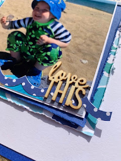
I wanted to make this layout very blue to match my little boy's hat and shoes and to contrast against the white background to reflect the blue and white stripes on his arms. I had an idea to make a grid style page with 4 sections so printed my photos square.
I started by layering the different papers behind my photos at different angles ensuring that each one showed, and distressed all the edges using a scissor blade. I used the 'Splashing Around' and 'Swim Like A Fish' papers and used both sides. I also added some blue and white washi tape on my background so that it would peep out on one side of each square.
I decided to give the entire layout a blue border so I gutted the middle of a sheet of Bazzill cardstock so that I could also use the middle to add to my layering.
I added a white polaroid style frame to the top left square and used my die cut machine to cut my title out of the 'Splashing Around' paper. I also cut a little 'Beach' signpost out of the B side of the paper.
I embellished this section with a banner style tag from the Ephemera Icon pack and added a blue Doodlebug Design Doily and a white clip by Freckled Fawn.
I used another doily and some fish icons from the ephemera pack to the bottom right grid, and I also cut out a section from the Daily Details paper to use as a journalling card.
I fussy-cut the two 'Waves' from the daily details sheet and used these to embellish my photographs. I also created a little tag from the blue section on the reverse of the daily details sheet and finished this off with a mini brad by Doodlebug.
I completed my layout by adding two chipboard pieces by Dusty Attic on to my photos.
I hope you've enjoyed this layout. I certainly enjoyed creating it!
Please check out this wonderful collection in the shop, and I'll be back with another layout later in the month.
Take care
Rebecca
x


3 comments:
Lovely page Rebecca, super cute. I really like all the layers xx
This is fresh and inspiring Rebecca, nice to see some boy pages too. x
Lovely layout Rebecca. Love the colours and the photos are so cute. x x
Post a Comment