Hello, It's
Lynn with you today sharing my experiments with
Tim Holtz Distress Crayons.
A little information about the crayons:
* The crayons look like markers, the medium is in a plastic barrel with a removable lid at one end, the other end is twisted to extend the medium - much like a lipstick. Each crayon is the length and diameter of marker so easy to handle. The cap and the 'twister bit' show the colour of the crayon and the name is also written on the barrel. This shows the crayon fully extended so you can see how much of the product is in the barrel.
* The crayons are available in packs of six colours, there are three packs available so far -
brights,
neutrals and
earth tones.
* The crayon is a very smooth, creamy consistency.
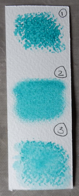
* The pigment is water reactive, so can be applied (1) as it is dry or (2) smudged with a rag, sponge or your finger or (3) blended with water.
* The crayons can be used on many different coloured surfaces and because it is a pigment it works well on dark cardstock.
* The colours can be mixed, and appear to work best when a large amount of medium is used. This shows the results of blending the colours (shown dry at the top of each image) with water (left) and dry with my finger (right).
* The colours match the existing Distress palette of products.
* The crayon pigments do not contaminate one-another when adding one color over another. So you can add in a pale colour when you have already used a dark one, without spoiling your crayon.
* You can take the colour from the crayon with a wet brush and apply it to paper that way.
* The colour is permanent when dry, but can be made wet if further movement needed or sealed to prevent movement.
*The medium is non toxic and odour free, but the package says they are for adult use only and should be kept out of the reach of children.
Here are a few ideas I experimented with:
Gesso
I used watercolour paper and treated one piece with
Gesso to see what the difference would be. The Gesso sealed the surface and made the colour move around more easily.
1. I coloured them both with the crayons, then blended the colour by rubbing it with my dry finger.
I tried lifting colour with a baby wipe through a stencil on both samples (a wet piece of kitchen paper or cloth works just as well).
The Gesso base appears to result in a whiter finish when the colour is removed.
While I still had the Gesso out, I tried different tricks with water - t
his shows application of crayon over water (top) and water over crayon (bottom) - with and without a Gesso base.
Texture Paste
I tried colouring the
texture paste with the brights crayons by mixing the two together on my craft mat before using through a stencil. I like the subtle shades it produced, a lot of crayon would be needed to make a strong colour.
I added texture paste through a
stencil and allowed to dry then added colour using the crayons. These were then blended with a water brush. This gave a good result as the texture paste took up the colour easily, and gave the same intensity as the paper.
I tried transparent texture paste next - this was applied through a stencil and allowed to dry completely. I drew onto the surface with the crayons and rubbed in with my finger. Initially the pigment on the paper was a dark contrast to that of the texture paste. Rubbing further with a soft cloth removes colour from the texture paste until it is just tinted and finally disappears all-together from the shiny surface.
Stamping
The verdict for stamping is that the crayons can be stamped onto but not stamped with!
I tried pigment ink and dye based ink both work, despite applying to dry colour, both smudged a little after about 15 minutes.
However the next day it seems not to smudge, shown here on Gesso (left) and without (right).
I tried using the crayons on the stamp to make an impression, Look carefully to see the top image which is barely visible and was created with the crayon applied and stamped directly onto the paper (labelled 'dry'). The second impression shows what happened when I added crayon to the stamp then misted it with water before stamping.
Masks and Stencils
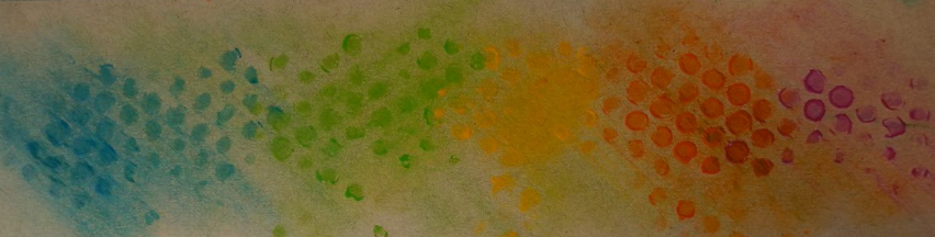
I tried applying the colour directly from the crayon through the stencil. This gave a lovely rich colour but there is a build up of medium around the edges of the shapes which takes longer to dry and therefore the card remained tacky for some days after application. You can see where I have tried to blend the thicker areas out but rubbing and so smudging the colours together.
I wanted to achieve a softer application of colour and so tried using the blending tool and foam. The colour was added to the craft mat and applied through the stencil with the foam and tool. This was a successful way of obtaining subtle colour blending.
Textured surface
I made a textured surface using an
embossing folder, then several colours were added to the raised areas and blended with my finger.
Painting
Using the crayon pigment as water colour was achieved by adding some colour to the craft mat and picking it up with a wet brush and painting with it. The stamped images are on watercolour paper in fast drying oil based pigment ink (
Versafine). I added each colour and blended them as I went along on the paper. I edged the paper by drawing on the edges with the crayon and then used the wet brush to drag in the pigment in creating a colour wash type background.
Metal
I tried colouring a metal embellishment to highlight the detail. I added the crayon directly to the surface and left it for a few minutes before polishing off the excess.
These crayons were fun to use once I got going. I have to say I was a little disappointed at first, but it just took a bit of practice to get to understand how they work. I found them easier to use as I went along. I like the way they can be used as the very bold colour they are in the crayon but can also create much paler shades. A pack of six crayons can result in many additional shades by blending the colours together. The effects shown can be achieved with other media, and all give slightly different results.
The closest comparison I have found is the
Gelatos by Faber-Castell. Carol reviewed these on this blog last year and her post can be found
here.
I hope this gives you some ideas for using the crayons. Have fun and please leave comments when you have tried them or to ask questions.
Thanks for looking, and well done if you have reached the end of this post!
Lynn x

.JPG)
.jpg)
 For
each card I trimmed a piece of watercolour paper to measure slightly
smaller than my card blank. I placed a selection of colours of Distress
Oxide ink onto a messy mat. spritzed them with water and ran the paper
back and forth through the colours to create the background for the
card.
For
each card I trimmed a piece of watercolour paper to measure slightly
smaller than my card blank. I placed a selection of colours of Distress
Oxide ink onto a messy mat. spritzed them with water and ran the paper
back and forth through the colours to create the background for the
card. 




.JPG)
.JPG)






.jpg)