I started this layout by cutting a section from the green 'B' side of the 'Little Trucks' patterned paper and placing it central on the bottom half of my cardstock. I then layered a piece of the 'Construction Zone' patterned paper running horizontally on top. I distressed the edges of both pieces of paper and drew a black border around the edges before adhering using double-sided tape.
I had lots of photos to chose from for this layout, but narrowed it down to 5, so had to print them quite small. I think in the end I settled on 2.5 x 2.5 inches. I matted them on white cardstock first, and then on blue bazzill cardstock from the Matchmaker Pack. I positioned 3 photos onto the orange 'construction zone' paper and placed the other two floating above - all with adhesive foam behind them to add dimension to the page.
Next came the fun part of trying to fill all the gaps with embellishments! I pulled several stickers from the 'Elements Sticker Sheet'. I used two of the strip stickers - I placed the 'caution' strip above the patterned paper at the top left, and the strip that looks like a road underneath my three photos with a couple of vehicles at either end.
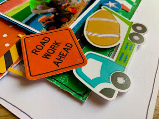
I then pulled out my Ephemera pack and added a few of the bigger bits across the layout. I added a coloured chevron strip at the bottom, a ticket shaped piece that says 'fun zone' in between the top two photos to tie the photos together, a round cement mixer, and also a square piece with a crane on. I mounted the crane onto the same blue bazzill cardstock as the photos to help it pop a bit more. I used foam dots behind most of the stickers and ephemera pieces to add dimension and interest to the page.
I then worked on trying to fill the smaller gaps with smaller elements. I used the round star stickers from the sticker sheet, a 'road work ahead' sign from the ephemera pack and also a green arrow I'd previously fussy cut from the 'Hard at Play' cut-apart patterned paper.
There were still a few areas that looked a bit bare, and I felt that this was making the layout look a bit disjointed so I continued to add bits and pieces to make the layout feel less like it was made up of sections. I added a couple of chipboard pieces that read 'live in the moment' and 'shine brightly', a wood veneer circle with the word 'today' in the middle which I'd heat embossed with black embossing powder, and a barrier sticker from the elements sheet.
I finished the layout off by adding a large digger sticker to the top right corner, my title 'Hard at Play' using thickers from my stash and finally a doodled border around the edge of the white cardstock.
I hope you've enjoyed this layout. This collection is so fun to work with and is still available in the shop.
I'll be back later in the month with my final layout using this collection - and it includes some mixed media messiness!
Take care,
Rebecca x


2 comments:
Absolutely love this Rebecca! So nice to see lots of pics but still not over crowded. Loving all the elements you have used, such fun and beautifully layered. What a little cutie too! xx
Such a fun layout Rebecca. Those papers are just perfect for scrapbooking about your little boy. x x
Post a Comment