Hello Papermazers! Rebecca Bee here to share a third layout using Carta Bella Honey Bee collection...I just could not resist using these gorgeous supplies for one more layout, I really love this collection!
Wednesday, 29 October 2025
Bee Happy | Carta Bella Honey Bee collection | Rebecca Bee
Wednesday, 8 October 2025
Pumpkin - Simple Stories - Simple Vintage Autumn Breeze Collection
Hi everyone!
It’s Rebecca here today, and I’m excited to share my latest layout using the Simple Vintage Autumn Breeze collection, which you can find in the shop here.
With October in full swing and Halloween just around the corner, I thought it was the perfect time to scrap some pumpkin patch photos. I began by fussy-cutting a few polaroid frames from the Crisp Days patterned paper and used them to frame my photos. I arranged the frames so they overlapped slightly in the centre of a sheet of premium white cardstock.
I was immediately drawn to the Cozy Season patterned paper featuring a variety of ticket stubs. To make these tickets a focal point, I fussy-cut several in different sizes and colours, then used a circle punch to add semi-circular notches to the tops and bottoms. I arranged them in a diamond shape behind my photos for added dimension and visual interest. To finish this section, I added foam behind my photos for lift and adhered them over the ticket design.
I wanted to keep the layout fairly clean and uncluttered, so I kept embellishing to a minimum. I chose a few large leaves from the Floral Bits & Pieces, along with some pumpkin clusters and floral pieces from the same pack and also some fussy cut from patterned papers within the collection. I tucked the leaves behind the photos and placed the pumpkins on either side of the ticket cluster to extend the design and balance the composition.
For the title, I used the word Pumpkin from the Foam Stickers. I absolutely love these stickers — they come in a range of fonts and styles, and they always make a great statement title.
To finish the layout, I added a bit of mixed media. Using Distress Ink in the shade Carved Pumpkin, I applied soft stencilled leaves around the edges of the design. I then added ink splatters in the same shade, along with some metallic gold for a touch of shimmer.
Thanks so much for stopping by! I hope this layout inspires you to get scrapping with your own pumpkin patch memories.
Take care,
Rebecca xx
@preciouspagespapercraft
Monday, 21 July 2025
Keep Your Light Shining - Mintay Papers - Lighthouse Collection
Hi everyone, it’s Rebecca here with my final layout of the month.
Can you believe how fast July has flown by? This month, I’ve been working with the beautiful Lighthouse collection by Mintay Papers, and I’ve absolutely loved it. The deep, moody colours in this collection are so inspiring—it’s been a real joy to create with. You can find the full collection in the shop here.
For this layout, I decided to be a little brave and chose Paper 05 for my background. It’s much darker than what I usually go for, but I was really drawn to its rich shades and intricate details. I just had to give it a go!
I started by layering several papers from the 6x8 Add-On Paper Pad, carefully selecting lighter tones to contrast with the dark background. I distressed all the edges to add texture and visual interest—the white torn edges reminded me of ocean foam, which felt perfect for this coastal theme.
To enhance the beachy vibe, I incorporated some hessian, netting, and cheesecloth into my layers. These textures brought the layout to life. I used a couple of staples to secure everything, making sure to place them in the centre of the pieces so they wouldn’t be visible once the layout was complete.
No beach layout is complete without a lighthouse, right? I fussy-cut one from the 6x8 Add-On Paper Pad and nestled it into my paper layers. For the photo, I mounted it on a lighter patterned paper to help it stand out against the dark background.
Around the photo, I added embellishments using pieces from the Paper Die Cuts and Paper Elements packs. There are so many goodies in these sets! You can even stretch the collection further by fussy-cutting images from Paper 09 to create your own unique embellishments.
For the title, I chose a phrase from the Paper Stickers Words sheet and popped it up on foam pads for dimension. I placed the title in two staggered lines just beneath the photo to create a balanced look.
To finish the layout, I added lots of metallic gold and white splatters across the page. I love how the splatters help break up the dark background and bring light and energy to the design.
Thanks so much for stopping by! I’ve had such a great time creating with this stunning collection, and I hope you’ve enjoyed following along. It’s available in the store now, and I can’t wait to see what you all make with it!
Take care,
Rebecca xx
@preciouspagespapercraft
Monday, 26 May 2025
Courageous - 49 and Market - Rust & Revs 2.0 Collection
Hi everyone!
It’s Rebecca here, and today I’m excited to share my latest layout, created using the fabulous Rust & Revs 2.0 Collection from 49 and Market. If you loved the original Rust & Revs collection, you’re going to adore this new release by Dennis Bruton! The two collections are distinct enough to stand on their own, but they also coordinate beautifully—perfect for mixing and matching! You can find Rust & Revs 2.0 here.
To start, I cut strips from various patterned papers in the 12x12 Collection Pack and layered them to add depth and interest. I also incorporated a chipboard frame from the Chipboard Words and Phrases, which I cut in half so each piece could peek out from either side, introducing a fun pop of texture.
I mounted my photo using a coordinating solid cardstock from the 12x12 Solids Pack —choosing yellow to echo the yellow seat in the photo. To give it extra dimension, I raised the photo on a layer of adhesive foam.
Next, I tucked in a couple of pieces from the Die-Cut Elements —a tag above the photo and a tab to the left—for added detail and balance.
One of my favourite 49 and Market products is the Laser Cut Out Elements —I’m always amazed by how much they pack into a single set! For this layout, I chose a chain link design and positioned a small section above and below the photo, along with a yellow quad bike for a fun focal point. To bring in a touch of green, I added Laser Cut grass on either side, tying it all together with the green in my photo.
For the title, I chose the chipboard word "courageous." It felt fitting—my son is often anxious about new things, but he’s always shown such bravery when it comes to driving his grandad’s tractor. This year was extra special, as he finally grew tall enough to reach the pedals on his own, no help from mum needed!
Once all my layers and embellishments were in place, I turned my attention to the background. While I usually love leaving white space on my layouts, this one felt a little too bare. So, I added a touch of mixed media to bring everything together.
I began by applying a few Rub-On Transfers —I always add these before any ink work so the designs remain crisp and visible. Then, using a mini brayer, I applied some black Distress Oxide Ink for a distressed look and finished with black acrylic paint splatters for added texture and movement.
As a final touch, I added a couple of Epoxy Coated Stickers to finish off the page just right.
Thanks so much for stopping by—I hope you’ve enjoyed seeing what I’ve created with this amazing collection. I already know it won’t be the last time I reach for Rust & Revs 2.0!
Take care,
Rebecca x
@preciouspagespapercraft
Tuesday, 14 February 2023
Unforgettable - P13 Paper Products - Secret Garden Collection
Hello, it’s Rebecca with you today sharing my first layout of the month. I can’t quite believe we are half way through February already, when January felt about 3 months long! This month I’m working with the beautiful ‘Secret Garden’ collection from P13 Paper Products. It’s been a while since I’ve had a play with P13, and I’d forgotten how enjoyable it is to create with their collections.
Knowing that I wanted my photo to sit in the centre of the page, I added a couple of layers of Bazzill Cardstock behind it to help it pop and give it a frame. I love that Vanessa colour-matches Bazzill cardstocks for each collection - it makes life so much easier when you can just buy the Matchmaker Pack!
One of my favourite products in the P13 collections are the Die Cut Garland Tags. They are always double sided, and you get so many in a pack so really good value for money. I began by placing two of the banner tags behind my photo, ‘pointing’ out in opposite directions.
On to the florals! I LOVE that P13 collections always have plenty of florals - it makes embellishing so easy! I fussy cut some florals from Paper #7 and others from Paper #2 and arranged them around my photo and banners.
Once I had all these bits adhered together, I moved them all off the page so that I could add some mixed media. I didn’t want to go too heavy, but I knew I wanted to have a bit of colour, so pulled out a striped stencil I had in my stash. Using a blending brush, I added some Distress Oxide Ink through the stencil using the shades ‘Wilted Violet’ and ‘Dusty Concorde’. I felt like the layout was looking very heavy on the purple, so I also added some green around the edges of my photo and florals using a Distress Oxide in the shade ‘Rustic Wilderness’. I then finished the background off with some splatters in both green and purple.
I finished the layout off with some sentiment stickers. I used the ‘Unforgettable’ sticker for my title, and then added two further stickers for decoration. I matted each of the stickers with coloured cardstock to help them stand out against the busy florals.
I really love how well-coordinated the P13 collections are. It makes them so easy and enjoyable to create with. I hope you’ve enjoyed this layout - find the whole collection here!
Take care,
Rebecca x
@preciouspagespapercraft
Wednesday, 10 August 2022
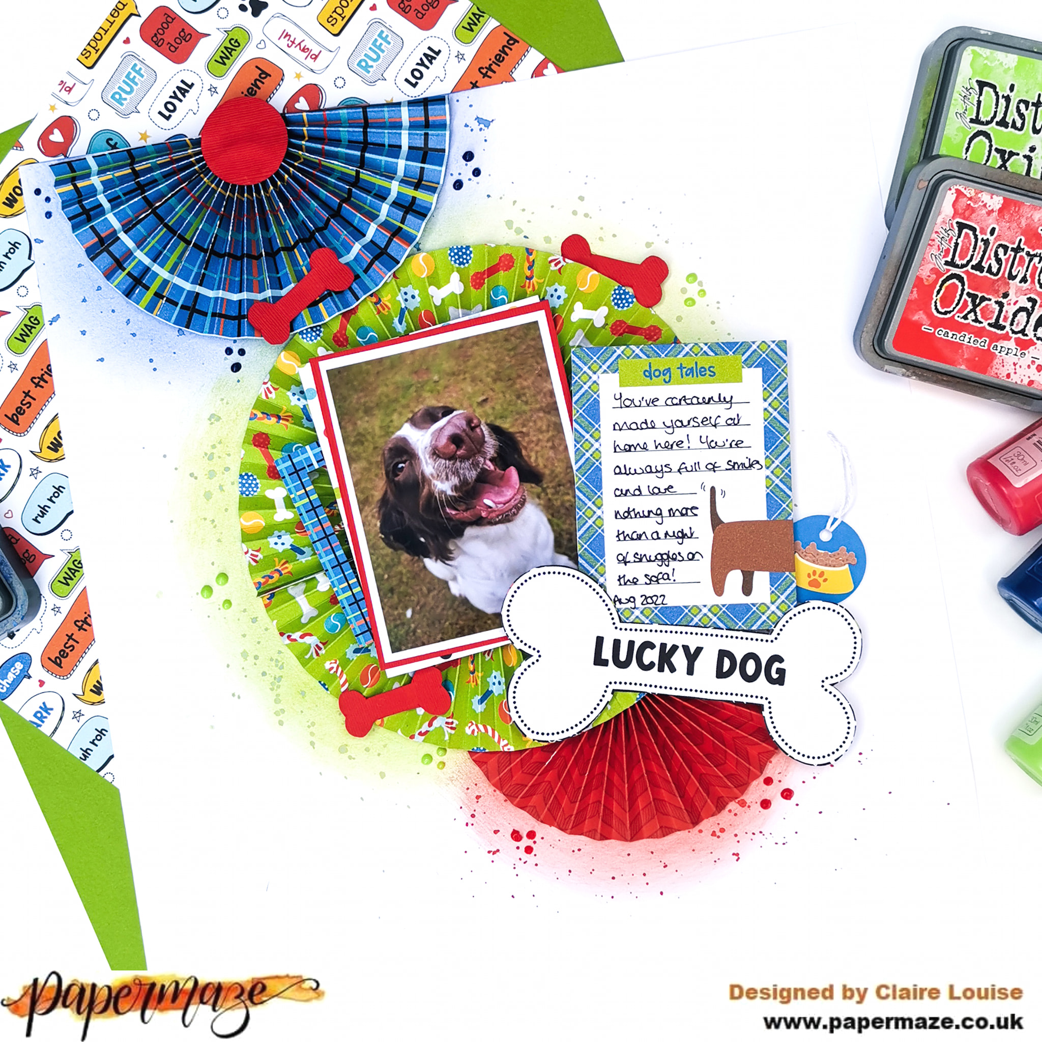
Photoplay - Bow Wow - Lucky Dog!
Hi everyone,
Claire here with you today, and this month I have the pleasure of creating layouts with the Photoplay Bow Wow collection.
We have recently opened our hearts and our home to a new furbaby. This collection was perfect to document her first few months here.
I started with a piece of plain white Bazzill cardstock from the Matchmaker Pack and wanted to make a real feature of the colours and patterns in the papers - they convey all the fun a mischief a new addition to the family brings.
I created 3 paper rosettes, using the b sides of the I Love My Dog, Chow Time, and Dog Treat papers, layering them to create a cascading, vertical design.
Once I had my positioning in place, I lightly drew around where the rosettes would sit, and brushed Distress Oxides around each in a circular motion. The coordinating colours I used were Blueprint Sketch, Twisted Citron and Candied Apple. Once that was done, I wet the ink and added splatters.
I double matted my photo using the red textured Bazzill from the Matchmaker Pack and a piece of the dotty Dog-o-mania paper, layering it on top of a frame from the Ephemera pack. I also pulled out this super cute dog tag to sit alongside the journaling.
I fussy cut one of the cut apart cards from the Lucky Dog paper to add my journaling, and also fussy cut the large 'lucky dog' bone to use as my title - it gave a real sense of playfulness that matched my photo.
Using the b side of the Speak! paper as a template, I traced one of the bones and used it to cut out some bones in the red Bazzill cardstock, which I scattered around the page as embellishments.
As a final touch, I added some Nuvo clusters around the rosettes and that was my page complete.
I'm having a blast with this collection and it's been selling out quite quickly, so don't miss out - you can grab it all here.
See you soon.
Claire xx
@Scrappysoulmate
Friday, 8 July 2022
On Island Time - Simple Stories - Simple Vintage, Vintage Seas Collection
Hello, it's Rebecca with you today and I am super excited to be sharing my first layout using the new Simple Vintage collection from Simple Stories - and it's a stunner - Vintage Seas. It's full of lovely blues and reds with a hint of rustic and it is right up my street! I adore anything nautical so this collection is perfect for me.
I started by cutting circles from some of the patterned papers. My circles are cut approx 2 1/4 inches across (about 5.5cm) and I've used a metal die to cut them. I picked some of my favourite papers - By The Sea (B side), Gone Coastal (both sides) and Sandy Shores. Once cut, I arranged the circles into 5 rows across a sheet of Premium White Cardstock and stitched them in place using my sewing machine.
With my circles in place, I then turned my focus to my photo - my little boy sat on the beach on the Isle of Wight last Summer. I was really drawn to one of the Chipboard Clusters and decided to cut the centre out and use it as a frame for my photo.
For my title, I've used one of the Combo Stickers - it was perfect considering my photo was taken on an Island which is renowned for having a slower, more relaxed pace of life. I've also added a sailboat from the Combo Stickers as my son's top has little lighthouses and sailboats on it.
I really didn't need to heavily embellish this layout because the patterned papers add so much beautiful detail all by themselves! I've added a few chipboard pieces from the Chipboard Clusters pack, and some die cuts from the Page Pieces.
To stretch my embellishing further out on the page, I've added some phrase stickers from the Sticker Book to two of the corner circles. I've raised these up using craft foam to introduce some dimension to the outer parts of the design.
I finished off the layout with a couple of acrylic seagulls from Bramble Fox, and some white splatters. For the splatters, I have watered-down some white gesso and as opposed to using white paint as I find the white stays whiter and doesn't soak into the patterned papers.
I hope you've enjoyed this layout and you find it inspiring. This collection is truly stunning and I can't wait to create more layouts with it. If you'd like to watch this layout come together, you can find a process video up on my YouTube channel here.
Thanks for reading! See you next time.
Rebecca x
@preciouspagespapercraft
Monday, 11 April 2022
Hello Sunshine - Vicki Boutin - Sweet Rush Collection
Hello, Rebecca with you today sharing my first layout created with the new 'Sweet Rush' collection, designed by Vicki Boutin for American Crafts. You can find the collection in the store here. At the moment, we have all the papers and some of the embellishments available, but we are still waiting eagerly for the ephemera to arrive. It won't be long now!
My eye was immediately drawn to the Rainbow Swirl patterned paper. Obviously. I'm a sucker for a rainbow paper and this one was no exception! I cut the rainbow in half so that I had the warmer colours on one section, and the cooler colours on another. I then cut along the adjoining lines (not all the way though!) so that I could distress all the edges in between the colours to introduce a bit of texture.
Next, I placed the blue-green section of the rainbow towards the top of my page, and then turned the warmer coloured section up the other way, so that I could place my circular photo in the centre, and it would look like the rainbow rays were coming out of my photo.
As I mentioned, we are still waiting for a lot of the ephemera and stickers etc to arrive - so I had to get my fussy-cut on and create myself some embellishments for my layout! I cut the clouds from the Silver Lining paper, the flowers from the Daisy Chain paper, and possibly my favourite - the butterflies - from the Soar paper. There is so much fussy-cutting potential in this collection which means you can really stretch it!
I placed the clouds across the rainbow, towards the top of my page, and a couple peeking out from behind my photo. I distressed the edges of them to give them a 'fluffy' appearance.
I added some of the fussy-cut flowers either side of my photo, following the diagonal design of the rainbow. I raised the petals up with foam pads to give them a more dimensional appearance.
I then added the butterflies in a tone-on-tone fashion, varying the sizes for interest. As with all my layouts, when I use butterflies I only ever adhere their bodies to my page. I love to leave the wings flapping free so that I can bend them up and make it look like the butterflies have just flown onto my layout.
For my title, I selected the phrase 'Hello Sunshine' from the Loving This Phrase Stickers. I love the way the black 'pops' against all the bright colours of my rainbow. I also added 4 of the heart-shaped Layered Stickers, again trying to stick to tone-on-tone. I bend the edges of the hearts up for dimension.
I finished off my layout with some black 'Holy Moly' acrylic perspextives from Bramble Fox, and some black ink splatters to add a bit of drama and impact.
I hope you've enjoyed this layout. I'm really impressed with how many embellishments I was able to create by fussy-cutting some of the patterned papers! If you'd like to watch this layout come together, there is a process video up on my YouTube layout, which you can find here.
I'll be back later in the month with another 'Sweet Rush' layout - and by then the ephemera will have arrived so I'll have a lot more to play with!
Take care,
Rebecca x
@preciouspagespapercraft
Saturday, 26 February 2022
Wet Mixed Media - Shimmerz Paints
Hello, it’s Rebecca with you today sharing my second layout of the month. In my previous blog, I talked about ‘dry mixed media’ - using mixed media products without any water. Today, I’m focusing on ‘wet mixed media’ and getting messy and having fun. Papermaze stock a HUGE range of mixed media products - head over to the shop and take a look here (click the 'Mixed Media' tab at the top!)
I often see people on social media commenting that they are too scared or apprehensive to try mixed media. I was exactly the same a few years ago, until I decided to pick up some scrap cardstock and have a play. And that’s exactly what mixed media is for me - playing and having fun. At the end of the day, it’s only paper! If you create a background and decide you don’t like it, start again!
There are so many different ways to apply mixed media products to your background, but the most popular way is using the ‘packaging technique’ - which is exactly what it says on the tin! Add your medium to a scrap piece of plastic packaging (the packaging that ephemera or thickers come in is perfect) and add some water. Then turn this packing over onto your layout and ‘smoosh’ it down onto the page. I love this method as it’s quick and simple and I love the watercolour effect it gives on the background. If you’d like to apply your medium with slightly more control, you can apply your medium to some plastic packaging or grease proof paper and mix with a little water, and then apply to your background using a sponge, some scrunched up tin foil or cling film, scrunched up plastic etc - most things will work! You could also use a paintbrush to apply the colour directly to the page, use a brayer, or scrape ink pads across the background and then add water to it! The possibilities are endless and the effect you get will be different depending on how you apply the colour and that’s what makes mixed media so fun!
For me, the key to creating a mixed media background is to build it up in layers; and that’s exactly what I have done with my layout today.
I allowed my layer of gesso to dry, and then using a stencil I made from Premium White Cardstock on my silhouette cameo 4, I added some white Texture Paste to my background.
I love using texture paste on my backgrounds - especially through stencils. I use a plastic spatula to apply the paste and on this occasion, I was going for a ‘rough/messy’ look. I use a white texture paste by Ranger as it’s nice and thick and dries quite quickly.
Once the texture paste was dry, I moved on to the next layer of mixed media - adding some colour! I swiped two Distress Oxide Ink Pads across my texture paste in the shades Chipped Sapphire and Mermaid Lagoon. I decided on a dark blue background to co-ordinate with my son’s clothes in my photo. Using a spray bottle, I added water to my page and tutoring it from side to side, spread the colour around and let it run across the texture paste.
I could tell the colour wasn’t quite what I was after, so I used some kitchen towel to soak a lot of the ink up. This was only possible because of the gesso - if I didn’t have gesso on the page those inks would have soaked through the cardstock and wouldn’t have mopped up.
Next, I moved on to my stash of Shimmerz Paints. I absolutely love Shimmerz products! There are various different products within the Shimmerz Range and they are all available at Papermaze:
Shimmerz - The original Shimmerz product! They are wet paints with tons of shimmer. They will need a quick stir before use just to evenly distribute all the shimmer as over time, it will sit on the bottom of the pot. Blingz are the same as original shimmerz but with much more shimmer!
Creameez - Like Inklingz, these are intensely pigmented, solid watercolours that are activated by adding water to the pot. Creameez tend to have just a hint of shimmer, put are richer in colour.
Vibez - A spray bottle of intense colour, highly saturated with shimmer. They also come in variations of iridescence - gold, silver, bronze, pearl or a mix of these!
Spritz - Pastel coloured iridescent sprays which are pigmented and shimmery.
On to the next layer! I finished off my background by adding some gold splatters using 'Good As Gold' and again, dried it with my heat gun. Sometimes I will soak up excess paint/water with kitchen towel but I find this often soaks up a lot of the shimmer - using a heat gun might take longer but it means the shimmer remains on the page. I also find that sometimes water can dilute the shimmer in the paints - the more water you add, the less shimmery the background will be, so bear that in mind when adding your water.
I actually added a fair amount of water to this background, but because I also added a lot of paint, it’s kept it’s shimmery appearance.
Mixed media isn’t just for backgrounds - you can add mixed media to lots of things - Cutfiles, chipboard, die cuts, ephemera etc. For this layout, I cut some layered flowers on my Silhouette using a cutfile by Paige Evans. I wanted to paint them yellow and purple to match the flowers in my photo.
I reached for my Shimmerz again, using 'Dandy-Lion' and 'Sun Kissed' Inklingz and 'Mango Tango' Vibez for the yellow and a mix of 'Plum Candy' and 'Beets Me' Inklingz and 'Berry Hot' Creameez for the purple. I also added in a small amount of Distress Oxide to give a bit of variation in the shading and tone. (Fosilized Amber and Dusty Concord).
I then added the flowers to my layout, along with my photo and embellished lightly with some butterflies from Vicki Boutin's Color Study Collection and some sequins.
I hope you've enjoyed this blog and it's given you some useful information and inspired you to have a play. Just remember - it's only paper! Have a play and try adding ink or paints in different ways, mix your colours and just have fun!
I will have a process layout up on my YouTube channel over the weekend showing how I created this layout and my mixed media. You can find my channel here.
Thanks for reading, see you next time.
Take care,
Rebecca x
@preciouspagespapercraft